Amstel Fallas 2015
Beer label design and gift packaging. Amstel. 2015
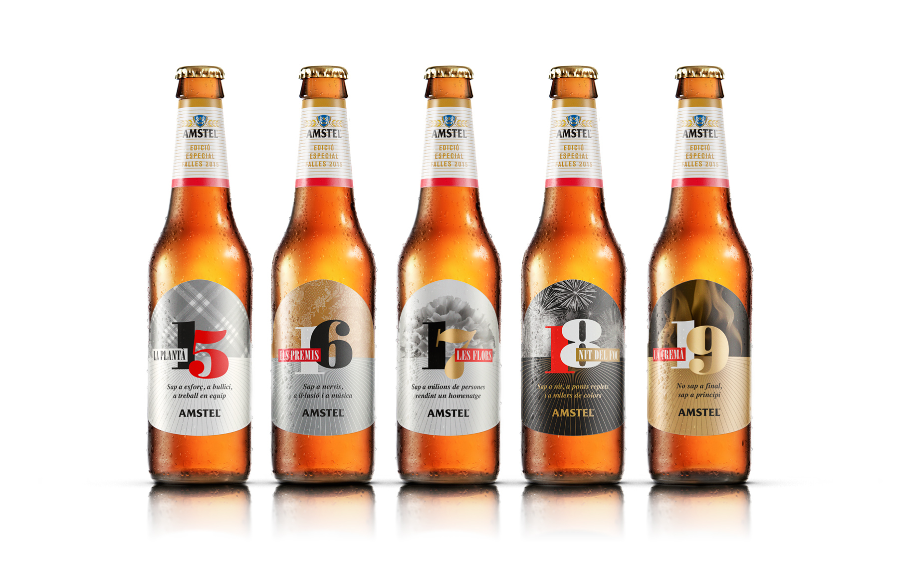
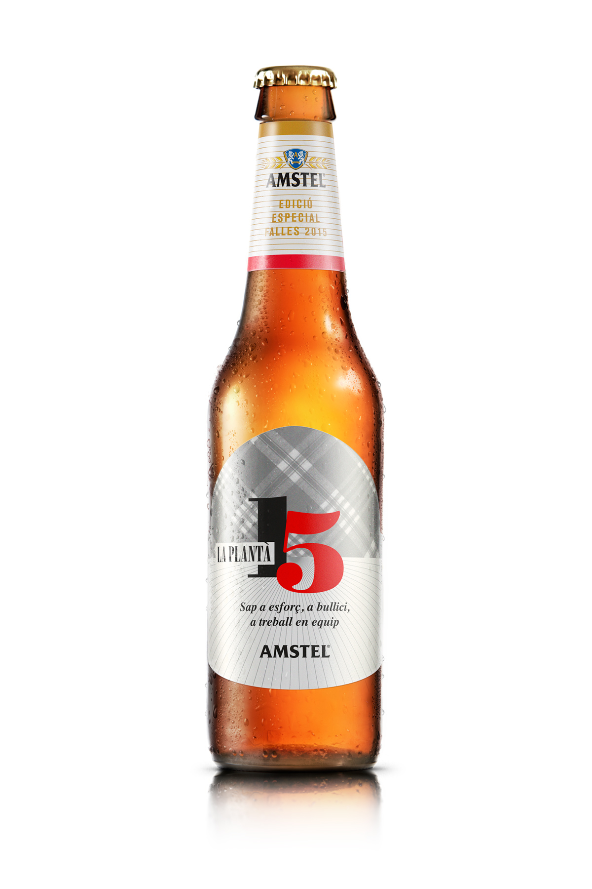
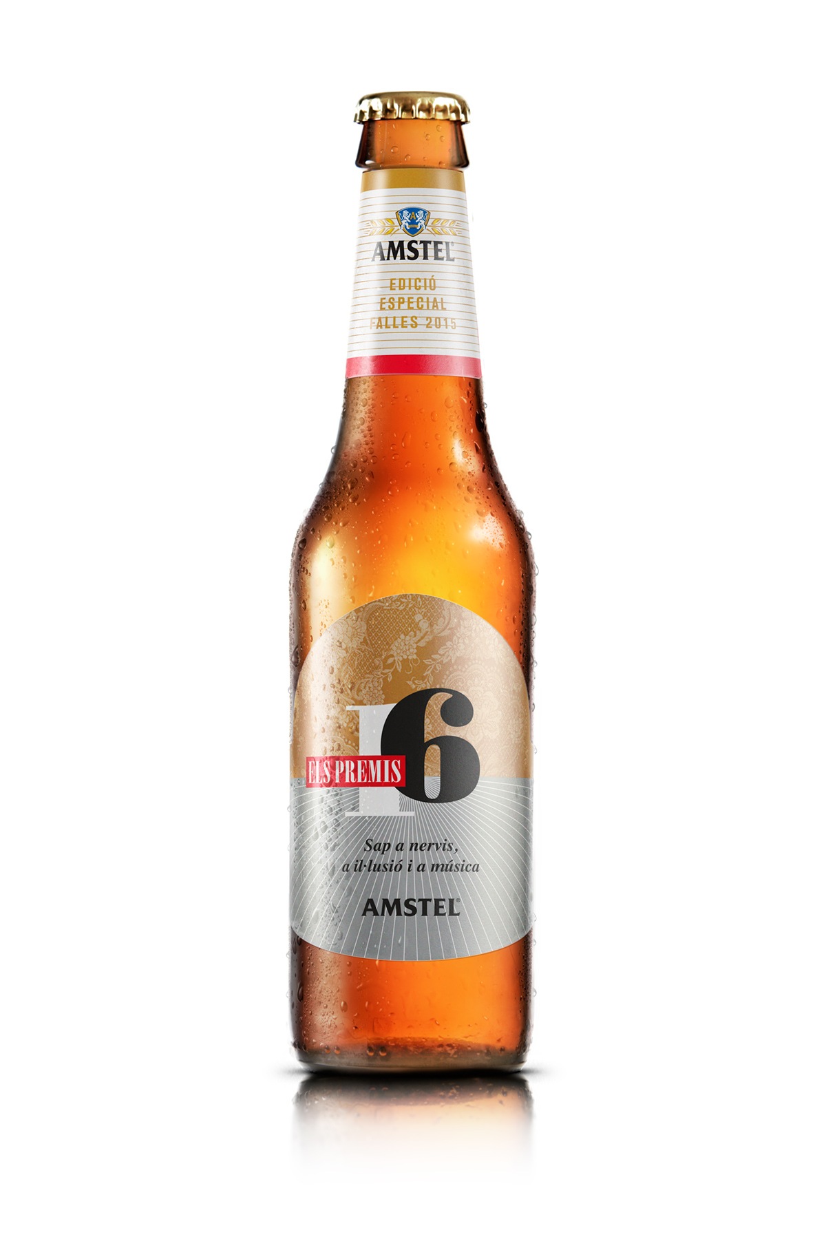
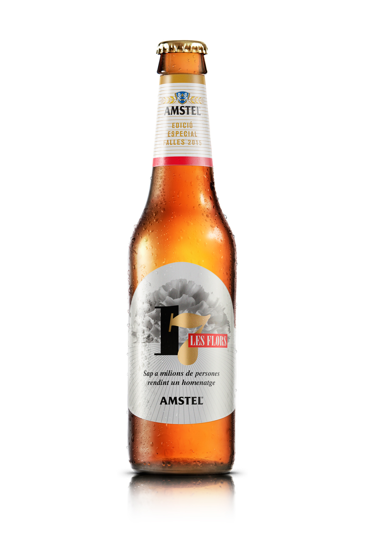
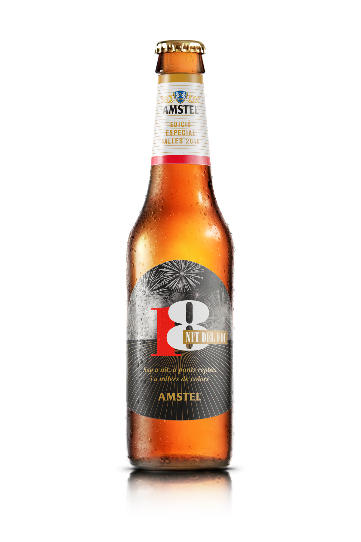
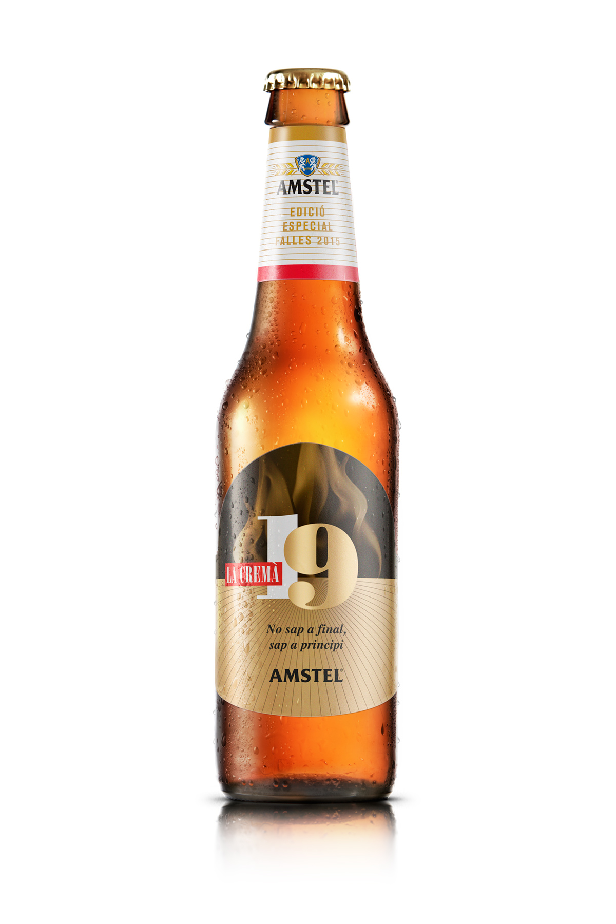
Each year, Amstel participates and sponsors Valencia’s notorious annual Fallas festival. This year Amstel’s advertising agency, Publips, had the idea of paying tribute to the final five days of the festival from the 15th to 19th of March. From the planting to the cremation, we were asked to design the five labels. We used symbolic Motifs related to the traditions of each day, giving them a treatment more akin to textures and patterns rather than using descriptive images or scenes.
The scarf, silk from the Fallera costume, flowers, fireworks and flames were the chosen themes. We kept Amstel’s colour pallete of gold, silver, red, black and white for the labels to be instantly recognisable as Amstel, a key brief requirement. The layout is divided into two halfs: the bottom reserved for the branding and the top for a changing graphic theme. We opted for a design which fitted with a classic beer label concept, with a centered composition, serif typeface and brimming with elements, which is also in keeping with the traditionally excessive fallera style.
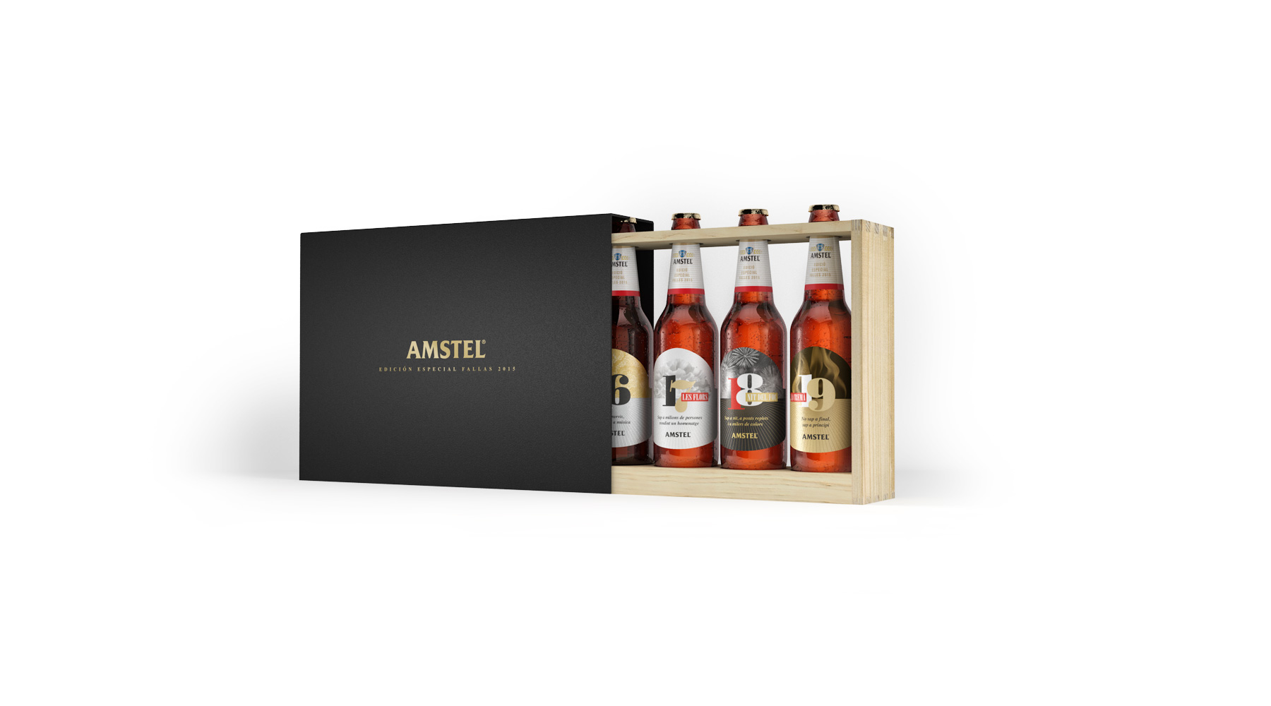
To complete the limited edition set, we designed gift packaging to include the 5 bottles from the collection. We wanted it to showcase the product while further referencing the fallas theme.
We were inspired by the “mortar tubes” that the pyrotechnics team use in the ‘mascletàs’ (an explosive barrage of coordinated firecrackers) and fireworks.