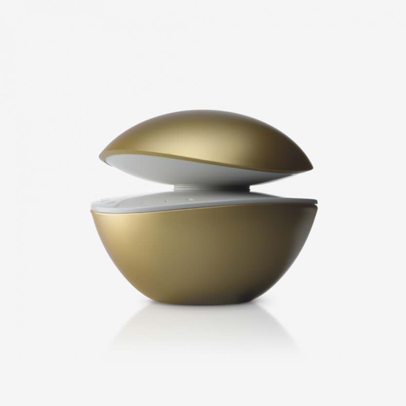
Codizia woman
Codizia is a fragrance developed for women who look for a quality and premium product, but at a much lower price than the top range perfumes. its bottle tries to transmit these attributes: elegance, personality, sophistication. With its rounded shapes, the golden finished glass, and the two curved white surfaces, which facing each other, produce a light and reflection effect. The package has a graphic design that refers to the shapes and colours of the bottle. It is distributed exclusively at Mercadona shops.
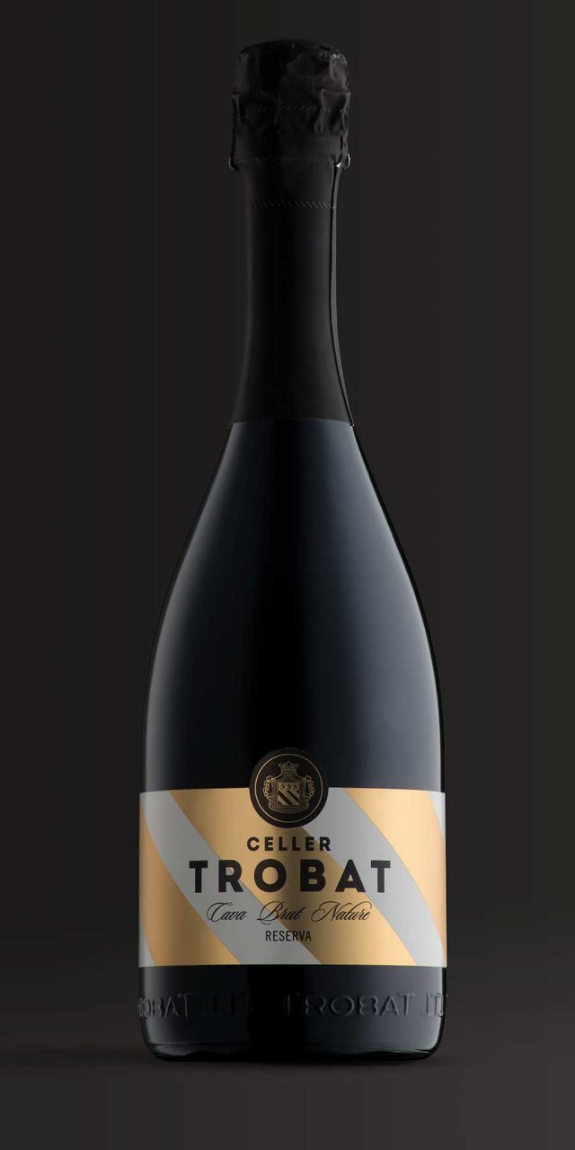
Celler Trobat
Celler Trobat is a winery in Ampurdán (Catalonia) with a history of more than 200 years. It produces wines and cavas with a designation of origin. We were commissioned to design the labels of their cavas, whose previous packaging had given a central focus to the coat of arms of the winery. This emblem had to be maintained as it was an identifying feature already known in the market, so we decided to make it the basis of the design. We gave prominence to the stripes of the shield and reproduced them in large scale, in gold and white for the reserve and in metallic pink for the rosé. They form a powerful and elegant background, upon which the text stands out, as does the coat of arms, which we simplified somewhat in order for it to harmonise with the more modern style.
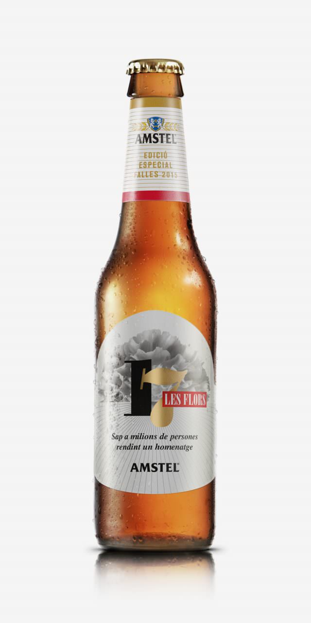
Amstel Fallas 2015
Each year, Amstel participates and sponsors Valencia’s notorious annual Fallas festival. This year Amstel's advertising agency, Publips, had the idea of paying tribute to the final five days of the festival from the 15th to 19th of March. From the planting to the cremation, we were asked to design the five labels. We used symbolic Motifs related to the traditions of each day, giving them a treatment more akin to textures and patterns rather than using descriptive images or scenes.
The scarf, silk from the Fallera costume, flowers, fireworks and flames were the chosen themes. We kept Amstel's colour pallete of gold, silver, red, black and white for the labels to be instantly recognisable as Amstel, a key brief requirement. The layout is divided into two halfs: the bottom reserved for the branding and the top for a changing graphic theme. We opted for a design which fitted with a classic beer label concept, with a centered composition, serif typeface and brimming with elements, which is also in keeping with the traditionally excessive fallera style.
To complete the limited edition set, we designed gift packaging to include the 5 bottles from the collection. We wanted it to showcase the product while further referencing the fallas theme.
We were inspired by the "mortar tubes" that the pyrotechnics team use in the 'mascletàs' (an explosive barrage of coordinated firecrackers) and fireworks.
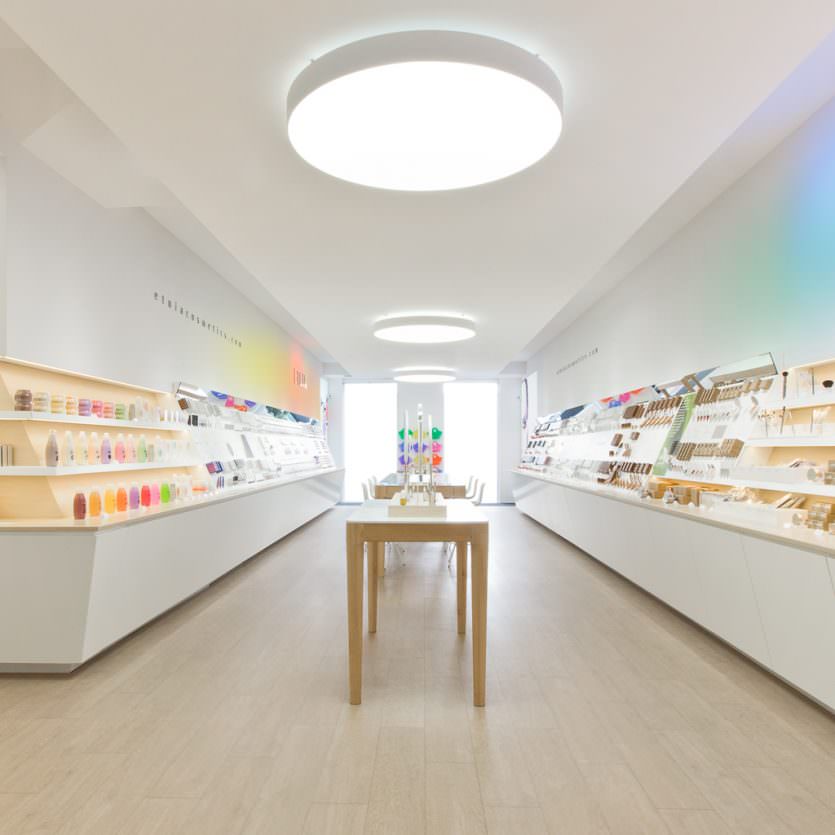
Etnia Shops
ETNIA Cosmetics brand has a clear objective: To open a network of stores in Spain and to repeat the same strategy at international level. The shops spacial design had to take into account efficiency, functionality and image. This is why modularity, product presentation and general appeal of the product at the point of sale have been central to the project. White combined with clear woods tones and quality lighting are some of the features that set ETNIA apart from other shops in the sector. The central table and the circular light fixtures are key elements of the shop personality and make a clear statement: ETNIA shops are a meeting and experiential points for people looking for innovation and quality in make-up, cosmetics and fragrances. In each ETNIA store, people can find a special corner to experience a new consumer experience. Concept and design by: Lavernia&Cienfuegos. Development and production: Tejedor Asociados/Prodiseño
Alma
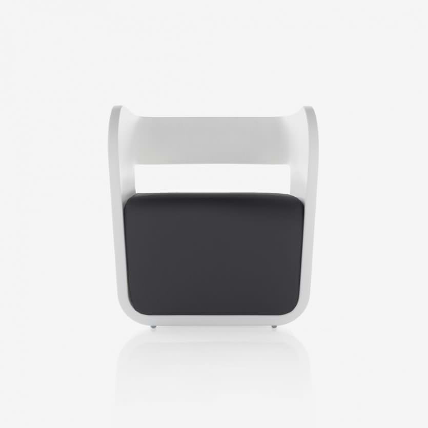
ALMA comes up as the result of looking for different typologies, trying to find a different composition and relationship among the elements that form an armchair. Two differentiated volumes that allow us to combine colours and materials, making possible its use in different areas:
"ALMA IN" is the totally upholstered version, ideal for interiors, whereas "ALMA OUT" is the one for outside. It is made of plastic (polythene) that can be combined with the fabric seat, which is a new feature in outdoors furniture.
City
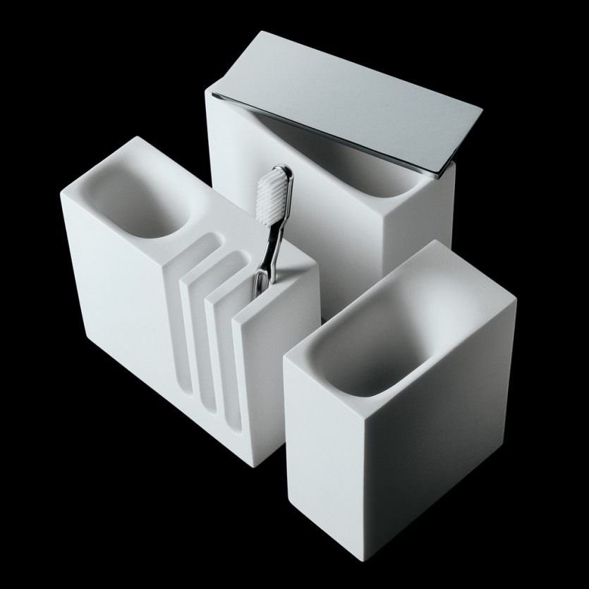
Given that the aim was to achieve a range of bathroom accessories appropriate for heavy use in large scale organizations, such as hotels, offices, and public spaces, we approached the project with a design focus on resistance ... The units had to look robust so we designed them using visually strong forms based on rectangular prisms. In contrast, the entrances that form such public spaces are smooth and rounded. They are made in both mineral resin (Stonefeel®) together with brass.


