

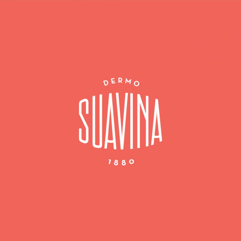
Suavina
Suavina is a lip protector with a lot of history behind, “135 years taking care of your lips”, as their baseline put it. The design reflects a classic product imagery, following the main brief requirement. The packaging design of the lip cream container is a redesign, a updated version of the container they have been using for many years. The surface has been curved and the edges has been rounded to bring the smoothness effect that this type of product requires, without becoming a feminine container, since it is not a female product. The lid shows the brand, which was redesigned from the original brand. It also includes the word “demo”, and the date of foundation of the brand: 1880. The design solution itself seeks to convey both tradition and modernity through elements such a classic typographic composition, Sans Serif fonts, and debossed letters.
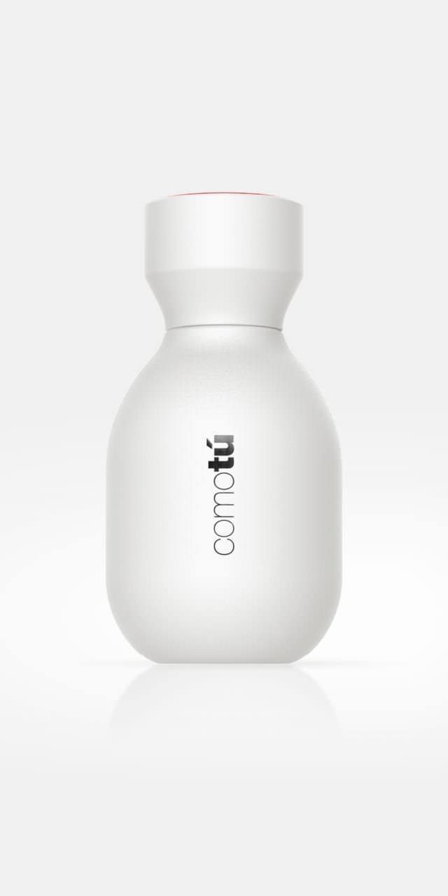
Comotú
The collection of mass-market fragrances, Comotú, designed for Mercadona, was aimed to be a simple product, in harmony with its price, but with a surprisingly premium appearance. In order to achieve a good brand image and minimise the costs of production, only one bottle design was used for the eight different fragrances, four in black (for men) and four in white (for women). The range of fragrances are differentiated by coloured lid tops. The shape of the bottle is rounded and curved, and the outer packaging use either a gloss finish or metallic inks. The overall packaging design transmits high quality and modern attributes at a competitive price. It's hugely popular launch demonstrates that a mass-market product can benefit even more with a good design.
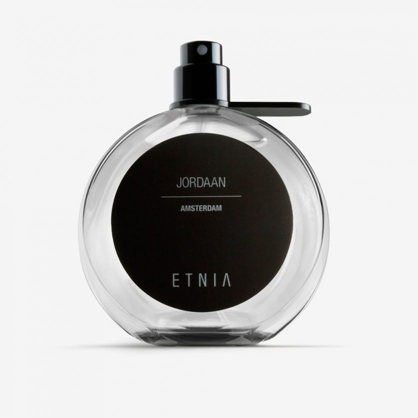
Etnia Fragance
The sense of smell has an amazing capacity to conjure up old memories and we like nothing less than to reminisce of trips to our favourite cities. ETNIA’s Fragrance Collection is dedicated to the trendiest neighbourhoods of the biggest and most famous cities. From London’s well known and vibrant, Brick Lane to Pekin’s unexpected, and avant garde, 798 Factory. Neighbourhoods and streets which set the trend around the world were the inspiration to create the fragrances and to design the packaging, from structural to graphic design. Rounded bottles give reference to the global nature of cities, to traveling and at the same time it serves as a magnifying glass, to amplify the map of the neighbourhood, which is seen from the inside of the bottle and reverse of the label.
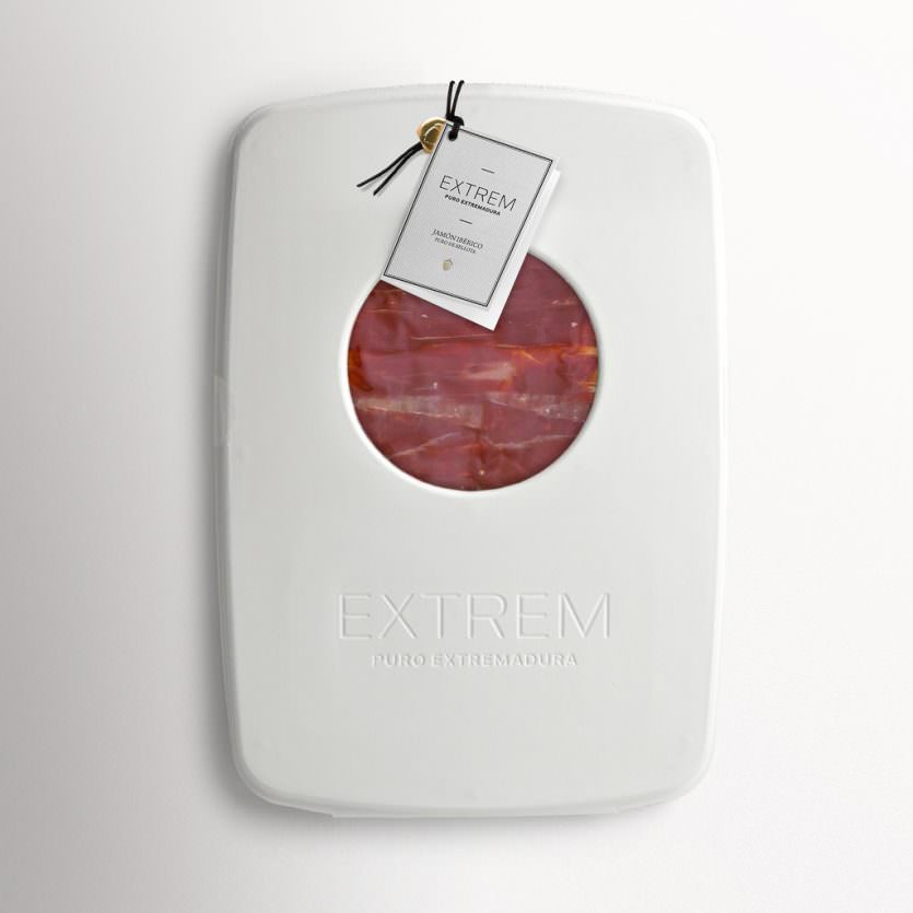
Extrem Premium
EXTREM is a new brand of Iberian ham from free-range acorn-fed Iberian pigs. The company wants a place among the best brands in its category, and it needs for its sliced ham an innovative packaging, a different one from the competition.
Their competition sells in food stores and gourmet shops, where ham is packed in cardboard or even in tins. As a premium quality and priced product, it requires an adequate packaging. The challenge was that EXTREM wanted to look different, but not to increase their prices, so we decided to look for a different shape or material within price range, but clearly distinctive.
There is an approach we love at L&C, and it is to propose the use of materials or features from different sectors, from other product typologies, far from the "universe" of the item we are working with. This led us to think about cellulose pulp, a material used to pack eggs and also widely used as a material to protect fragile electronic products. A humble material with no semantic pollution.
It has a low cost per unit if large amounts are manufactured. So we already had our proposal for EXTREM. A design which stands out from the competition in innovation and image, and furthermore, it has great advantages in cost and sustainability. The very material acts as a hinge, so the package is made from a single piece. It has a compulsory round window (the ham has to be displayed) made with a die of the mould, the same as the brand engraving, so there is no need for a later printing process. It is closed by means of a piece of string, a typical element in ham elaboration and presentation.
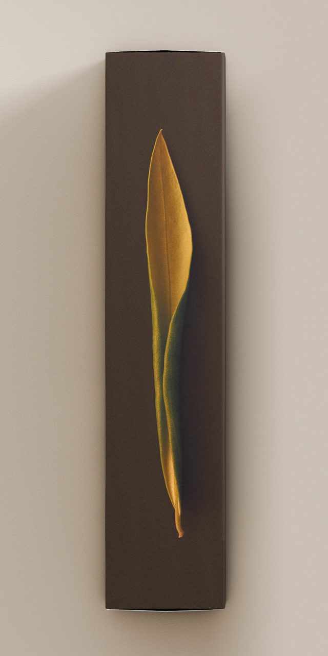
Vegamar Selección
Wine is grapevine and time. On the one hand, grapes grow and mature slowly. On the other hand, months of winemaking through a delicate craft create a rather unpredictable process. Combining the vine leaf with the passing of time is the idea for the Vegamar Selección identity, which is a specific store designed for tasting and buying select wine, cava, olive oil and other Vegamar products. The vine leaves were picked and photographed as they started to dry out and curl back on themselves, each in their unique way. It is similar to the wine aging process for which there is also a random element and unpredictable beauty. The identity for the store is built around these photos, with a monochrome treatment, and has been applied to the gift packaging, wine, cava and olive oil labels.
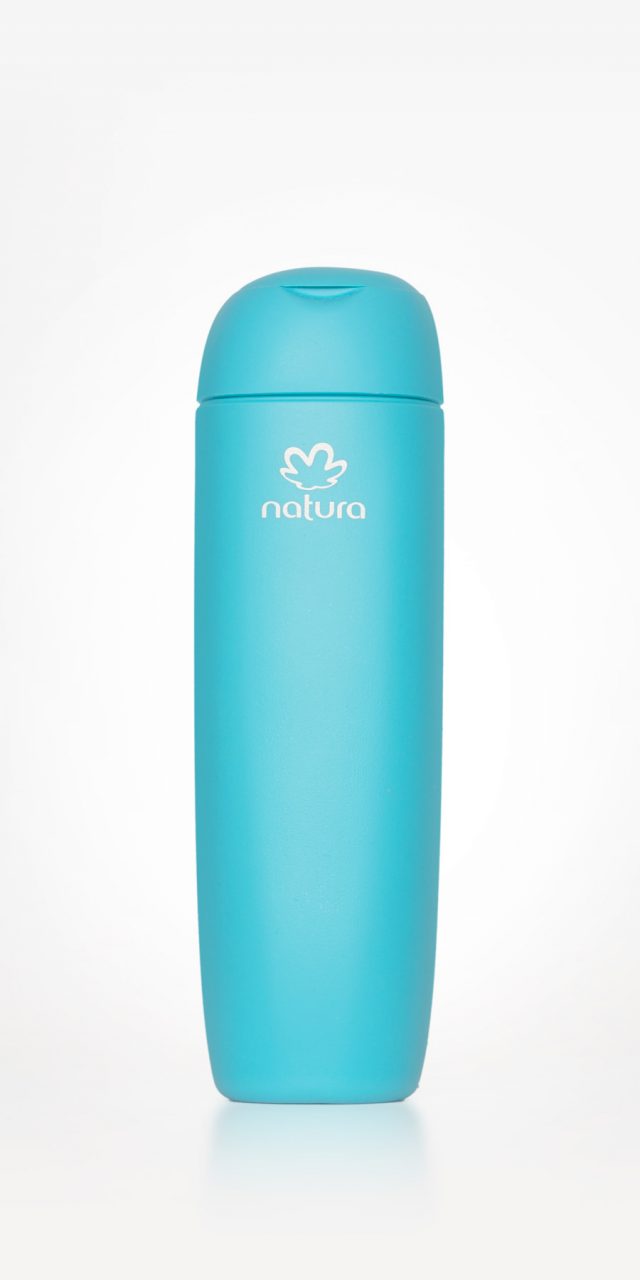
Natura Tez
Natura is a highly regarded manufacturer and leader of cosmetics and perfumes within the Brazilian market. The company is also committed to social development in Brazil, and are especially focused on the Amazon region and the improvement of the living conditions of its human communities and the sustainability of its wildlife population. Natura has over the years also come to be regarded as a benchmark for quality design, as its impressive headquarters in Sao Paolo, sleek product design and creative communication campaigns clearly attest. In this case, Natura asked for a design that communicated the simplicity of a line aimed at women who were after a practical, accessible and uncomplicated product. Furthermore, the brief specifically asked for an organic, feminine and contemporary feel.