

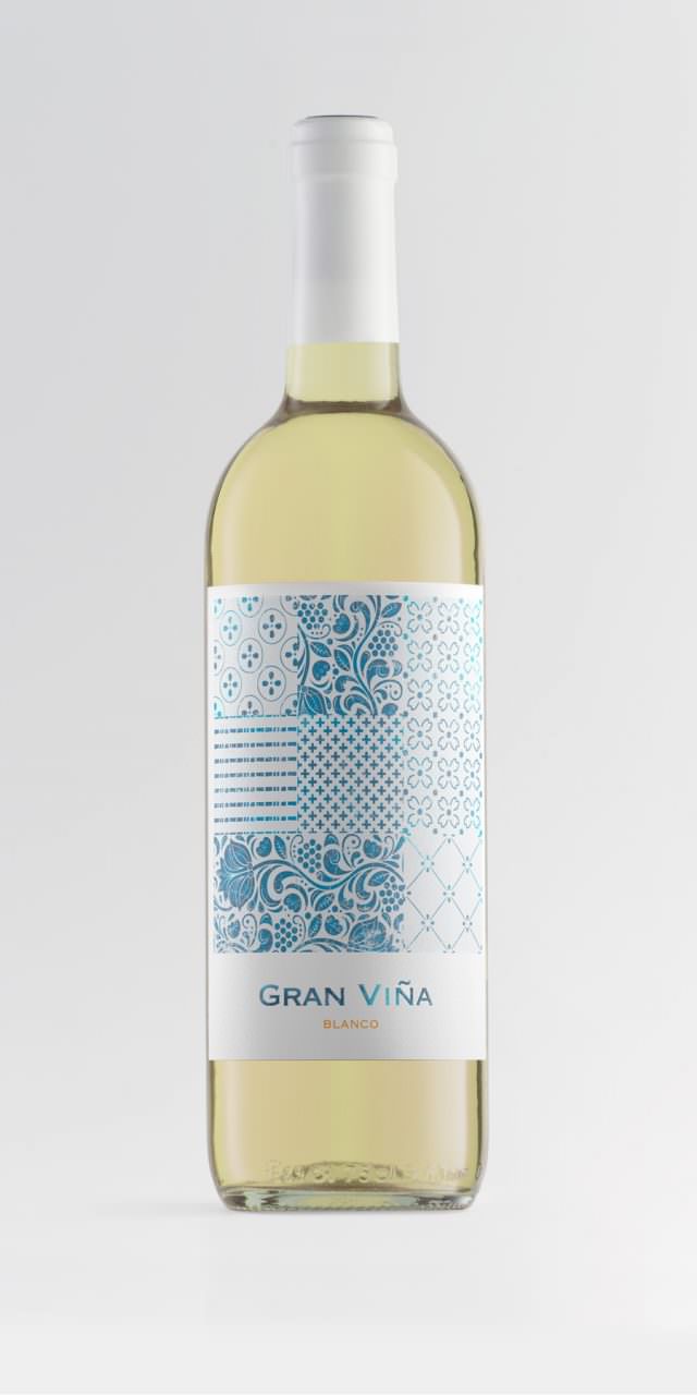
Gran Viña
This is a family of humble, honest wines. Made with grapes from the vineyards resting behind the old farmhouse — the landscape the grandmother looked at from her kitchen every day. They are a homage to that woman who prepared delicious jams, exquisite almond and caramel sweets, and who ate with her grandchildren every afternoon — the same grandchildren who now take care of cultivating the vines and making this wine, with which they wanted to pay tribute to her. The label evokes the memories of the tiling in that kitchen, as if it were a kind of Proustian madeleine.

Extrem Deluxe
EXTREM, a new Brand of Iberian, acorn-fed ham has been launched by Agriculturas Diversas, a Spanish company with a long tradition in the premium ham sector. EXTREM needed prestigious new packaging for their top product that could be bought as a special gift as the brand positions itself in gourmet shops around the world. The packaging needed to transmit the product’s extremely high quality to put it on par with other delicacies at the high end of the gourmet world, such as caviar and foie. We designed the packaging in matt black, with a contrasting golden pig handle. An elegant serving tray in which to present the finest cuts of Iberian ham “comme il faut”. Client: Gallén-Ibáñez and AGR! for Agriculturas Diversas SLU.
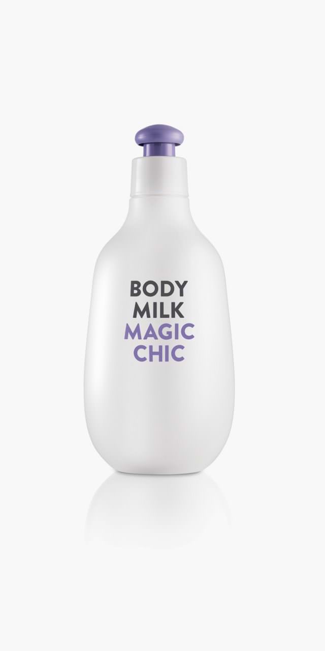
Magic Chic
Magic Chic is a family of three different products—bath gel, body milk, and cologne—targeted at young people. The brief called for something different from what is on the market: something less conventional, more fun; something that was not romantic, which did not talk about the ingredients or the benefits of the product. It had to be something direct, very immediate. This is what we strove to convey with a simple emphatic 2D design in contrast with the bottle we created, which is soft, friendly, with an unusual shape and a highly functional cap—something uncommon in this type of product.
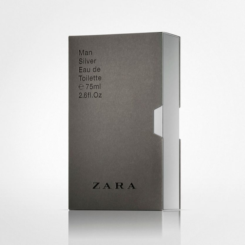
Zara Men VHS
The brief required a new design for the boxes and graphic for most of ZARA male fragrances. The design had to be neutral and versatile enough to accommodate not only existing fragrances, but also new editions to be incorporated to the brand's portfolio.
Regarding the box model, we chose a videotape case model adapted to the bottle size. This kind of packaging allowed us to play with an external cover and an inner box. Regarding graphic design, we decided to use a classic typo outside, Helvetica, simple composition and sophisticated finishings: blind emboss, bas-relief, and gloss varnish on the lettering in contrast with the matte cardboard.
The first fragrances with the new design were the classical ones: Silver, Uomo and Blue Spirit. Warm grey on the outside, and the matching colour of each fragrance in the inner box. This colour is visible on the opening side, same as videotape cases, and on the thumb notch.
We applied then the new pattern to the Cities line (Cities where ZARA is present), as this pack solution is very suitable for it. The outer box is white and the city image fills all the inner box, and it is seen progressively as the inner box is removed from the case, in the same way as visitors discover little by little the city they travel to.
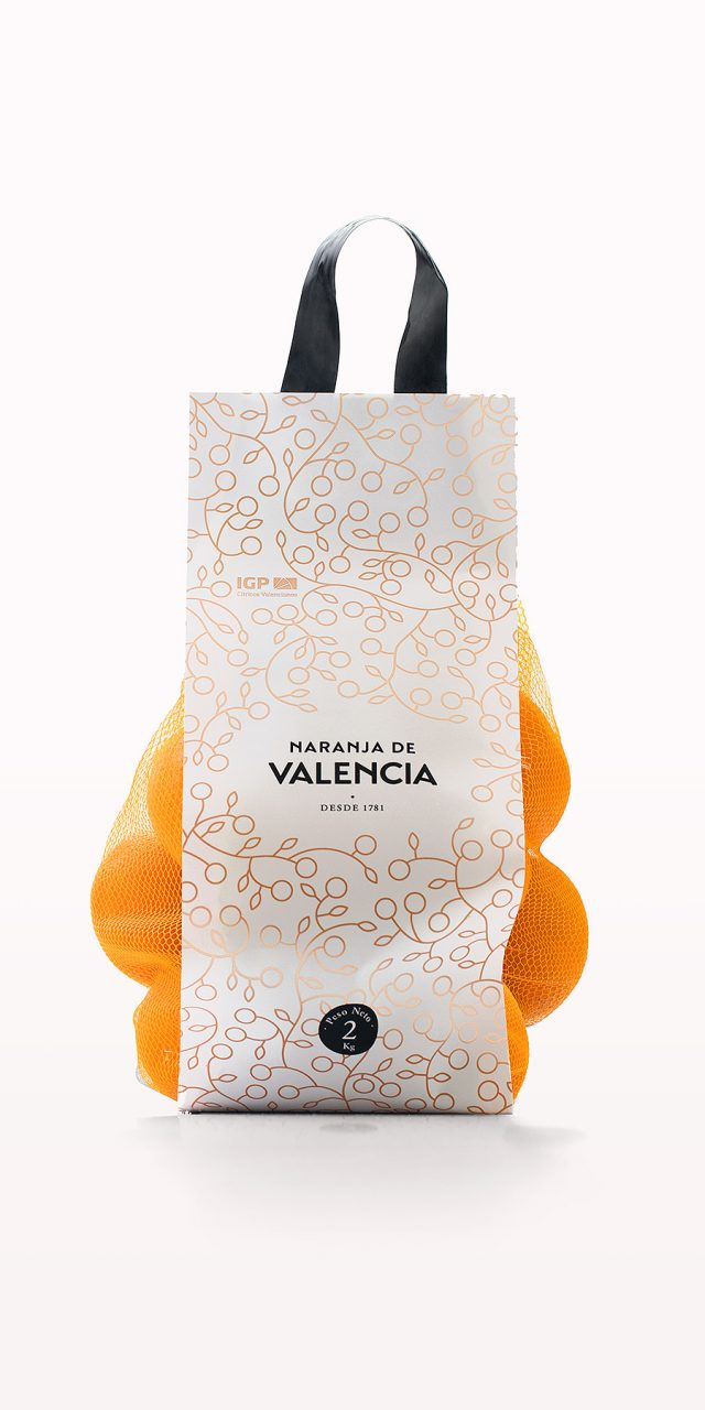
Naranja de Valencia
A group of producers and exporters made use of the PGI, Protected Geographical Indication, which guarantees that the oranges they distribute around the world are grown in Valencia, therefore benefiting from their renown quality. The name of this brand is very clear and very direct: Naranjas de Valencia—or Valencia Orange, in the English version. All the brand applications revolve around the point of sale: boxes, mesh bags, signs, bags, t-shirts for fruit shop vendors and a website. In the logo, the word Valencia stands out most of all, as the presence of the oranges, displayed in their boxes or mesh bags, makes it almost unnecessary to say what the product is. The choosen typography, san serif, has been modified to evoke the traditional types used in the middle of XX century in orange design labels - activity that had a great development in the first half of that century. The brand identity has another essential element that complement the logo. We accompany the logo with an illustration that works as a motif pattern to be used in other media, such as wrapping paper, signs, bags, website, etc.
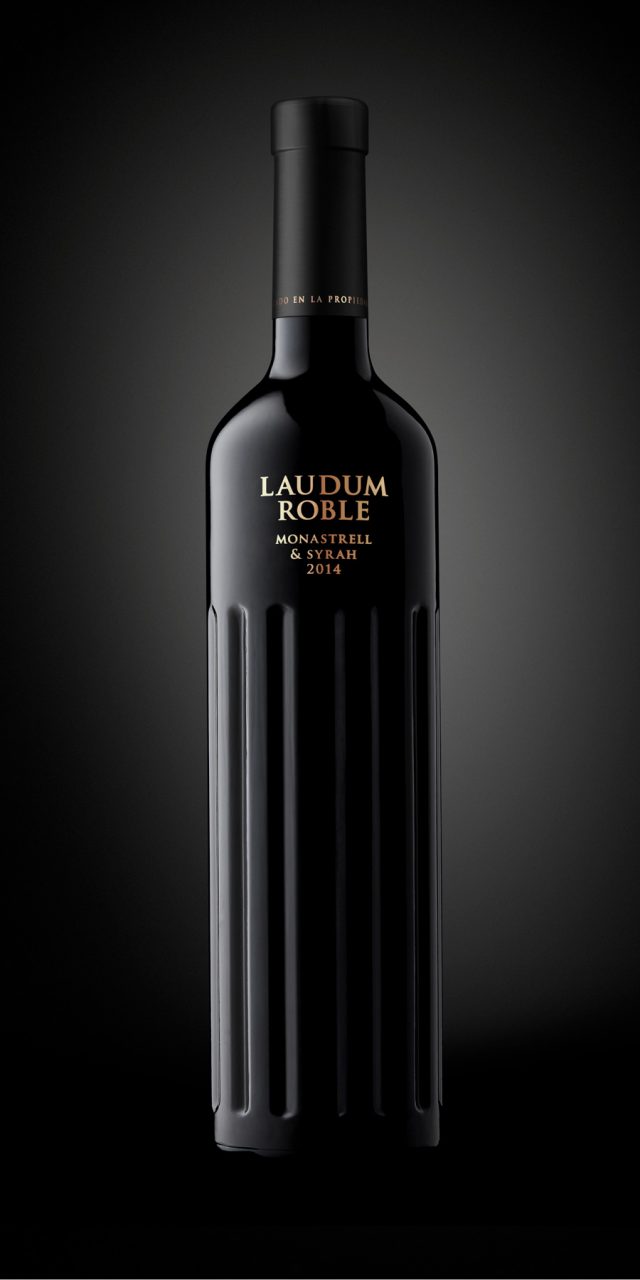
Laudum
LAUDUM is the genitive plural of Laus, the Latin word meaning praise, glory, fame. For such a classic, Latin name, with strong Roman overtones, we have designed this bottle with references to columns of the Lonic or Corinthian period with characteristics from ancient Roman temple architecture. The relationship between viticulture and the temple is age-old. The column is part of the temple, it rises towards the sky, it is history and art, as is wine.
Photography: Guillem López