

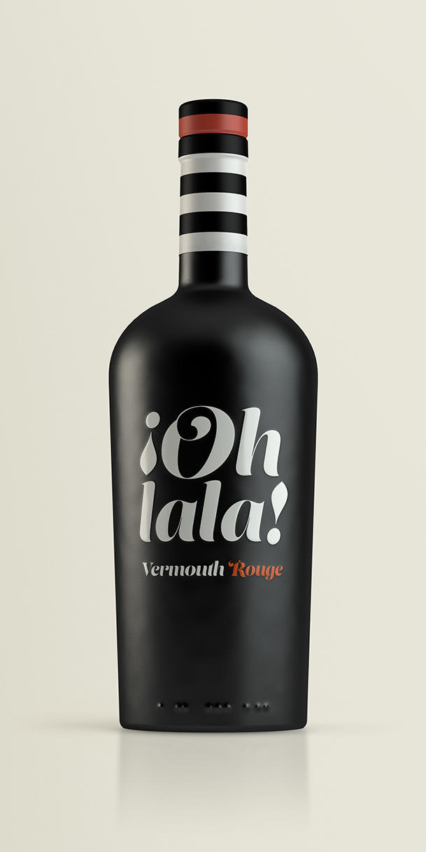
Ohlala!
We were given the name and, with a name like that, the image that immediately sprang to mind was of a bistrot by the sea or in the square of a port town on the Côte d’Azur, and the quintessential image of a French woman in a striped shirt, like a sailor’s shirt, and a scarf or red beret. Sometimes the evocative power of the name is the key to the whole design; it is capable of telling a story, of suggesting a scene. A young woman sitting at a table asking for un vermouth rouge, s'il vous plaît, and an attentive garçon who answers, or thinks, Oh la la!
Suavina
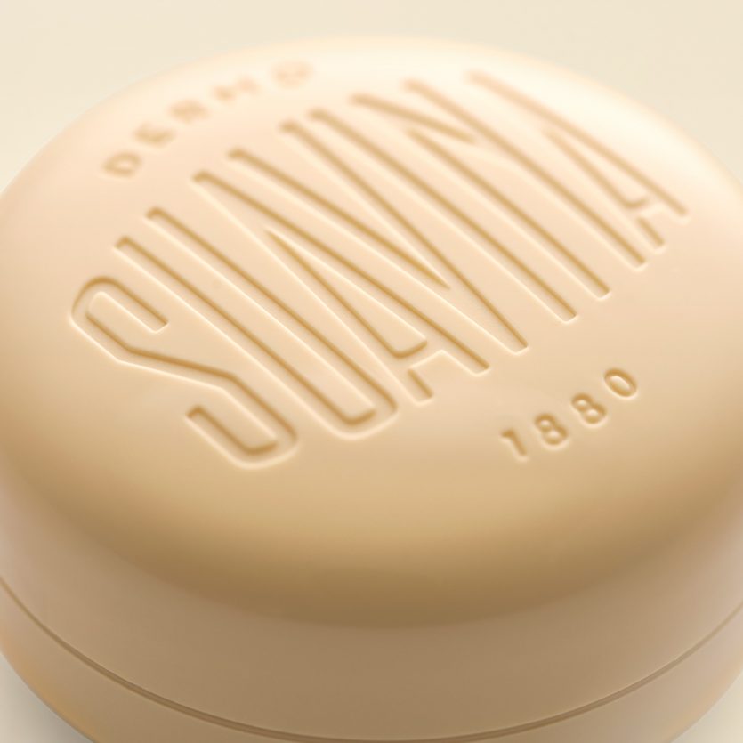
Suavina is a lip protector with a lot of history behind, “135 years taking care of your lips”, as their baseline put it. The design reflects a classic product imagery, following the main brief requirement. The packaging design of the lip cream container is a redesign, a updated version of the container they have been using for many years. The surface has been curved and the edges has been rounded to bring the smoothness effect that this type of product requires. The lid shows the brand, which was redesigned from the original brand. It also includes the word “demo”, and the date of foundation of the brand: 1880. The design solution itself seeks to convey both tradition and modernity through elements such a classic typographic composition, Sans Serif fonts, and debossed letters.
Utopick Chocolates
Paco Llopis is a Master Chocolatier. An ingenious Craftsman constantly searching for new discoveries in flavors, textures and filling techniques in the world of “bean-to-bar”- an artisanal craft produced entirely under the makers control, in this case, using selected cocoa pods bought directly from local producers in Colombia and other Latin American countries.
He came to us with the challenge of creating a new design and unique packaging that effectively communicates who he is and what he does, in other words, a design that represents invention and creativity.
He already had a name for his product, Utopick: (a reference perhaps to the creators desire for unattainable perfection and, at the same time, a play on words “you to pick”).
He also had a symbol, a ship embodying the spirit of adventure and representing the long voyage the cocoa pods make to reach the Chocolatier - this being the same route taken by Spanish Explorers when they set sail and first brought them back in the Sixteenth Century.
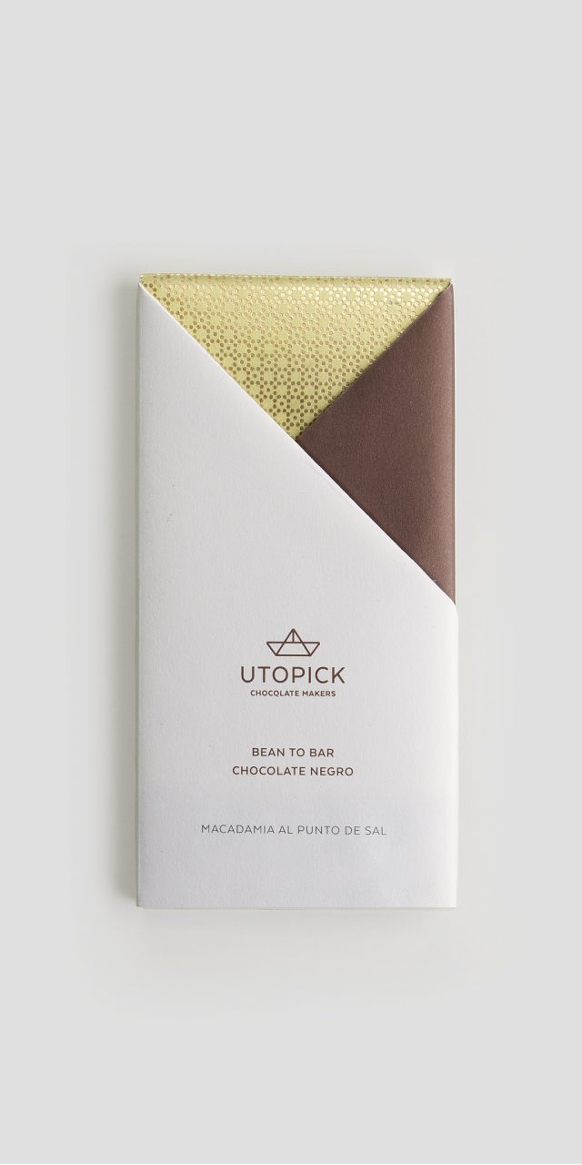
Engaged in the task of how to package the chocolate, we transformed the symbol into an origami boat, a moment that marked the birth of our solution.
Utopick package their batches by hand so we created a unique way of folding the paper to wrap the bars. This is a hands-on process which is pure and authentic, embracing the traditions of a skilled craft that is free from the restraints of automation.
The paper folds to create two triangles on the front of the design, each with their own colour and texture, personalizing every bar.
The packaging opens and closes in a way that makes it easy to rewrap the chocolate making it appear untouched (it’s well known that some people like to keep their chocolate addiction secret).
We reproduced the same shapes on the bar, which is pre-cut into big triangles, once again taking advantage of the ships own geometry - the symbol of Utopick.
A paper ship that’s travelled from afar.
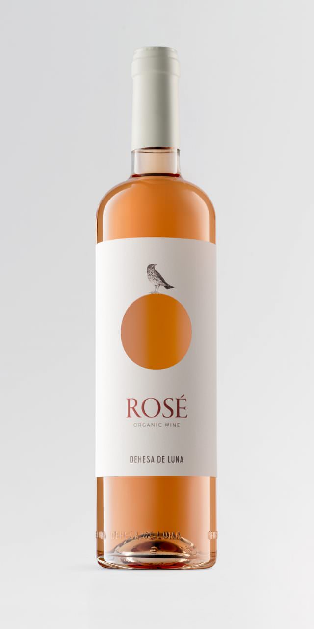
Dehesa de Luna
Dehesa de Luna Biodiversity Reserve Estate is located in Campo de Montiel and is a protected area of almost 3,000 hectares of tremendous ornithological interest. From its hills, it is possible to see countless birds, such as imperial and royal eagles, short-toed snake eagles, goshawks, kites, peregrine falcons, bustards, red-legged partridges, and many others. The image we designed combines the two key elements: the moon and the birds. The wine labels were initially formulated in pencil drawings in which different birds, one for each type of wine, superimposed over the moon. This resource can generate further design solutions for all the other products that are planned, such as cheese, olive oil, honey, etc.
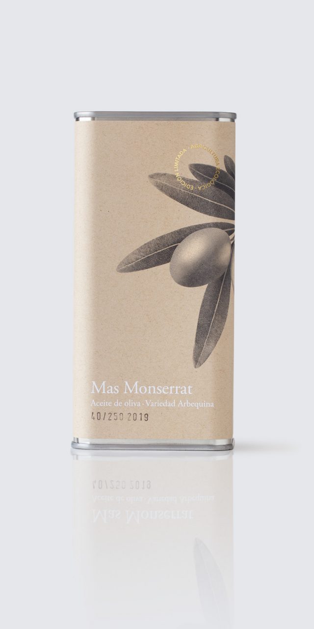
Mas Monserrat
Premium oil produced in a field of olive trees in Moixent (Spain) in an artisanal way. Just a few numbered bottles.
A very contained graphic, resolved in two colors, in which the important thing is the composition, the spatial, size and color relationship between the text and the image. A discreet and elegant graphic solved with a recycled paper label.