

Lola Cruz
Lola Cruz is the brand of shoes designed by María Jesús Gozalvo, who inherited her knowledge and passion for the world of footwear from her father. They are shoes with a lot of personality that are made for young, independent, cosmopolitan women. The logo seeks to reflect the spirit of the brand and transmit power and style. There are two principles in the world of designer fashion brands that we wanted to respect: first, to make the corporate colour black because, in the field of fashion, colour ranges are part of the collections and vary constantly — black guarantees neutrality and ensures that no problems of coexistence will arise; and secondly, to look for an abbreviated form of the name that can be used on shoes, buckles, belts, bags, as a fastener or as an ornament. For this purpose, we chose the letters L and Z, the first and last letters, the beginning and the end, the two most distinguishing letters in the logo.
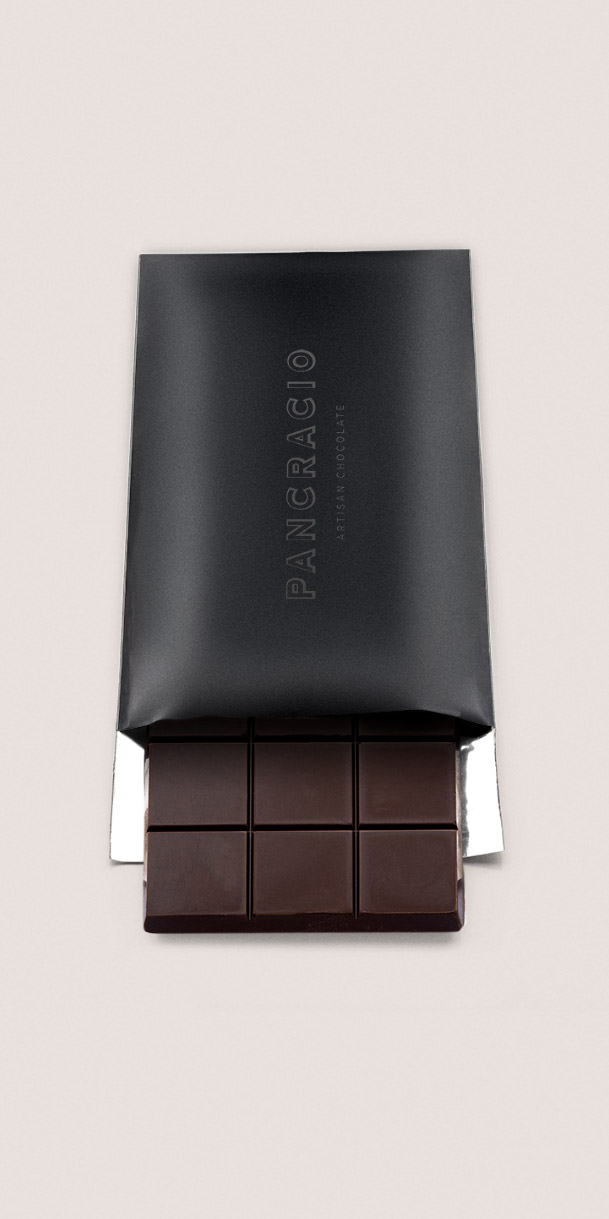
Pancracio
Pancracio was a small, local chocolate company with presence in very exclusive shops. In this new phase, the aim is to grow and access broader markets without renouncing its premium positioning and quality. All the elements of the packaging and graphics had to be analysed in depth and a decision had to be made as to which ones to keep and which ones to change. It was decided to keep the logo, which has strength and personality; to use white backgrounds where images and texts breathe; a centred composition, in which the hierarchy of information and balance has been highly valued so that it generates confidence, and an attractive photograph of the product. The result is an elegant and approachable packaging at the same time, in which special attention has been paid to the "unboxing" experience that makes it work perfectly as a gift.
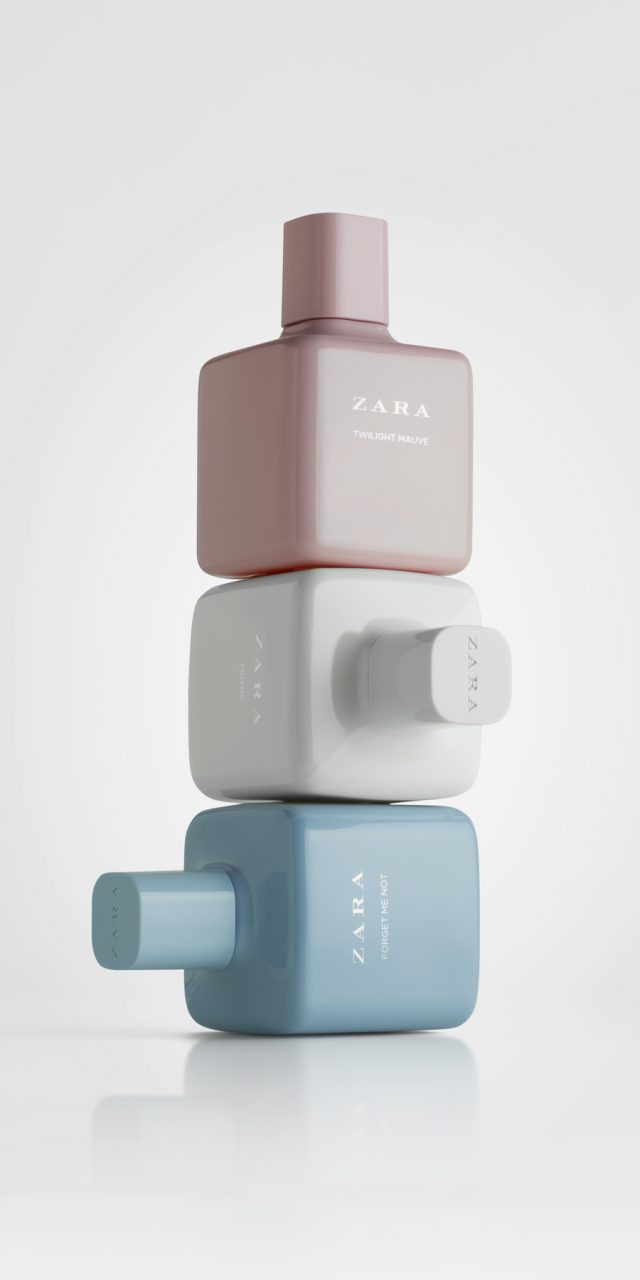
Zara Woman
Zara approached us to redesign their "best seller" women's fragrance range. The brief asked that the new design be an evolution of the previous one, with the intention that customers continue to recognize the collection. They asked us to focus on the bottle and cap and to make very little changes to the box. Previously the bottle had a cube design with very pronounced edges, similar to other designs, which have become commonplace in the fragrance market. The cap was cylindrical. We started to work on square forms, but also looking for that ‘something’ to give it character. We rounded the edges, subtly curved the faces and we created a transitional join between the bottle shoulders and the cap to make it seem as a seamless continuation of the glass. We also gave the cap a square rounded shape. The result is a more feminine and smoother appearance than the previous design, which also transmits more quality because of its extra weight. There are seven fragrances in total that are divided into two groups . One group with clear glass and black caps. The other group containing the more sophisticated variants, with tinted glass in black, red or white.
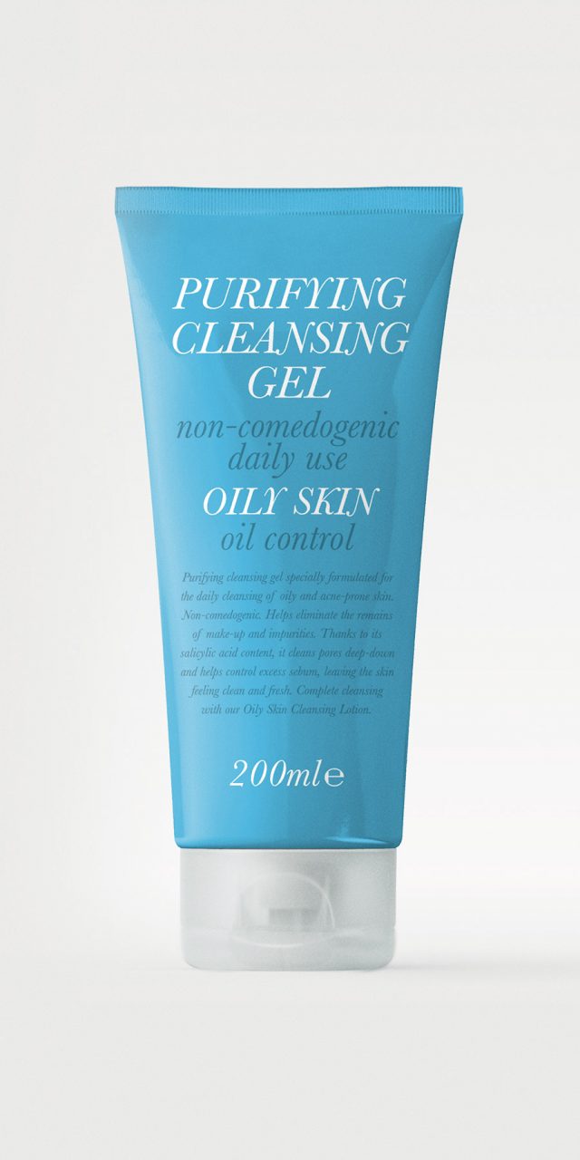
Oily Skin
A line of skincare products for young people, for which we developed a typographic solution. The brief gave us a lot of freedom and we chose to transmit a restrained, functional look, where the information is given priority in the graphic design. Young people with skin problems look for efficiency and clarity. We took our inspiration from the aesthetics of old medicinal compounds found in pharmacies at the end of the 19th century, designed with a typographical composition which mixes fonts of different sizes and weights. We opted for a transitional Roman typeface, Baskerville Italic, for the text composition. The varying sizes and weights serve to create a clear hierarchy of information. The text is in black or white, on a blue background; the colour which identifies the line.
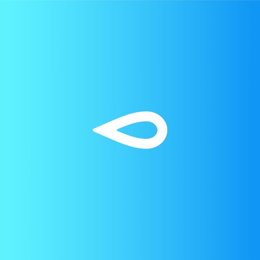
Global Omnium
Global Omnium has been dedicated, among other activities, to managing the entire water cycle – from catchment and purification to distribution – for more than 125 years.
We were commissioned by them to design a new visual identity in line with the company’s current positioning: a dynamic, modern group of companies with a high level of R&D, employing state-of-the-art technology, with a clear standpoint of social responsibility and respect for the environment, and the ambition to outsource its activity and compete in a globalised market.
The “drop” is the most universal and recognisable icon to represent the concept of “water”, and it acts as the “leitmotif” for the activity of the companies within the group. By placing it horizontally, it acquires a dynamic character, which is intensified by the colour gradient. This placement also gives it a distinctive feature: it is a drop that is “advancing”, which clearly highlights the main activity of the company – bringing water to wherever it is required.
The simple, striking shape of the icon makes it more powerful, and its geometric outline denotes the element of technology and conveys the idea of a modern and dynamic company. The typeface has been specifically designed from Myriad, but simplifying some characters to make it more streamlined and modern and we have decided to use lowercase letters, which gives the logo a more personal, friendlier character.
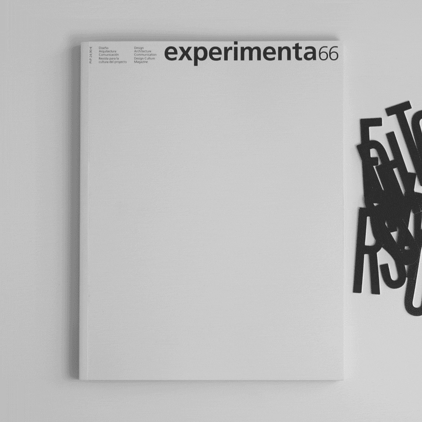
Experimenta 66
EXPERIMENTA’s editor and publisher, Pier Luigi Cattermole, asked us to design the first issue for the new stage of the magazine – a challenge we just had to accept. After three years online, EXPERIMENTA returns to print. It was paused at number 65, and now each issue will be dedicated to a specific theme and the design will be assigned to a different studio or designer. But the great thing about the rebirth is that EXPERIMENTA continues to be EXPERIMENTA, picking up where it left off at number 66. For this reason we were respectful to the magazines past culture and maintained two of its most identifying features: the format and the masthead. For the inside spreads we collaborated very closely with EXPERIMENTA’s long-standing designer, Antonio Rodriguez. L&C focussed its attention on the cover and article openers. Since this issue has a do it yourself theme, we proposed that the reader make their own covers: a blank canvass in which to compose the title “DO IT YOURSELF” using the die-cut letters provided, white on the one side and black on the reverse. We chose Steelfish as the typeface for its strong and bold features. The typeface is also used on the article openers, where the key title word is highlighted and from there the rest of the page elements are composed.
We are proud to have assisted from the front line in the rebirth of an editorial project that talks, reflects and breathes design, which was never meant to disappear. EXPERIMENTA is dead! Long live EXPERIMENTA!