

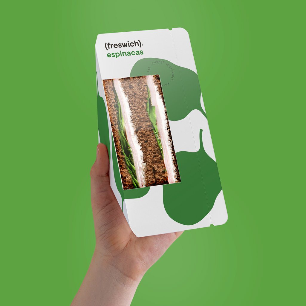
Freswich
What to name a brand of sandwiches that stand out for the freshness of their ingredients? “FRESWICH”. It’s fairly obvious, but we mustn’t forget that it’s often the most obvious things that work best, and when it comes to the difficult art of naming products, this is a golden rule. This very desire to be straightforward and simple led us to create a logo in which the word “freswich” (written in lower case, true to the humble simplicity of a mere sandwich) appears in parenthesis as an obvious representation of the parenthesis formed by the slices of bread that make a sandwich, and also the parenthesis in time involved in stopping what you’re doing to enjoy a bite. The symbolic image of the main ingredient is realised in a single colour on the background (white for the basic range, beige for the vegan, and black for the “chef” range) in a way that helps identify each variety and, additionally, leaves the front of the pack uncluttered, emphasising the clear window through which the sandwich reveals its contents.
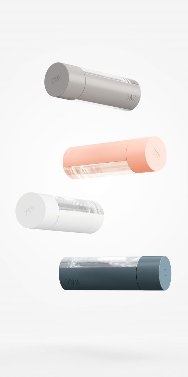
Zara Fragrances
They requested a unisex container, with a touch of colour in the glass, which could be customised to make special editions. It is a fragrance for a young target, and the brief insisted on it being ‘minimal’. We designed this cylindrical bottle, an elementary form, with two indented areas into which two opaque pieces fit, dividing the bottle into four parts: two transparent, and two coloured sections that can be swapped for different versions. The lid, also cylindrical, is an extension of the body and is in the same colour.
Random
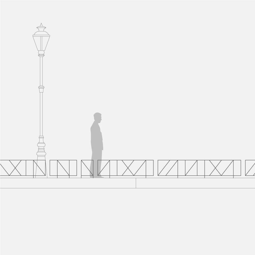
There are two key characteristics for street furniture components: utility and integration. The utility of this fence is to protect specific landscaped areas from being walked on or occupied by dogs; thus, it has to meet some basic requirements in terms of its height and the size of the openings. However, there is another functional aspect that interested us, one affecting the manufacturing and installation processes. To simplify them, we designed the fence as a series of modules that are installed with gaps between them, so it can be adapted perfectly to the measurements of the area to be fenced without the need for onsite welding or creating custom pieces, offering, in addition, the variety provided by a multitude of possible combinations.
The integration of the fence into the city environment was something that concerned us a greatly because we understand that these elements have to be designed to fit into any urban setting without dominating, but instead harmonising with the surrounding architecture, taking into account the plethora of metal handrails, guardrails or balustrades in many different styles that are found in any street. We decided on a simple design, discreet, with straight lines, in order to achieve this integration, but having more appeal than the classic, boring, barred railings repeated ad infinitum. As the modules have slight differences between them, they allow fences to be created without repetition, but with a certain rhythm and flow of their own.
The play of vertical and oblique lines of this fence produces a sensation of movement as the observer moves forwards, while the narrow profile of the bars renders it almost invisible when viewed from a distance, where its presence as a barrier is unnecessary.
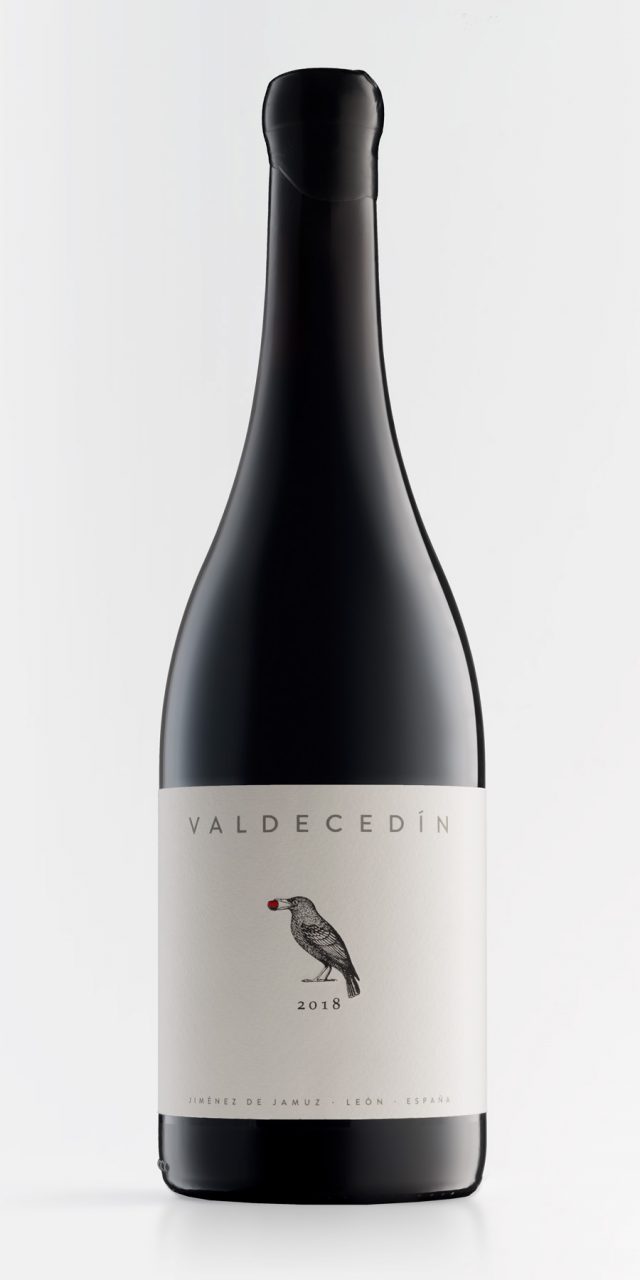
Valdecedín
The rise of storytelling is a difficult challenge for thousands or even millions of companies that, in all honesty, do not have a great deal to narrate. A delicate situation, and quite the opposite of the one we met with when we became acquainted with El Capricho. It is not that they have a story, rather that they are the epitome of storytelling. Every gram of their products, every square metre of their facilities, every detail of their business has a story behind it: a story linked to the family, to individual efforts, to the dreams and crazy ideas of an ancestor, to the deep knowledge of traditions, to respect for the land, for animals, for nature — the best raw material for the best storytelling. For this reason, when we made the label for this wine, we only needed to listen to what they had to tell us. And we drew a starling with a cherry in its beak. As always, there is a family story behind it, memories that go back three generations and that, in this case, are recounted on the back of the label.
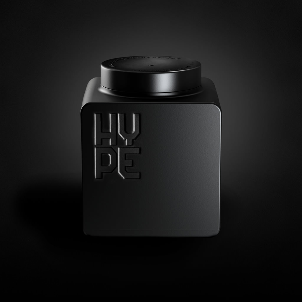
Hype
The Hype Company is a fertiliser manufacturer and expert in biotech treatments using natural sources. As an addition to its catalogue, its R&D team developed an innovative line of products focused on flower cultivation. They wanted a liquid fertiliser container that could be reused as a receptacle once empty. It is aimed at a young, modern target who care for their own urban garden and are just starting out in agriculture. The brief specified that the container should be stackable, and also established certain conditions regarding the diameter of the mouth and the closing cap. The result is this cube that brings to mind classic construction set blocks and optimises logistics for both the manufacturer and the users.
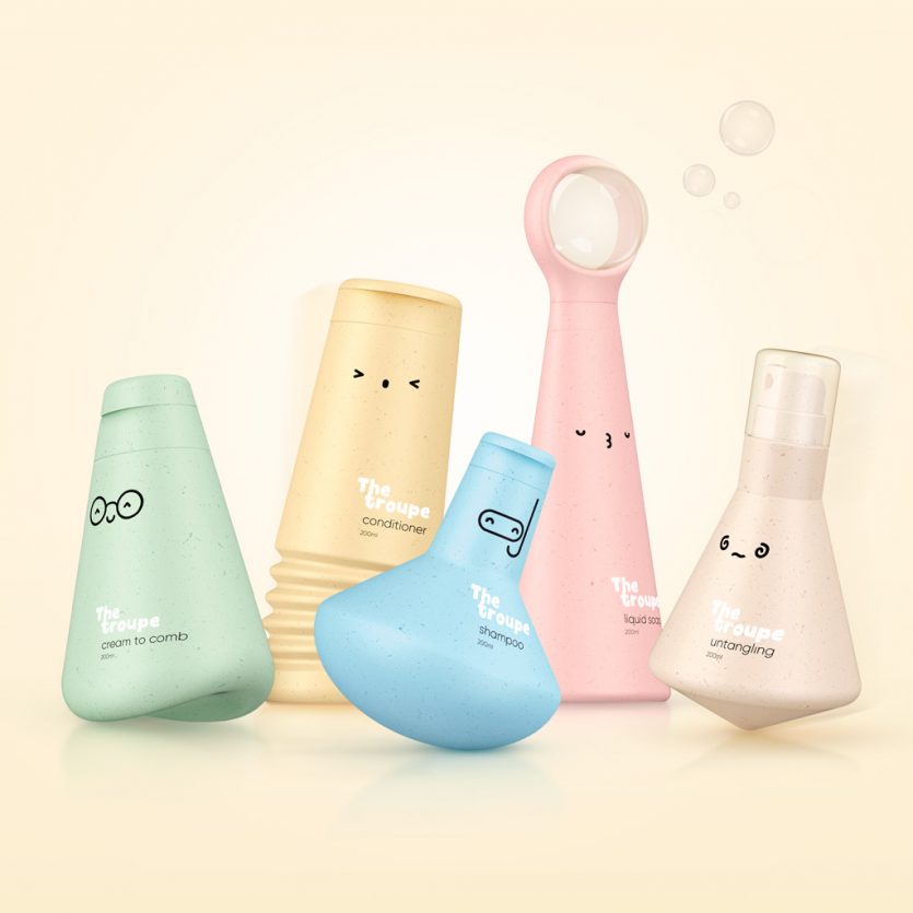
The Troupe
It is a line of bath products for children that aims to provide a sustainable solution by both the recycled PE packaging material and its permanence beyond the time of use of the product. The focus is on the game. The game at bath time and also after, once the products have been used, to extend its life. The idea was to create a bunch of characters, as a "troupe" of circus performers, each with their own skills: the untangling spinning top, shampoo-submariner, liquid-soap-bubble builder, the
conditioner-jumper and the cream-roly poly toy. Five characters designed to turn the bathtub into an aquatic circus ring, transforming it into a beloved and fun troupe to play with for a long, long time.