

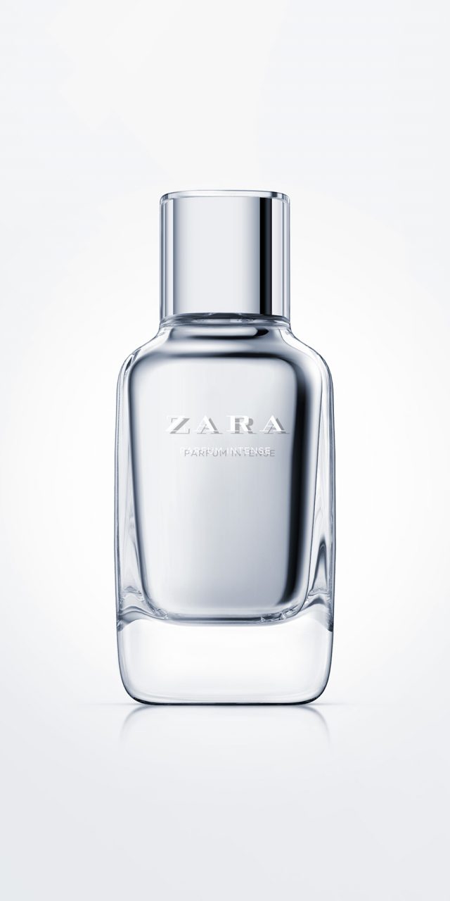
Zara Parfum Intense
This is Zara’s top range of fragrances. We designed a bottle with a rounded-off square cross-section, like the basic range, with a smooth and seamless transition in the meeting of the shoulders with the neck. It has heavy glass characteristic of premium fragrances and painted inner walls, so the bottle appears to have two skins: the exterior one transparent, and the interior one in silver (later versions have been made in other colours such as red, pink, etc.). The lid was designed to form a continuation of the neck, adding a transparent outer cover so it would have the same set of double skins as the body.
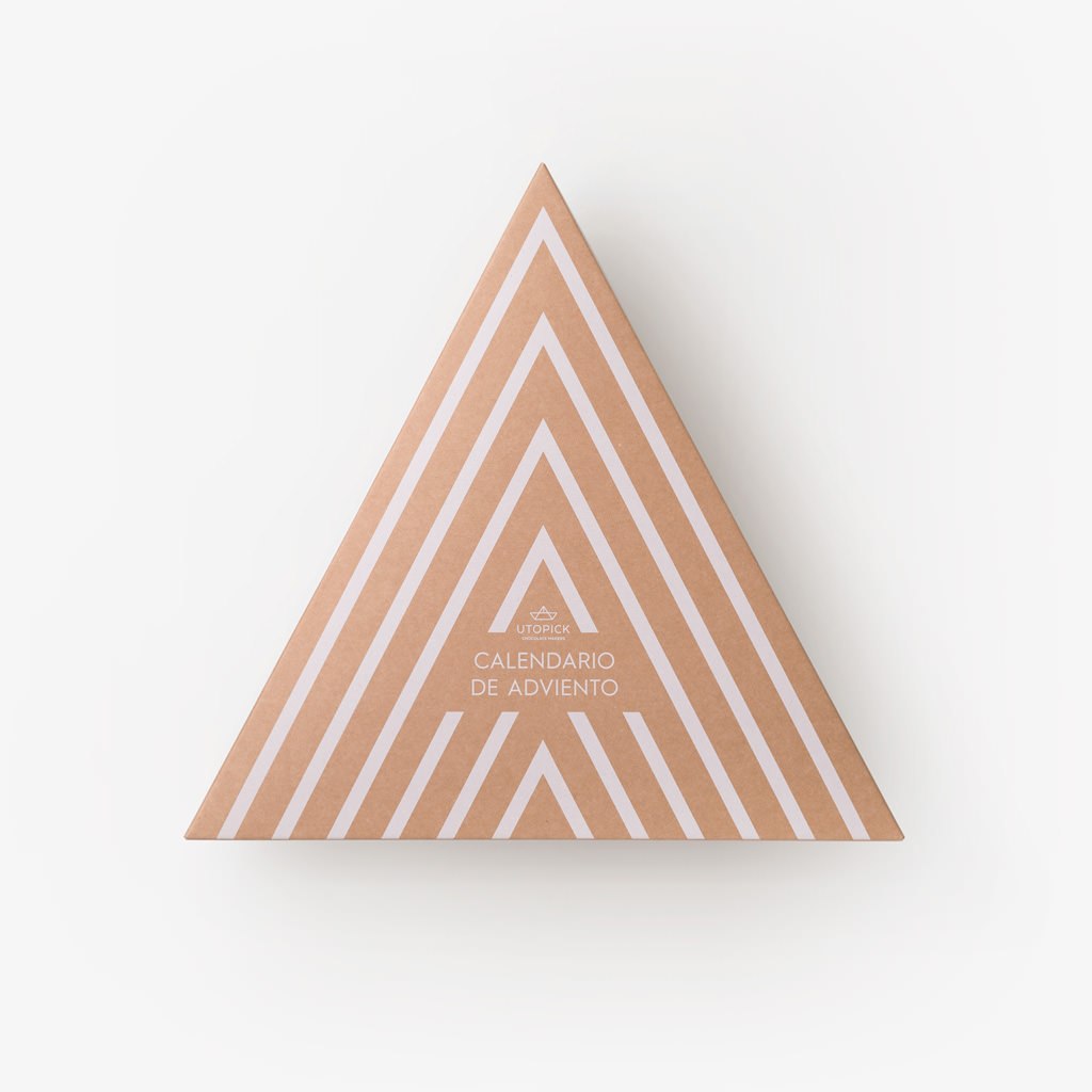
Utopick Adviento
Advent calendars have recently arrived to Spain, but they have done so with strength. Companies see in them another possibility to reach their end customers by touching the emotional fibre and offering a pleasant experience. The triangle dominates the entire design of the Utopick calendar, firstly because it is linked to the brand (a little paper boat made of triangles) and secondly because it replicates the shape of a Christmas tree. It comes in a triangular box in which the 24 little boxes are arranged, also triangular, with golden geometric patterns that turn them into Christmas decorations. That's what they really are, because they are designed to hang on the tree, so that they have more life than usual and a starring presence during the festive season. Inside, delicious pieces of chocolate, designed for the calendar with ad-hoc motifs, await the day marked in their little box.
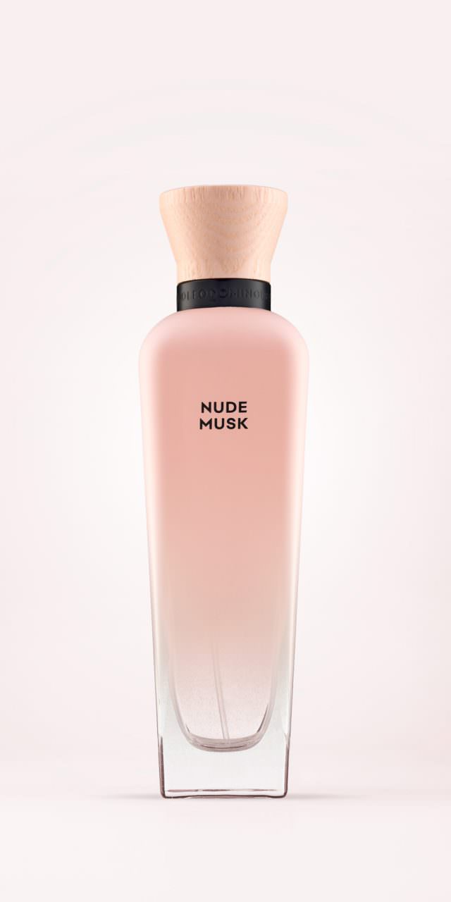
AD Musk
The task was to design a new line of women’s fragrances for Adolfo Domínguez which had a twofold objective: to convey the spirit of the new fragrances based on musk as the main ingredient, with sensuality and naturalness given prominence; and also to provide sustainable packaging.
Based on the iconic “Agua Fresca” bottle, in a refillable version (regular and refill), a wooden stopper was specially designed with a natural finish to add warmth. In terms of finishes, a thin layer of matt paint was chosen on the bottle, which gradually fades from the shoulders until it disappears in the lower area to reveal the transparency of the glass. The collar, in which the stopper sits, was designed with the brand’s logo engraved in matt black bas-relief.
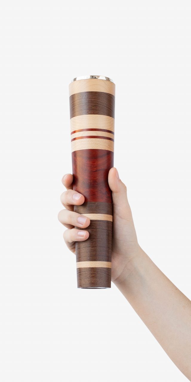
Award for Cultural Merit City of Valencia
When we thought about what the shape of a trophy should be, we realized that a trophy should be thought so that it can be held in the hands and raised to claim victory. That's why the big cup have handles. And thinking of someone with their arms raised, we clearly saw the torch and we liked it. Because it has the right shape and, moreover, it symbolizes light, the search for truth, knowledge, culture. And we decided to make it in wood because wood is a living and noble material, like culture.
On the other hand, wood is closely linked to Valencia where furniture craftsmen, cabinetmakers, turners, even the trade and distribution of wood from all over the world, have had a lot of roots, as well as the manufacture of musical instruments such as the dolçaina, typical of Valencian music. And why not turn different woods on the same torch? It is a way of alluding to the culture that is formed by adding layers, year after year, generation after generation. And, for that matter, why not make them somewhat different from each other, so that, always being the same trophy, the same prize, each one is different as each of the winners are different?
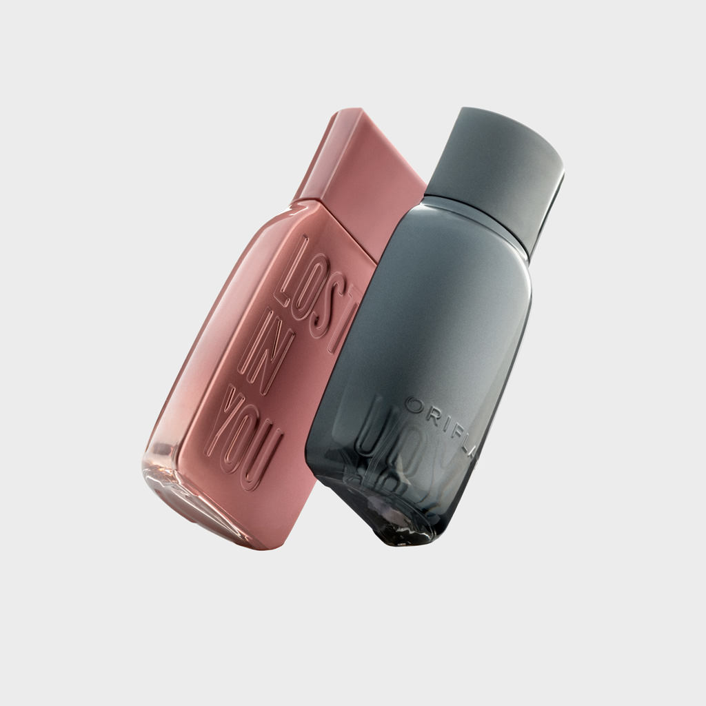
Lost in You
The client asked us to design a bottle for a masculine and a feminine fragrance that communicated the idea of a couple, of love, of seduction... and that was aimed at a young audience (millennials).
In fact, the name of the perfume "Lost in you" is taken from the lyrics of a well-known song "I'm addicted to you" by the famous DJ Avicii.
The solution was a design that is the two halves of a single bottle, an idea that emphasizes the concept of couple and attraction. “Lost in you” is embossed on the glass itself and each bottle is finished with a metallic color that fades from opaque to transparent.
Project in collaboration with Glow Brand design.
Generalitat Valenciana
In 1985, the Generalitat asked La Nave studio to design the symbol for the institution, based on Peter IV of Aragon’s helmet. Over 30 years later, they decided to revamp the symbol and recommissioned the same authors. The typography has been replaced with a much more legible font, not associated with any trend, and the design of the symbol has been harmonised throughout by equalising the thicknesses of the lines, giving more weight and more solidity to the tilted shield, and omitting features that, due to their small size, caused problems when reproducing the image.