

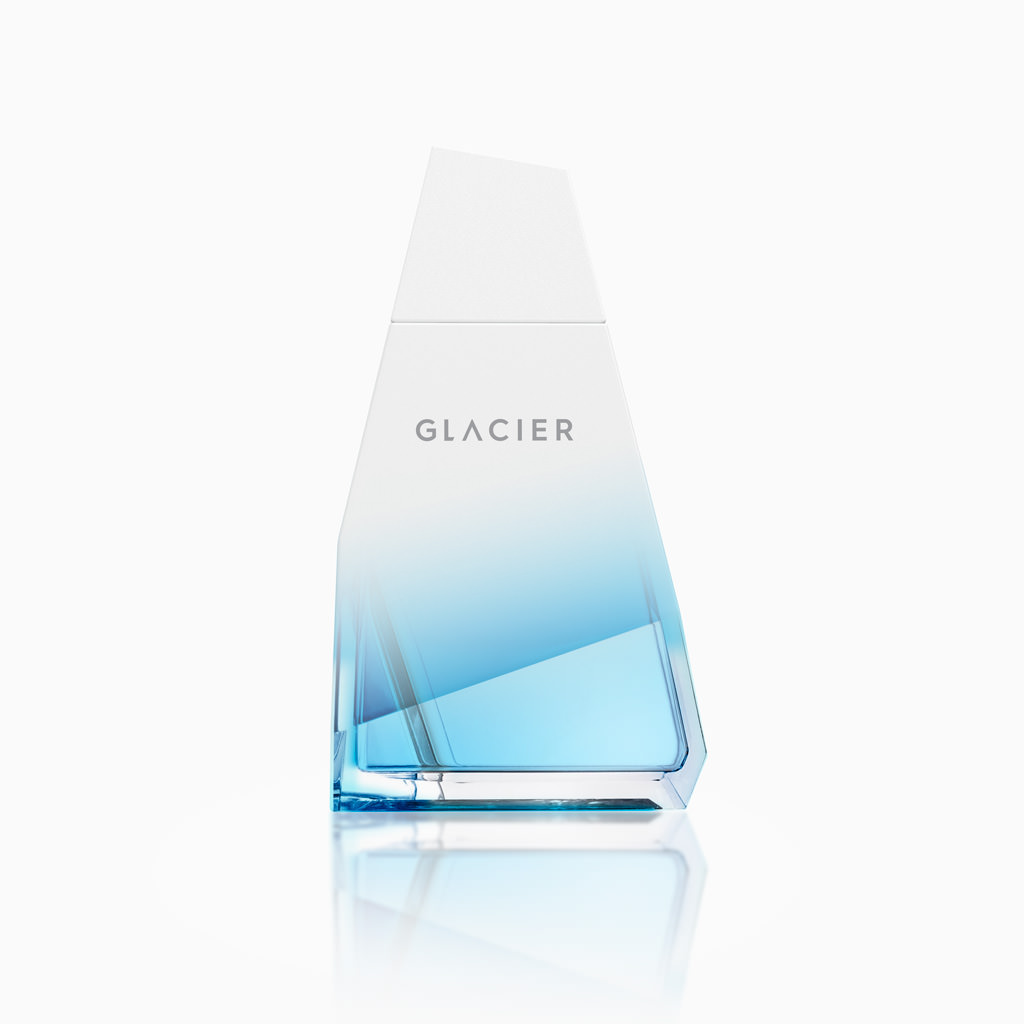
Glacier
Glacier is a line of fragrances for a type of men who loves risk and adventure. The name (Glacier) clearly refers to wild nature. The shape of the bottle, which is faceted and with very marked edges, is reminiscent of an iceberg or a rock and the finishes suggest each of the three perfumes. An organic, masculine form, with bold colours for each of nature’s challenges — as requested by the brief. Project in collaboration with Glow Brand design.
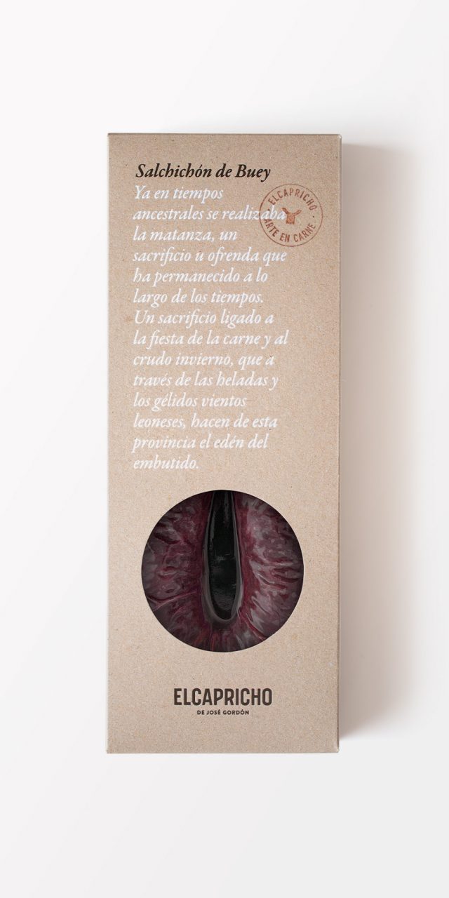
El Capricho
El Capricho is a famous restaurant specialising in beef. Gourmets from all over Europe, Japan and America make the pilgrimage to Jiménez de Jamuz, a small village in Leon, to savour the incredible experience of having lunch or dinner in this temple to the best meat in the world, carved into the mountains.
The packaging design seeks to combine tradition and innovation, fusing the austerity of traditional materials with a bold graphic design that reflects the unique, powerful and honest image that El Capricho conveys. The use of materials such as handmade cardboard, wood, string and cloth for a gourmet product intends not only to transmit these values of authenticity, terroir and tradition, but also to produce a surprising and unusual consumer experience. The idea of a signature product is expressed through quotes from José Gordón himself, the soul of El Capricho, which speak of a history of generations.
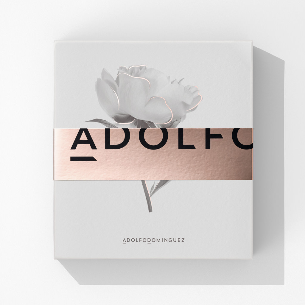
Adolfo Domínguez
Perfume gift boxes are a frequently used sales instrument. Together with the perfume, they include supplementary items such as aftershave, body lotion or deodorant with the same scent. It is a means of motivating purchases by employing a dual incentive: the price (which is always better than buying the two products separately) and that of the gift itself. This gift status takes precedence in the design, imposing a set of qualities on the product’s appearance and how it should be perceived. It needs to be suggestive, attractive… as it is envisaged as a gift; it is also intended, moreover, that the box can be kept and reused. The presence of the image of flower conveys delicacy and alludes to the perfume within. The golden strokes accompanying the black and white images and the austerity of the composition provide a touch of distinction, added to by the discreet presence of the brand, distancing it from any promotional intention (the design was made in close cooperation with the client’s marketing team); and the allusion to humility implied by its small size is a sign of confidence in its prestige. This facet is repeated, in another way on the sealing strip, which will supposedly be thrown away once opened, on which the brand name appears in large but incomplete type, subordinated to the discreet elegance required of all good gifts.
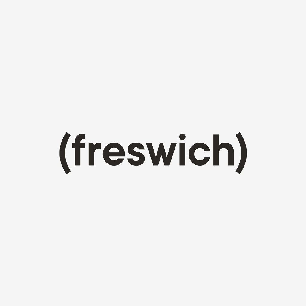
Freswich
What to name a brand of sandwiches that stand out for the freshness of their ingredients? “FRESWICH”. It’s fairly obvious, but we mustn’t forget that it’s often the most obvious things that work best, and when it comes to the difficult art of naming products, this is a golden rule. This very desire to be straightforward and simple led us to create a logo in which the word “freswich” (written in lower case, true to the humble simplicity of a mere sandwich) appears in parenthesis as an obvious representation of the parenthesis formed by the slices of bread that make a sandwich, and also the parenthesis in time involved in stopping what you’re doing to enjoy a bite. The symbolic image of the main ingredient is realised in a single colour on the background (white for the basic range, beige for the vegan, and black for the “chef” range) in a way that helps identify each variety and, additionally, leaves the front of the pack uncluttered, emphasising the clear window through which the sandwich reveals its contents.
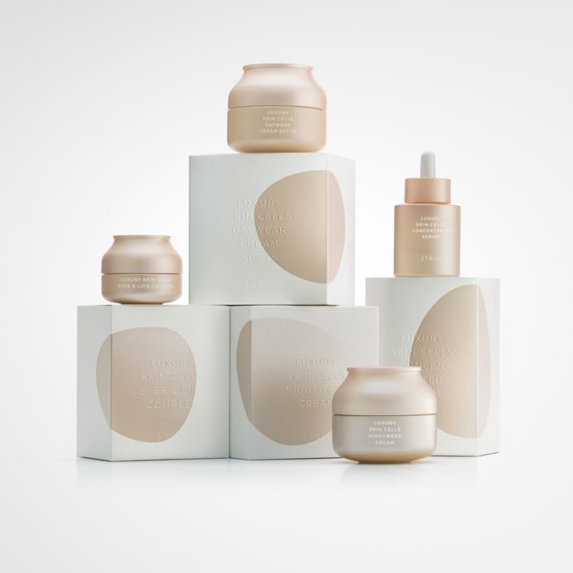
Luxury Skin Cells
The main goals were:
-Creating an image with its own personality, consistent with the product quality standards and the “Luxury Skin Cells” range concept.
-Conveying these attributes: elegance, sophistication, gentleness, exclusivity.
Usually finishes like stamping, embossing, shine and metallic finishes, and so on, are different resources added to the design in order to add premiumness to the product look. Here the idea was to use all those finishing resources as the design and layout key elements . On the one hand, an organic metallic shape which evokes the idea of cells and that transforms on each box to personalise each of the products. On the other hand, the text is blind embossed without ink, giving the “cells” the maximum focal point of the design. The jar has been designed with colours and forms in harmony with the range.
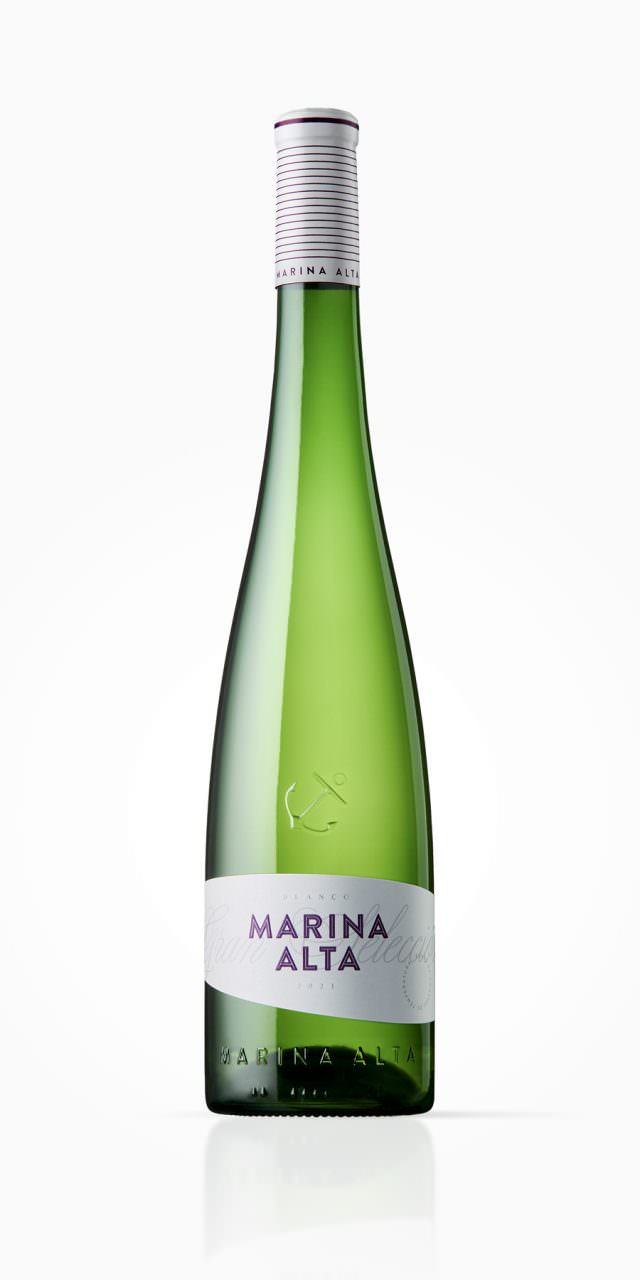
Marina Alta
The brief was comprehensive: to design a new bottle and new graphics for Bodegas Bocopa’s best-known and best-selling wine. Accordingly, it had to maintain a certain connection with the previous design. With regard to the bottle, one fundamental requirement was to reduce the weight of the glass to under 600 g (in some countries the wine is exported to, bottles heavier than this are not allowed or are taxed for environmental reasons), and the other was to maintain the height and style of the previous bottle: Rhine-like, narrow (unlike those for Burgundy) and without shoulders (as opposed to those for Bordeaux).
To achieve a lightweight bottle, highly original or disruptive forms must be avoided, since these types of shapes, generally asymmetrical or with irregular surfaces, featuring drawings or engravings on the bottle itself, require a greater amount of glass and make it impossible to reduce the weight (the proposed design weighs less than 540 g). It is in the proportions and the harmonious outlines of the curve and counter-curve forming the transition from the trunk to the neck where the elegance of the bottle’s shape is found, differentiating it from other Rhine-style bottles.
The graphics begin on the capsule with a striped pattern that gives it a nautical feel, then continue with a bas-relief anchor on the glass of the bottle and conclude with a narrow label with curved upper and lower edges, suggesting the sails of a ship or the waves of the sea. A bold and powerful sans-serif typeface counterbalances the soft lines of the bottle and label and makes the brand, which is already very successful in the market, the focus of attention.