

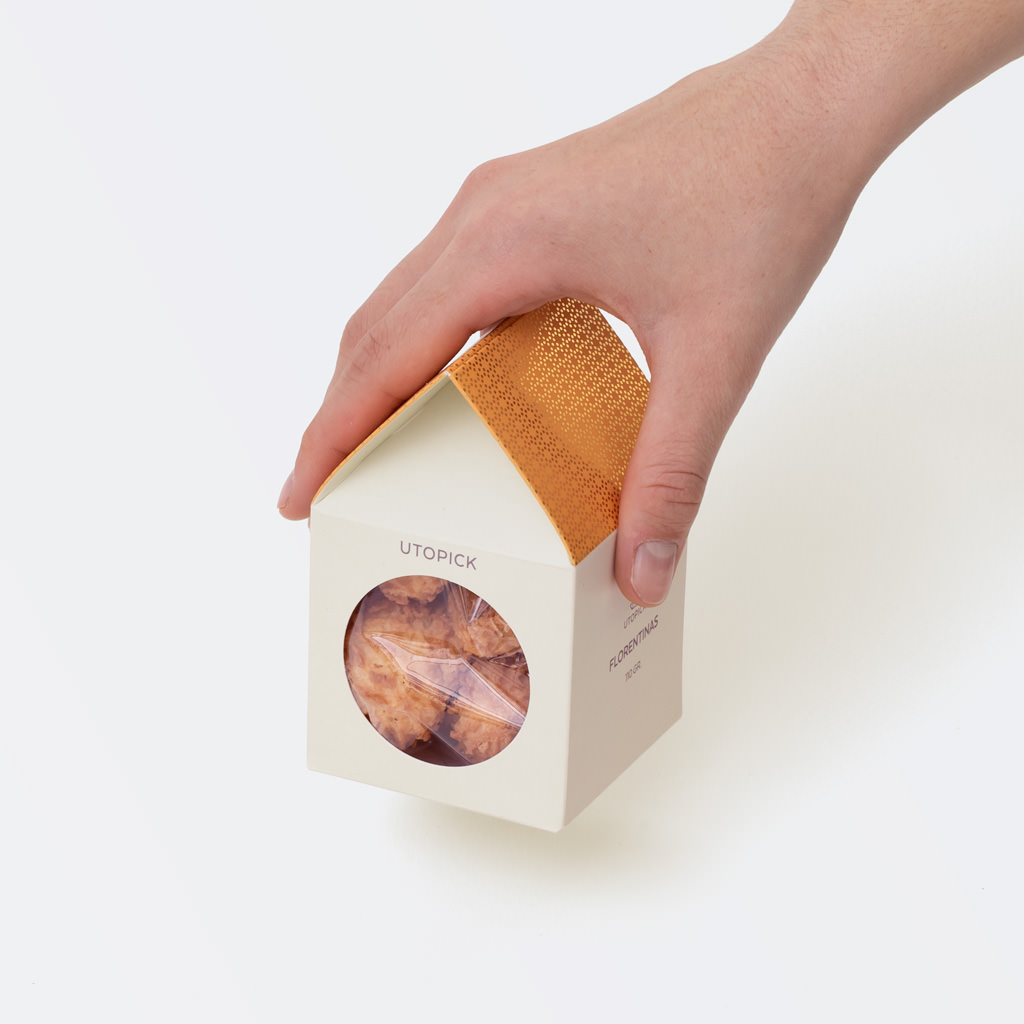
The Little Houses of Utopick
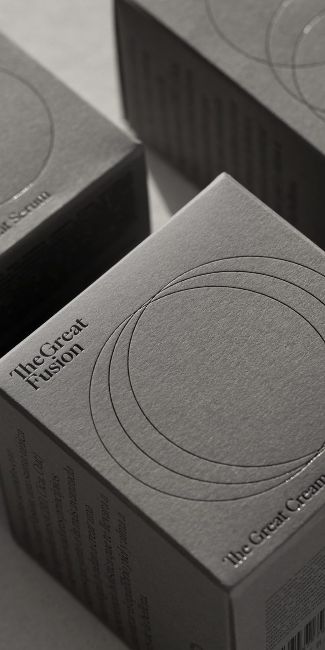
The Great Fusion
Global project where all the communication elements of the brand have been designed: naming, logo, visual identity, packaging, photography art direction and website (web development: Nectar Studio).
The Great Fusion is an indie beauty brand that considers the individual as a whole and offers products that promote calm and inner peace by acting on the skin, so that external care also becomes a moment to seek personal balance. and inner care.
It is the result of combining traditional botanical knowledge with the most advanced technology, through which they have merged the three key ingredients: Hemp, Cica and Oats.
The main graphic element of the Packaging design is three circles that merge to emphasize the union of these ingredients. In addition, these circles also serve as a graphic resource that frequently accompanies the brand in print communications, web, RRSS, etc. The circle represents perfection, it stands out and isolates at the same time, and many times it will be used as a counterpart to the way we talk about the brand, as a way of emphasizing what we are saying, of focusing on something important.
The logo is structured in two lines that separate the two essential concepts: Great and Fusion, using the PP Eiko font, which is also used for communication.
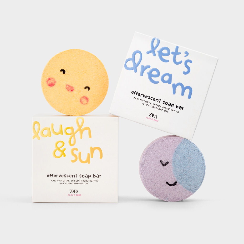
Zara Play & Care
The client asked us to design a line of hygiene products (soaps and effervescent bombs) aimed at children. It was not only about designing the graphics for the boxes, but also about designing the products themselves.
Each piece would have a phrase of two or three words that would refer to the playful and imaginative part of the product, their role would be to create an emotional bond, so we decided to give them a lot of prominence.
The chosen font (calligraphic) is clearly childish and bright colors on white backgrounds. To make it stand out even more, they are embossed with glossy varnish.
In contrast, the rest of the information (product name and characteristics) are in black, thus avoiding an excessively naive design. These are not toys, but hygiene products that try to make the bathroom more attractive to children.
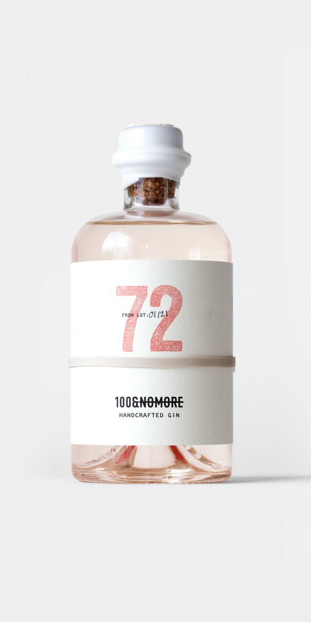
100&NOMORE
A new brand producing gins with special flavours, which requires a name, position and image. The crux of the project is its exclusivity, with batches of 100 numbered bottles of each flavour. The first thing is to find a name that refers to this quality and which gives rise to a story: A Dutch sailor, Andreas Van Loy, is sent by the Dutch East India Company in search of a berry with which to make a curative gin, capable of alleviating the pandemic that is ravaging the Netherlands. After two years in the Java Sea, just as he is about to end his voyage without having achieved his goal, he finds the sought-after fruit, fills the holds and begins his return. However, encounters with storms, pirates and the harsh conditions of the return voyage decimate the ship’s cargo. Upon arrival at the port, the berries are unloaded, and it is discovered that very few of them are still in good condition. The Prince of Orange, dismayed, tells him just how few bottles of gin they will be able to fill: 100&nomore!
On the label, without adhesive, held in place by a rubber band, the central feature is the lot number, and on the reverse there is a text relating to the corresponding flavour of the gin, which can be read through the glass on the back. The bottle is sealed with sealing wax and is presented in kraft cardboard boxes of one or three units that serve as a shipping box, since sales are made on the internet and we wanted to avoid having one box inside another.
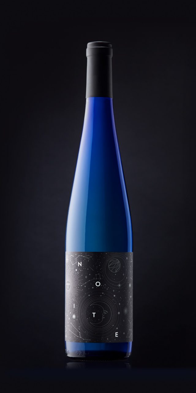
Noite
When we design a label, the first thing we do is look for an idea that suggests an image or a focus to start working with. Sometimes this idea is found in the brief, sometimes in the origin or the characteristics of the wine itself, and occasionally it is found in something external, such as the moment in which it is enjoyed: a summer night, a hammock on the terrace, a glass of Albariño and a dark sky filled with stars. All is calm, and there, floating in space, are five letters that say it all: NOITE.
Wines of the World
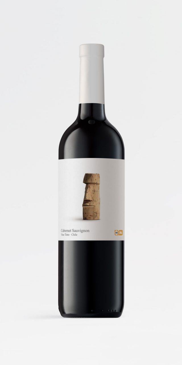
This is a range of wines that Belgian supermarket chain Delhaize offers within its own brand “365”, which includes simple, everyday products at affordable prices. The cork is a sign of humility, an object of little value, often used as craft material, as a simple and easily manipulated element with which to play and create. The use of cork gives it the air of something simple, typical of an everyday product. The cap is the element that unifies and personalizes the whole range. The motif designed for each label refers to the country of origin.