

U/1ST Massimo Dutti Blooming
U/1ST is a brand that was born with the purpose of creating a makeup line with properties and ingredients that care for the skin, not only focusing on beauty.
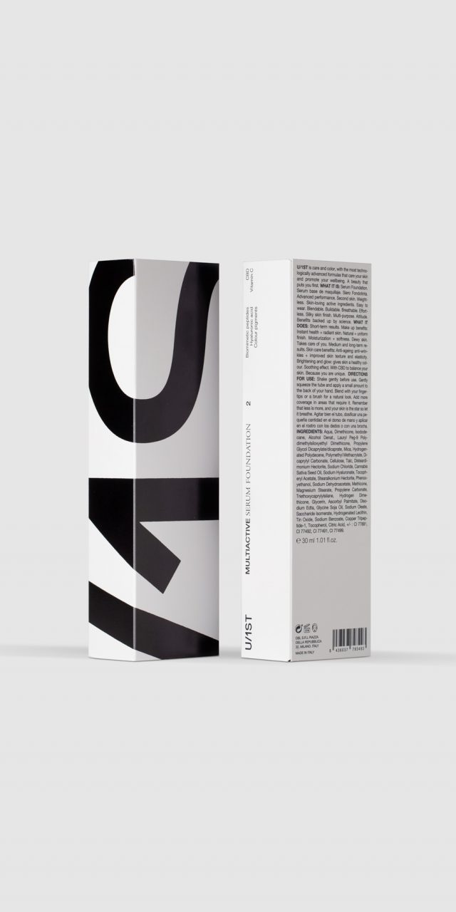
Products designed for active, confident, and straightforward individuals seeking practical, realistic solutions. The presence of the logo overflowing the limits of the boxes is a reflection of its personality: powerful, even challenging. This approach is evident in the design of the boxes as well as in the use of the brand on the web, social media, and all visual communication.
The logo is composed of a sans-serif typeface, which complements the high technology behind the products. It is presented in black on white because the strong contrast emphasizes visual power and sets the brand apart from conventional solutions, which often rely on color, as seen in the packaging of competitors.
A special text composition has also been considered, combining a sans-serif typeface (indicative of technology and modernity) with a serif typeface (closer to the beauty world). This combination allows for hierarchy and influences the reading of messages.
In the design of the boxes, there are two sides with a large logo, while the other two sides feature the descriptor and other information. This way, when displayed on the shelf, one can choose which side to use as the front – the most eye-catching and emotional, the informative, or perhaps a combination of both.
Photography: L&C, Ernesto Sampons, Daniel Molina, Estudio Catorze
Ecoalf Wellness
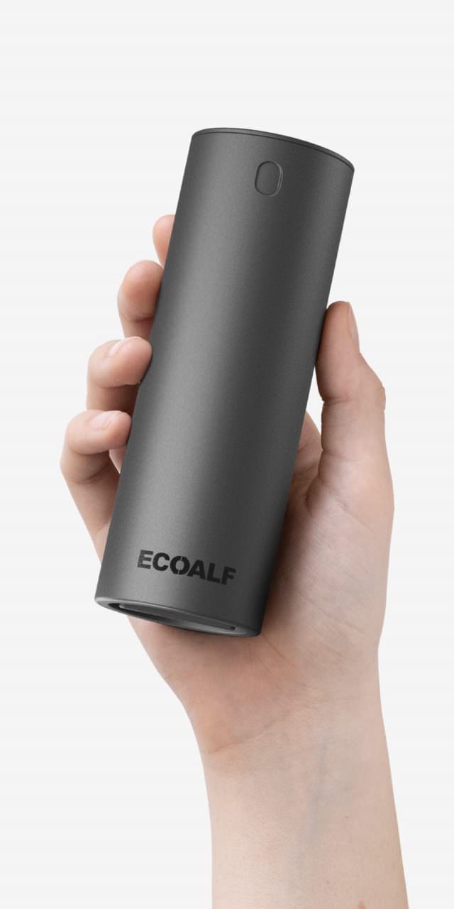
Ecoalf is a Spanish sustainable fashion brand that uses fabrics and materials made from plastic waste collected from the sea. In 2022, they decided to launch a personal care line. It was evident that this new line should align with the brand's environmental commitment and positioning. Our involvement went beyond packaging design, as we were engaged from the outset in product concept and development, working collaboratively with the marketing, production, and formulation teams to find the most eco-friendly solutions.
The solution resulted in a line of multifunctional products with environmentally friendly ingredients and processes, including solid and powder products that eliminate the need for water. By removing water, we reduced weight and CO2 emissions during transportation. This allowed us to eliminate plastic bottles and opt for lighter, more sustainable packaging. Additionally, all products are sold for use in specially designed reusable aluminum containers. The packaging, both for the aluminum containers and the products themselves, is made from eco-friendly materials, including recycled cardboard, compostable pouches, and cellulose paste. The graphics serve as a means of communication, explaining the purpose and functionality of each item and the overall line, making it easier for the end customer to make environmentally conscious choices.
For this launch, Ecoalf has opted for an alliance with RNB, a cosmetic group with a pharmaceutical background and over 30 years of business experience in the sector.
According to a study carried out by the technological institute (ITENE), a 74% reduction in CO2 emissions and a 70% reduction in water consumption is achieved compared to equivalent conventional products during one year of use.
Photography: L&C, Ernesto Sampons, Daniel Molina.
Valencia Tourist Brand
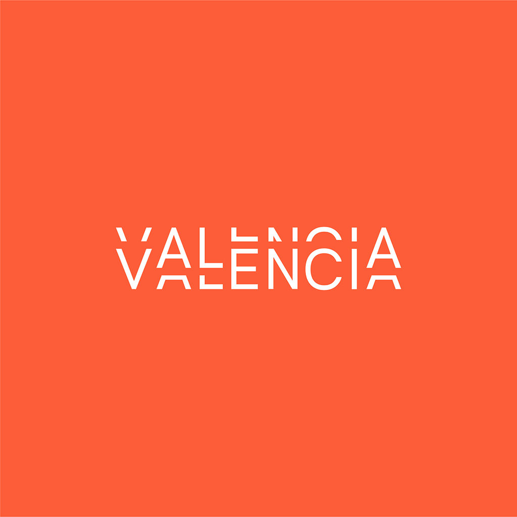
This logo communicates the idea of Valencia as a dynamic city open, modern city that is vibrant and alive with intensity (brand concept: weaddyou agency). It does so by using a graphic device that comes from the world of drawing, from comic strips, where lines parallel to the outline of a figure are used to create a sense of vibration, but in this case it is applied to typography.
Although it is a tourism brand, the conclusion from preliminary studies and surveys was that it should not be centred on the conventional tourism of sun, beach and fun. Valencia is also a major city with ideal economic, cultural and infrastructural conditions for organising conferences and cultural, professional or business events. This is why we have designed a logo in which, even though there is movement in the letters and a vibrating effect, everything is enclosed within a rectangle, which is a compact shape that transmits strength and solidity. At the same time, the result is sufficiently unique and distinctive, within the category of city branding, to be easily recognised and remembered.
You&You
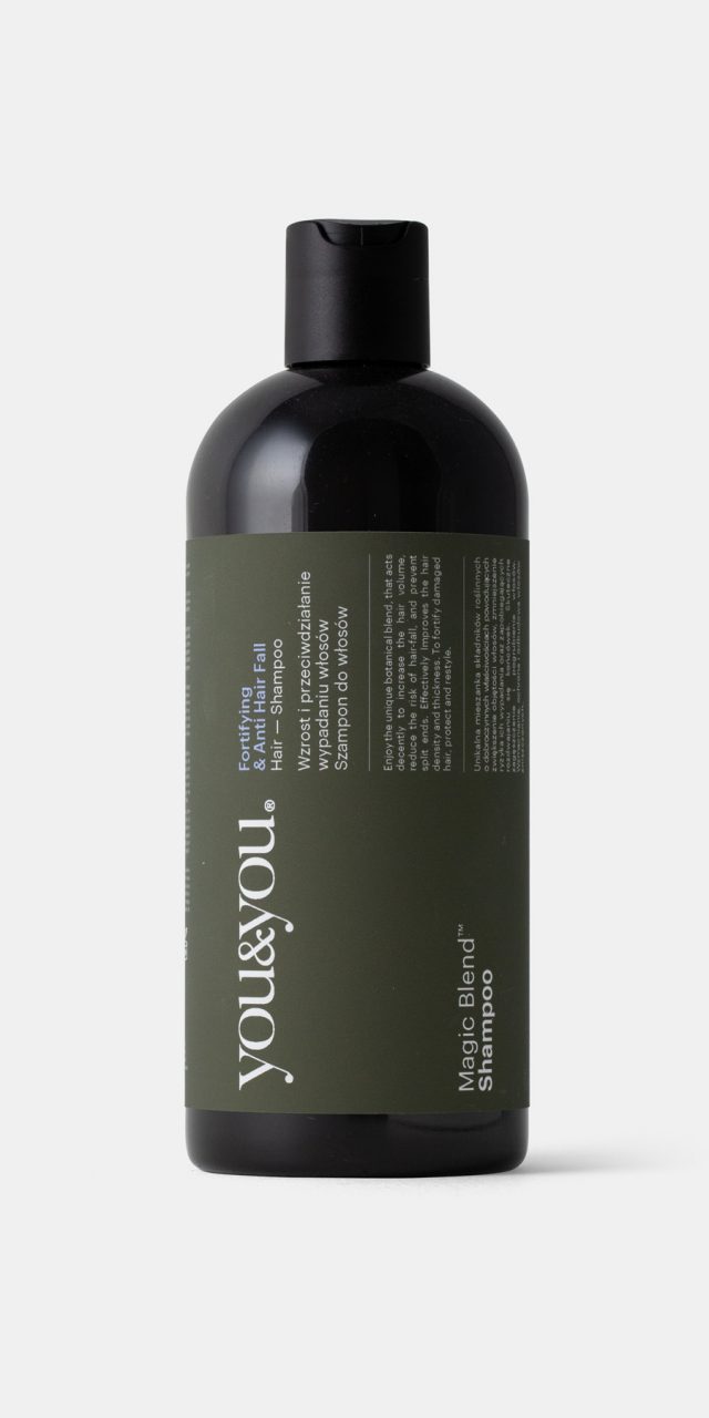
This is about a young Polish company, RJ1, headquartered in Warsaw, offering oral and body care products. In just a few years, they've expanded their presence across most European countries. You&You brand products result from a blend of science, passion, and emotions, crafted using natural ingredients with an eco-friendly perspective. The brand's positioning leans closer to the 'health' segment than 'beauty,' which is reflected in the design. Both the chosen standard bottle, following the traditional 'magistral formula' packaging style, and the graphic solution convey this. The primary ingredient reference is illustrated on the back of the boxes, while the front opts for a sober typographic approach, avoiding flashy colors or images, emphasizing credibility over the typical language of fashion or beauty products.
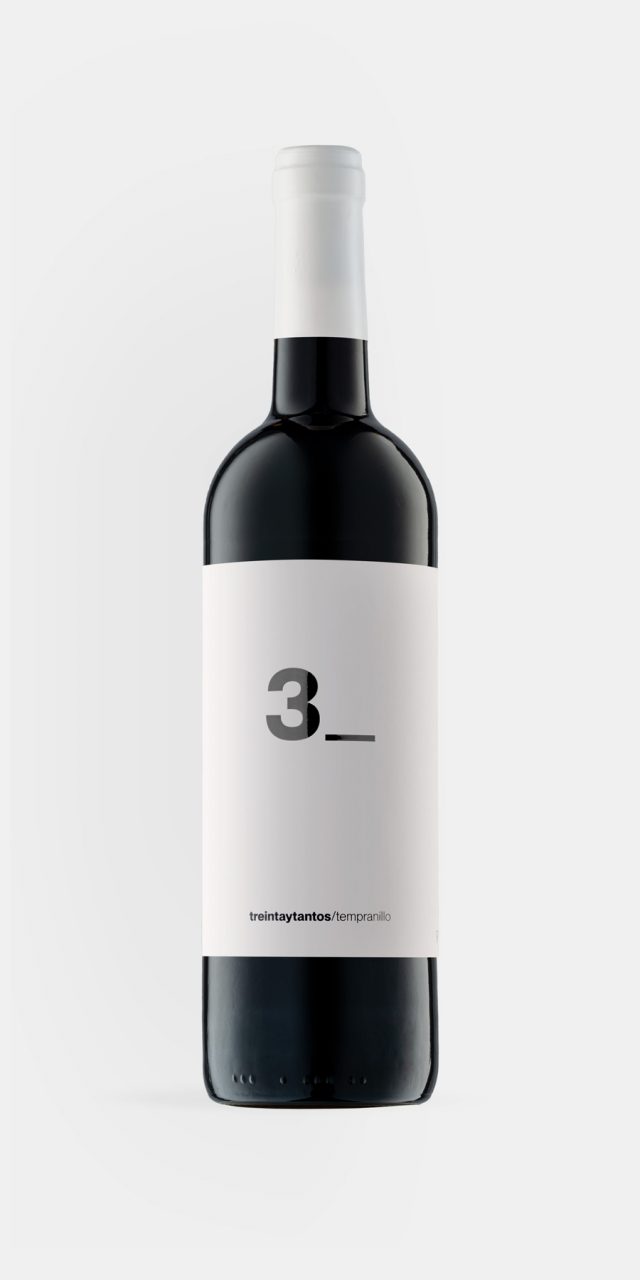
Treintaytantos
It seems that it is from the age of thirty onwards when people begin to drink and appreciate wine. It is as though a more mature stage of life has been reached, one which is better adapted to the calm and tranquillity required to enjoy it. This is the origin of the name of the wine. The origin of the design of the label is the way we found of representing this ambiguous number of thirty-something.
The underscore _ is an invitation to write what is missing. When a form asks someone to fill in information, an underscore is used. We decided to only put 3_ on the front of the label, in die-cut text on white paper, so the wine would provide the colour.
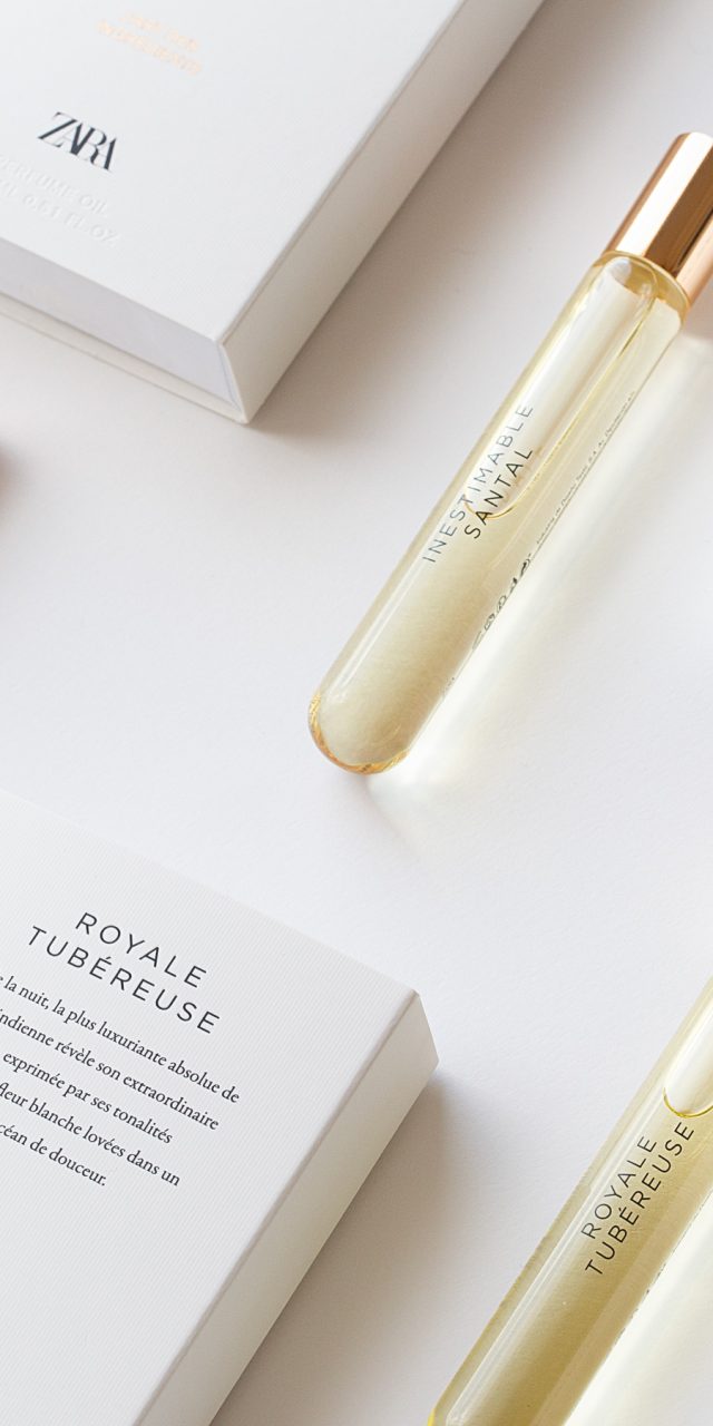
Zara L’art des Ingrédients
The Egyptians used oil with flower extracts as perfume. Many years later, the mastery of techniques such as distillation led to the production of perfumes with alcohol. But in a way the Egyptians had been right, since a perfume in oil has many other advantages. It moisturises, holds the scent better, is safe when exposed to the sun and seems to last longer on the skin. Additionally, the small size of the bottle makes it easy to carry with you wherever you go. The design is different from that of a normal fragrance, both in the glass bottle, shaped like a test tube, and the box, which features only text, with an elegant and restrained graphic layout. Everything is printed on textured card that gives it the product the premium look and feel that the client requested.