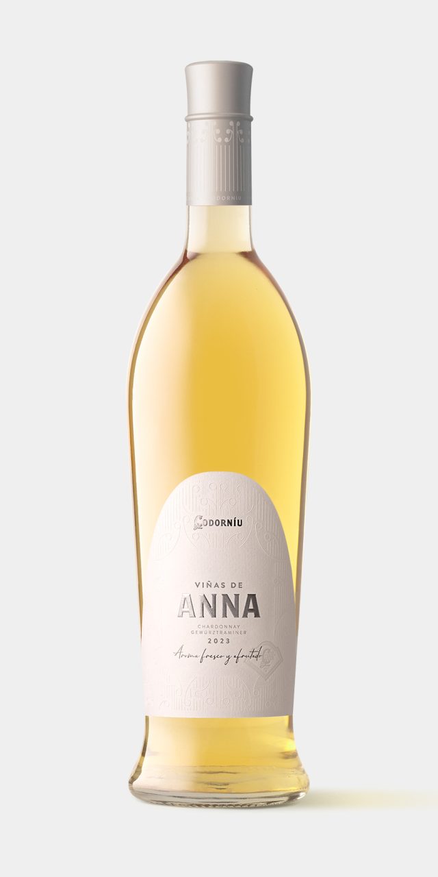
Viñas de Anna
The task was to redesign a wine, Viñas de Anna, originally launched in 2015 and which Codorníu had decided to update. We started with an iconic bottle design that aligns with the attributes the wine conveys: delicate, feminine, bright, luminous, fresh, and with personality. We were inspired by elements of the modernist architecture of the winery, designed by Puig i Cadafalch. The die-cut of the label takes the shape of the building’s characteristic parabolic arches, and the embossing reproduces fragments of the ornamentation. The composition, typographic work, chosen paper, and the use of stamping and embossing give it the delicacy and elegance that the brief demanded.
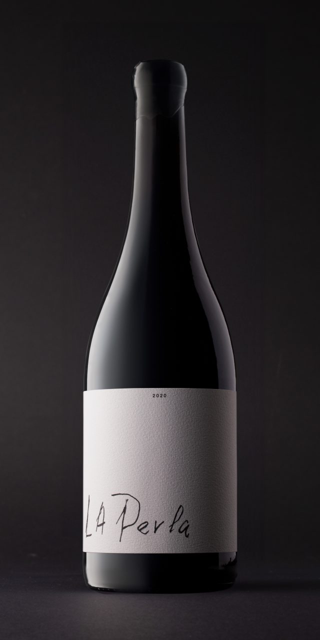
La Perla
One of the attractions of El Capricho, and undoubtedly the reason for its personality, is that it is an author's work. All its products, its activities, its day-to-day are permeated by the presence and intervention of its creators: today José Gordón, previously his father, and originally his grandfather, Segundo. They are the ones who excavated the cave that now houses the restaurant, who buy and care for the oxen, who planted the vines, who make the wine. Everything is intertwined with their experiences, their feelings, their passion for what the land gives, for the authentic. This wine is made from the grapes of the highest vineyard planted by the grandfather, and it was José's father who, enamored with this wine, christened it by writing on the barrel: "La Perla". The packaging of El Capricho can only be a showcase that displays that increasingly rare quality of authorship, personal effort, authenticity. Everything else is superfluous.
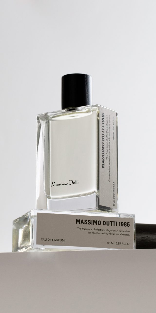
MASSIMO DUTTI 1985
Massimo Dutti has launched this new men's perfume, where the name “1985” refers to the year the company was founded. They wanted to give it a contemporary, youthful, and fresh vibe while maintaining the tone of elegance that characterizes the brand.. For the secondary packaging, we adopted the concept of a book so that its display in the store would resemble a library. This is why the information is provided on one of the sides, which functions as a spine. To elevate the perception of quality, it is covered in a textile-like paper and features black stamping for the brand name. Additionally, it has a fabric ribbon that makes it easy to extract the bottle, which also has a label on one side.
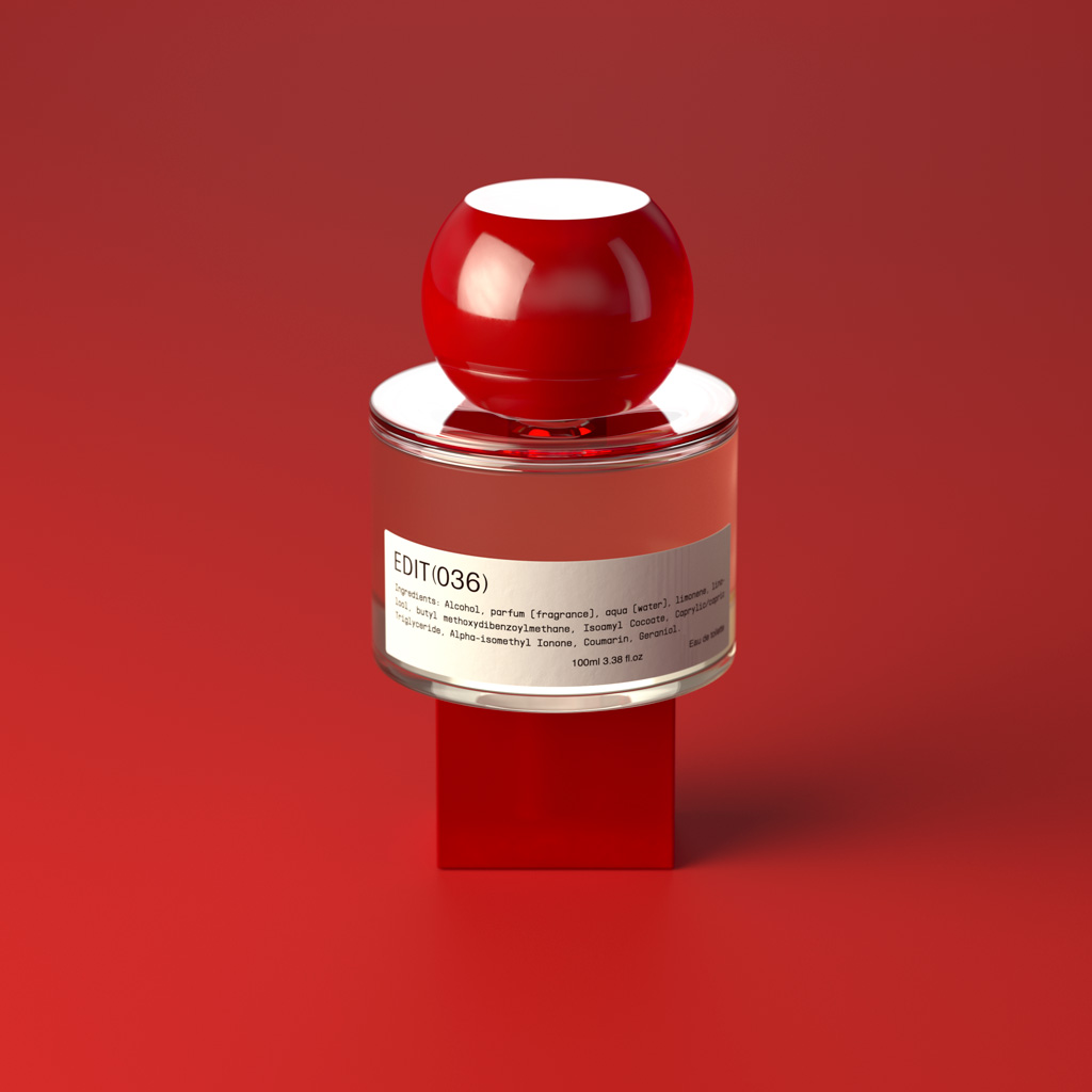
Edit (036)
CONCEPT
Two design aspects converge in “EDIT 036”: on the one hand, the concept of customisation, the possibility of the user participating directly in the final configuration of the object; and on the other, the incorporation of the emotional dimension as an important part of the relationship between object and user. Postmodern design reproached the International Style for its coldness, its intransigent determination to focus the project on functionality and production, on the strict values of exchange and use; and it brought to the table all the communicative values of the object — what Baudrillard called sign value — namely, the capacity of the object to represent us, to speak about us, to transmit our lifestyle, and to do so not only on the outside, but also on the inside, to ourselves, establishing an emotional link between the object (in this case the packaging) and ourselves that transcends functionality, that goes beyond.
“EDIT 036” combines industrial techniques with artisanal processes. This is currently a rising trend because it has a direct impact on a product’s sustainability and, moreover, this practice is becoming increasingly widespread in the world of luxury goods, where the excellence and exclusivity of artisanal production — which combines the tradition, uniqueness and warmth of handmade products — is especially valued.
APPROACH
“EDIT 036” plays with two elements, designed under rigorous sustainability parameters: a central glass piece, specially designed, which can be presented in 5 different finishes, and another piece that can be used as a cap and as the base of the bottle. This last piece is presented in 6 different forms, hence EDIT 036, since there are 36 possible combinations of 6 plug geometries with 6 bases. Each of them is offered in 5 materials that, in turn, are presented in 3 different finishes each, so that the user can create his own bottle, choosing the model he wants in glass, cap and base, among 40,500 possible combinations. .
The bottle bears a label with information about the perfume and the logo and is presented in a rigid lined box that closes with a label that is also customizable. The customization process is carried out through a website in which the user sees and decides the different characteristics of each of the components.
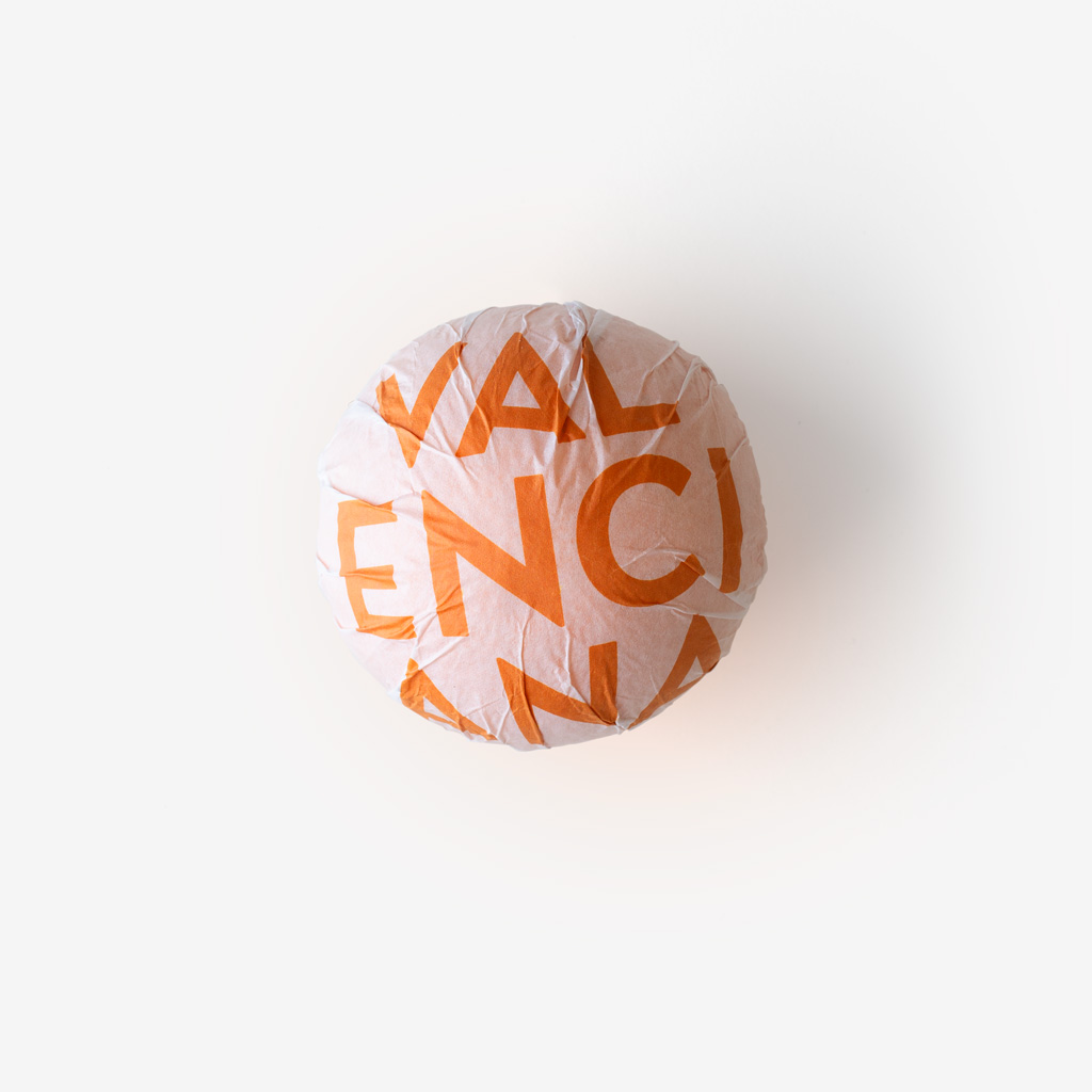
Naranja Valenciana
The task was to create a brand to promote, commercialize, and sell the best Valencian oranges and tangerines. It had to be a contemporary, young, fresh, and powerful brand.
There are three relevant applications due to their presence at the time of purchase: the sticker on the fruit itself, the mesh, and the boxes.
We needed the visual impact and immediacy of a logo that would be recognizable, versatile, and easy to apply. Capable of conveying, on its own, that these oranges or tangerines are from Valencia.
The solution has been to create a symbol: an orange circle (which is, in turn, the iconic representation of an orange) with the word 'VALENCIANA' inside, and that serves for both oranges and tangerines.
The symbol is accompanied by a logo, in highs and lows, and in a typography that does not compete with it, ensuring the complete understanding of the message on decontextualized supports where there is no presence of the fruit.
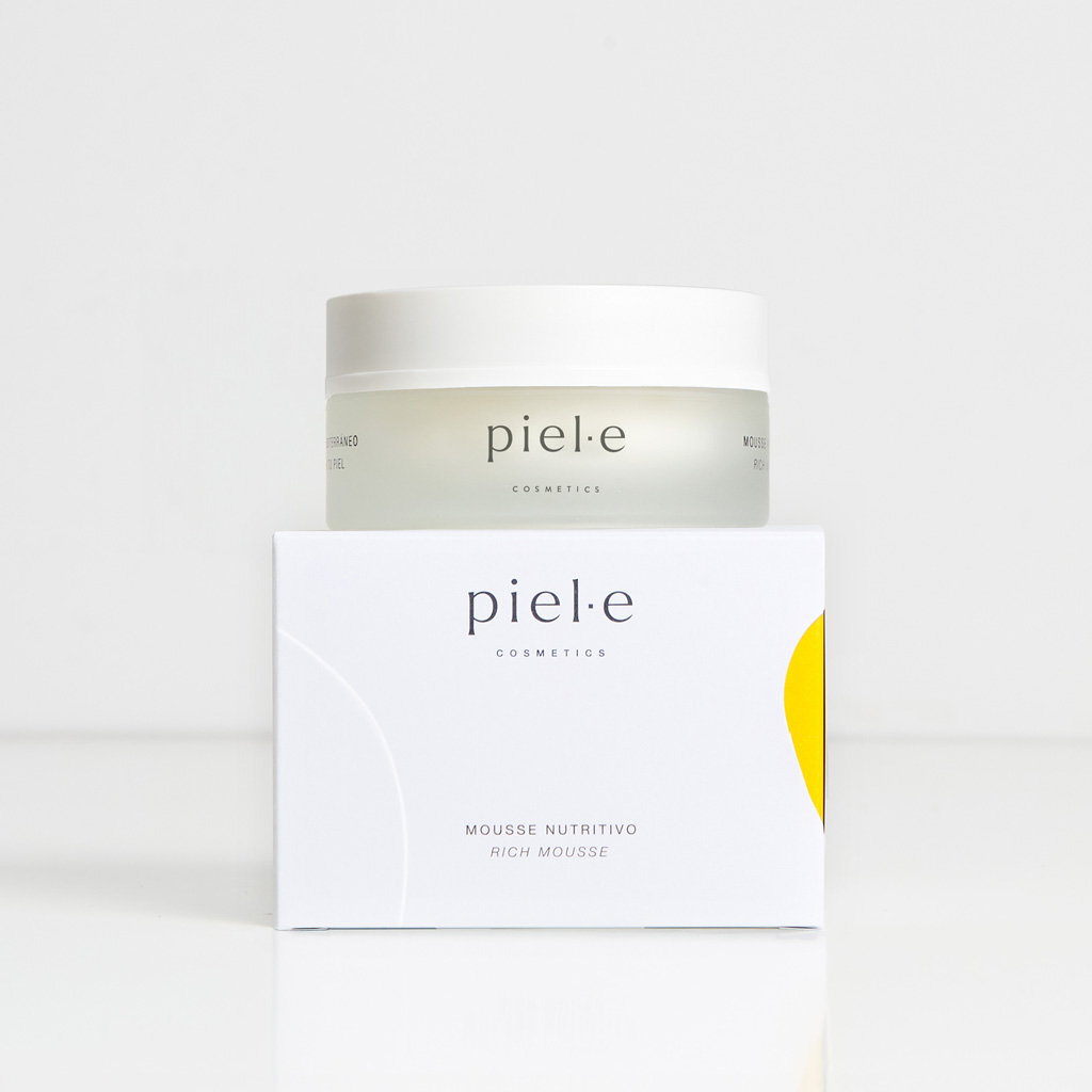
Piel·e Cosmetics
Piel·e is a brand of cosmetic products born with the intention of using ingredients from Spanish agriculture that represent Mediterranean culture. It is aimed at individuals who want to be part of the responsible and sustainable change in the cosmetics industry. We designed the logo with the Larken Thin typeface, which is stable, rich in nuances, expressive, and in lowercase (with appropriate kerning) conveys reliability and closeness. As for the packaging, we have tried to convey the main brand personality traits: elegance, with the predominance of the white background and text composition; sensoriality, through the presence of an die-cut organic shape that reveals the color inside the box, yellow for this first line, and a raised design that interacts with it. The primary translucent glass packaging also reinforces these sensations of softness and sensoriality, which are at the core of this premium brand.


