

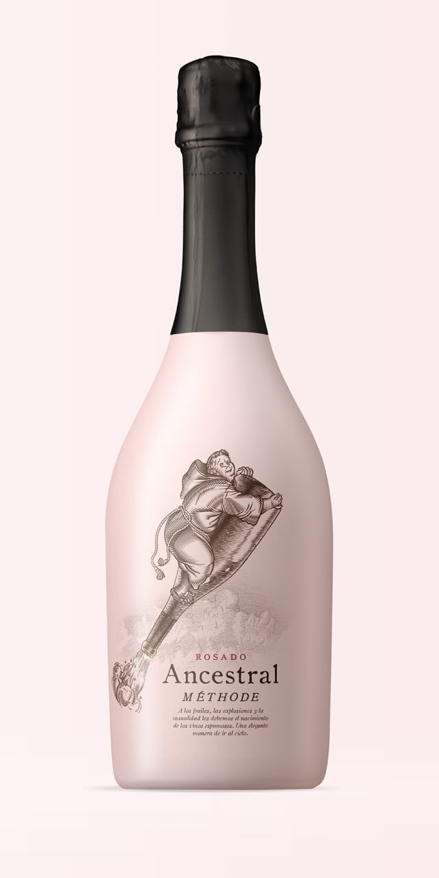
Ancestral
In very cold regions, the arrival of winter used to stop the fermentation of the grape must before it was bottled. When spring came, the wine began fermenting again in the bottle, producing gas, and the bottles (which were not yet made of glass with a cork like the kind we are familiar with today) exploded. Nevertheless, some remained intact, and thanks to this a new type of wine was discovered—sparkling, extraordinary—but by pure chance. The ancestral method was the first to be conceived and forms the basis of the traditional method used to made exceptional champagne and cava today. Unlike the latter, in the ancestral method the wine is bottled before the first fermentation is finished, so that a second fermentation subsequently takes place in the bottle, thereby achieving the natural carbonation. It is a fresh, fun, astounding, sparkling wine. Undoubtedly, it was the result of chance—like all great inventions—along with the ingenuity of shrewd monks, ever ready to ascend to heaven for a good cause.
Sunsilk
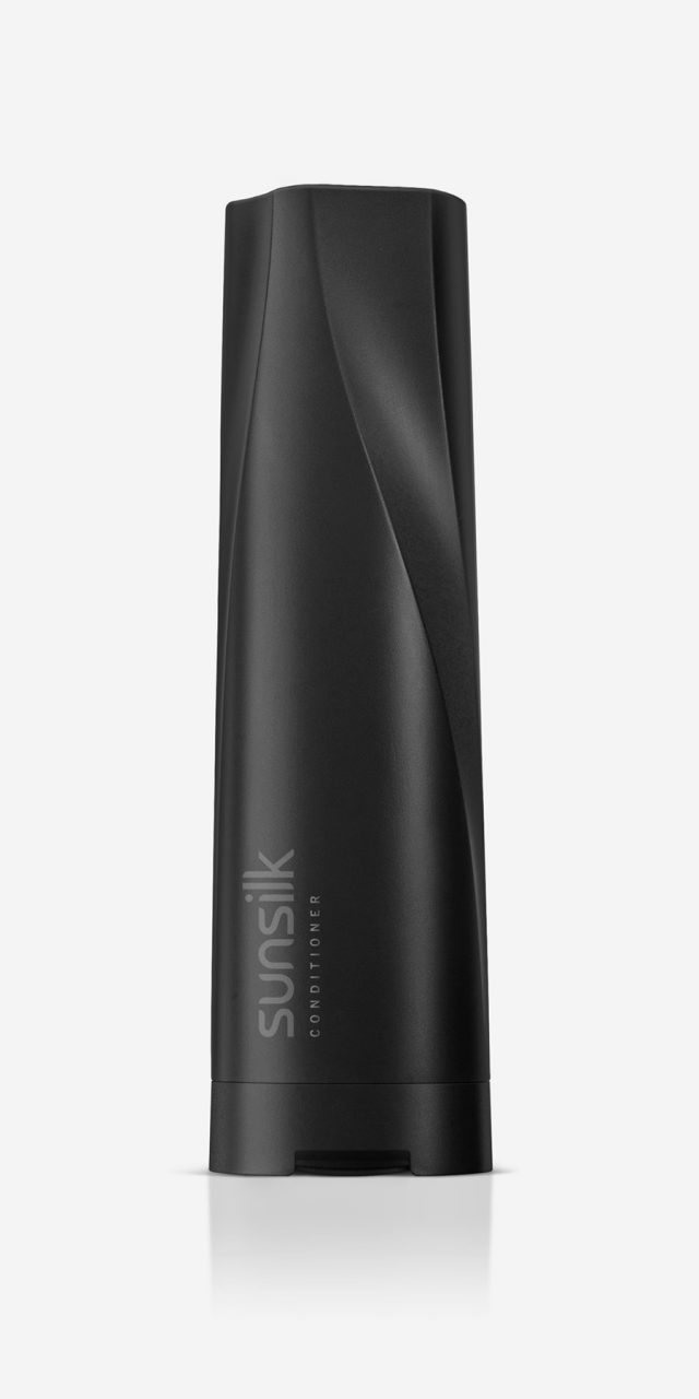
Sunsilk sells hundreds of millions of units a year worldwide. This is, therefore, an important project in which significant investments are at stake; not only to produce the new bottles and pots, but also to configure the production plants and assembly and packaging lines where the new designs will be produced, located in the main geographical areas in which the brand presence is greatest.
The process was extremely exhaustive, from the two-day briefing with a team of more than thirty people, to the creative process lasting almost two years, the consumer tests, and the requirements of the company’s sustainability programme.
Sunsilk is a brand dedicated exclusively to haircare. It is targeted at young, open, dynamic women who understand that hairstyling is an essential way for them display their personality. From among the characteristics of the brand, colour and expressiveness were chosen as the core aspects for this project. In addition to a vibrant range of colours, the design is distinguished by the undulating surface of the containers, running from top to bottom; a feature that transmits dynamism and refers to the freedom of movement of healthy hair. This design was adapted to the different formats (bottles of various capacities and pots) in order for the whole range of products to embody a strong personality that can be easily recognised both visually and by touch, which was an aspect to be taken into account given the conditions under which this type of product is used. Colour, expressiveness and efficacy. That is Sunsilk.
Fuego Lento
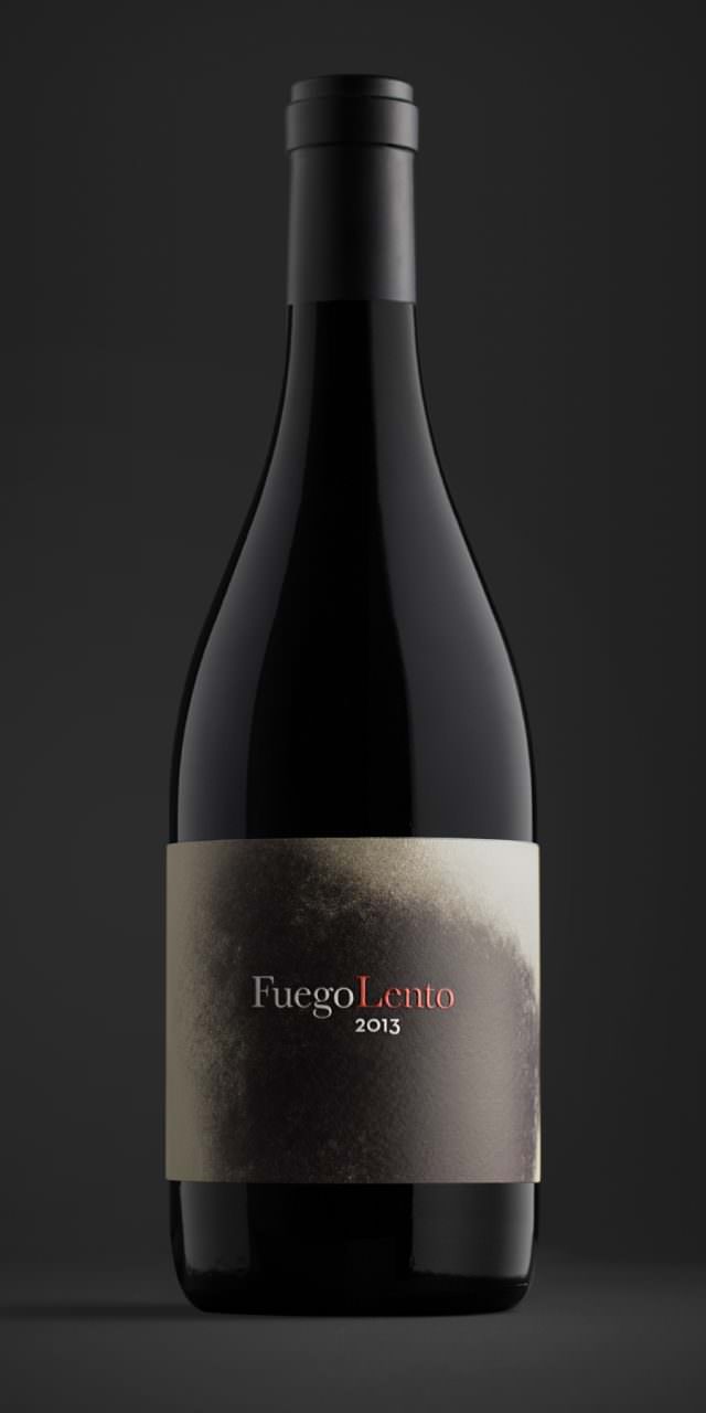
'Slow Fire' or more commonly, 'Slow Cooked' is an expression that casts us back to the kitchens of a bygone era. This is a technique that uses a low flame to slowly draw out intense flavours, it conjures up images of smokey coal fires, burning embers and brick walls blackened by soot. This gradual build up of soot has accumulated over time, in other words, the time taken to patiently nurture something to the point of perfection. Therefore this soot has become the centre piece of the project.
These fine black particles have been converted into the main graphical element and are reflected on the labels, the boxes and other supporting media. 'Slow Fire' is a way of understanding the essence of both food and life. Never rushed, never stressed. Pleasure and haste don't go well together.
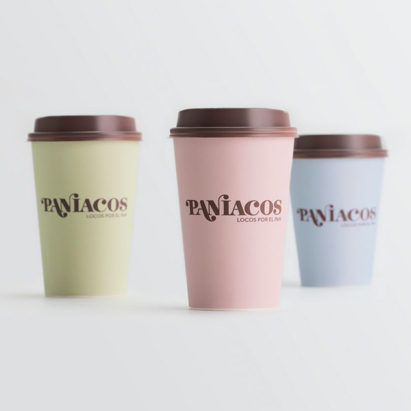
Paníacos
Paníacos (a portmanteau play-on-words of 'bread' and 'maniacs') springs from the new concept of bakeries that are also cafés. Featuring innovative and exclusive products made following traditional recipes. It is a business model that combines the tradition of the bakery with the modern service of the café, where you can have breakfast, lunch or afternoon tea while chatting or surfing the internet. The logo aims to combine tradition and modernity. It uses a classic typography, Bodoni, to which we have added a few teardrop terminals, the rounded end-strokes, which give it dynamism and a certain irreverence, setting the word 'pan' (bread) apart and coming to an end by depicting the dot of the 'i'. This is the hybrid, iconoclastic ethos behind the brand, which also features in the ad copy that goes with the packaging and other elements—such as placemats, napkins, or bags—all on pastel-coloured backgrounds.
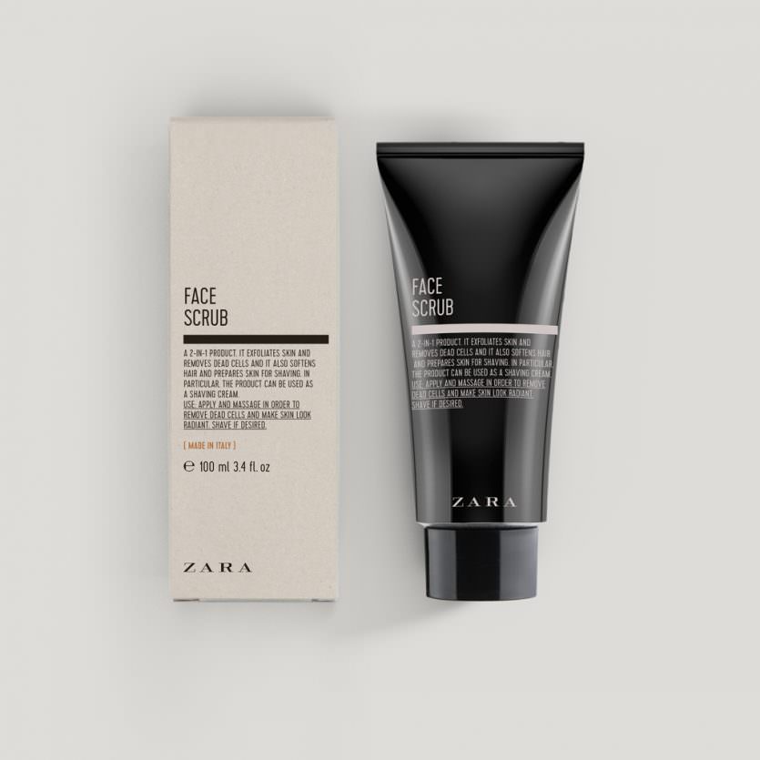
Zara Men Cosmetics
The aim was to develop a line of men's cosmetics with an aesthetic closely resembling the designs found in old pharmacies, with bottles in an amber tone and the use of texts featuring the ingredients as the main element, and prominence given to the phrase "Made in Italy" on the front. The proposed designs are based on typographic solutions that remind you of the old labels on medicinal compounds found in pharmacies. The selection of the typographic fonts together with the composition of the texts strive to give the line its own personality and a language appropriate to the world of cosmetics. The colours employed underline the masculine character.
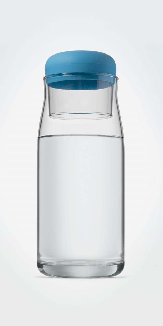
Global Omnium Carafe and Glass
Global Omnium is dedicated, among other activities, to managing the whole water cycle: from catchment and purification, to distribution. They commissioned us to design a carafe and glass set for internal use that would also serve as a gift. The idea is to promote the consumption of tap water or, at least, for the company, which dedicates so much effort to supplying homes with quality drinking water in the best conditions, to set an example.
We were inspired by small jugs and glasses that were traditionally placed on the bedside table within arm's reach, where the glass itself was used as a lid. Both the glass and the carafe are made of ecologic glass. The base of the glass has a silicone sheath. It can act as a stopper without the glass parts coming into contact, providing a more secure seal that protects the contents of the carafe when it is not in use.