

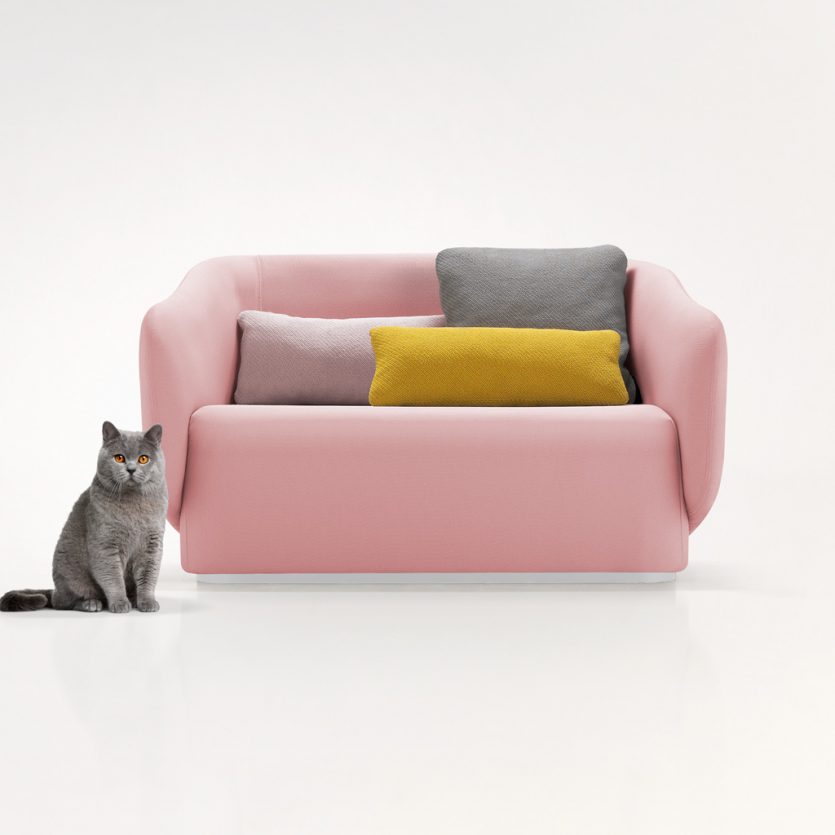
Yon
This sofa, produced in different lengths, is the centerpiece of a collection (chaise longue, armchairs ...) designed for home and comercial use. The chair arms form part of the back and open outwards as a welcome gesture. Square and rectangular cushions create color compositions against the neutral tapestry background.
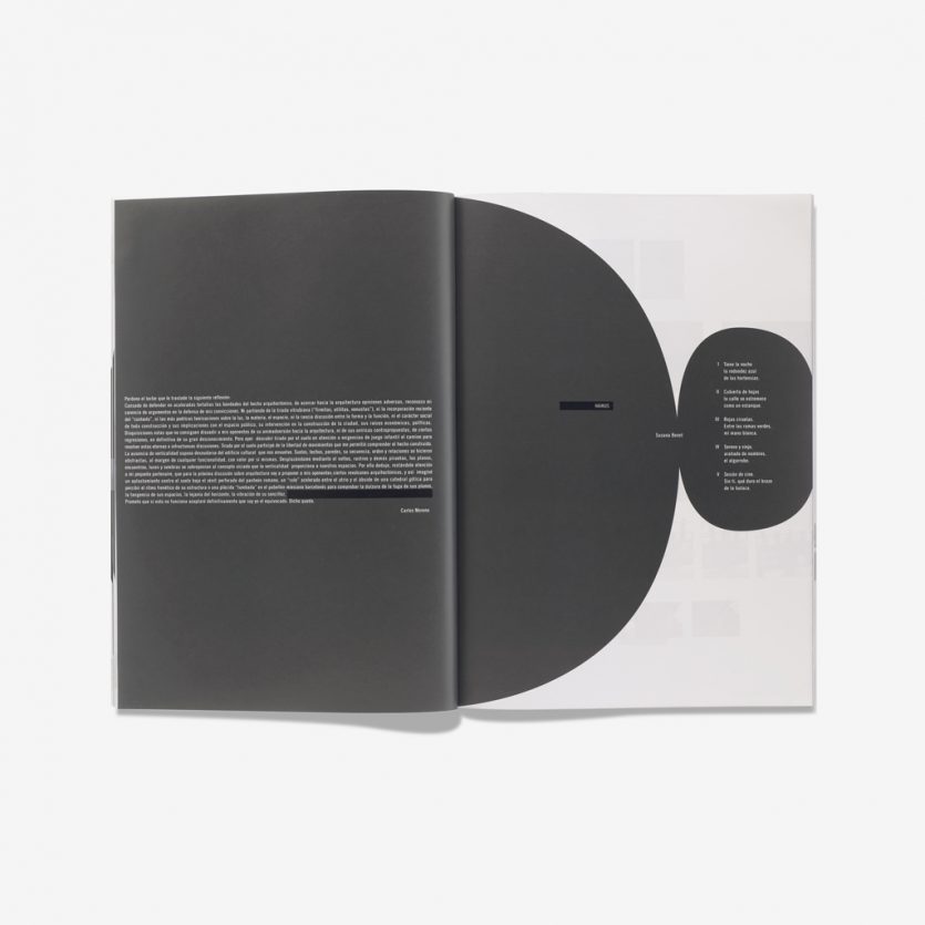
Papel Elefante
In 2000, an alternative space was created in Valencia where painting, sculpture, design, photography, jazz and classical music concerts, and more, coexisted. A space to promote the latest cultural trends, and its name is Color Elefante. The magazine Papel Elefante that deals with art, literature, etc was created to complement the gallery. Each issue of the magazine is carried out by a different designer and we were asked to design issue nº 3. To focus the design, we placed a white text within dark-gray rounded forms to provoke more visual impact. It gives greater importance to pages where the text is the unique visual element and has to compete with pages that contain paintings, drawings or sculptures and are visually more attractive.
www.colorelefante.com
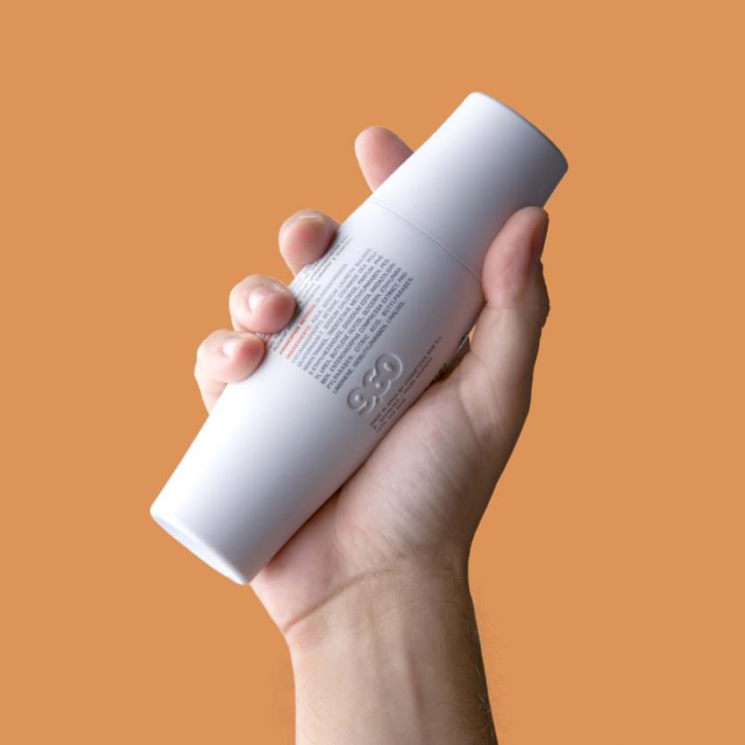
9.60
A mass-market range of cosmetic products for men that are exclusively distributed in 1500 stores for the Spanish supermarket chain, Mercadona. This basic line of cosmetics is related to concepts such as fitness, sports activities, and exercising… The design of the package tries to reinforce these concepts. The name brings out the idea of a sports record, and the package makes reference to the morphology of the muscle. All the 100 ml and 200 ml containers were designed with an ergonomic shape and fabricated in flexible plastic so they are very resistant and they can be carried in a sport bag.
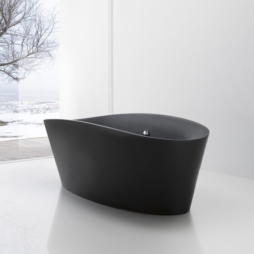
Tina
Tina responds to the new concept of bathroom, which has evolved from pure functionality into a space where we spend increasing amounts of time and where comfort, experiences and aesthetics are given more importance. For this reason, Tina's shape is sensually rounded, comfortable and evocative, in contrast to the squared and straight shapes in vogue everywhere. It is made out of mineral resin (Stonefeel®).
www.sanico.es
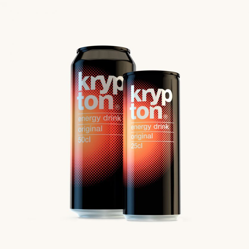
Krypton
All drinks categories have their distinct visual codes, which serve the consumer to quickly recognise the type of beverage they are looking for. That is, to communicate effectively. In the case of energy drinks, references for the concept of "energy" are overt and inevitable. With just a few components, from the naming to the graphic element, everything points towards transmitting a strong energetic image aimed at connecting with a young audience. The red circle that expands outwards from the center, like an explosion on a black background, transmitting strength and dynamism while, at the same time, it achieves a strong focal point on the shelf. The word krypton, with its obvious associations, has been further strengthened by giving it unique typographic features.
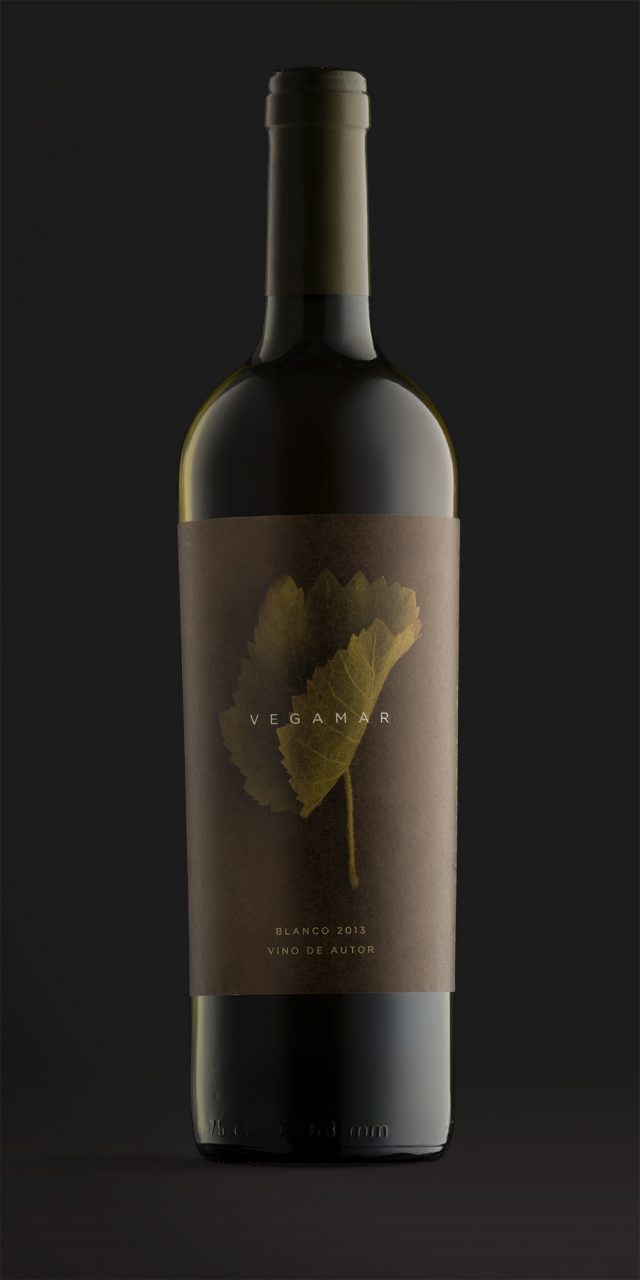
Vegamar Wine
Wine is grapevine and time. On the one hand, grapes grow and mature slowly. On the other hand, months of winemaking through a delicate craft create a rather unpredictable process. Combining the vine leaf with the passing of time is the idea for the Vegamar Selección identity, which is a specific store designed for tasting and buying select wine, cava, olive oil and other Vegamar products. The vine leaves were picked and photographed as they started to dry out and curl back on themselves, each in their unique way. It is similar to the wine aging process for which there is also a random element and unpredictable beauty. The identity for the store is built around these photos, with a monochrome treatment, and has been applied to the gift packaging, wine, cava and olive oil labels.