

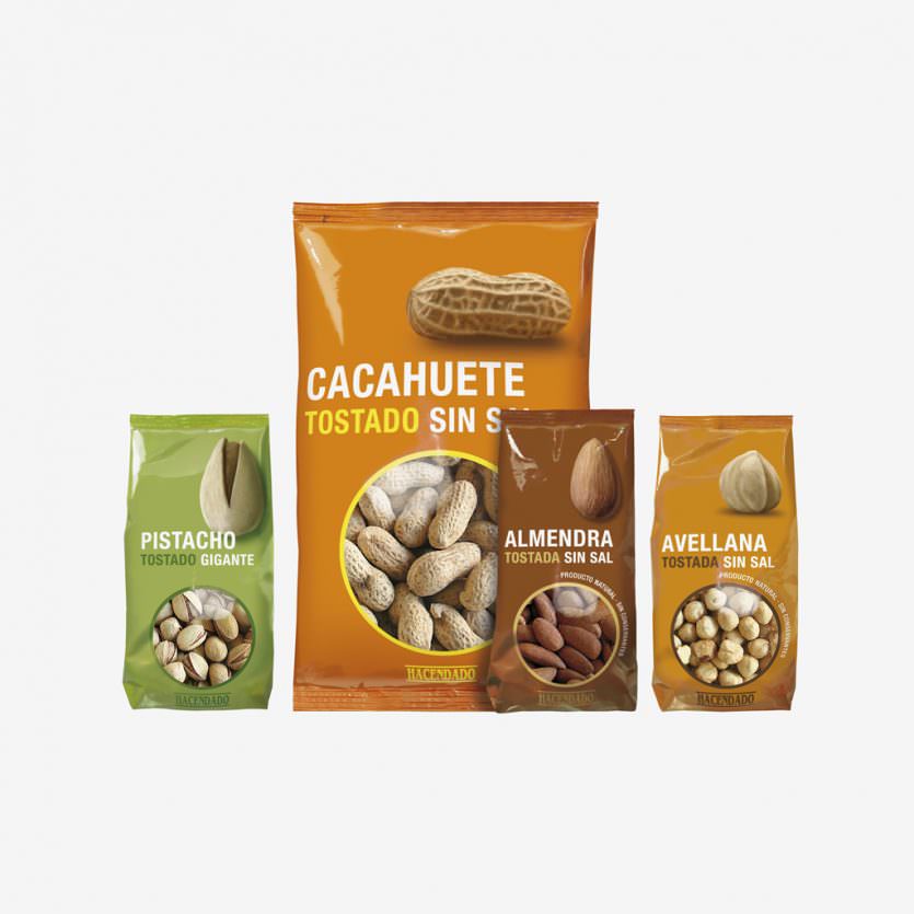
Hacendado dried fruits
A dry fruits range produced by IMPORTACO exclusively for the supermarket chain MERCADONA. There was a main objective: to put order and to improve their visibility and to minimize the time in the shopping decision. The solution is based: - In the functional use of colours, which helps to identify the different ranges of products. - A clear and very legible typography. - Huge images of the nuts, which besides facilitating the identification provide a differential and amusing aspect.
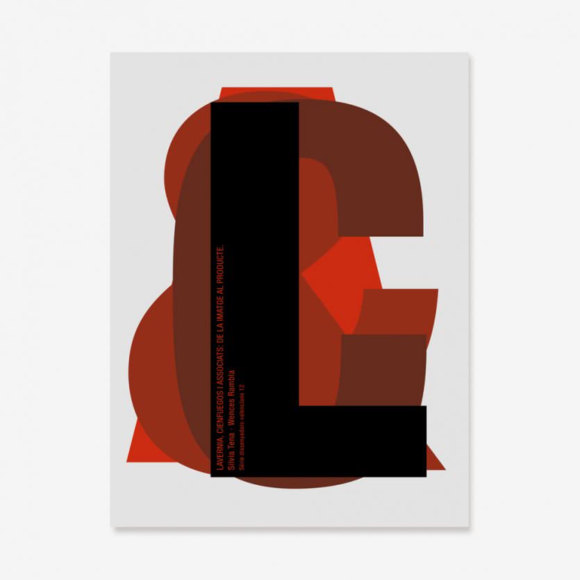
LC&A
We were asked to design a book cover for Jaume I University that focused on our work. It belongs to a collection called Dissenyadors Valencians (Valencian Designers). It consists of four characters or letters L, C, &, A, that work together, combining one on top of the other.
Transit
A range of bathroom fittings, lavatories and bidet, made out of STONEFEEL® (white, beige or anthracite) on the outside, and porcelain on the inside. STONEFEEL® (mineral resin) and porcelain are combined to create a product in which each material offers its own qualities: the porcelain is clean and hygienic, while the STONEFEEL® has a silky texture and is able to be molded into shapes and forms that porcelain can not. Two different versions of the lavatories were designed, one with an external tank, and another tank to be fitted in a rear wall.
www.sanico.es
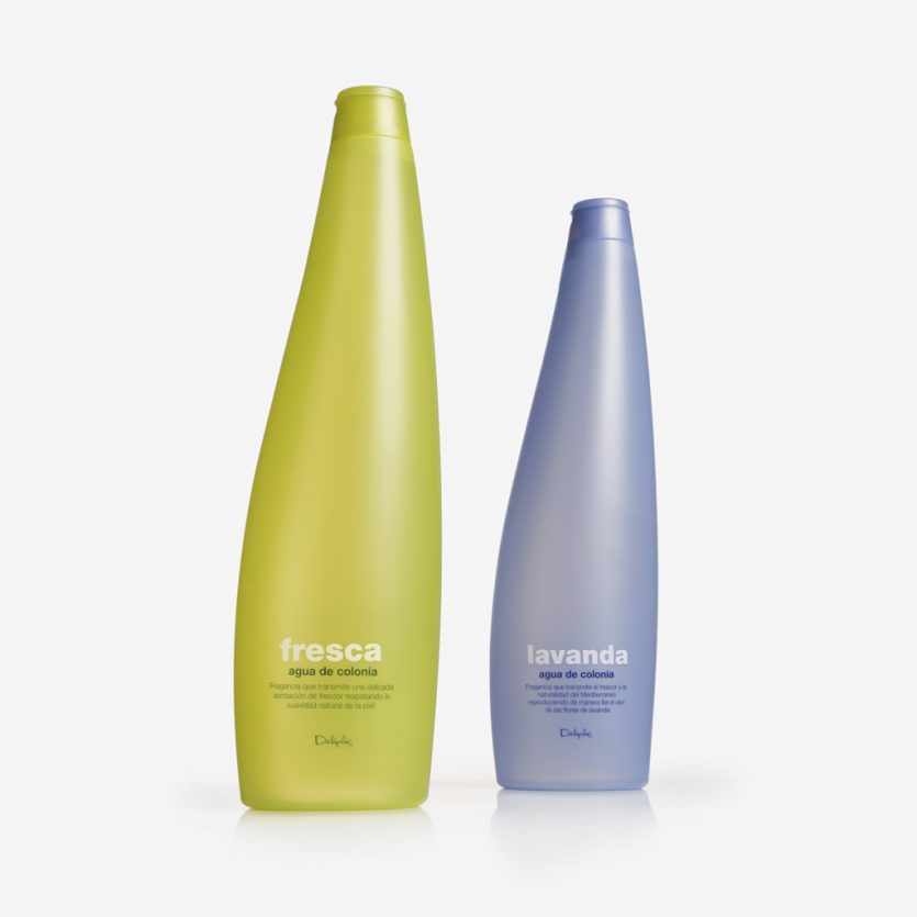
Deliplus Fresca y Lavanda
Bottles and graphics for two mass-market colognes distributed by Mercadona stores nationwide. The bottles (750ml) are made out of coloured translucent plastic. A modern design with an air of sophistication.
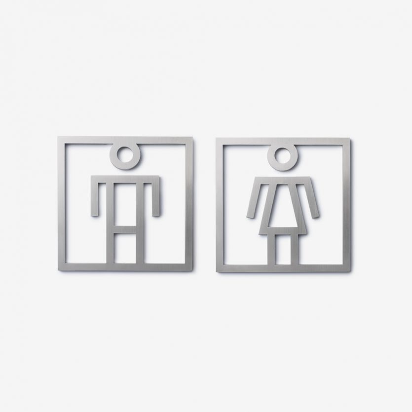
Pictos
A range of icons specially created for interiors with design appreciation. The square and rectangular shapes perform two functions. Firstly to achieve homogeneity and, secondly, to allow for the combination of signs to extend meaning and to complement one another. The main aim of the design is to achieve clarity and immediate interpretation when wayfinding through using universally recognisable icons. The Pictos project includes a complete alphabet, numbers and common symbols. The signs are self-adhesive and fabricated in stainless steel cut by laser.
www.sanico.es
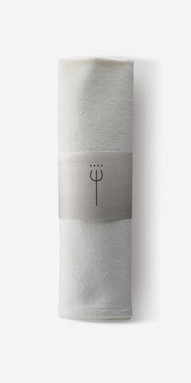
Neptuno
Neptuno Hotel is a project in which interior designer, Andrés Alfaro, and Lavernia & Cienfuegos worked on together. The Hotel is located on the front line of La Malvarrosa beach. The logo is the drawing of a trident, Neptune's three-pronged spear, which also gives name to the hotel restaurant (Trident Restaurant). The identity extended to hotel and restaurant communication (Menus, leaflets, amenities, etc) and consists of black and white photographs of the surrounding beach and the sea.
www.hotelneptunovalencia.com