

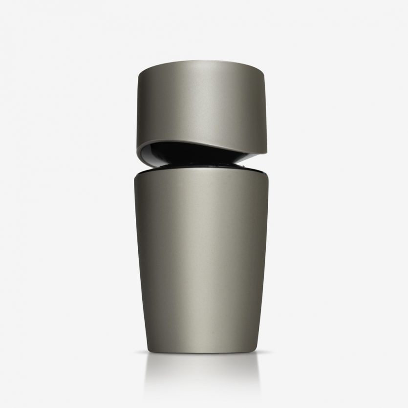
Codizia Man
Codizia Man is a men's fragrance from the same brand which was launched three years ago for the female market. It shares the same quality product positioning differentiation, and has a much lower price than high-end colognes. The packaging communicates similar attributes: sensuality, elegance, dynamism... It does this following the same language and some of the characteristics of its female predecessor, as in the solution for the join between body and cap, but with changes that reaffirm its male personality: the colours and the volume, which moves from a horizontal to a vertical position for Codizia Man. It is distributed exclusively at supermarket chain, Mercadona.
Rabitos Royale
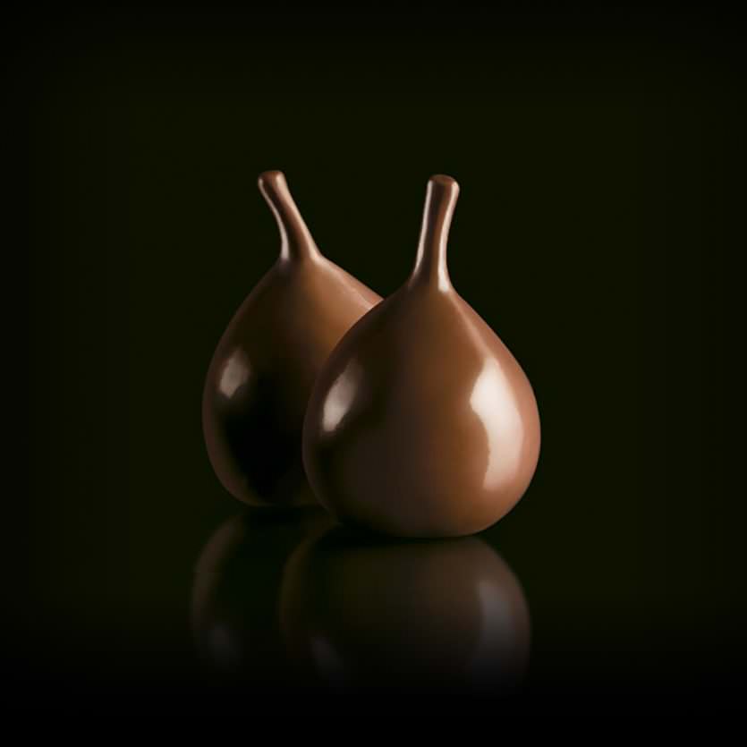
Bombones La Higuera is a company based in Cáceres, the province where the "calabacita" is cultivated, a variety of figs; sweet, small, tender... In the 1980s they created and started to product fig chocolates for the Spanish market and now, with the new packaging, they are starting to have great success with exports to the US: This has been the objective of the new designs, to assist the entry of these unique and exquisite chocolates in the existing American "gourmet" products market.
Bombones La Higuera

CDICV
This identity presented the challenge of having multiple initials difficult to read and pronounce and of having a lengthy title difficult to recognise and memorise. The proposed solution attempted to make a virtue of a necessity by giving a typographic solution of a typographic problem. Therefore for the initials, a functional composition was looked at which favoured readability and recognition. The solution also consisted of a compact unit in which the initials and the title became the actual logo. This solution was stable and powerful, white or black over a colour and is neutral, timeless and transmits the college's standing and rigour of which the brief asked.
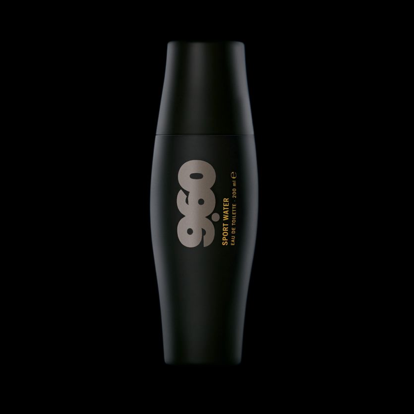
9.60
A mass-market range of cosmetic products for men that are exclusively distributed in 1500 stores for the Spanish supermarket chain, Mercadona. This basic line of cosmetics is related to concepts such as fitness, sports activities, and exercising… The design of the package tries to reinforce these concepts. The name brings out the idea of a sports record, and the package makes reference to the morphology of the muscle. All the 100 ml and 200 ml containers were designed with an ergonomic shape and fabricated in flexible plastic so they are very resistant and they can be carried in a sport bag.

M&A
M&A works in the packaging sector. They provide services ranging from technical consultancy to the production of containers using all types of materials or processes. They are a very flexible family company and so their logo is in lower-case; their scope is global hence the use of the sign “et”; their focus of activity is in packaging, hence the asterisk in a parenthesis, evoking in written form the image of the contents within a container.
www.myapackaging.com
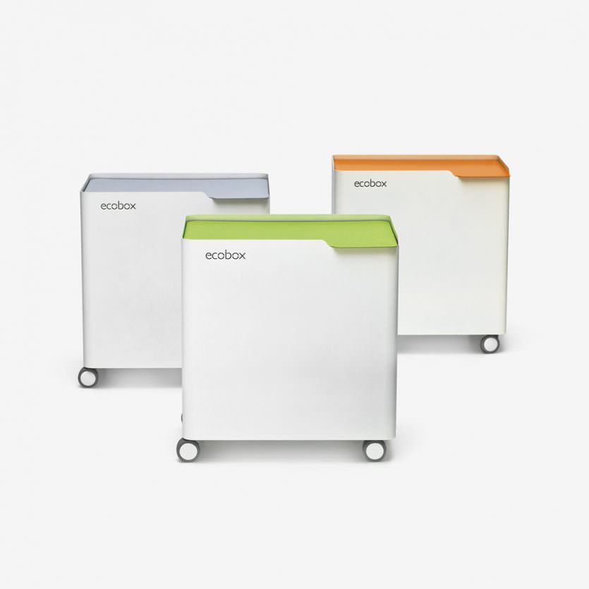
Ecobox
It is becoming more and more frequent that the new designs of kitchens incorporate elements more or less standard for the recycling of residues. But there are million of houses where the kitchen furniture does not incorporate them and the bags with these residues do not find their place. Ecobox is a simple metallic container, in which any type of plastic bag can be used, dividing the space according to specific needs. It has been designed thinking also about semi-public space (offices, waiting rooms...).
www.donhierro.com