Experimenta 66
Design Magazine
Client Experimenta
Year 2014
Editorial Design
Awards
LAUS ADG-FAD 2015
Bronze. Book Covers
ADCV 2015
Gold. Editorial Design: Diversity
Home
Experimenta’s editor and publisher, Pier Luigi Cattermole, asked us to design the first issue of the magazine’s new phase—a challenge we could hardly refuse. After three years as a digital-only publication, Experimenta returns to print. The magazine had paused at issue number 65, and from now on each edition will be dedicated to a specific theme, with the design commissioned from a different studio or designer.
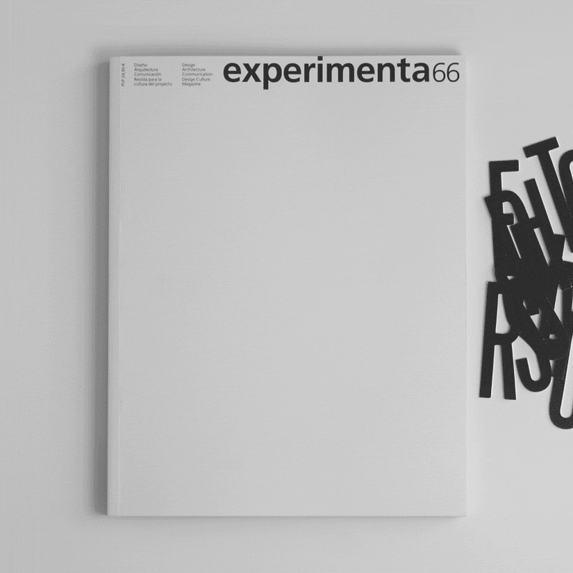
The most remarkable aspect of this rebirth is that Experimenta remains unmistakably Experimenta, picking up exactly where it left off with issue number 66. For this reason, we approached the project with great respect for the magazine’s legacy, preserving two of its most recognisable features: the format and the masthead.
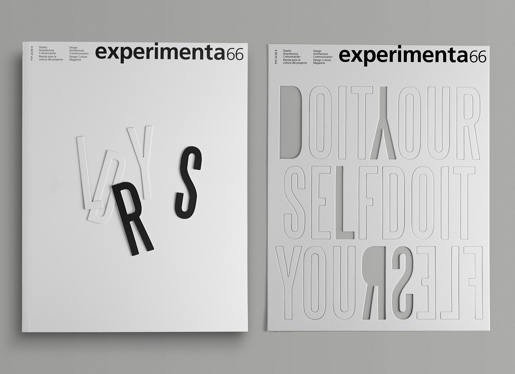
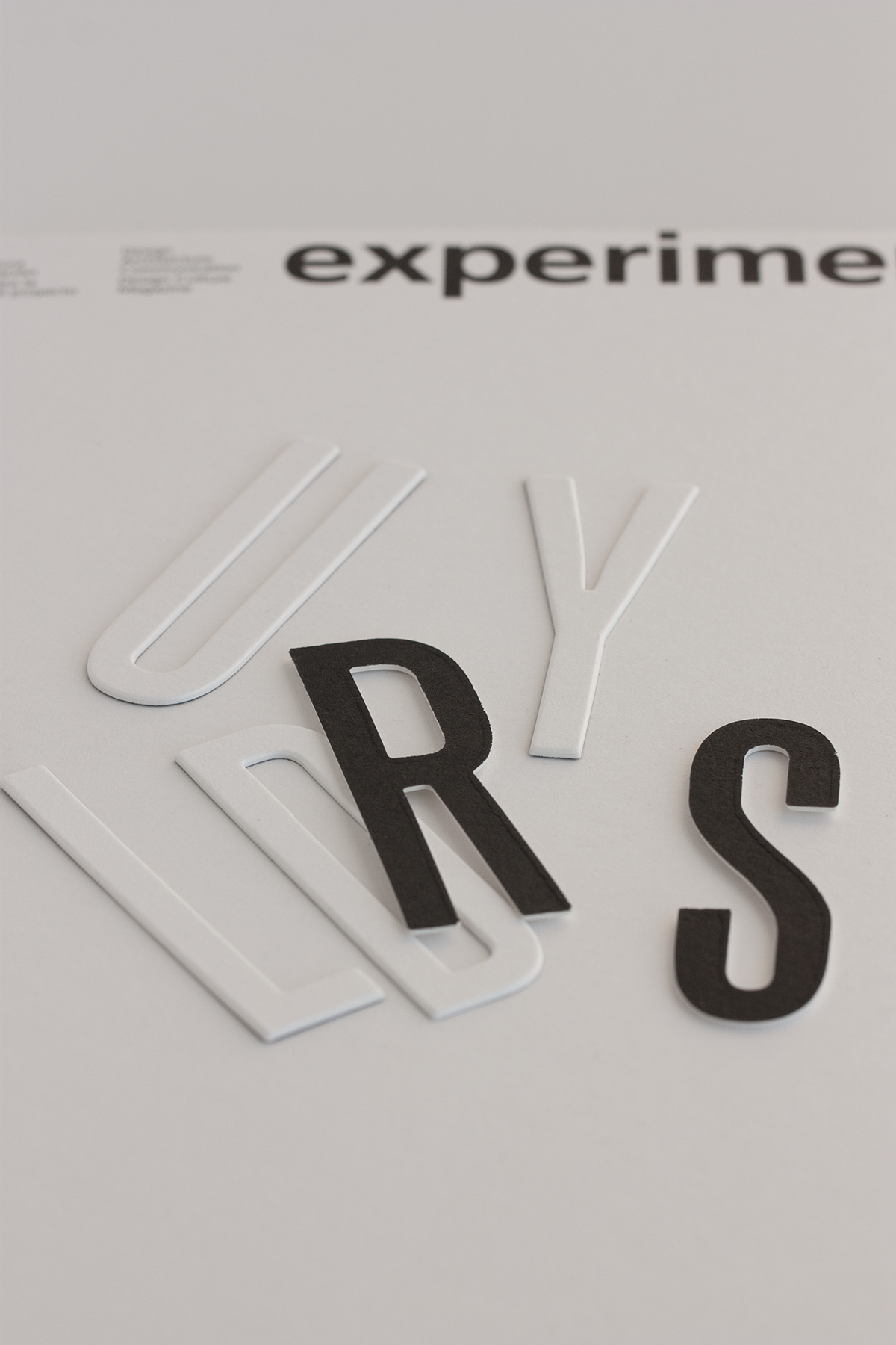
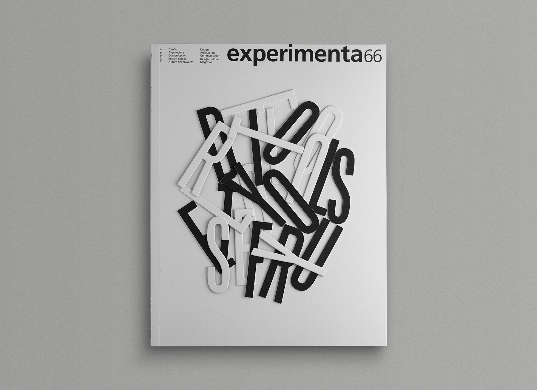
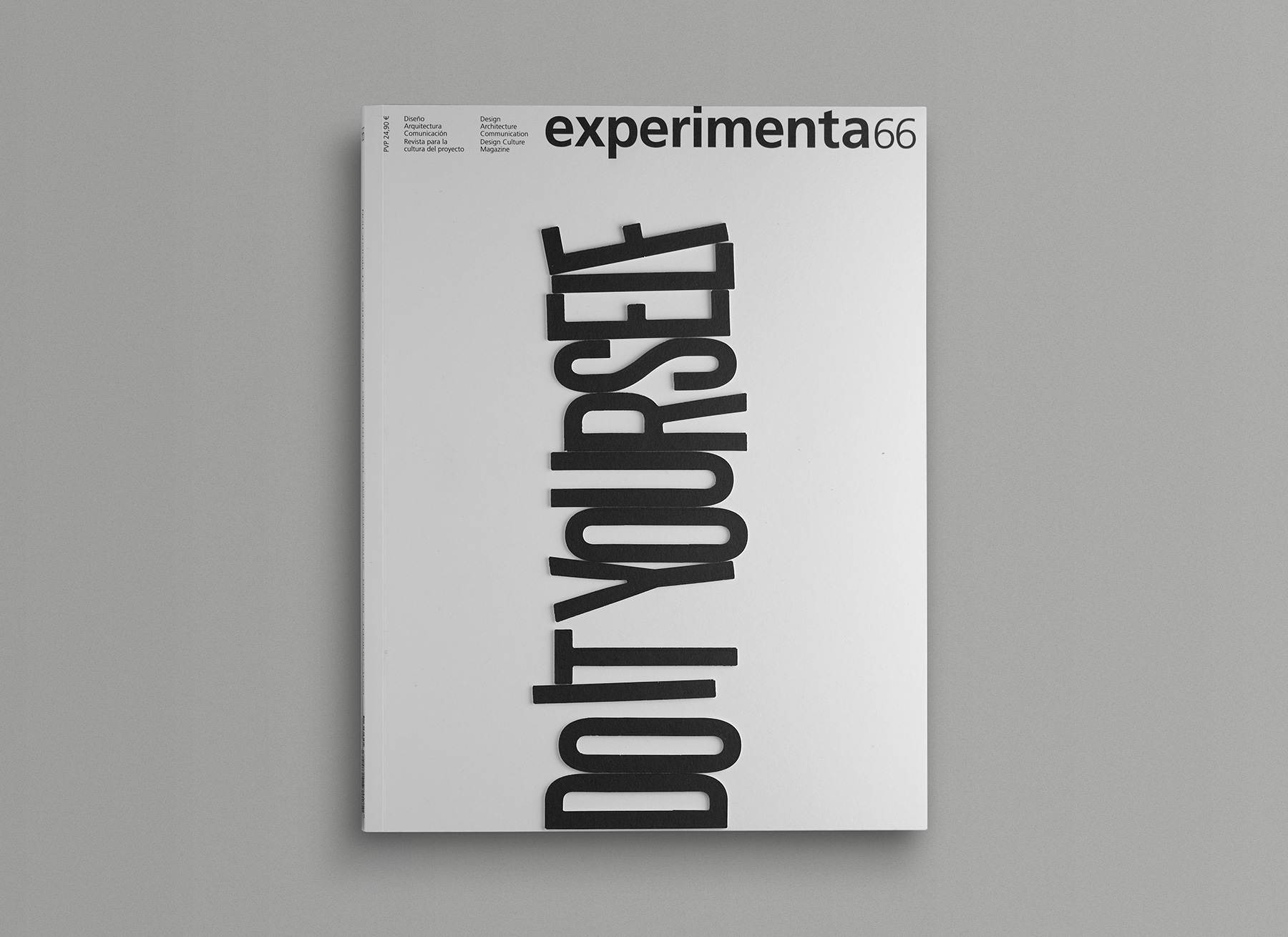
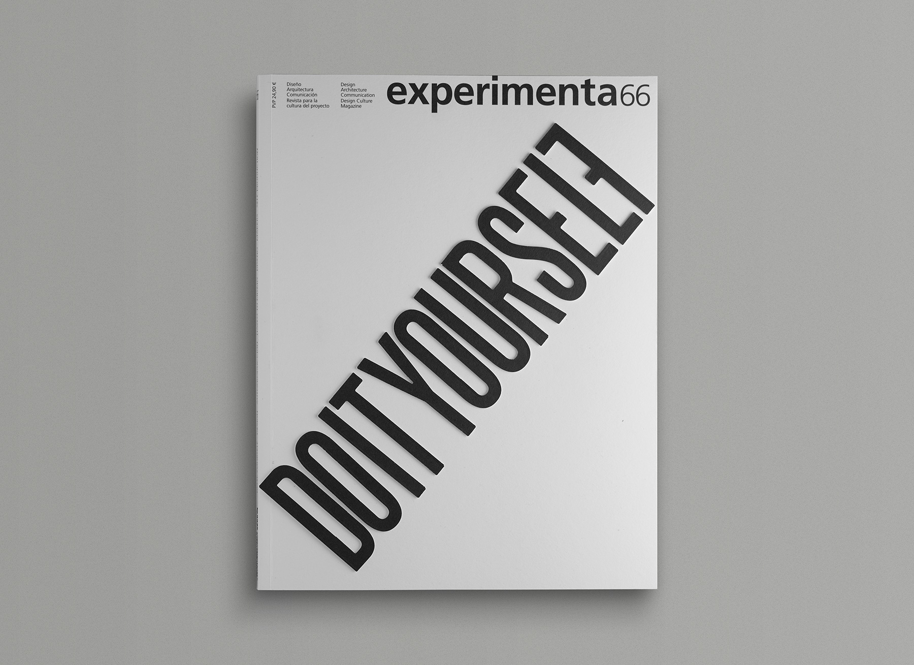
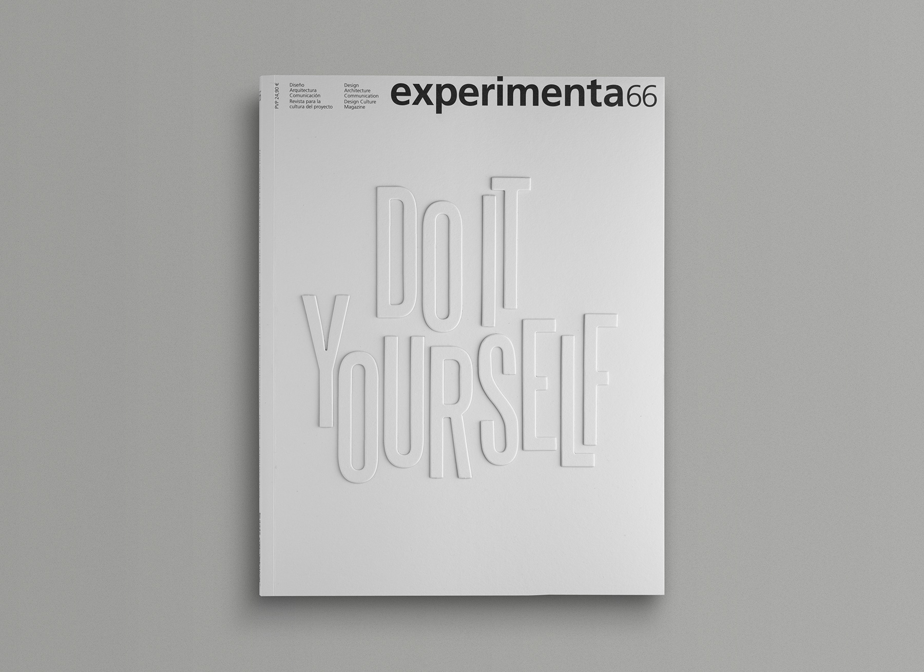
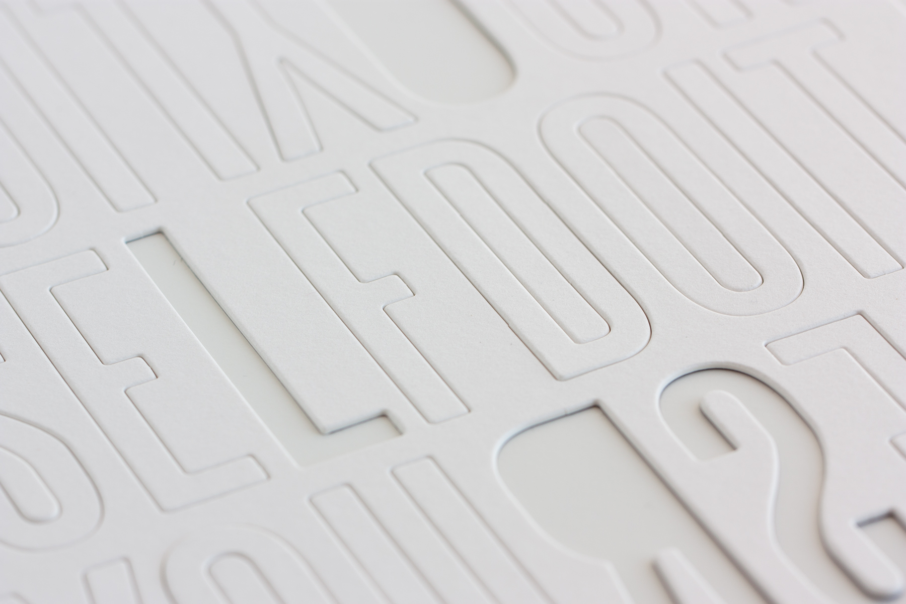
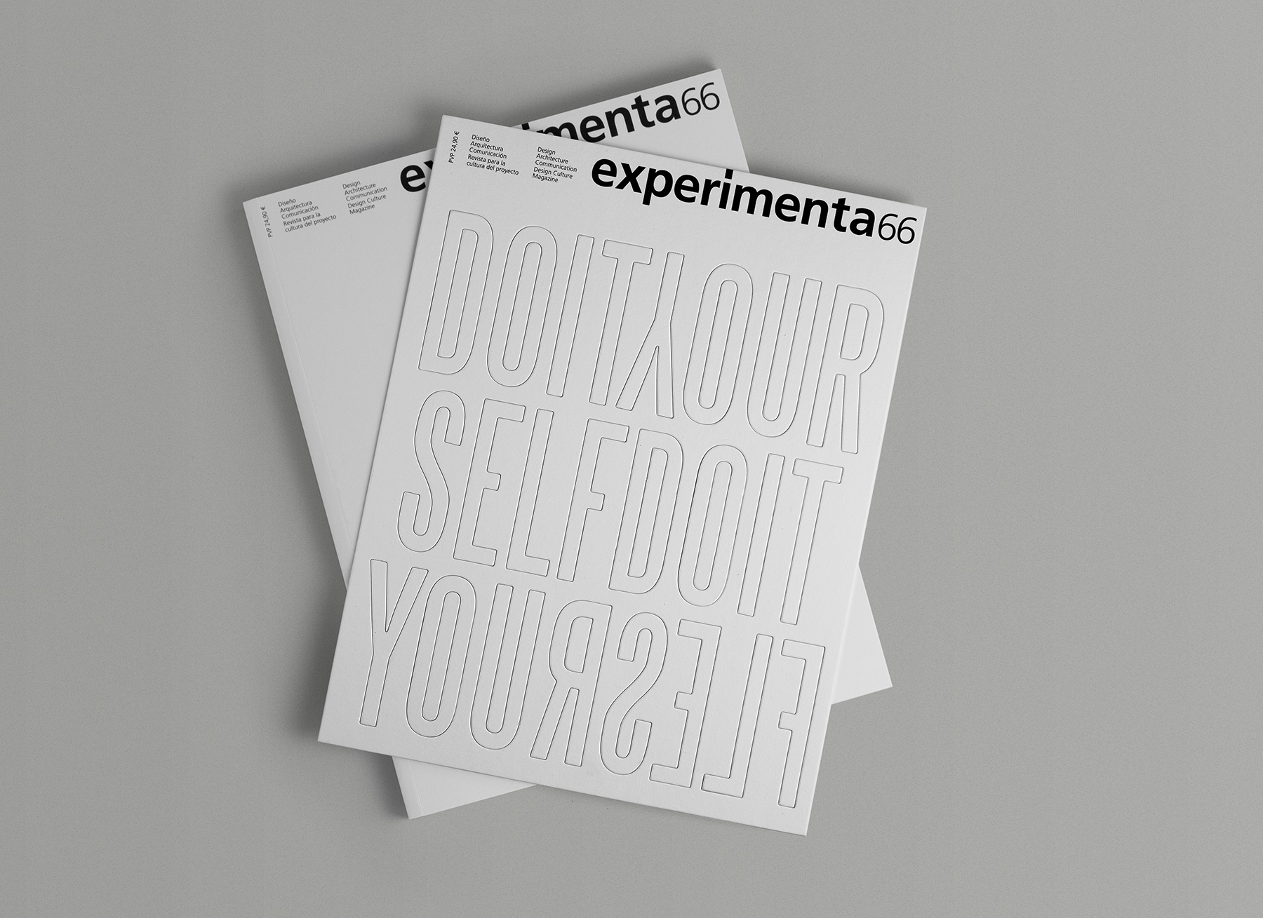
For the interior spreads, we worked in close collaboration with Experimenta’s long-standing designer, Antonio Rodríguez. Lavernia & Cienfuegos focused its contribution on the cover and the article openers. As this issue revolves around a do it yourself theme, we proposed that readers create their own covers: a blank canvas on which to compose the title DO IT YOURSELF using die-cut letters provided with the magazine, white on one side and black on the reverse.
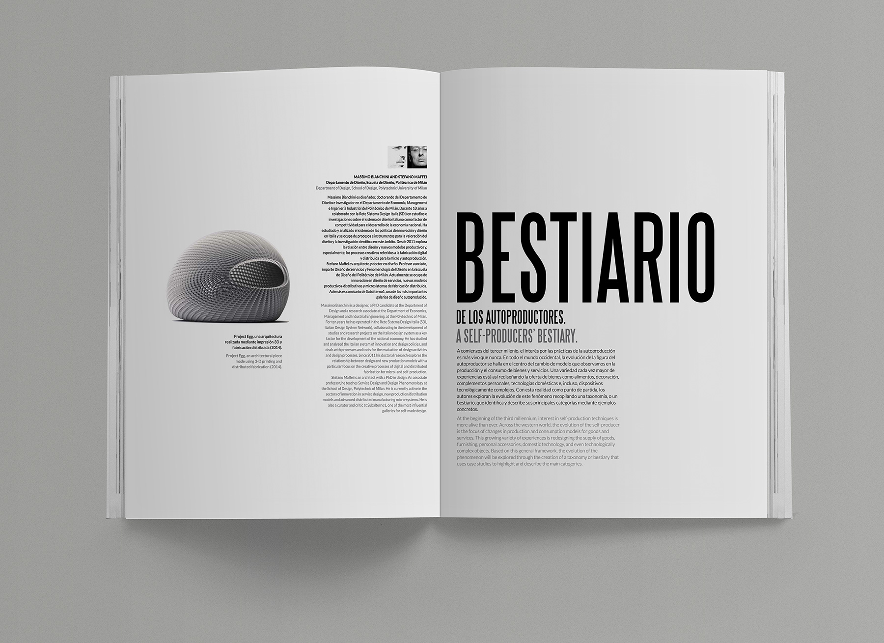
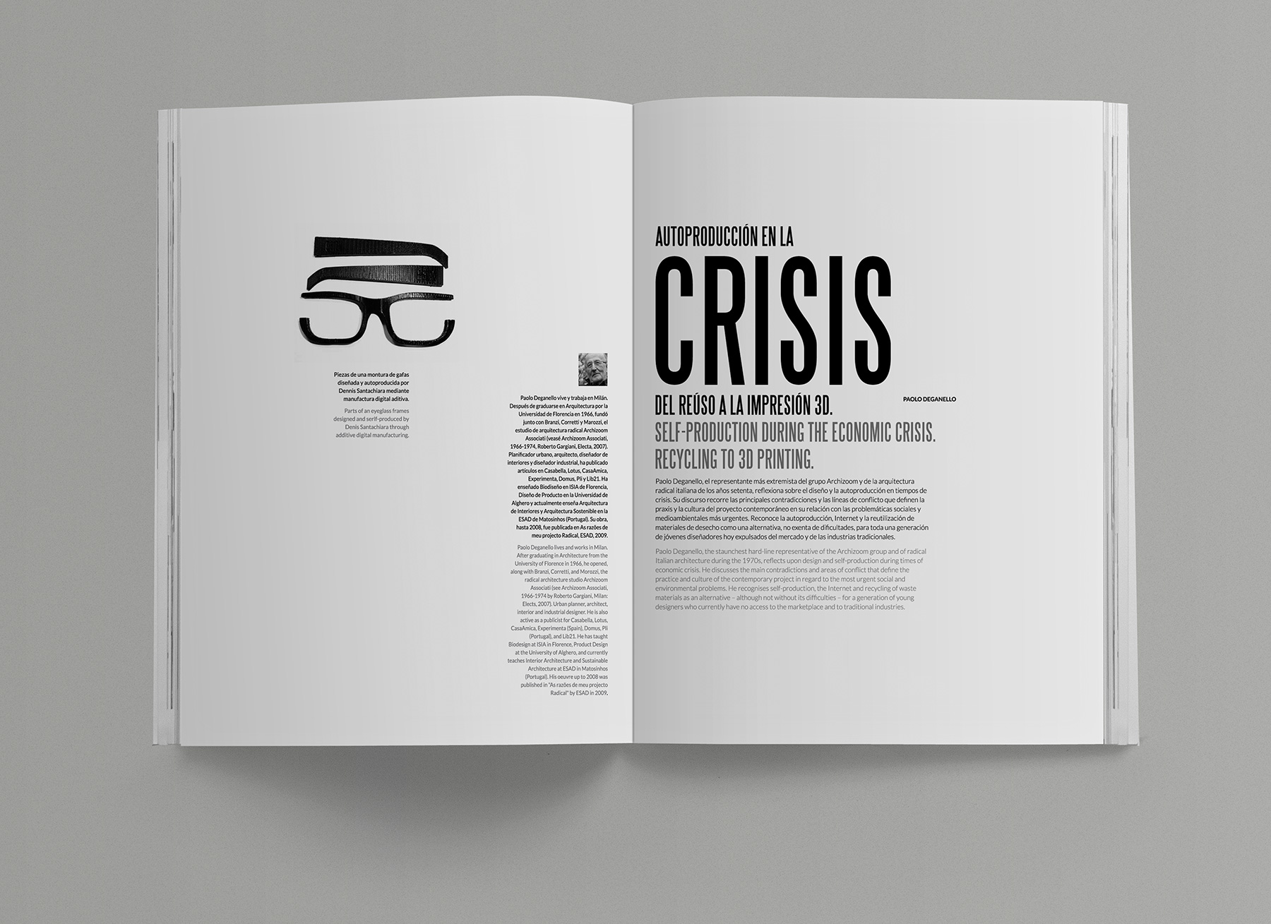
We chose Steelfish as the typeface for its strong, bold character. The same typeface is used in the article openers, where the key word of each title is highlighted and serves as the starting point for the composition of the remaining page elements.
We are proud to have taken part, from the front line, in the rebirth of an editorial project that speaks, reflects, and breathes design—one that was never meant to disappear. Experimenta is dead. Long live Experimenta!