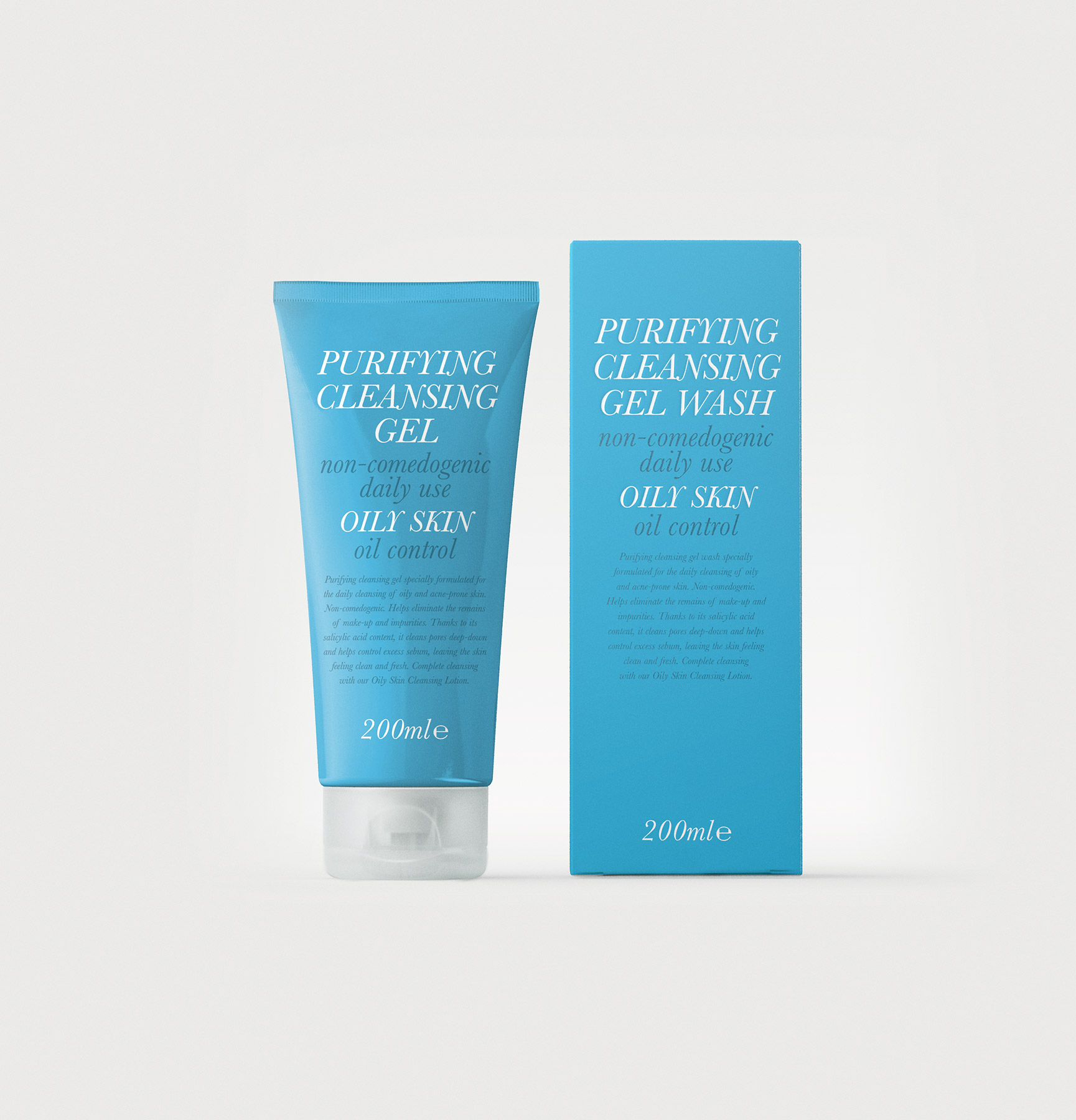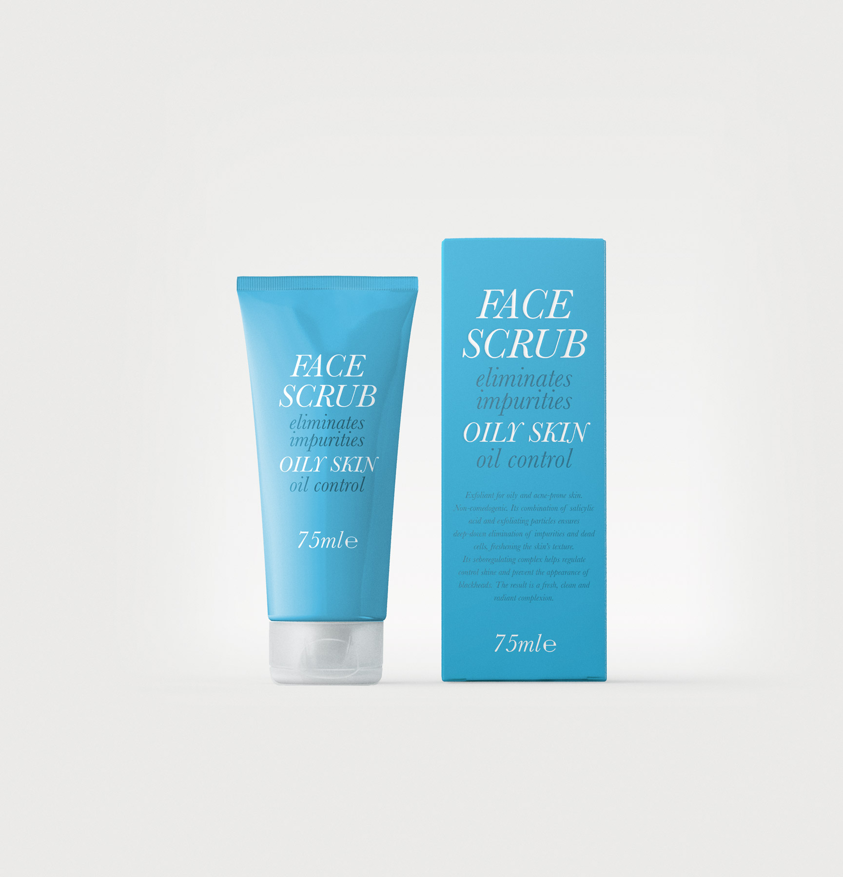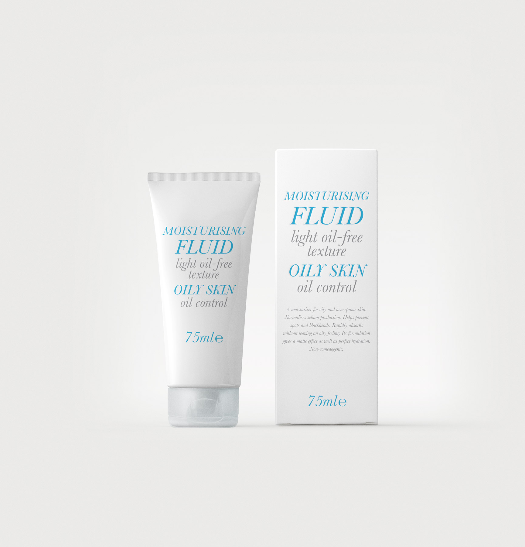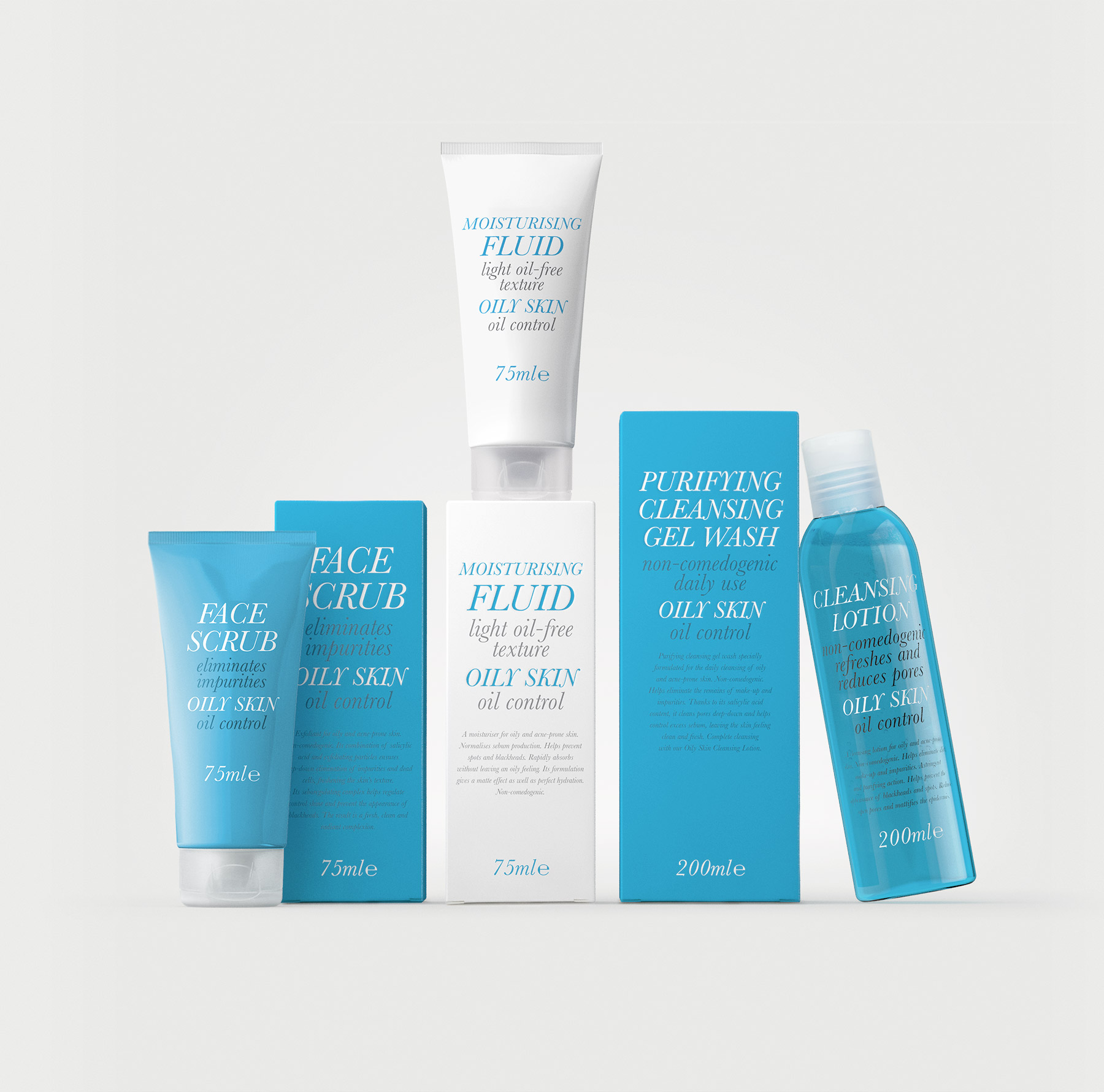
This is a skincare line aimed at young people, for which we developed a typographic-led solution. The brief allowed for a high degree of creative freedom, and we chose to convey a restrained, functional aesthetic in which information takes priority within the graphic design. Young people with skin concerns seek clarity and effectiveness above all else.
Our inspiration came from the visual language of late nineteenth-century medicinal compounds found in pharmacies, characterised by typographic compositions that combine typefaces of different sizes and weights. We selected a transitional Roman typeface—Baskerville Italic—for the main text. The variation in scale and weight establishes a clear hierarchy of information. Typography is rendered in black or white against a blue background, the colour that identifies the range.