100&NOMORE
Craft Gin
Client Ricardo Barguñó
Year 2021
Logo
Packaging
Naming
Awards
LAUS ADG-FAD 2015.
Bronze. Packaging
WORLD BRAND DESIGN SOCIETY 2022.
Gold. Packaging Design Creation
Home
A new brand producing gins with distinctive flavours required a name, positioning, and visual identity. The essence of the project lies in its exclusivity, with batches limited to 100 numbered bottles for each flavour. The starting point was to find a name that would convey this quality and give rise to a story.
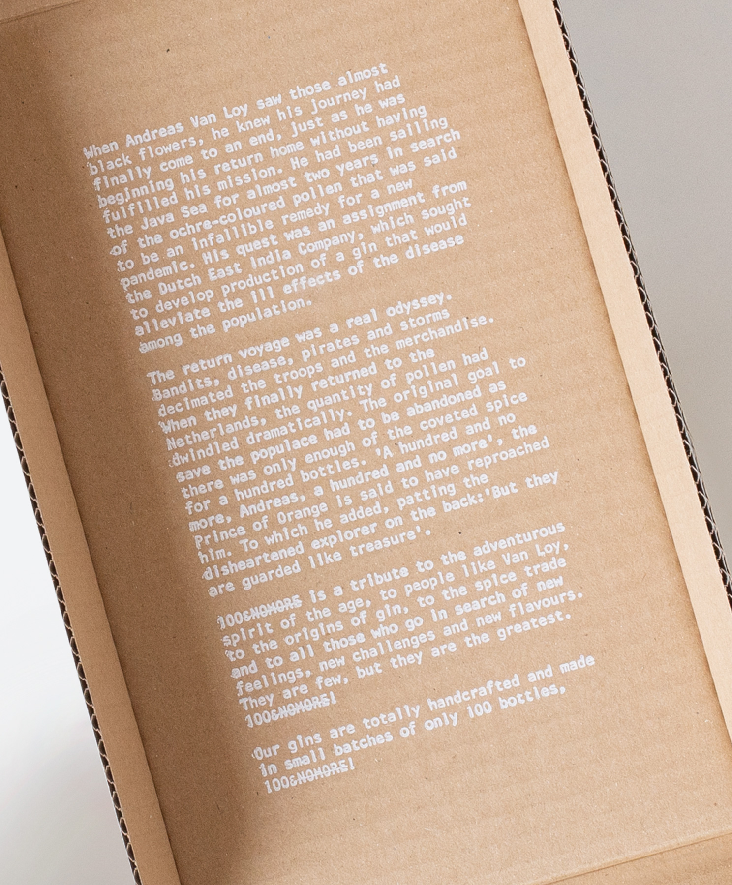
The narrative tells of a Dutch sailor, Andreas Van Loy, sent by the Dutch East India Company in search of a berry from which to produce a curative gin, capable of alleviating the pandemic ravaging the Netherlands. After two years sailing the Java Sea, just as he is about to return empty-handed, he discovers the long-sought fruit, fills the ship’s holds, and begins the journey home. Storms, pirates, and the harsh conditions of the return voyage, however, decimate the cargo. Upon arriving at port, it is discovered that only a handful of berries remain in good condition. The Prince of Orange, dismayed, declares how many bottles of gin they will be able to produce: 100&NOMORE!
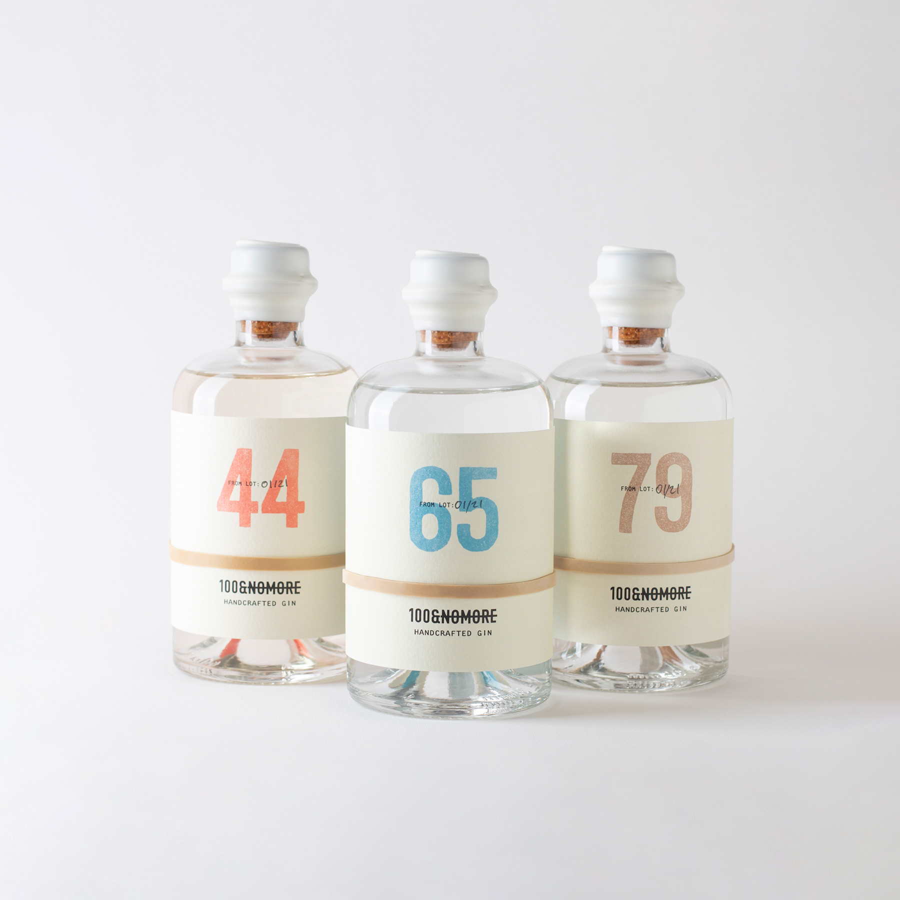
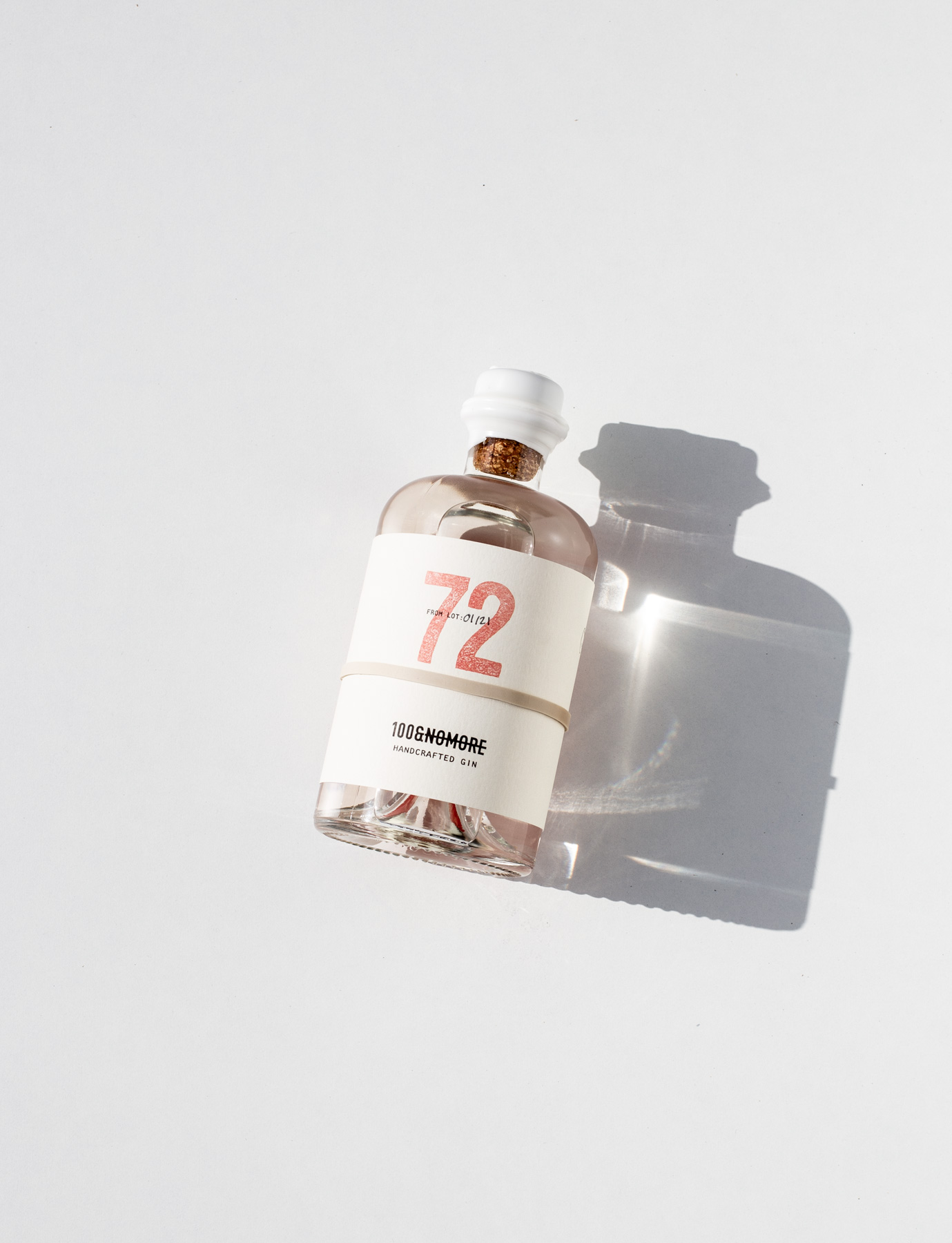
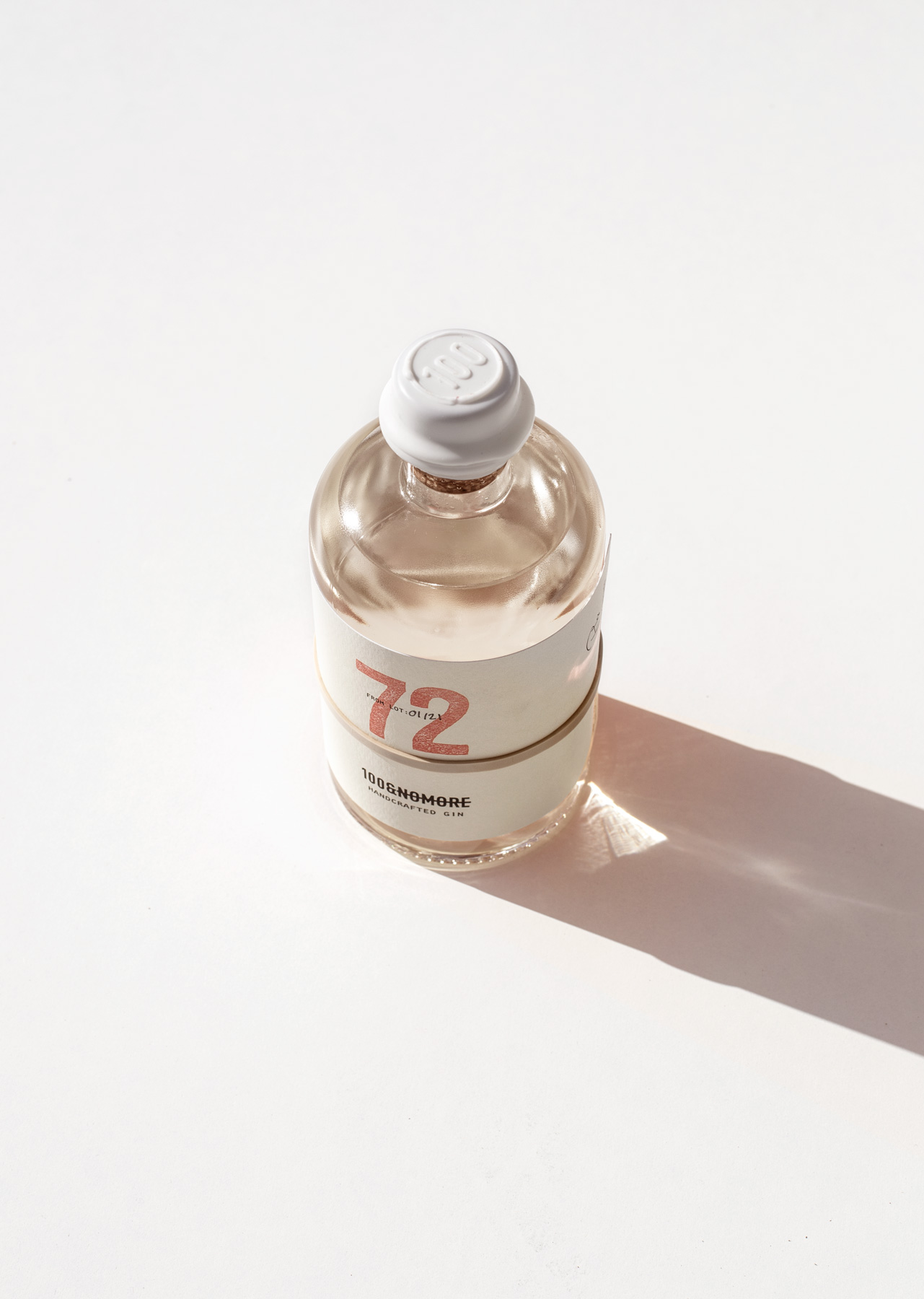
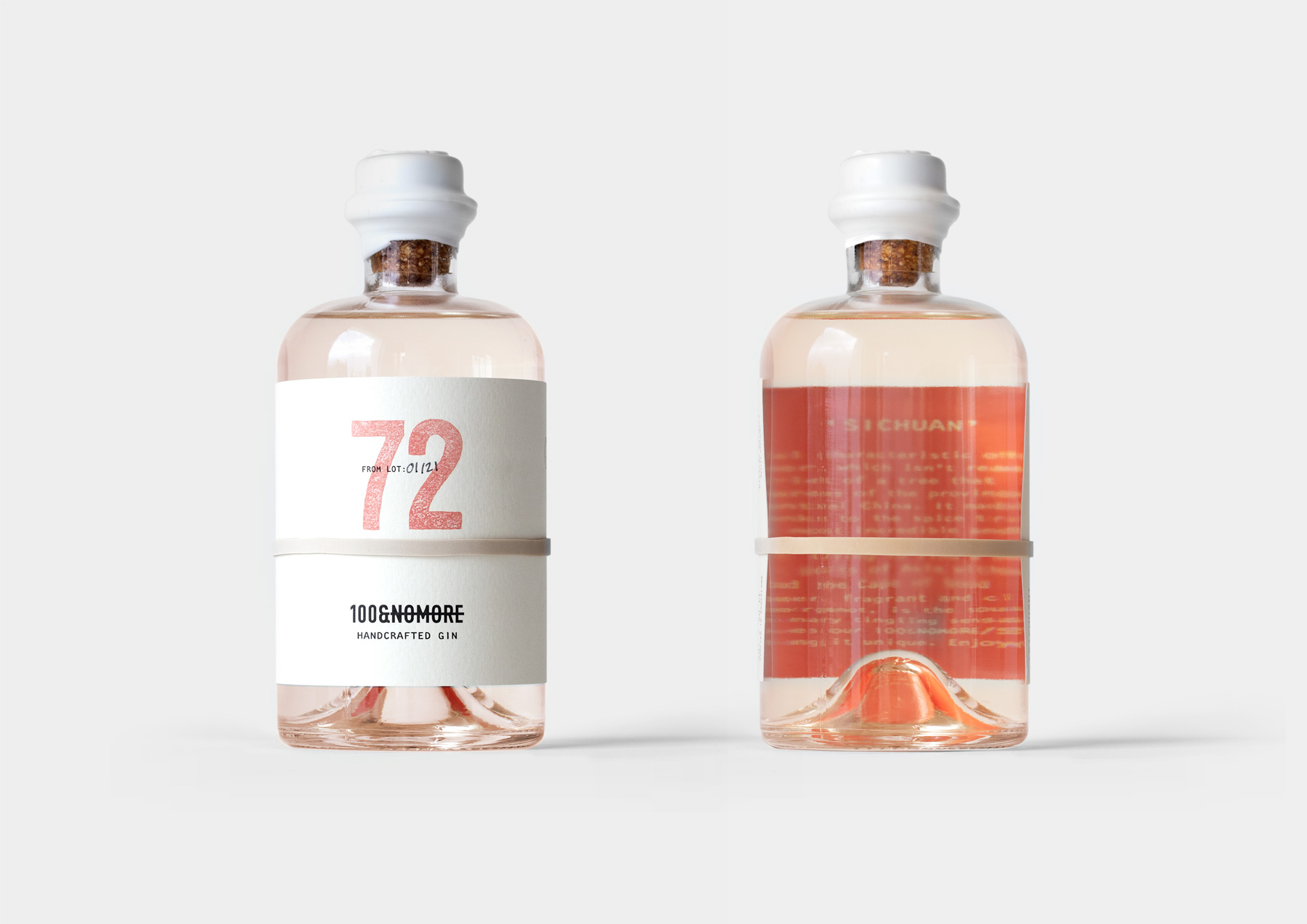
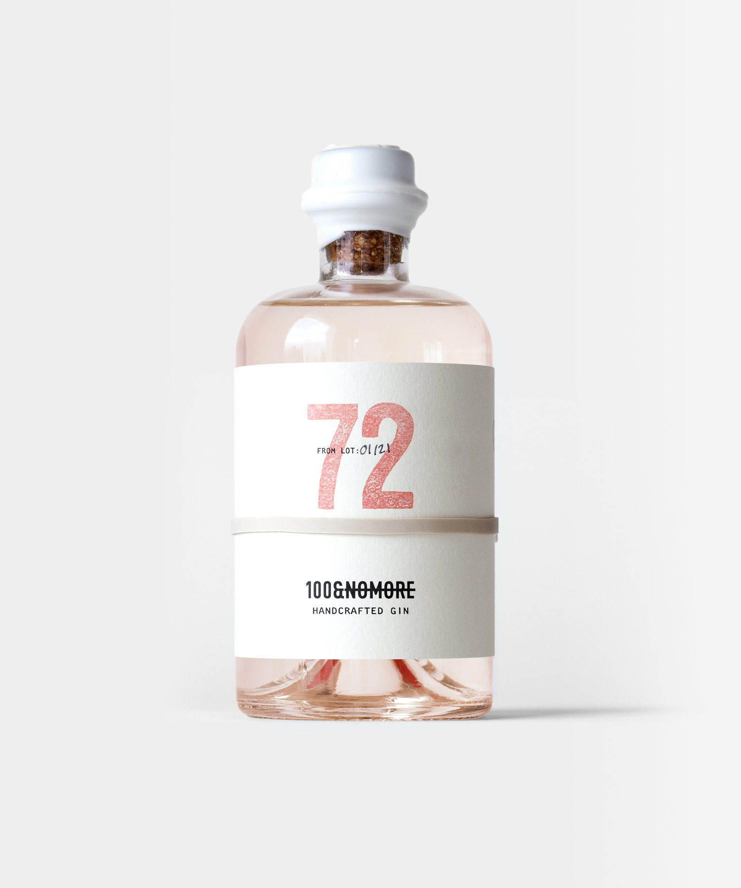
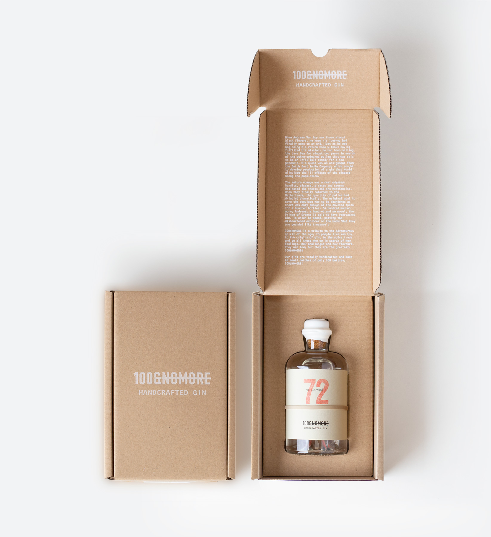
The label, non-adhesive and held in place with a rubber band, features the batch number as its central element. On the reverse, a text describing the corresponding gin flavour can be read through the glass. The bottle is sealed with wax and presented in kraft cardboard boxes of one or three units, which also function as shipping boxes. As the product is sold online, this solution avoids the redundancy of placing one box inside another.


