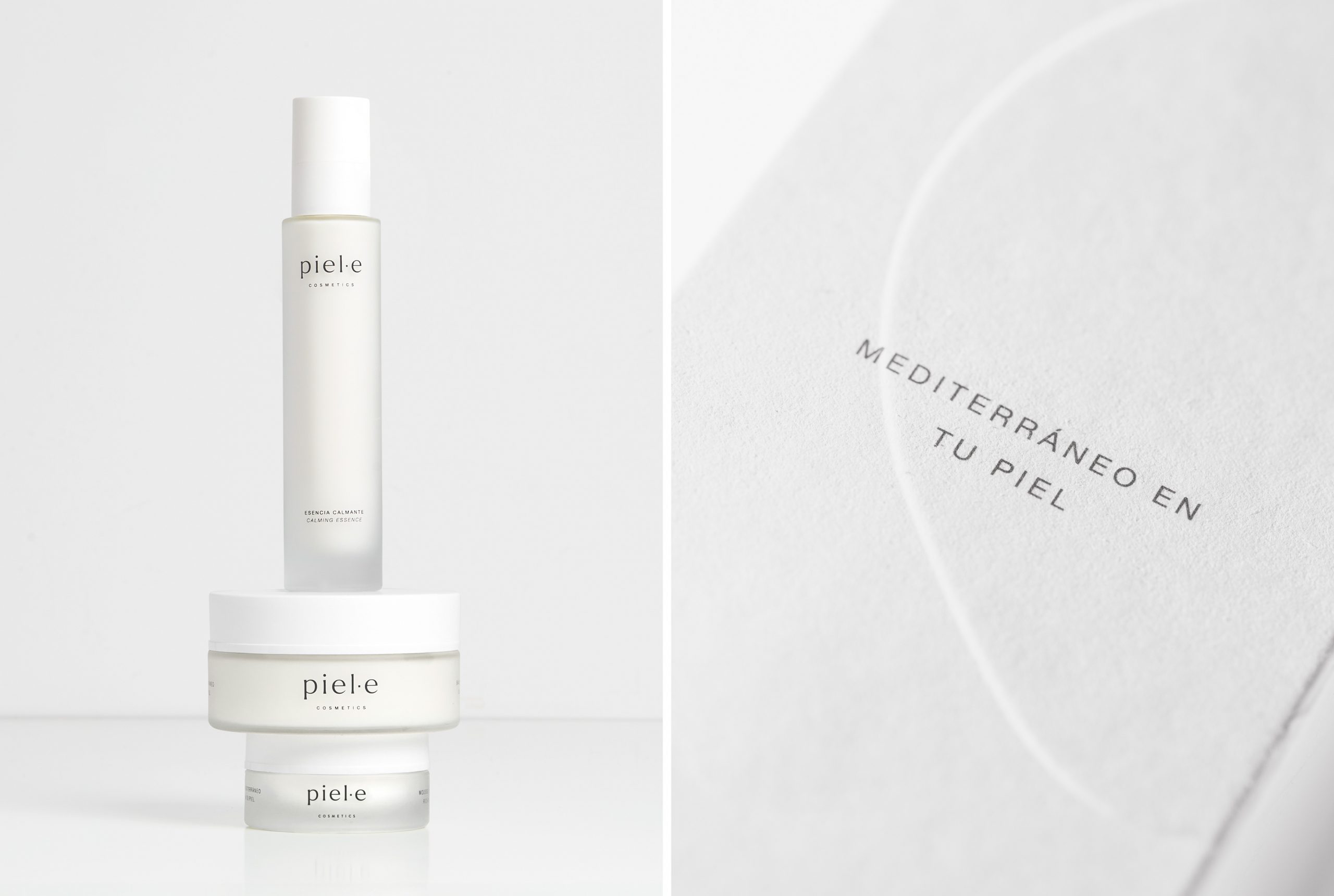
Piel·e is a cosmetics brand created with the intention of using ingredients sourced from Spanish agriculture that embody Mediterranean culture. It is aimed at individuals who wish to be part of a responsible and sustainable shift within the cosmetics industry.
We designed the logo using the Larken Thin typeface, a lowercase font with carefully balanced kerning whose stability, nuance, and expressiveness convey a sense of reliability and closeness.
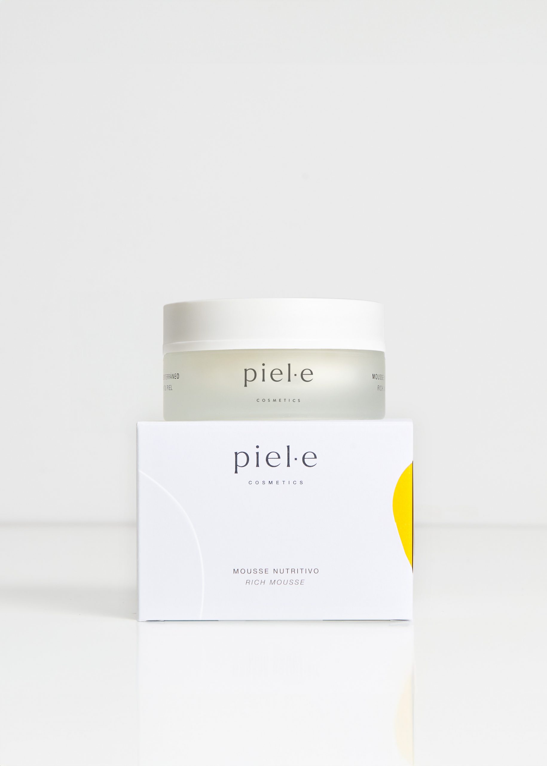
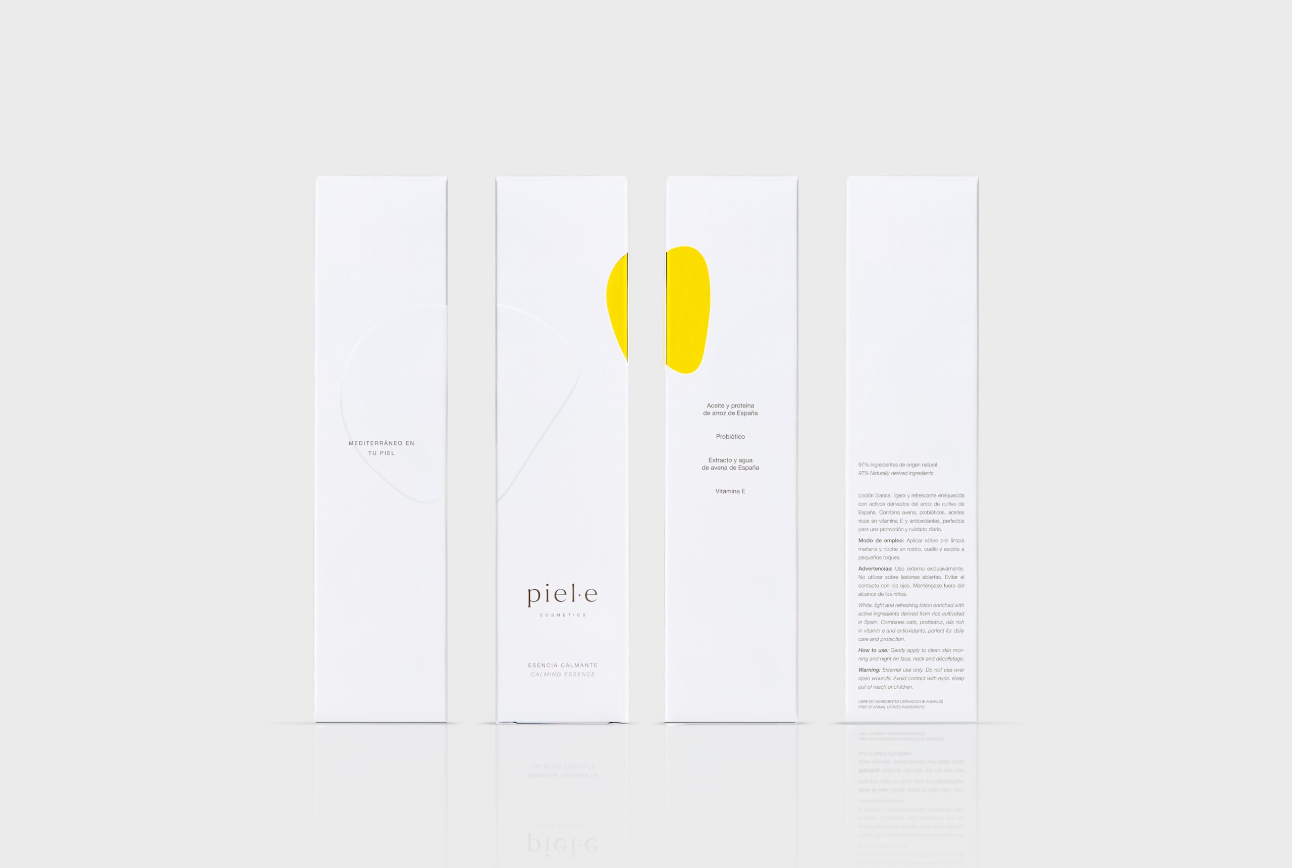
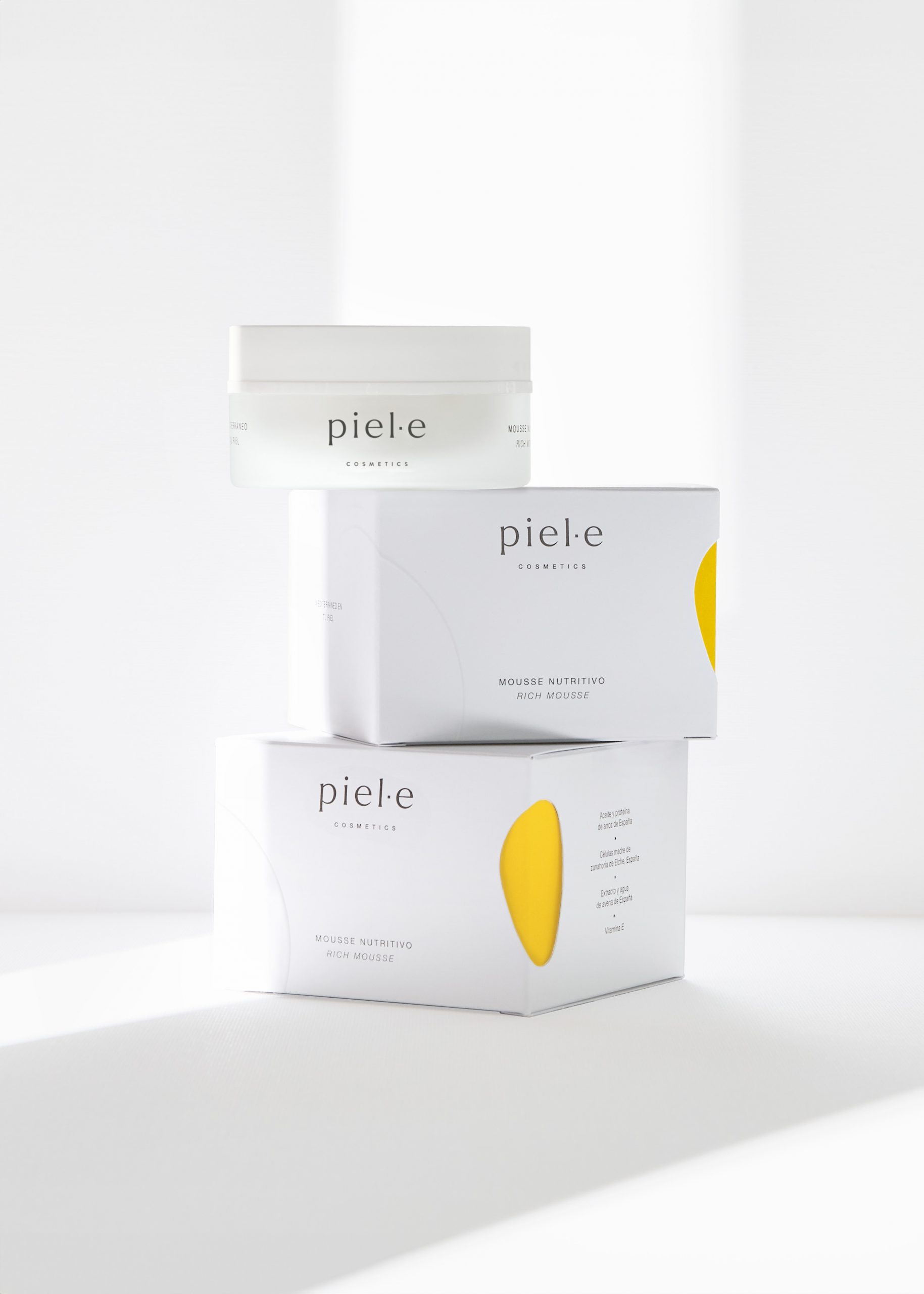
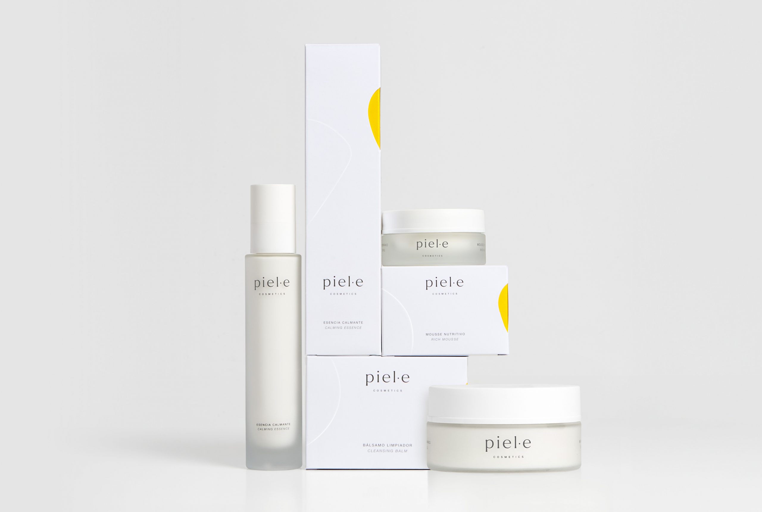
In the packaging design, we sought to express the brand’s core personality traits. Elegance is conveyed through the predominance of white backgrounds and a refined typographic composition. Sensoriality is introduced through an organic die-cut shape that reveals the colour inside the box—yellow in this first range—combined with a raised design that interacts with it. The primary packaging, made of translucent glass, further reinforces these sensations of softness and sensoriality, which lie at the heart of this premium brand.