In 2018, Nivea entrusted Lavernia & Cienfuegos with an ambitious 3D design project with a dual objective:
1. Defining a coherent packaging design language
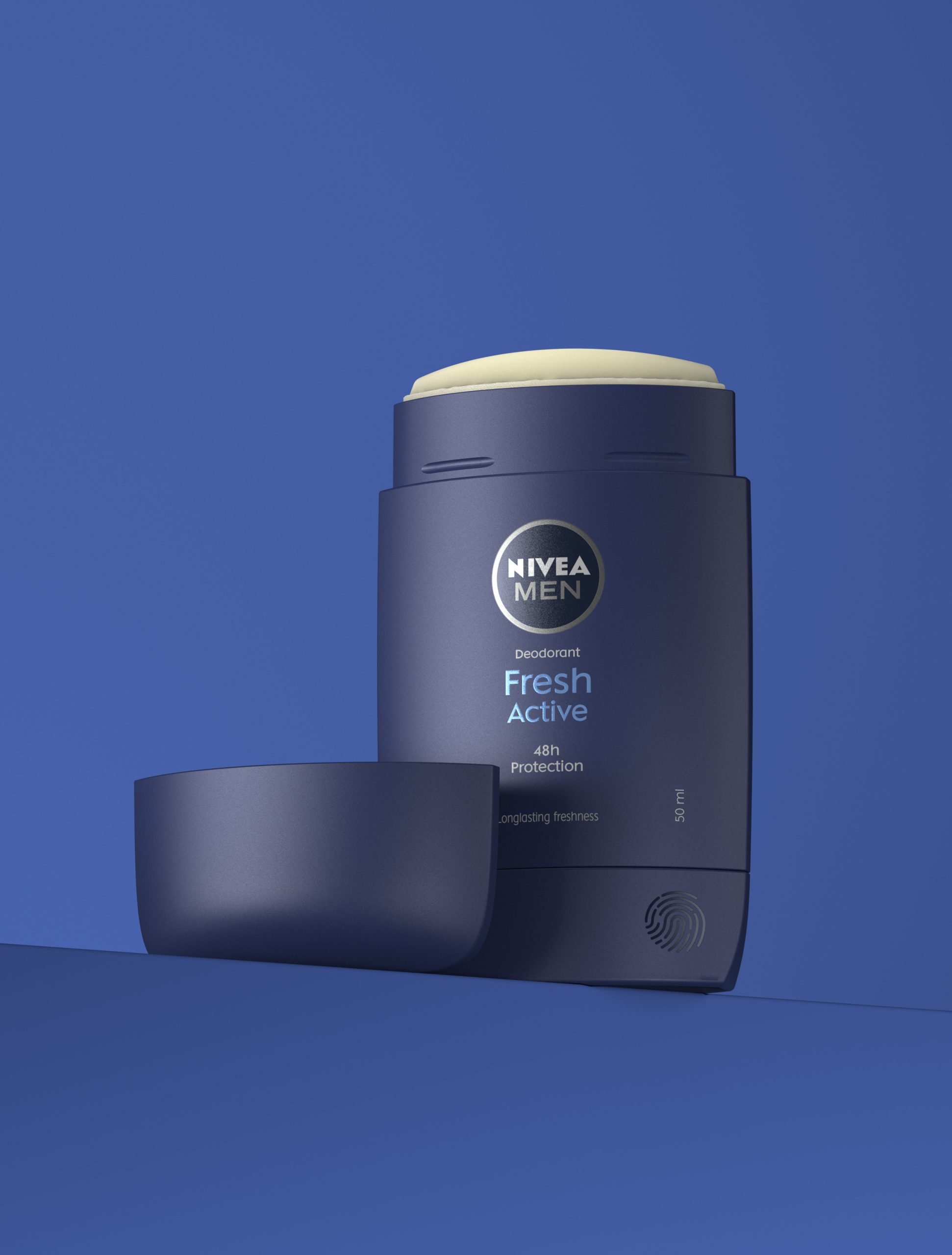
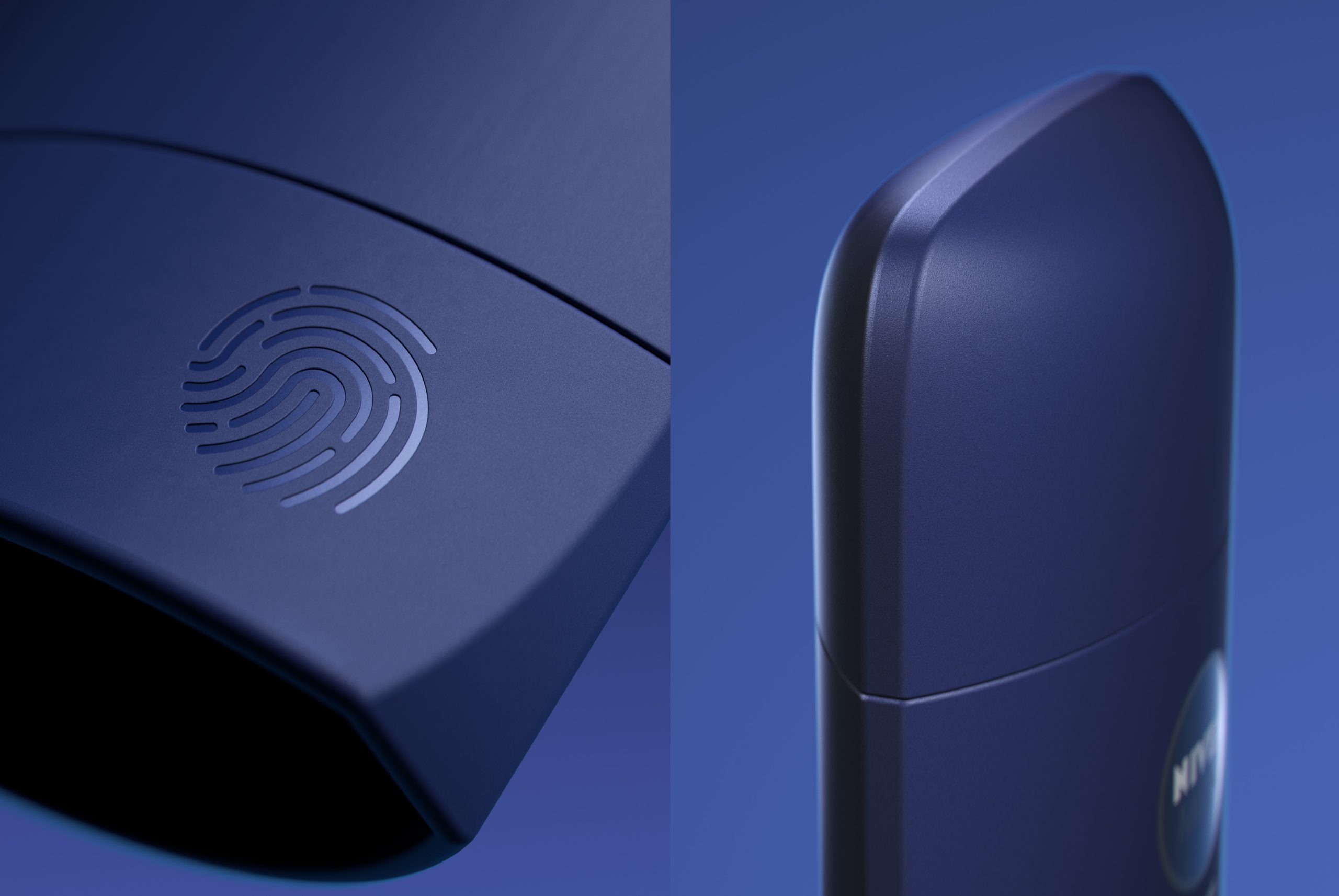
When Nivea approached us, the brand had identified the need to unify its packaging under a visual language that would faithfully reflect its DNA. We studied the company’s history, values, and positioning to develop a coherent formal language that would make its products recognisable even without logos or applied graphics. This involved an in-depth analysis of three-dimensional form, its expressive potential, and its ability to convey both product and brand identity.
2. Establishing visual codes and resources for different audiences
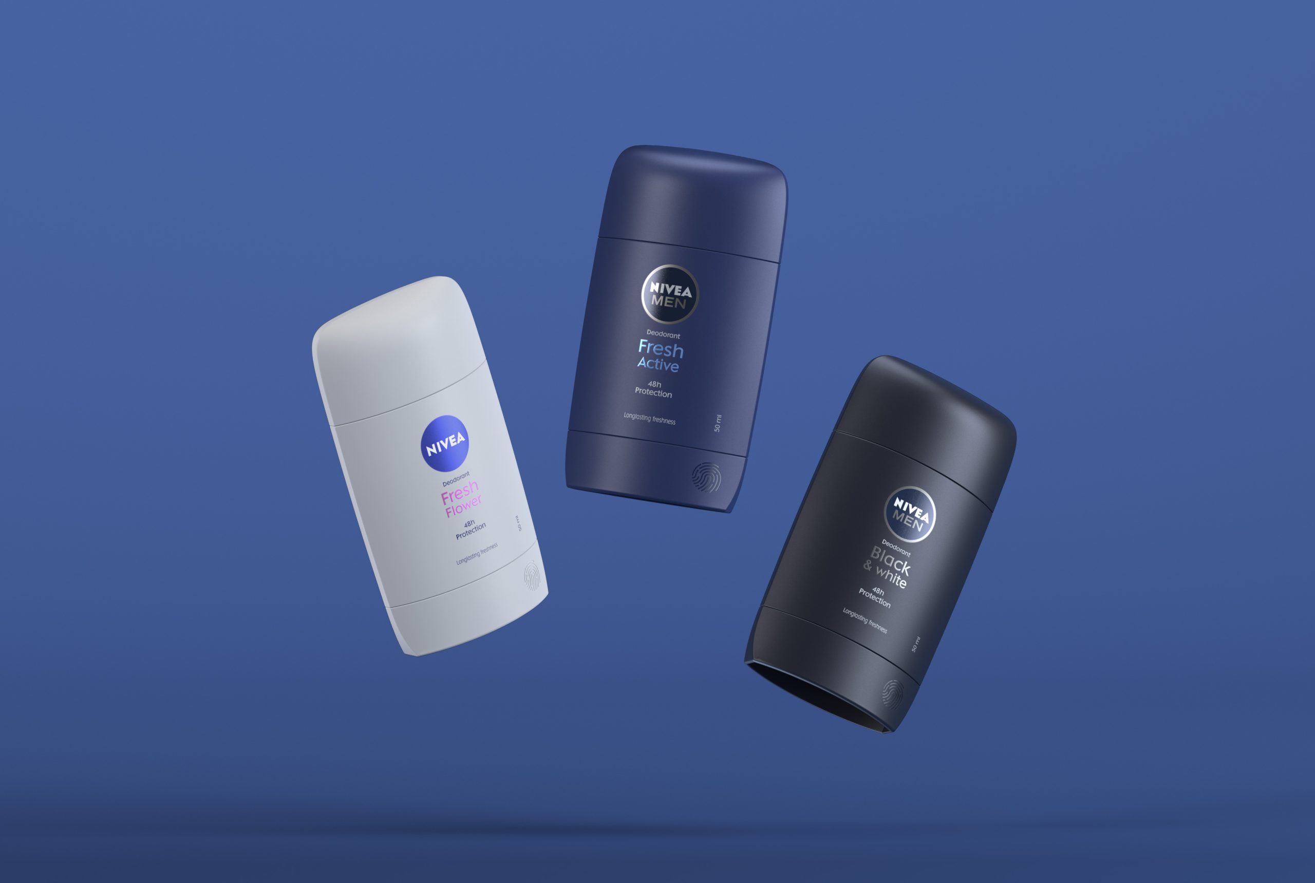
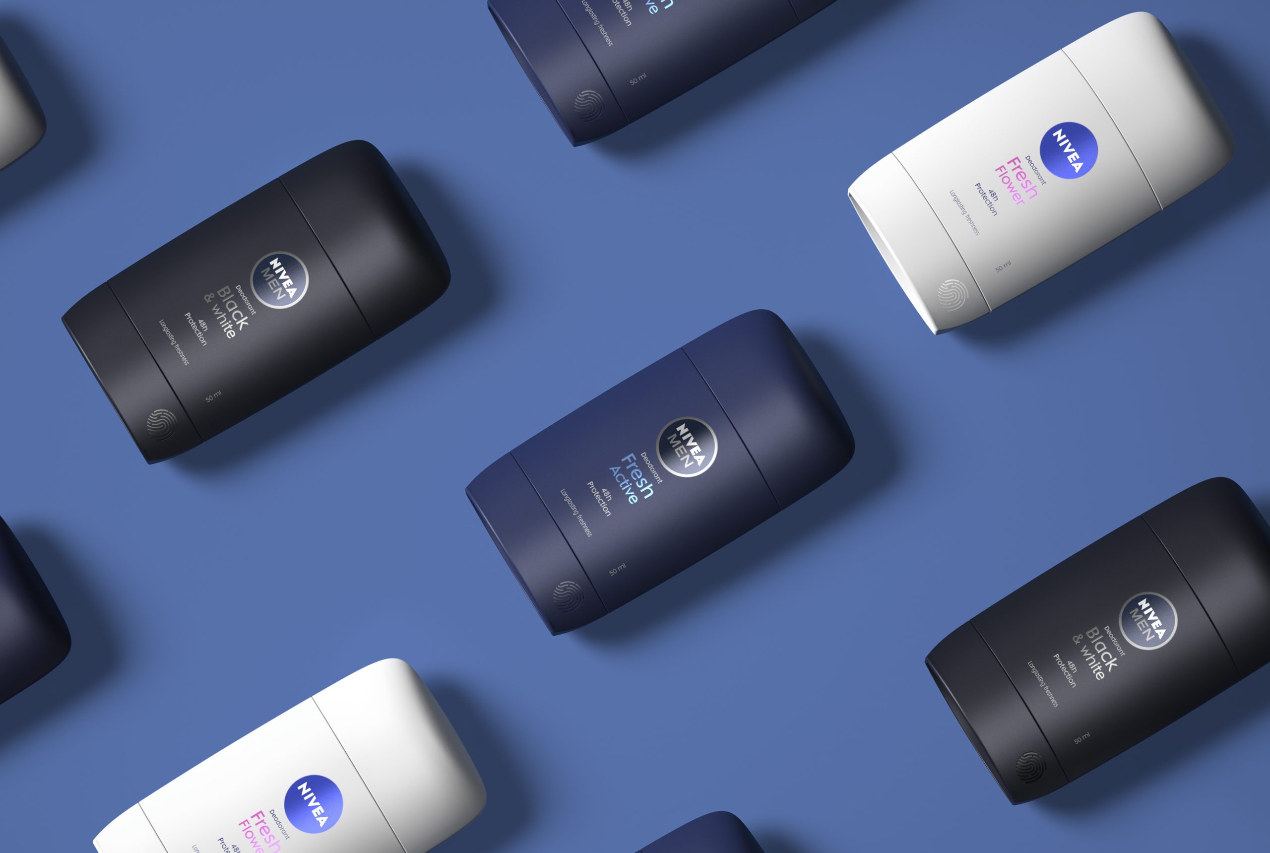
We developed specific visual codes and design tools to segment packaging for different audiences—unisex, family, male, and female—while maintaining consistency with the newly defined language.
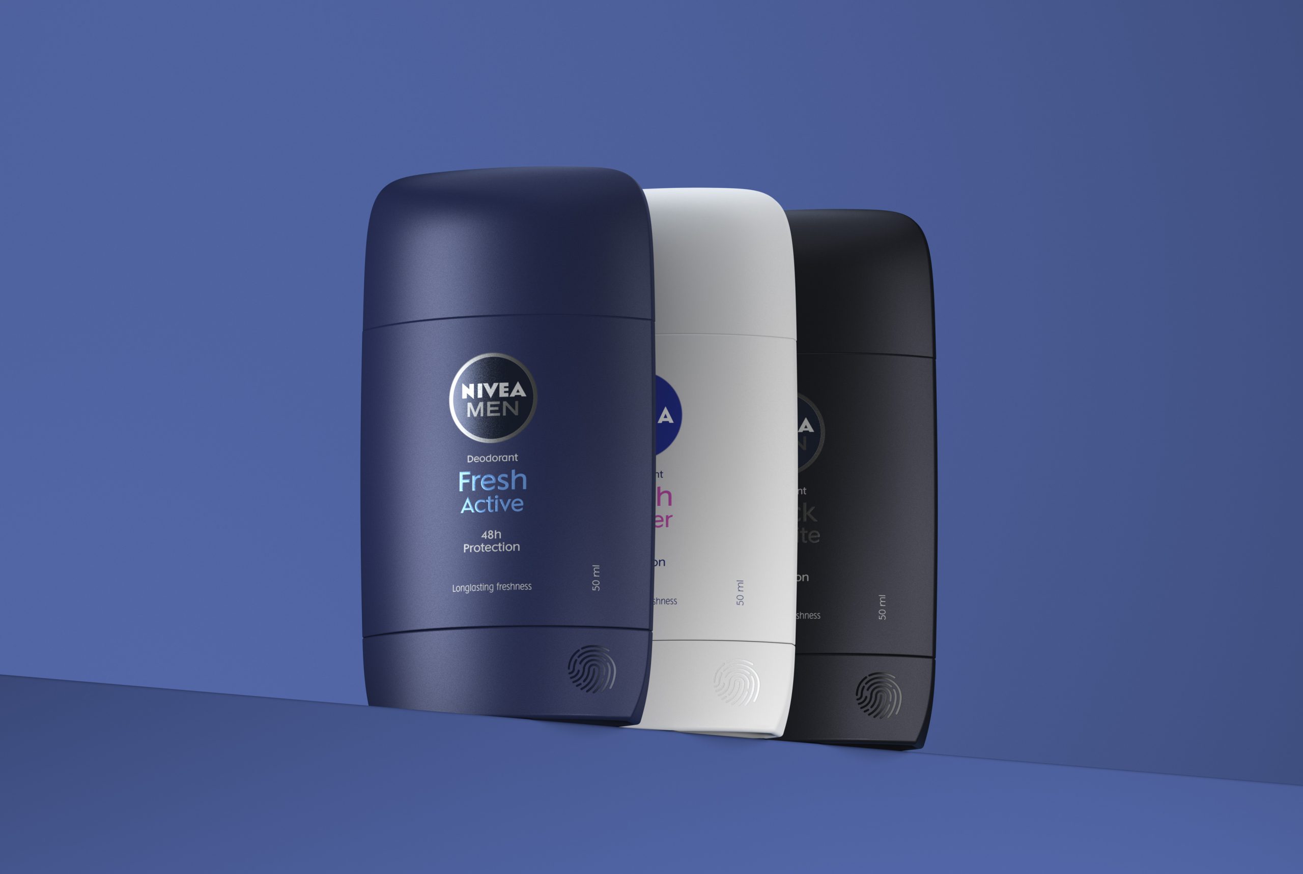
With this foundation in place, we went on to design a wide range of packaging formats, including deodorants (stick, spray and roll-on), shower gel bottles, men’s products and the redesign of the brand’s iconic body lotion bottle.
In all these projects, the brand’s commitment to sustainability was a constant priority, reducing the amount of plastic used compared to previous packaging.
The project spanned nearly six years and involved close collaboration with Nivea’s marketing team and other key departments, including category managers (body, face, shower, etc.) and the internal packaging team.
The first product to come out of this work was the stick deodorant. The main challenge was to reduce plastic use by 30% compared to previous models. The design aimed to convey softness and effectiveness while maintaining a unisex design language, as it is intended for both men and women.