Update cookies preferences

Ego

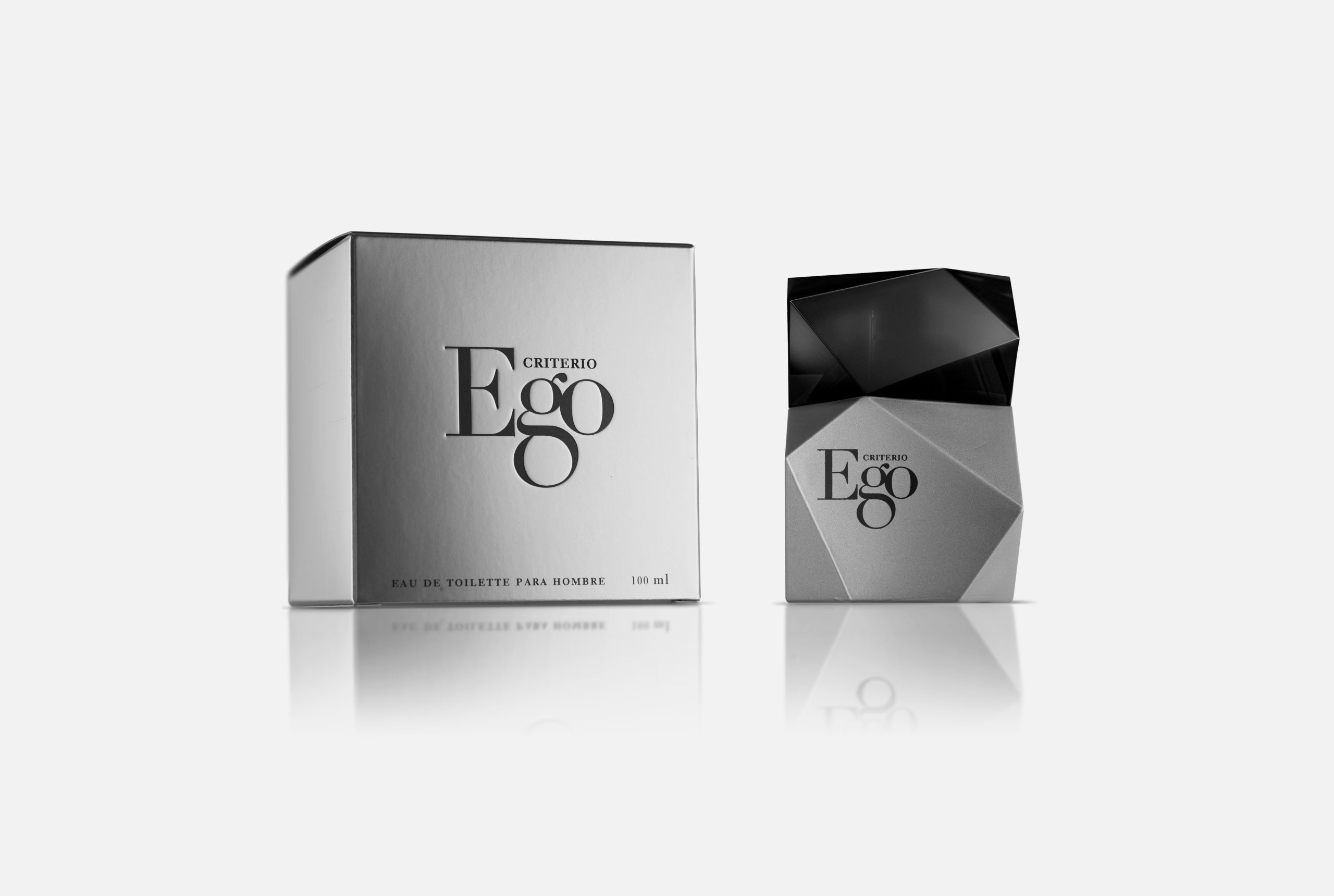
Structural and graphic design for men's fragrance. Cosméticos RNB. 2010

Ego aims to connect with a modern audience, concerned about their appearance, for a sophisticated elegance. The faceted glass pack has been painted in matte silver, such that the volume of the piece is solid and clearly defined. Ego uses a visual language which is direct and at the same time refined. The logo has been dealt with equal strength, starting with a Didot typeface in which the characteristics of the letter ‘g’ have been enlarged so that in context, three letters together form a single entity with more personality. It is distributed exclusively at the Mercadona chain of supermarkets.