Comotú
Women's and Men's Fragrances
Client RNB laboratories
Year 2005
Logo
Packaging
Product Design
Fragrances
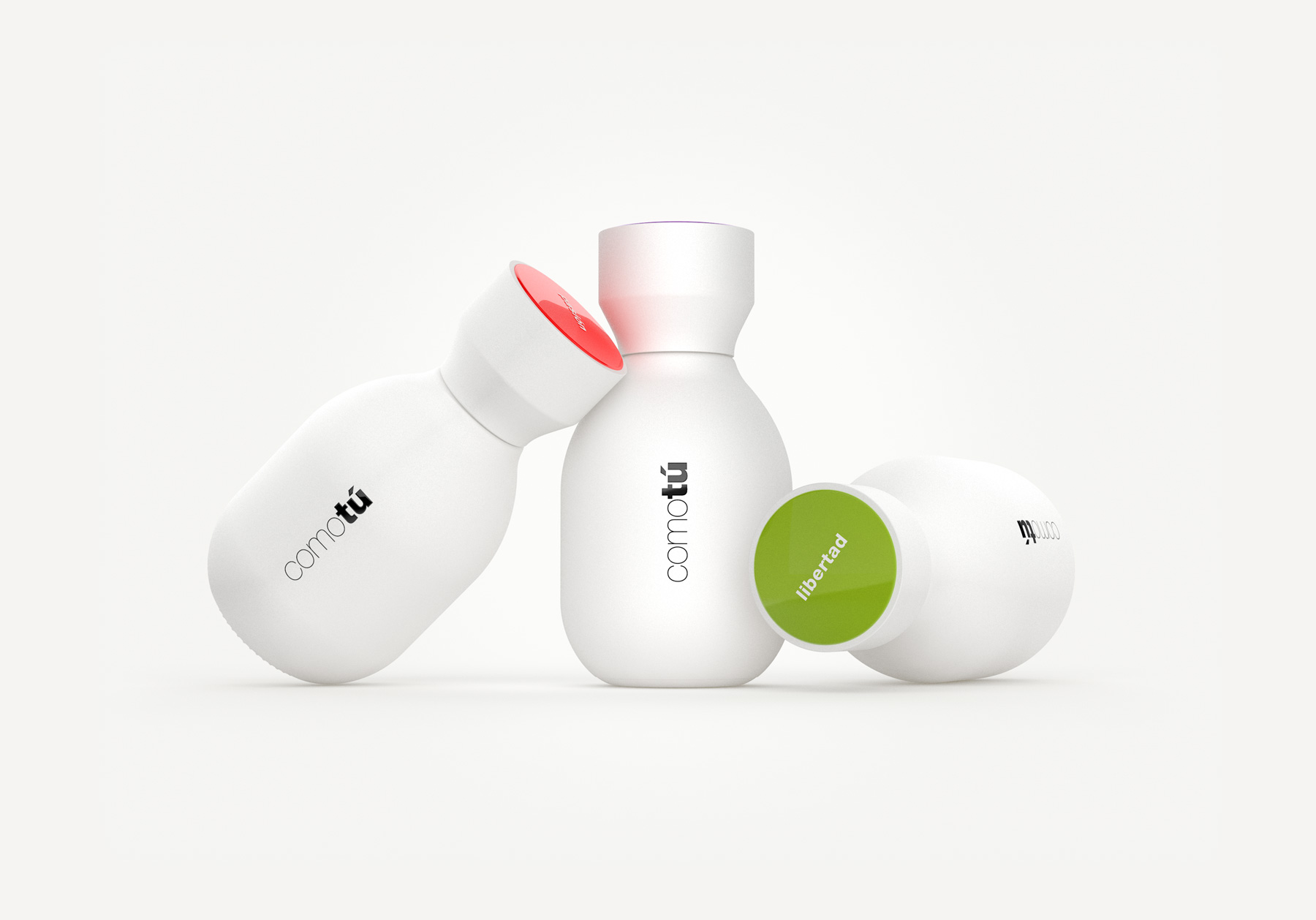
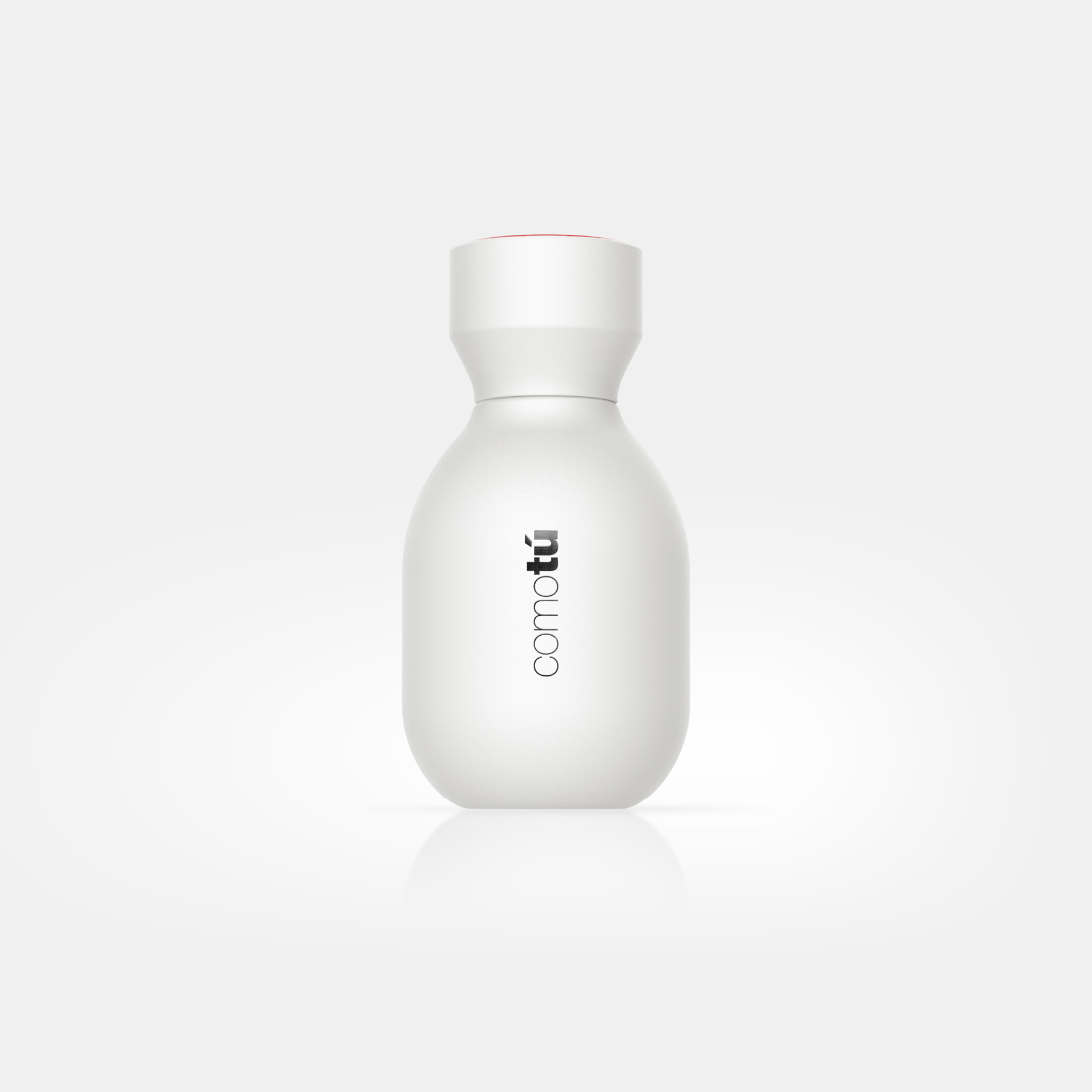
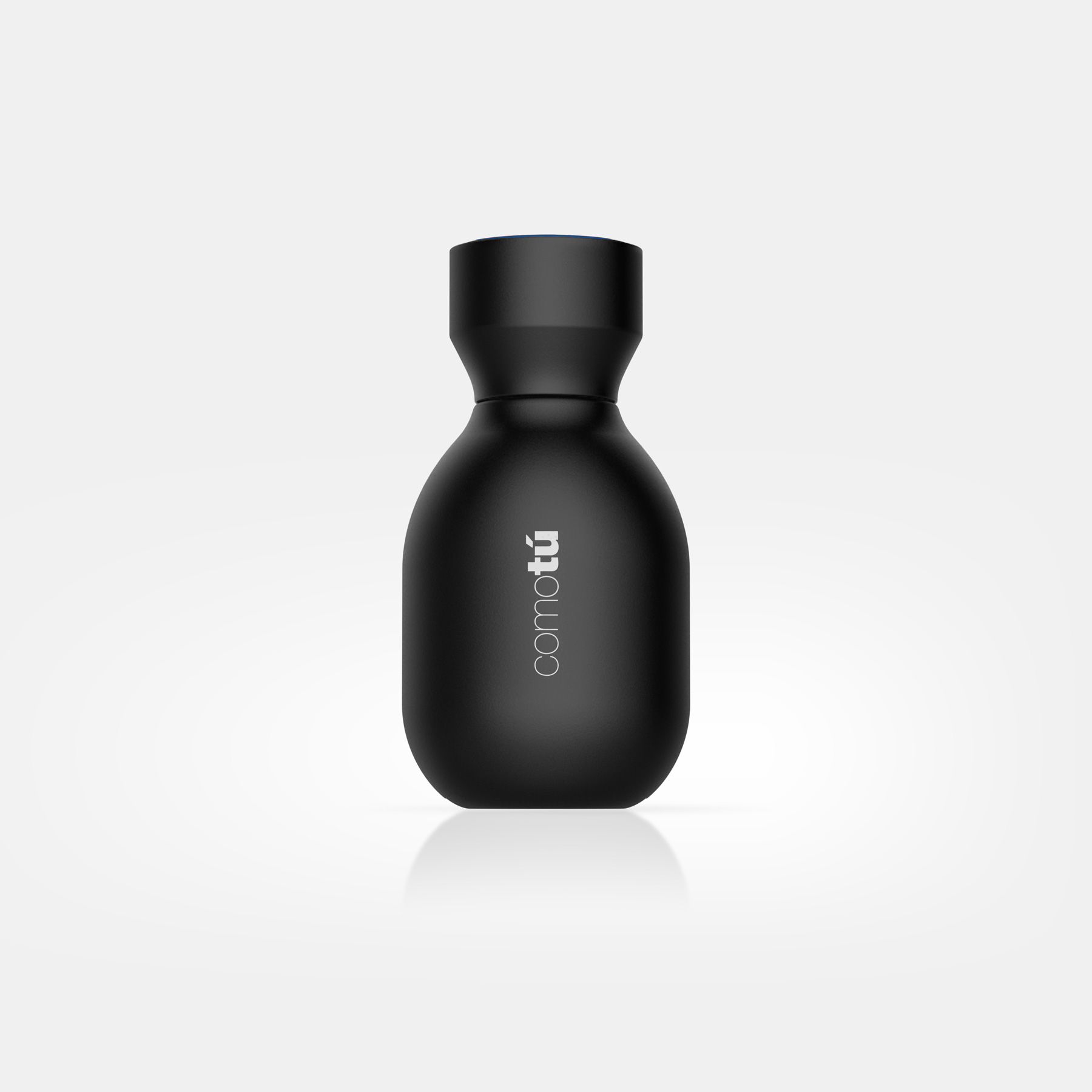
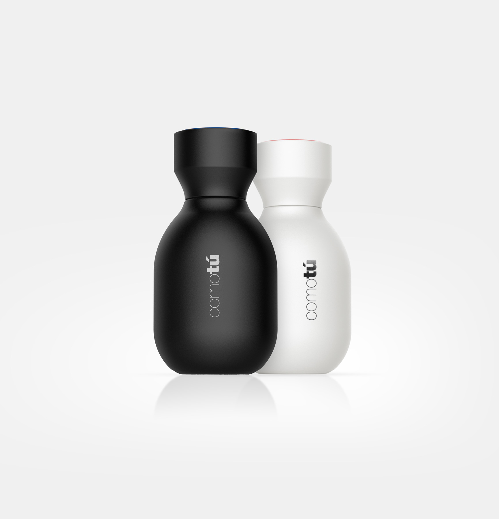
The collection of mass-market fragrances Comotú, designed for Mercadona, was conceived as a simple product, aligned with its price positioning, yet with a surprisingly premium appearance. In order to build a strong brand image while minimising production costs, a single bottle design was used for all eight fragrances: four in black for men and four in white for women. The different scents within the range are distinguished by coloured caps.
The bottle features soft, rounded forms, while the secondary packaging makes use of gloss finishes or metallic inks. The overall design conveys qualities of modernity and high perceived value at a highly competitive price point. The success of its launch clearly demonstrates that a mass-market product can benefit greatly from thoughtful and well-executed design.


