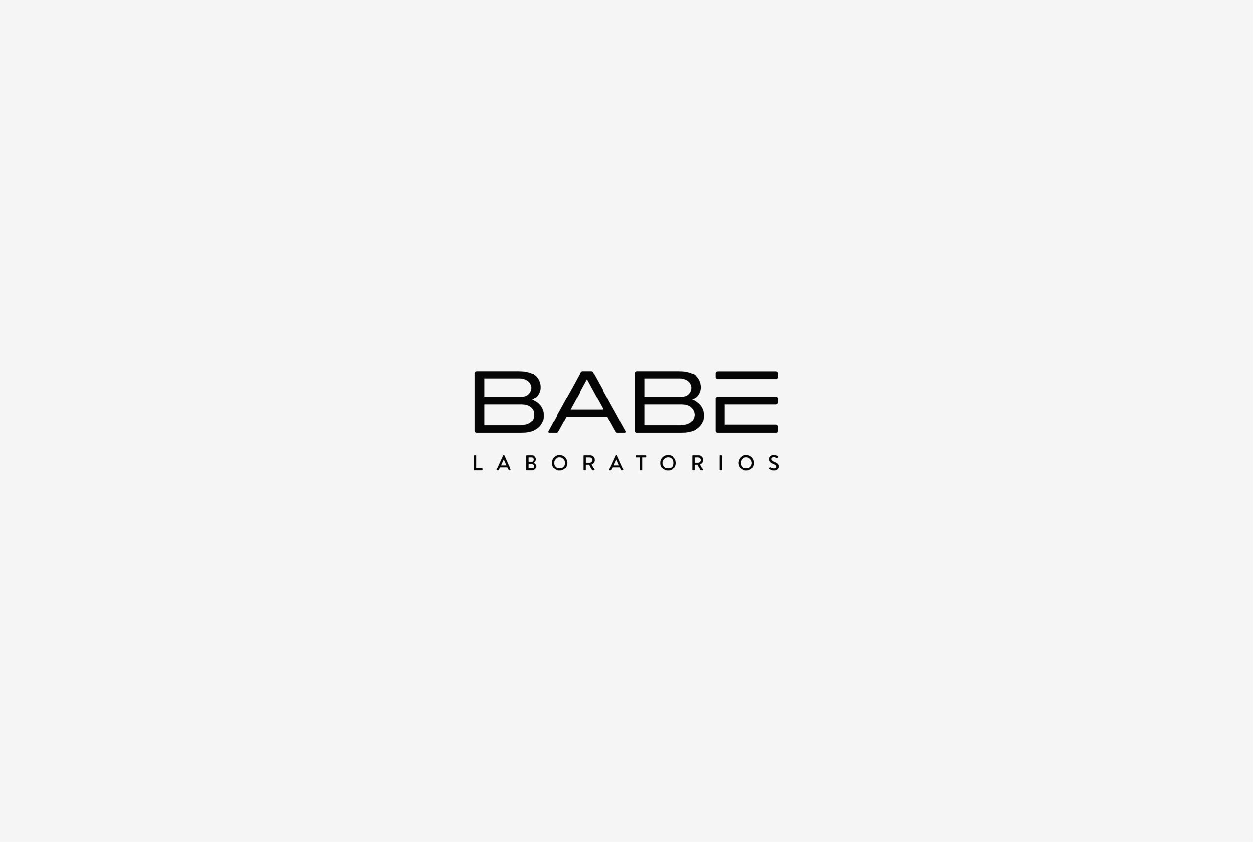
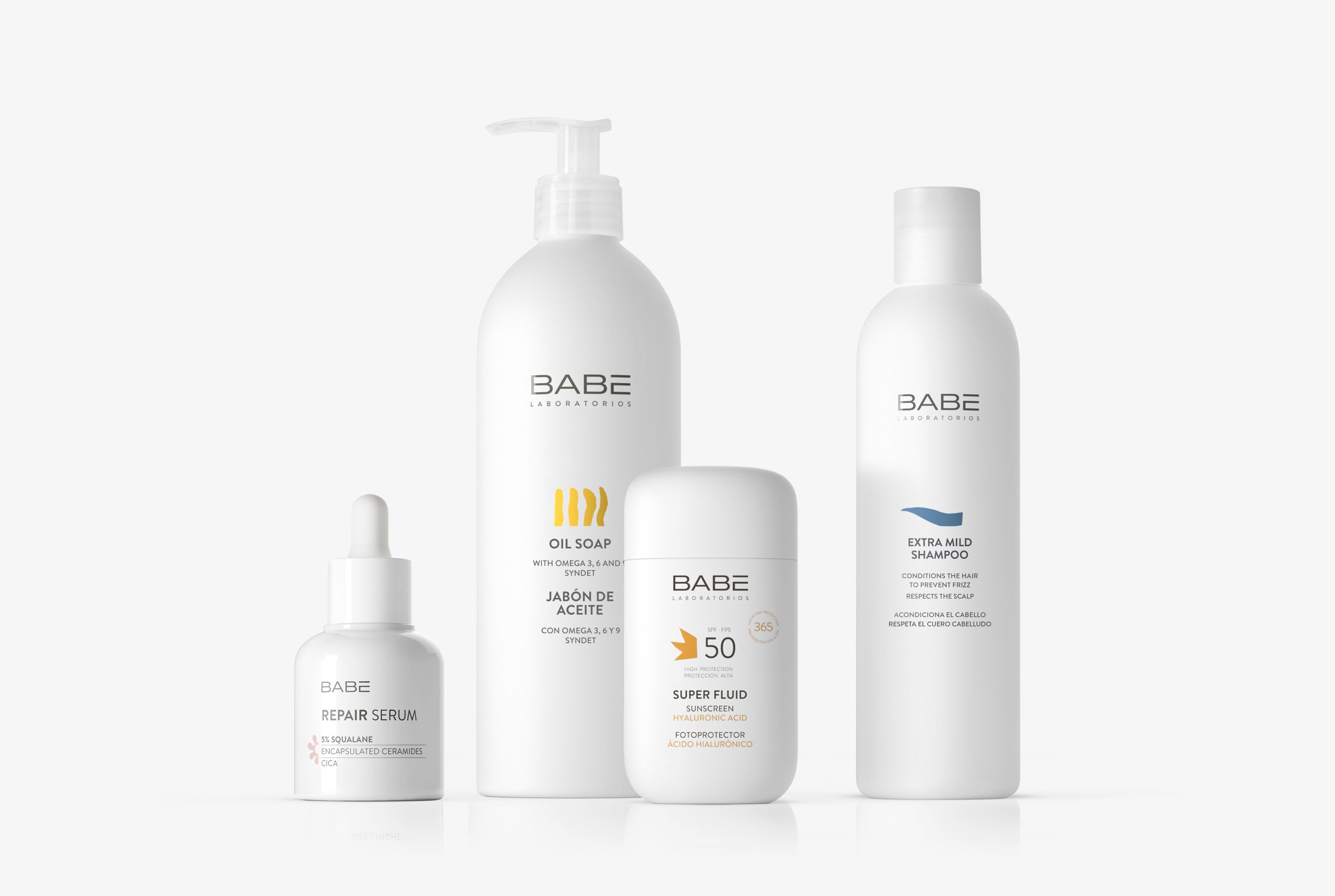
As Babé initially began selling exclusively through pharmacies, we proposed a graphic language for both the brand and its packaging that balanced pharmaceutical (scientific) codes with cosmetic (stylistic) ones. It was also essential to distance the brand from any infant-related connotations that the name might inevitably suggest.
For this reason, we opted for an uppercase typeface, creating a compact and professional block in which the accent mark is contained within the text box, ensuring that nothing overflows and that the composition remains controlled, precise and clearly defined.


