

“The making of” Experimenta66 [Spanish text]
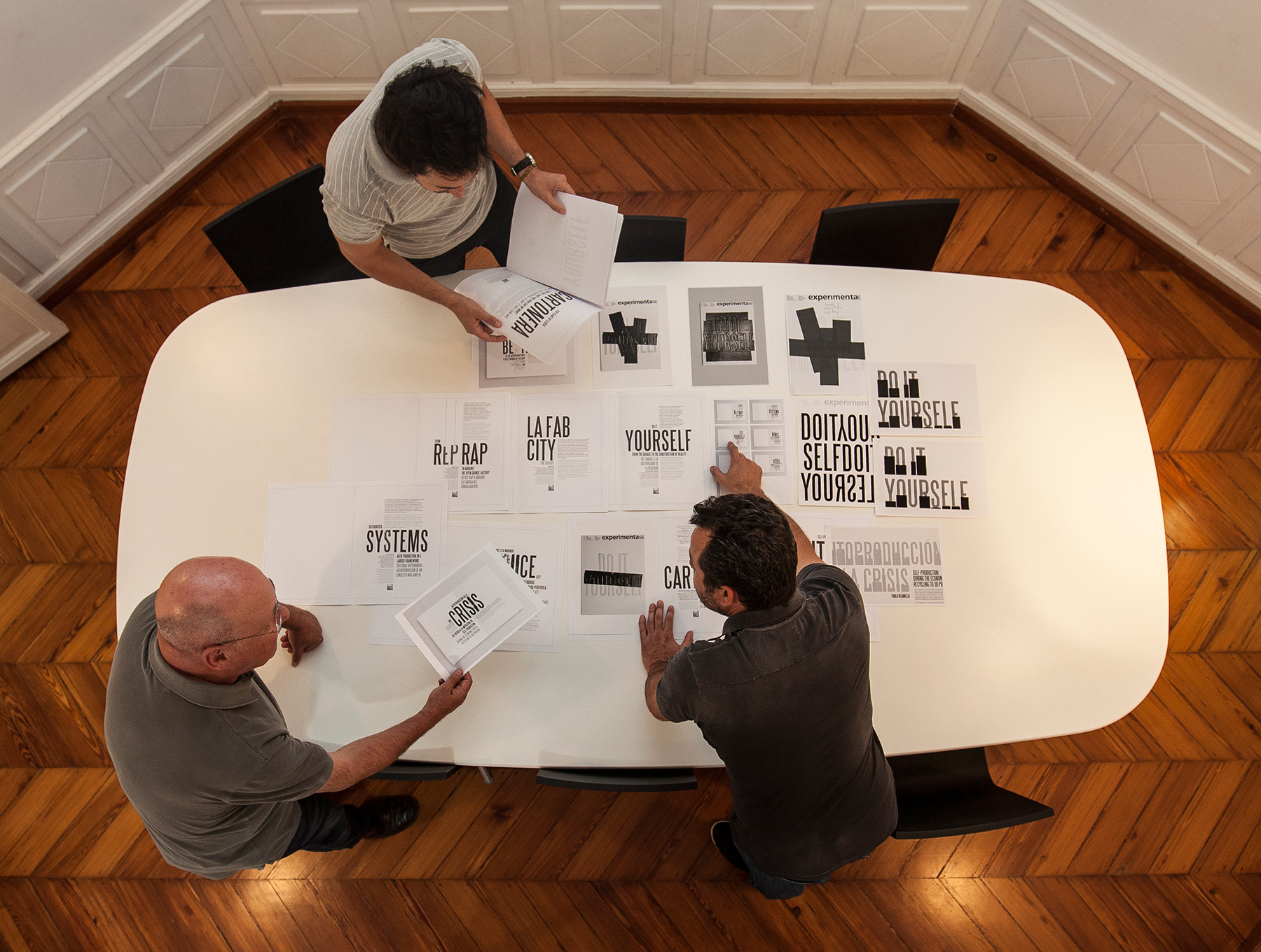
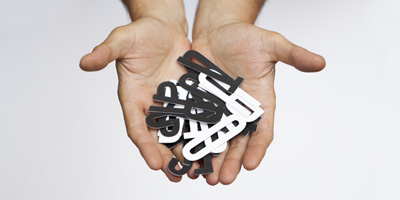
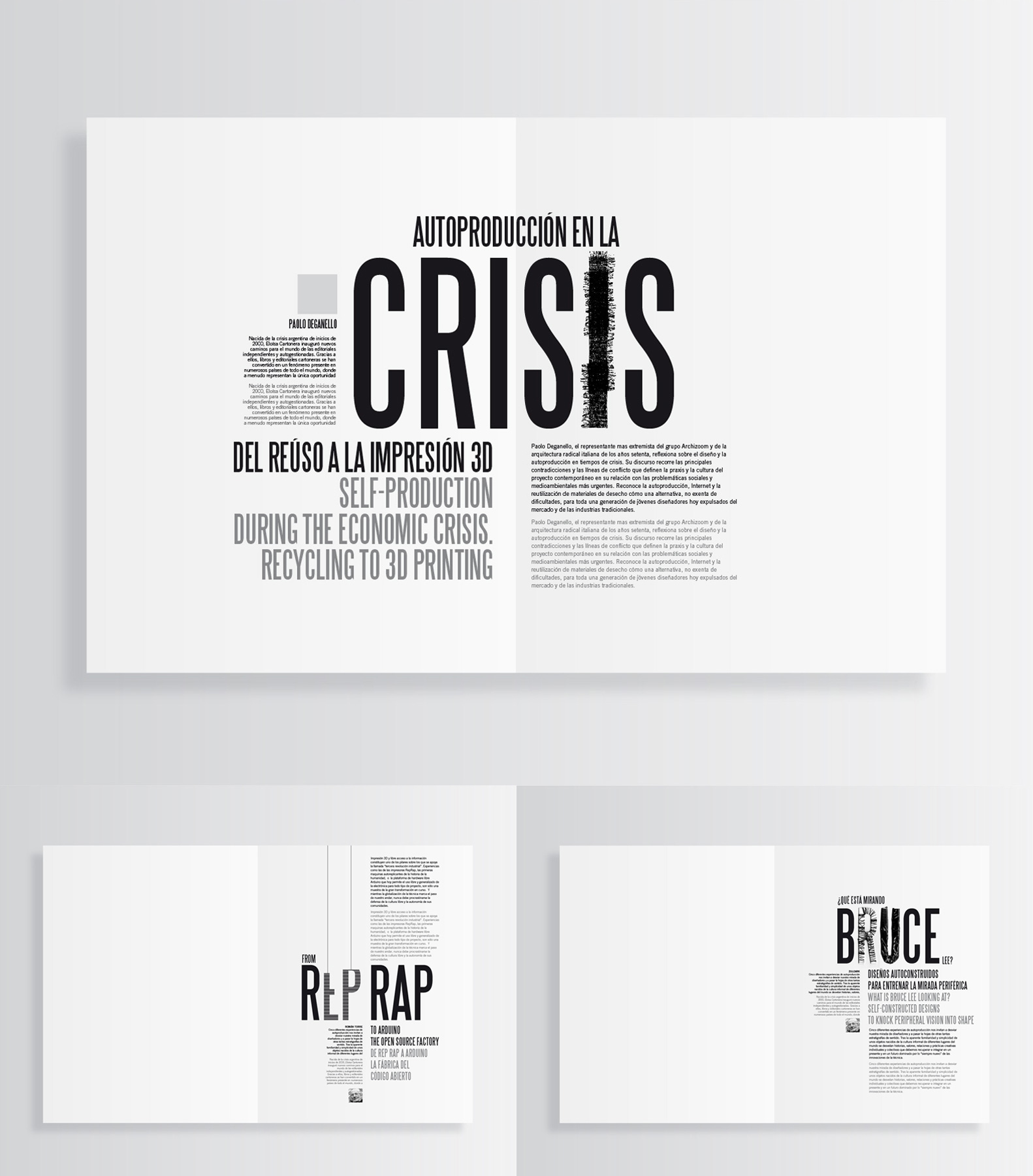
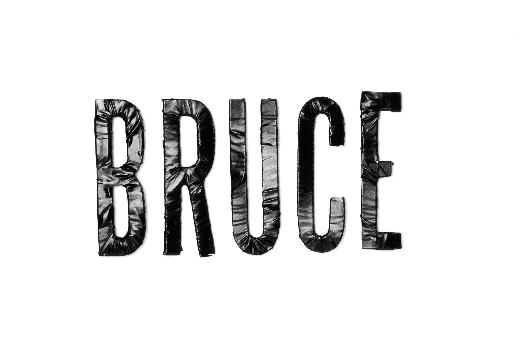
A los diseñadores nos gusta empezar a trabajar con todo el contenido, textos e imágenes definitivos encima de la mesa. Así nos aseguramos de que las decisiones que tomamos van a funcionar en todos los casos y además podemos tener presente la estructura definitiva de la obra. Y el tiempo. Sin sorpresas. Pero cuando se trata de una revista, eso es imposible. No hay manera. Los autores se retrasan, el editor se desespera, las imágenes no llegan, hay que cambiar un montón de cosas, traducir, corregir, retocar… No hay más remedio que armarse de paciencia y echar horas. La sorpresa es el caldo de cultivo en el que va creciendo el proyecto, con la presencia angustiosa del calendario. El tiempo pasa, tic, tac, tic, tac… Como se trataba de un número dedicado a la auto producción la primera idea fue utilizar letras troqueladas con la expresión “DO IT YOURSELF” para que cada uno pudiera componer su portada. Para explicar al lector qué cosas podría hacer con esas letras pensamos en usar los titulares de las portadillas como ejemplo. Se trataba de mostrar posibilidades. Una era la de manipular alguna de las letras: forrar, envolver, pegar con cinta adhesiva, cortar, doblar e incluso fingir cosidos, volumetrías o el proceso de elaboración de un impresora 3D construyendo las letras corpóreas. Es decir, usando los lenguajes propios de la autoproducción. Cutter, tijeras, hilo, cuerda, cinta adhesiva… y a probar. Cortamos algunas letras, las troqueladas de verdad ¡no estarían hasta el último día!, y nos pusimos a ello. Nos parecía interesante que cada manipulación tuviera relación con el contenido del artículo, lo cual se antojó una quimera, por muchas razones, a medida que nos iban llegando los textos.
Al avanzar en esta idea (tic, tac, tic, tac…) nos iba invadiendo el temor de que el resultado pudiera ser un batiburrillo de efectos, gratuito y además falso porque tendríamos que fingir los manipulados ya que no teníamos letras troqueladas. Renunciamos, pues, a los efectos y empezamos a componer con la Steelfish sin manipular (tic, tac, tic, tac…). Cuando estás en un proyecto como este el tiempo no transcurre de una manera lineal y constante. No. Se va acelerando progresivamente. Tic…tac, tic..tac, tic tac, tictac… Decides troquelar letras y haces un boceto que va a la imprenta para que estudien su viabilidad con el troquelador. Pasan unos días y no hay contestación. Bueno, hay tiempo. Un día llamas y preguntas. “¡Ah! El troquel” -te contestan- “¿No te había dicho nada? Hay que separar mucho más las letras entre sí.” “¡Vaya!” –dices_ “Y ¿cuánto?” “No sé. Lo pregunto y te lo digo”. Dos días más y al fin llega la respuesta, un poco ambigua e imprecisa, pero renuncias a concretar más y te pones manos a la obra para corregir la composición. Lo cual no es tan fácil como puede parecer. Al día siguiente lo envías para que lo aprueben y vuelves a llamar: “El del troquel está fuera estos días”. Mientras te empieza a entrar un sudor frío, porque miras el calendario y ves qué cerca está la fecha de entrega (tic, tac, tic, tac…), comienzas a replantearte las portadillas, a pedir que te envíen los textos de introducción de cada artículo, las biografías de los autores, sus fotos… y a componer de distintas maneras hasta encontrar la que te gusta (tic, tac, tic, tac…), con la esperanza de que lo que haces se adapte bien a cada caso y funcione. Al final todo encaja. Las letras troqueladas tardan en llegar, pero llegan. El problema de que al abrir la revista se caigan todas al suelo, se resuelve. Lo de la realidad aumentada funciona. Y lo mismo con otro montón de dificultades que acaban por solucionarse. La revista se imprime. Parece imposible, pero se imprime en forma y tiempo. Tienes la sensación de que las cosas salen porque detrás hay un equipo que se ha dejado la piel (editor, diseñadores, fotógrafo, impresores…). Y te preguntas, por enésima vez, si siempre ha de ser igual, si no se puede hacer de otra forma. Hasta que alguien vuelve a llamar y…
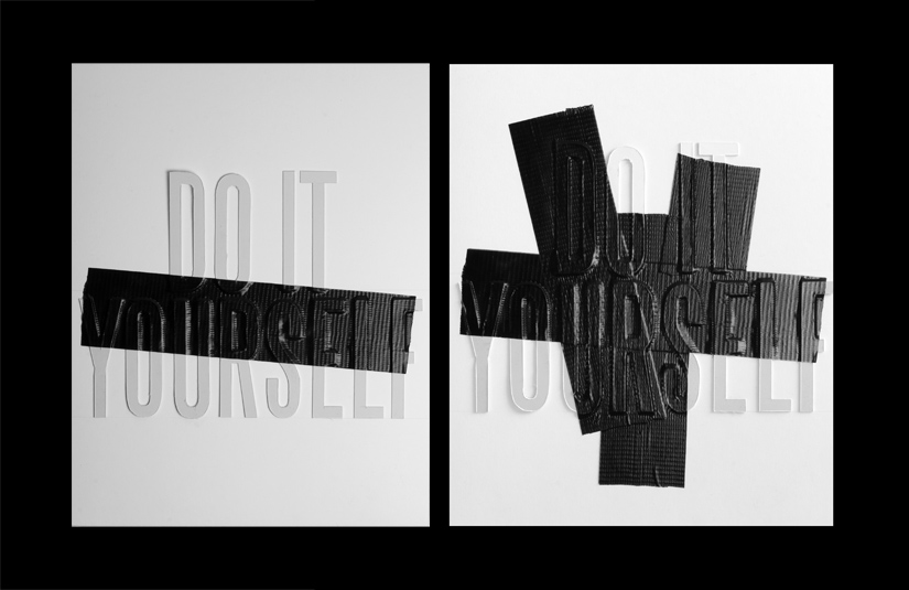
La idea para la cubierta fue proporcionar a los lectores un juego de letras troqueladas para que ellos mismos se pudieran diseñar su propia portada (Do it yourself). Para explicar a los lectores qué podían hacer, se materializaron unas cuantas ideas utilizando las letras troqueladas. La intención era mostrar en el interior de la revista algún ejemplo de “rediseño” de portada. Sobre estas líneas se muestra uno de los bocetos creados, en este caso con la ayuda de “cinta americana”.
See final project
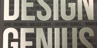
Nacho Lavernia interview for Design Genius
Recently Nacho Lavernia was interviewed for Design Genius, a book on the ways and workings of creative thinkers by Gavin Ambrose and Paul Harris.
Design Genius celebrates the creative thought processes of 69 leading artists, designers, creative agencies, animators, illustrators and typographers. While highlighting key design techniques and theories, the visual curiosities presented in this book aim to engage, provoke and inspire.
Here is the interview
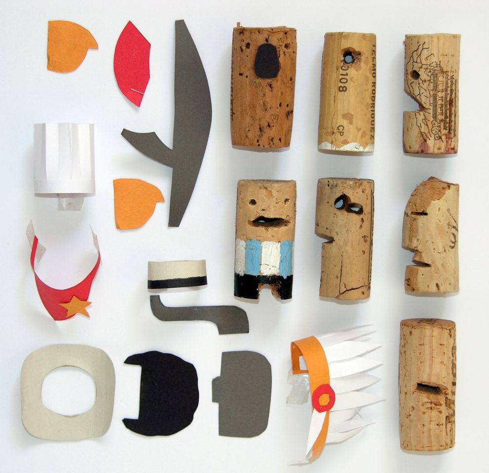
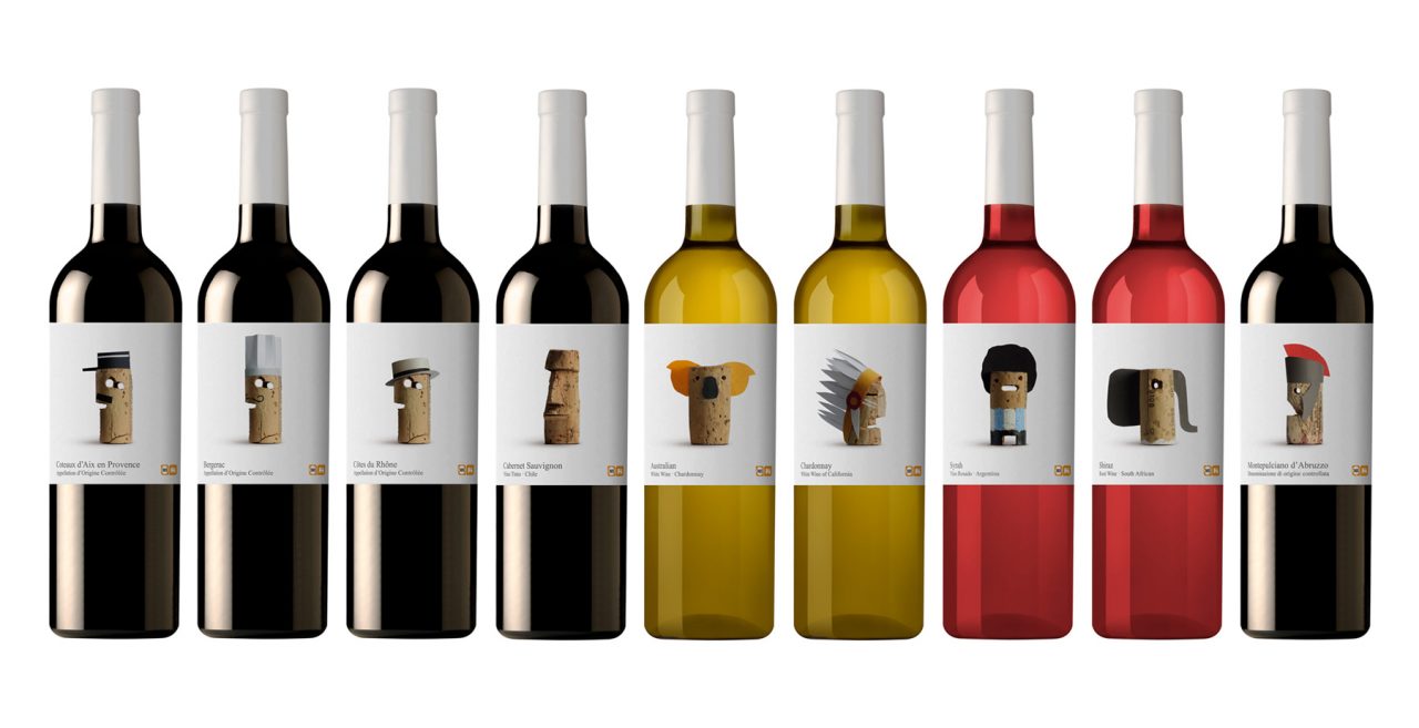
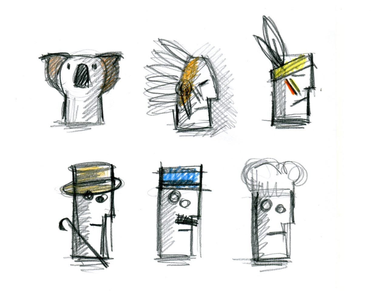
Lavernia & Cienfuegos’ design for Delhaize Vinos establishes a human connection through amateurism and the personification of corks extracted from bottles of wine. The various grape-growing regions are depicted by well-known signifiers, such as hats, that relate to specific regions. For example, a Roman centurion’s helmet for Italy and a policeman’s cap for France. There is also the explicit use of characterization, such as the depiction of footballer Diego Maradona for Argentina. in full.
Gavin Ambrose: I want to ask about the process of creating something new. Many markets are now saturated, so design has to play a more important role in brand development in the creation of new or existing products. The Delhaize Vinos project (shown opposite and on the following spread) is a good example of this, in a very crowded, saturated market you have found a new angle with a fresh approach.
Nacho Lavernia: We always try to find an original focus and then resolve it in a singular form. Sometimes, we do this successfully and at other times less so. Differentiation is now the value that is most demanded of design. Design provides other values of course but the need to differentiate brands and products has been a growing trend in recent years given that the market has become saturated, as you say. It is continually more difficult because today one competes with the whole world and therefore, you have to differentiate yourself from the greatest number of brands and products.
It is a dynamic that is starting to generate something like vertigo.
GA: How do you put a value on design? Value is a word often used in relation to design but to define exactly what this is can be tricky. Is it simply monetary value design can offer? Or does it a offer a more holistic set of improvements to how we live, to the way the world looks and acts?
NL: Any object has three values: use (its utility), exchange (its price) and significance. What is the value of its significance? Its capacity to influence ourselves and our environment. There are objects that reinforce our self-esteem or that help others see us as we want them to. The objects we posses are a reflection of our economic and cultural status. We think about cars or clothes where the value of the significance is very high. But design can add value in any of these aspects– functional improvements, cost improvements and emotional improvements produced between the object and its owner.
GA: A lot of your work makes very human connections, be it through narrative – as with the wine project – or through other senses such as touch and shape. Is the human interaction part of design something you consciously try to foster?
NL: Isn’t this the job of a designer? I think one of the things that differentiates the designer is to always work on the relationship between the object and the user. The artists or engineers that are at the two extremes of design act in another way. The first focuses on themselves, in their expressive capacity. The second on the object, on its functionality. It is the designer that has the user as their prime objective.
GA: Does your environment affect how you work?
NL: I think the work environment, that is the place, the ambience, the team, is decisive, but I also think it is a consequence of the way that each person works. That is, there is a reciprocal influence between oneself and the environment. The environment is created, or at least, you can transform it. Alberto Cienfuegos, my partner, and I have always thought this and we have tried to surround ourselves in a work environment that is at the level of our needs and also of our desires.
Design Genius