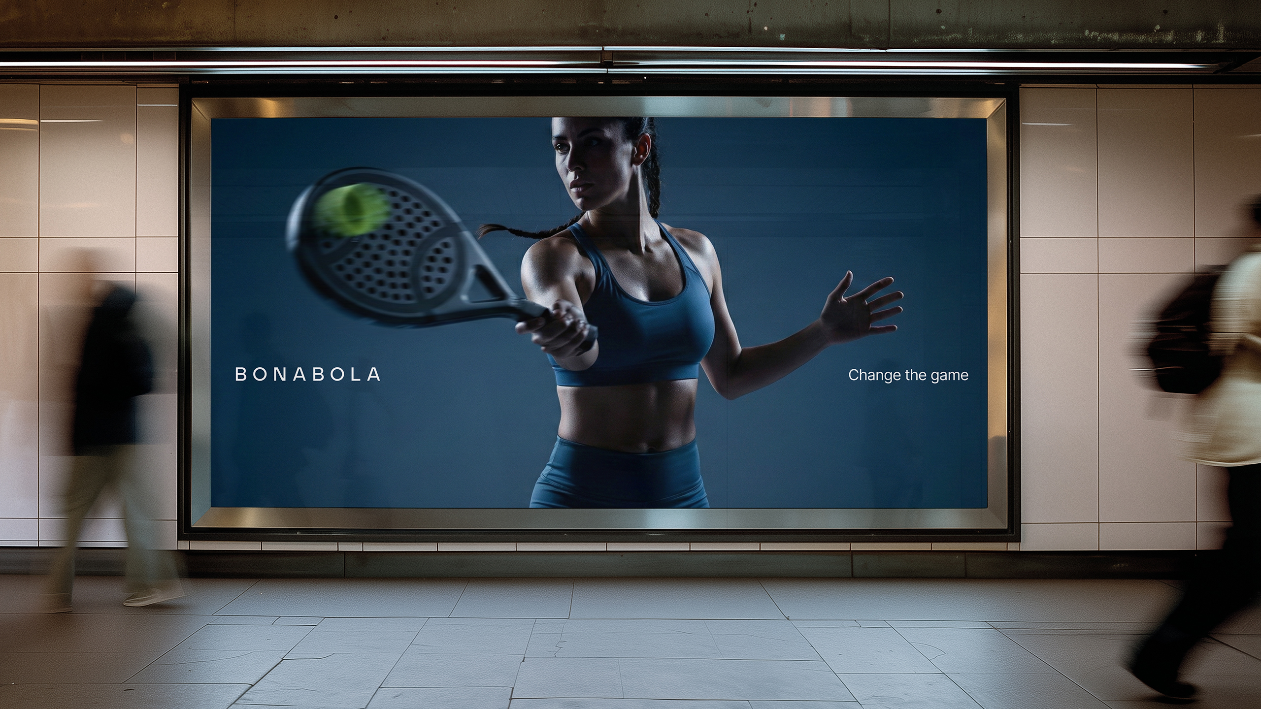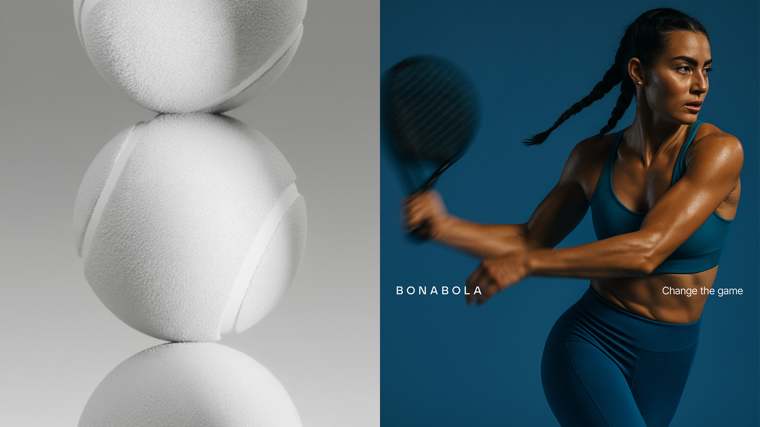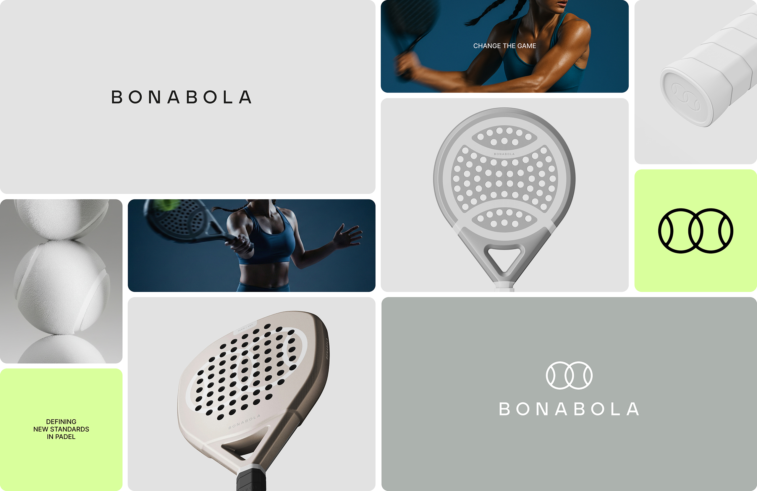
The client needed to develop the entire identity for a brand of padel-related products: naming, logotype, packaging, etc. It was conceived as a contemporary brand, with the ambition of moving away from the aggressive and overloaded visual codes that dominate the sector. The aim was to create a distinctive identity that would position the company as a modern, precise and product-focused brand.
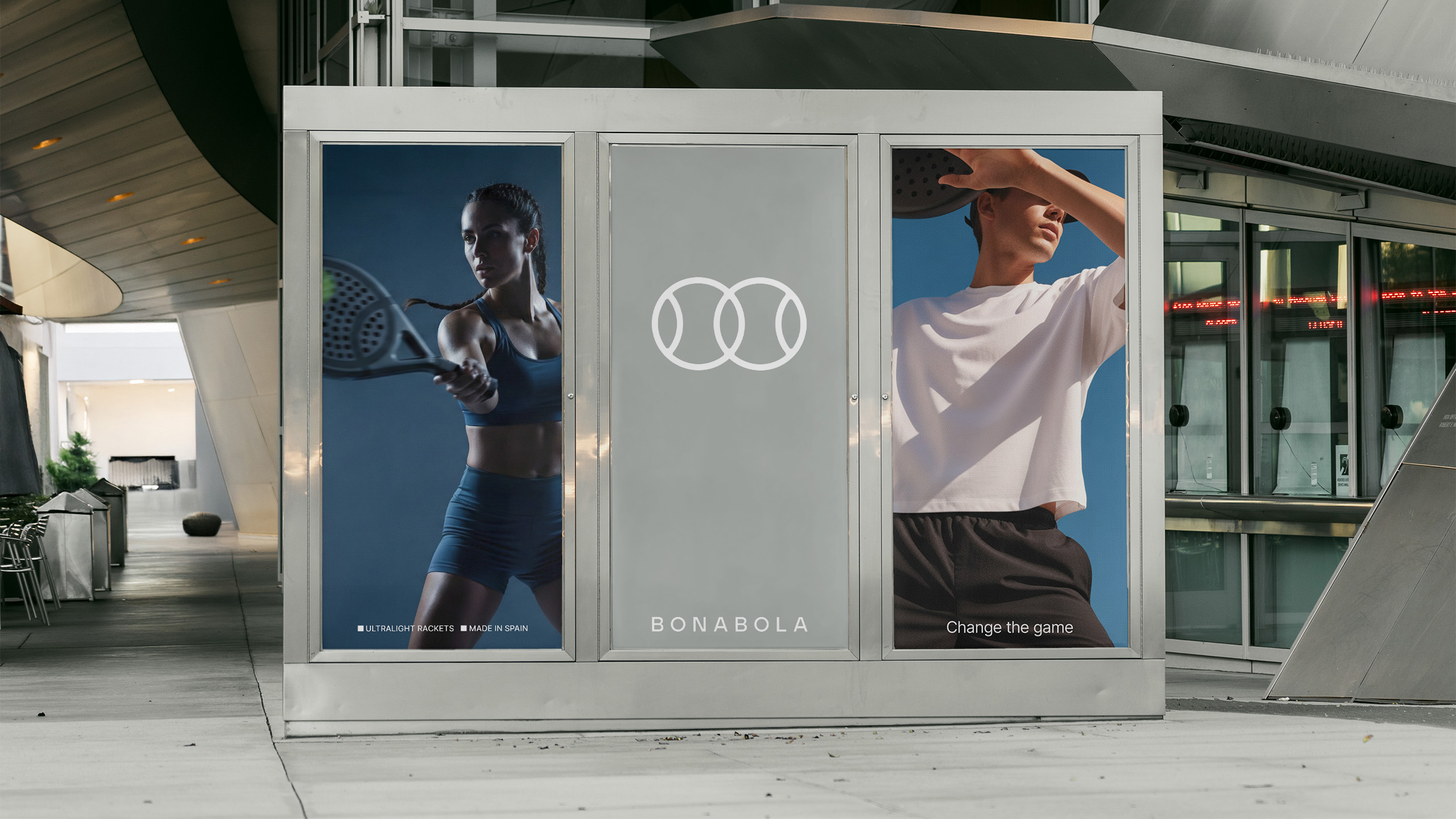
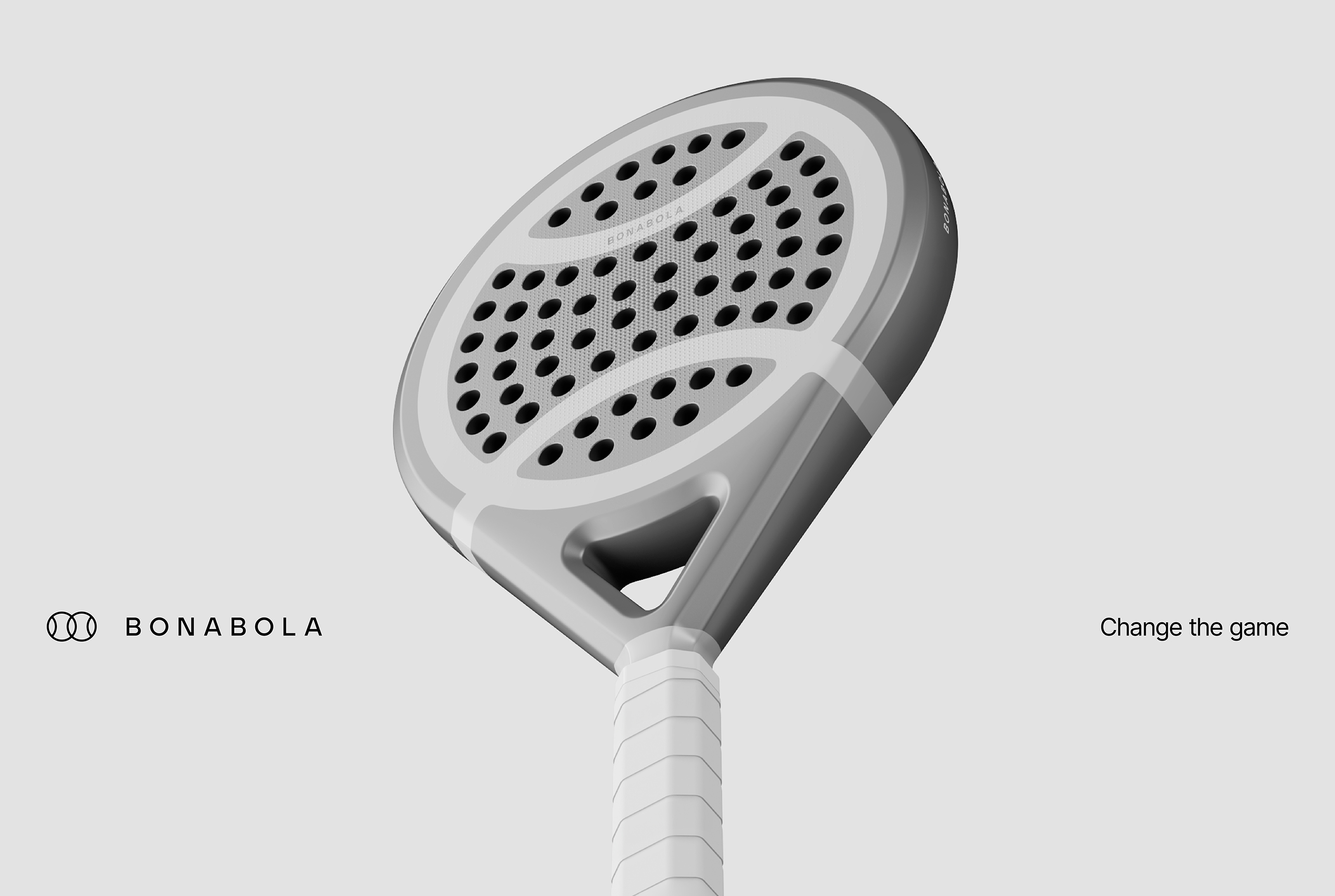
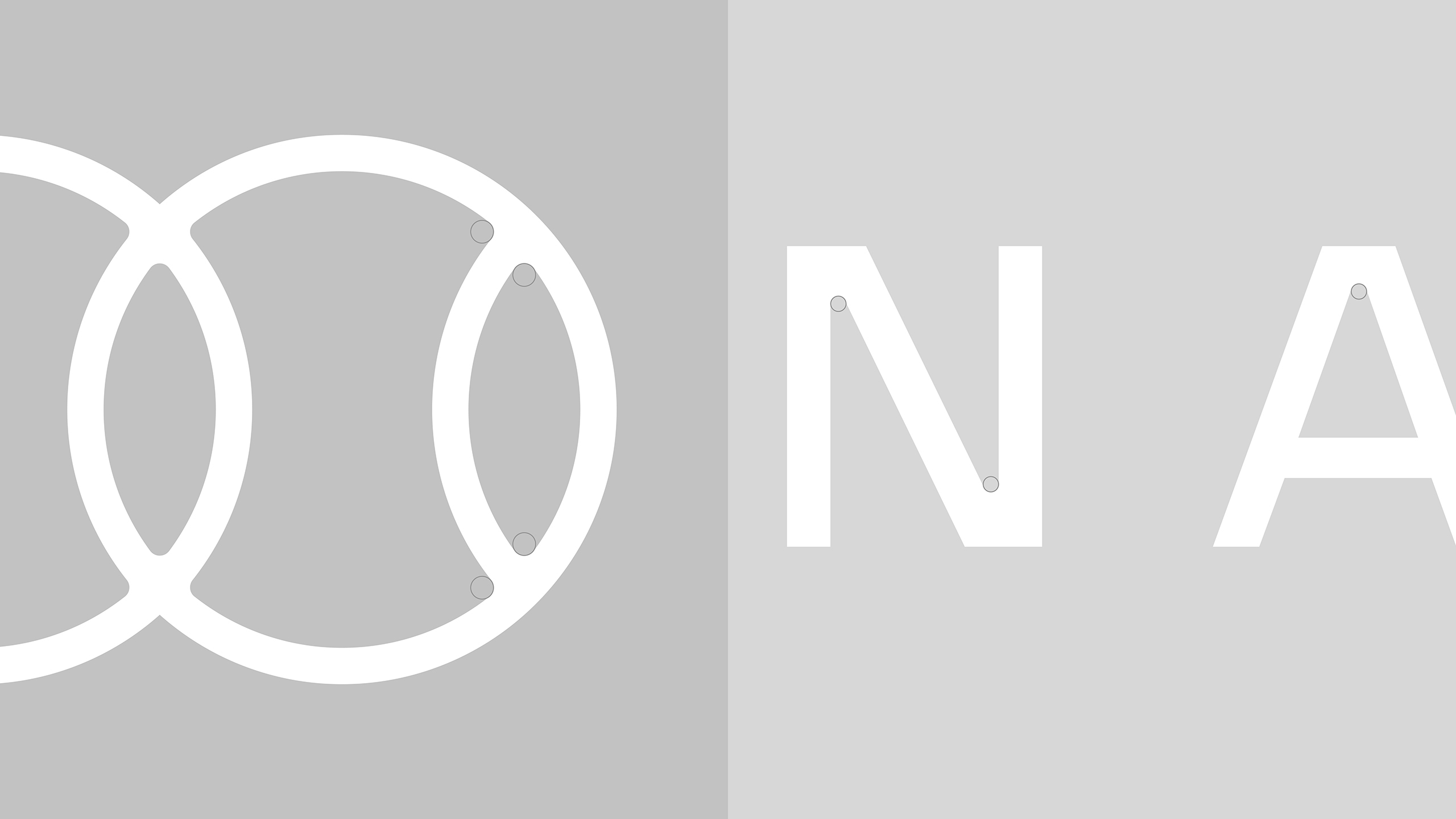
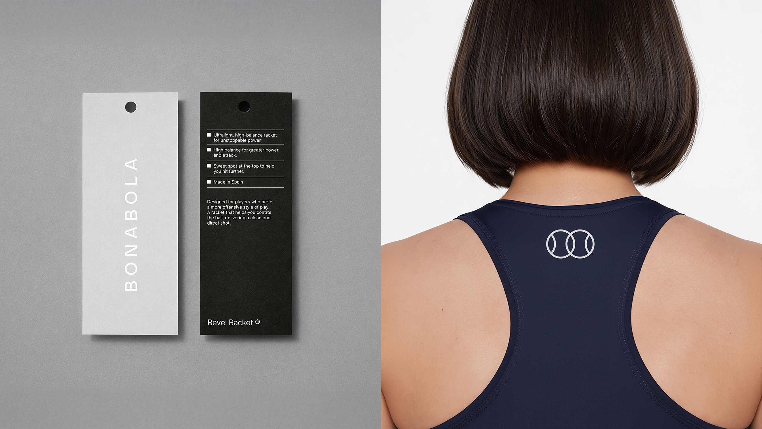
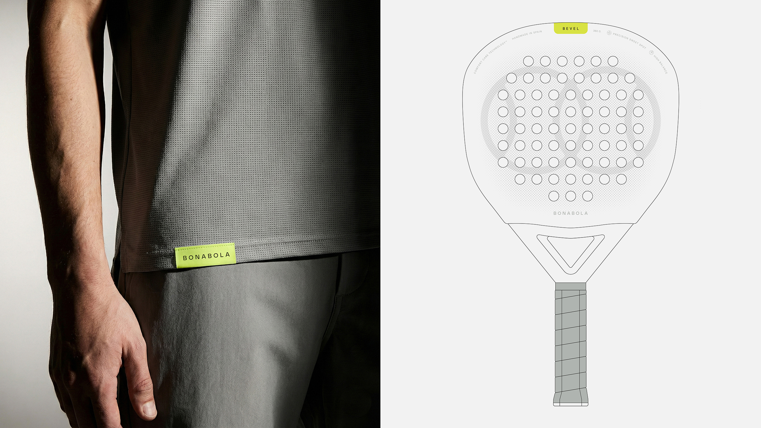
The project is built around a clean and essential system. The symbol, inspired by the intersection of two balls, refers to the fact that padel is always played in pairs, while the name BONABOLA connects the brand to its place of origin, as it means “Good Ball” in Valencian.
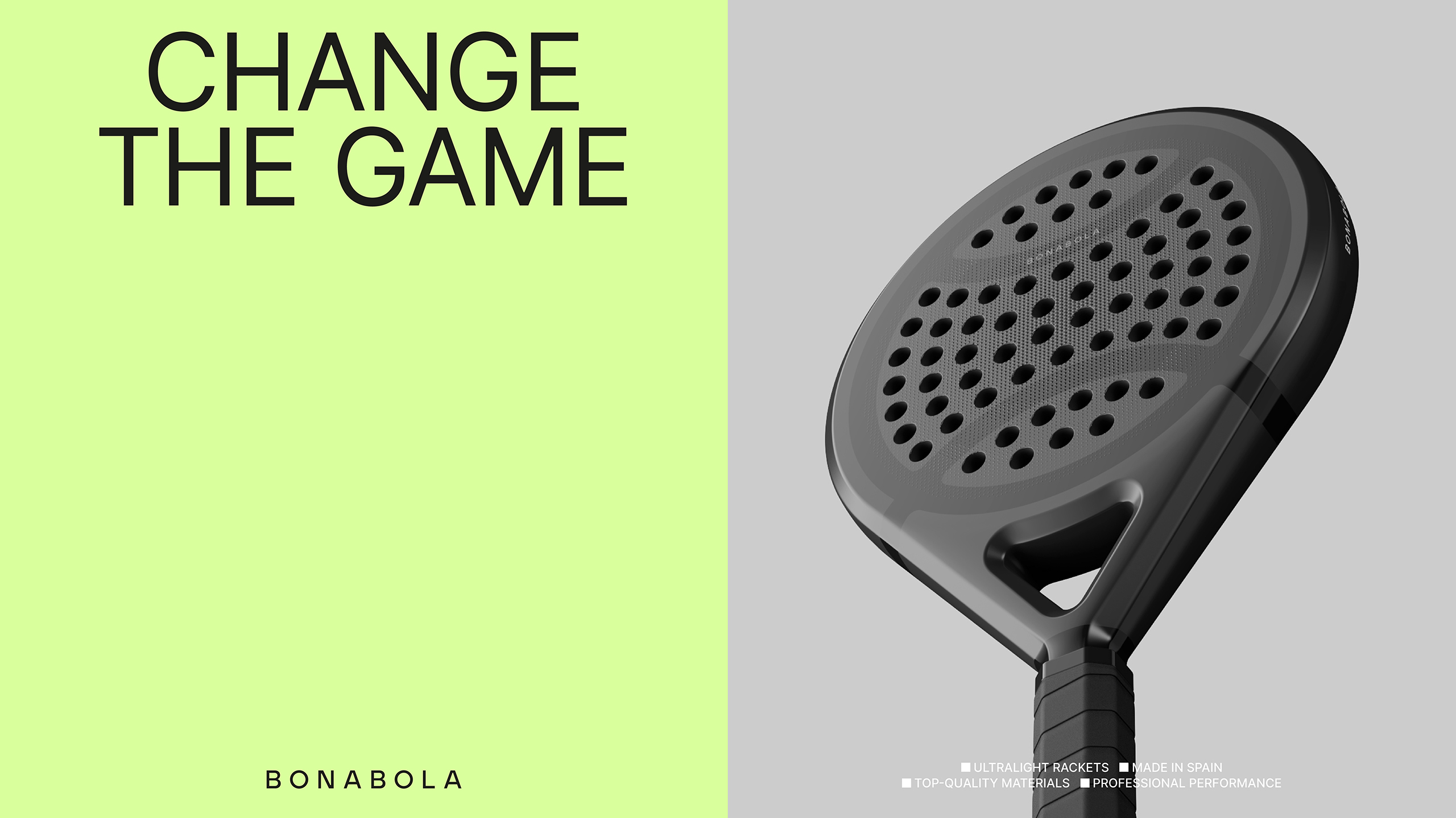
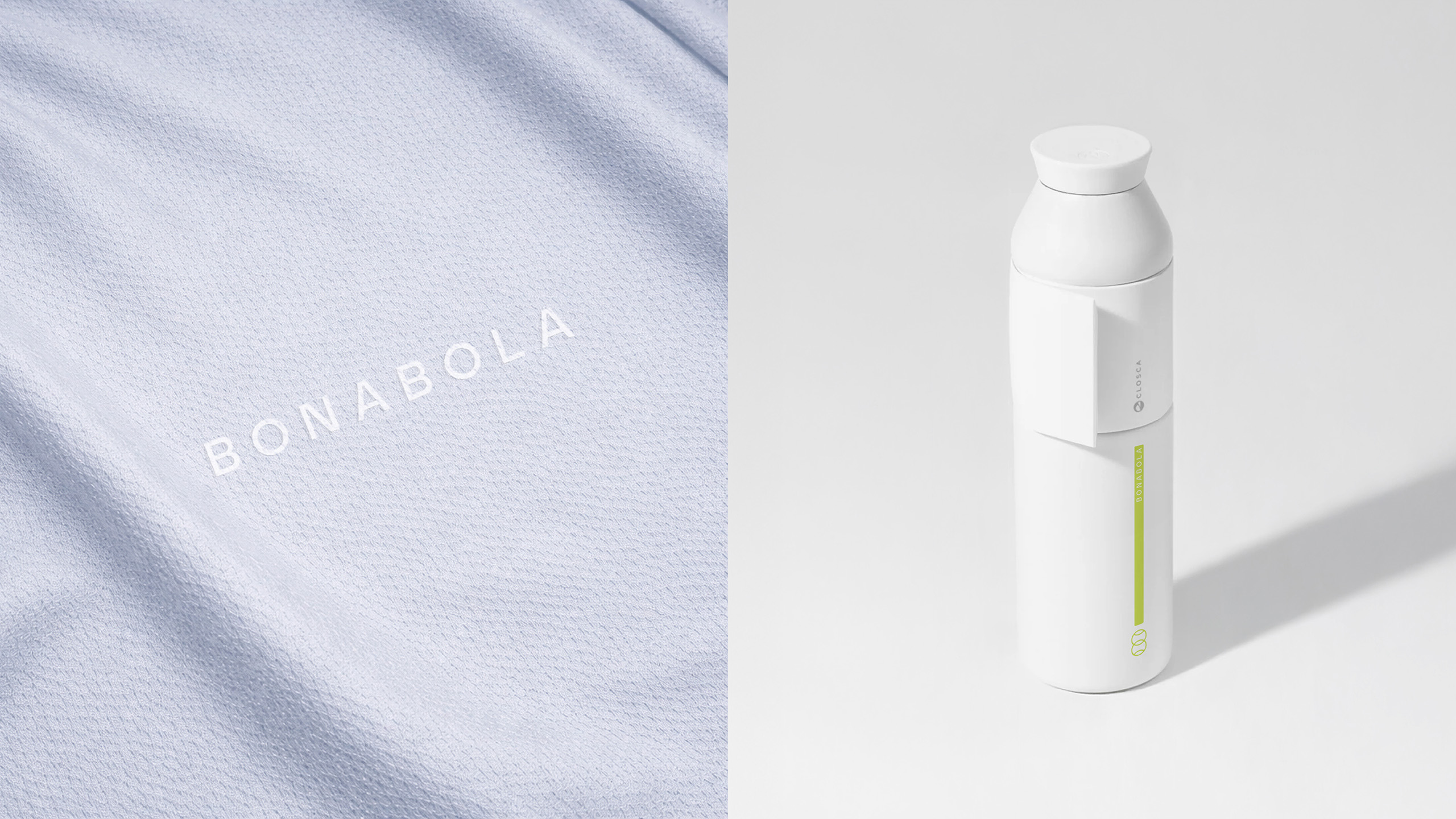
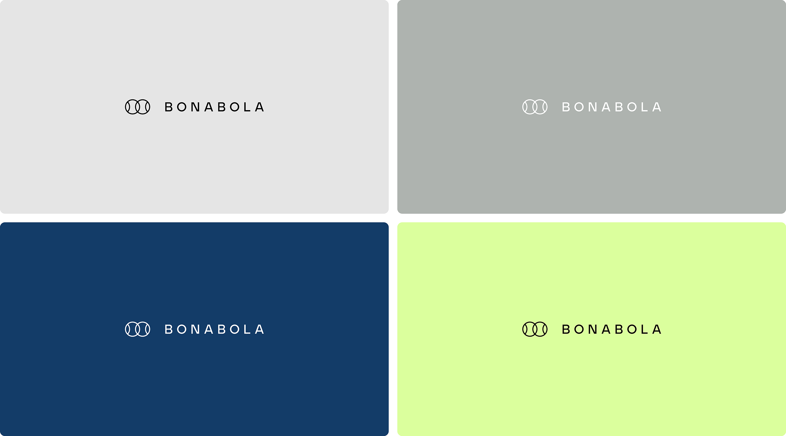
The logotype uses a sans-serif typeface whose inner corners have been rounded in the same way as the joints in the symbol’s strokes, while the increased letter spacing gives the whole a harmonious rhythm that conveys elegance and personality. The colour palette combines understated greys with a vibrant yellow that brings energy and a distinctive character of its own.
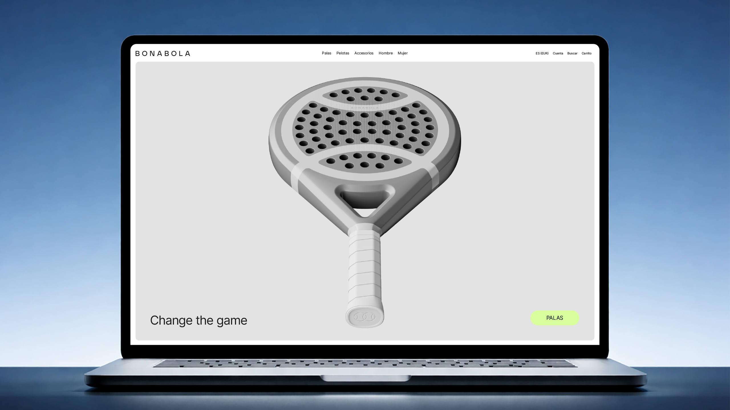
The art direction is based on a minimalist aesthetic, with restrained compositions and neutral backgrounds that emphasise the product’s technology. The result is a brand that conveys precision, performance and confidence.
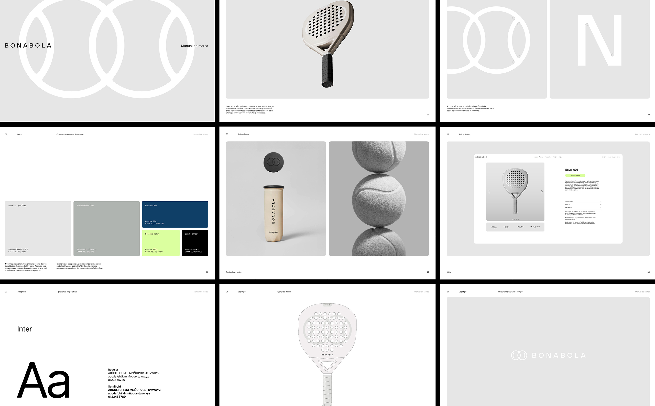
The project also included a Brand Manual with precise guidelines for applying the identity across a wide range of media, including rackets, clothing, advertising, accessories, and the brand’s presence on the website and social media.