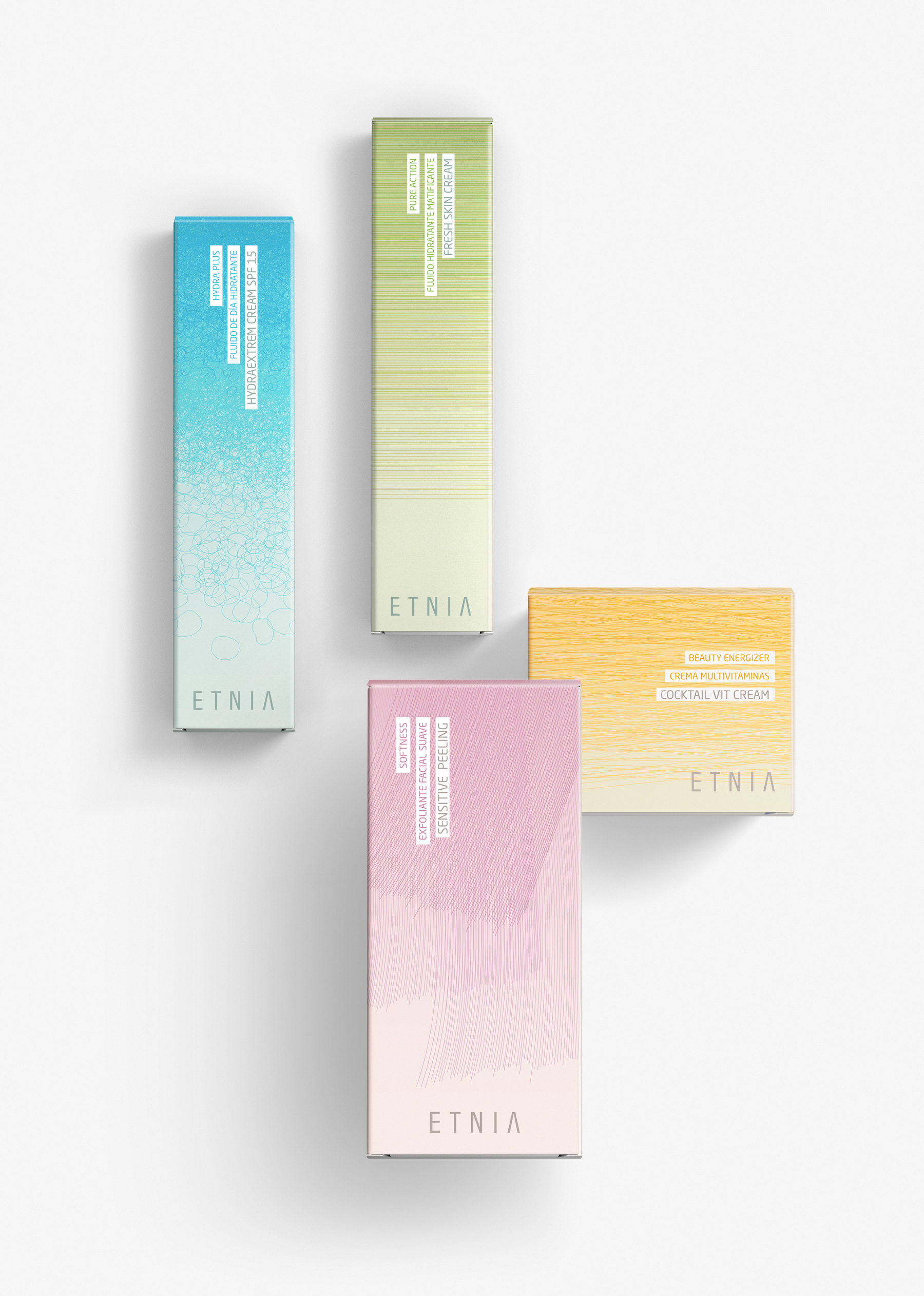
Etnia Skin Care
Packaging design for skin care. ETNIA Cosmetics. 2013
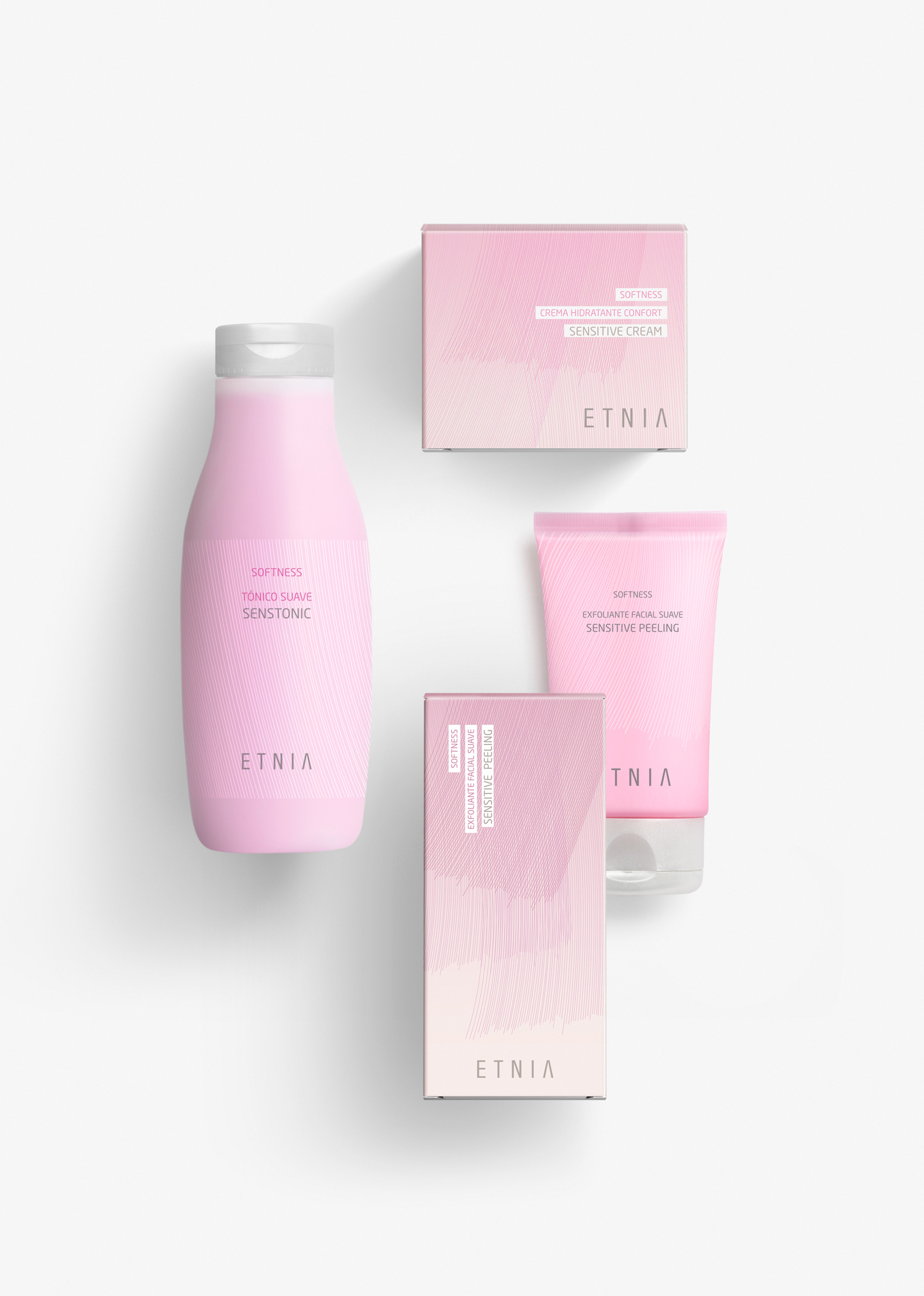
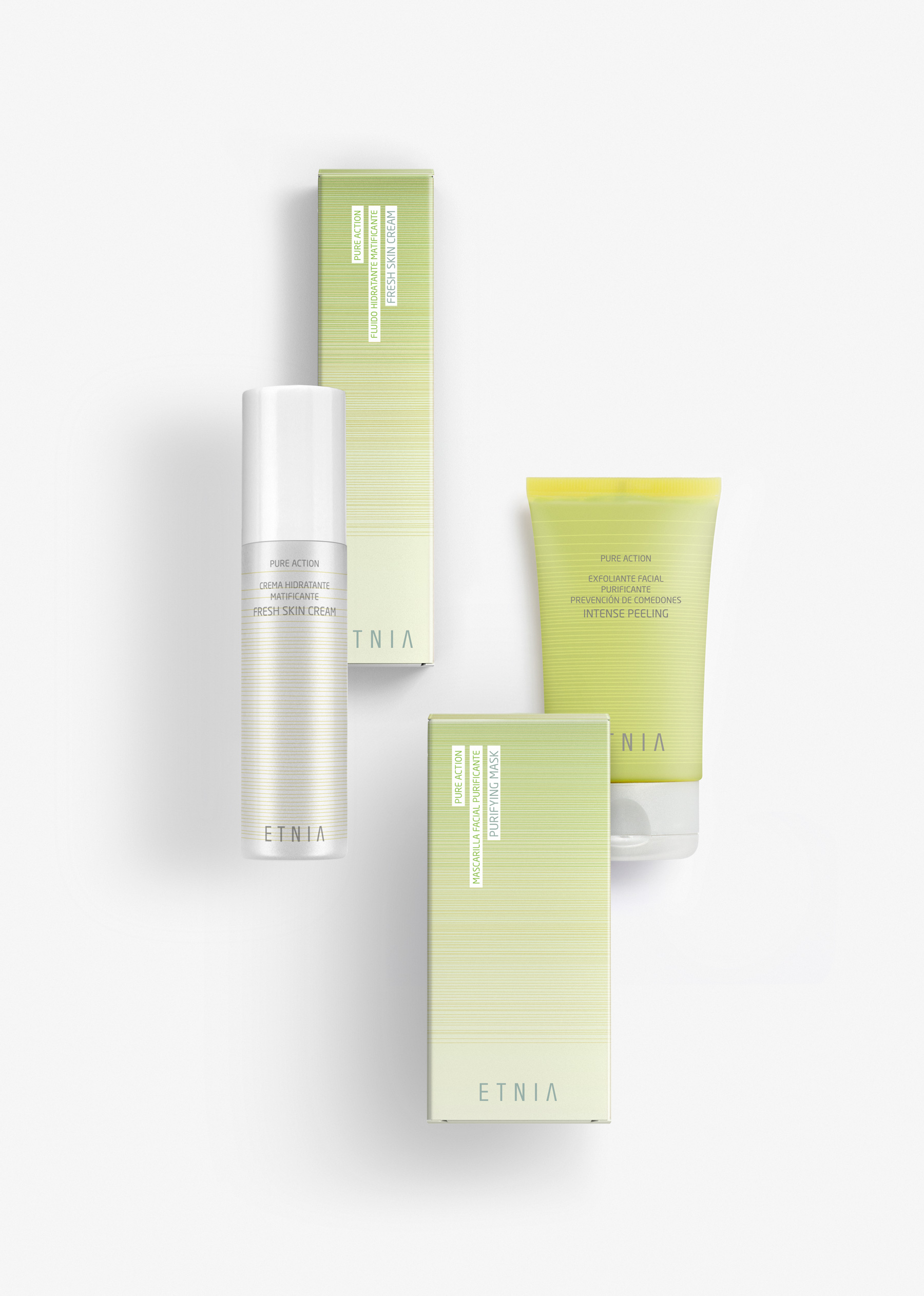
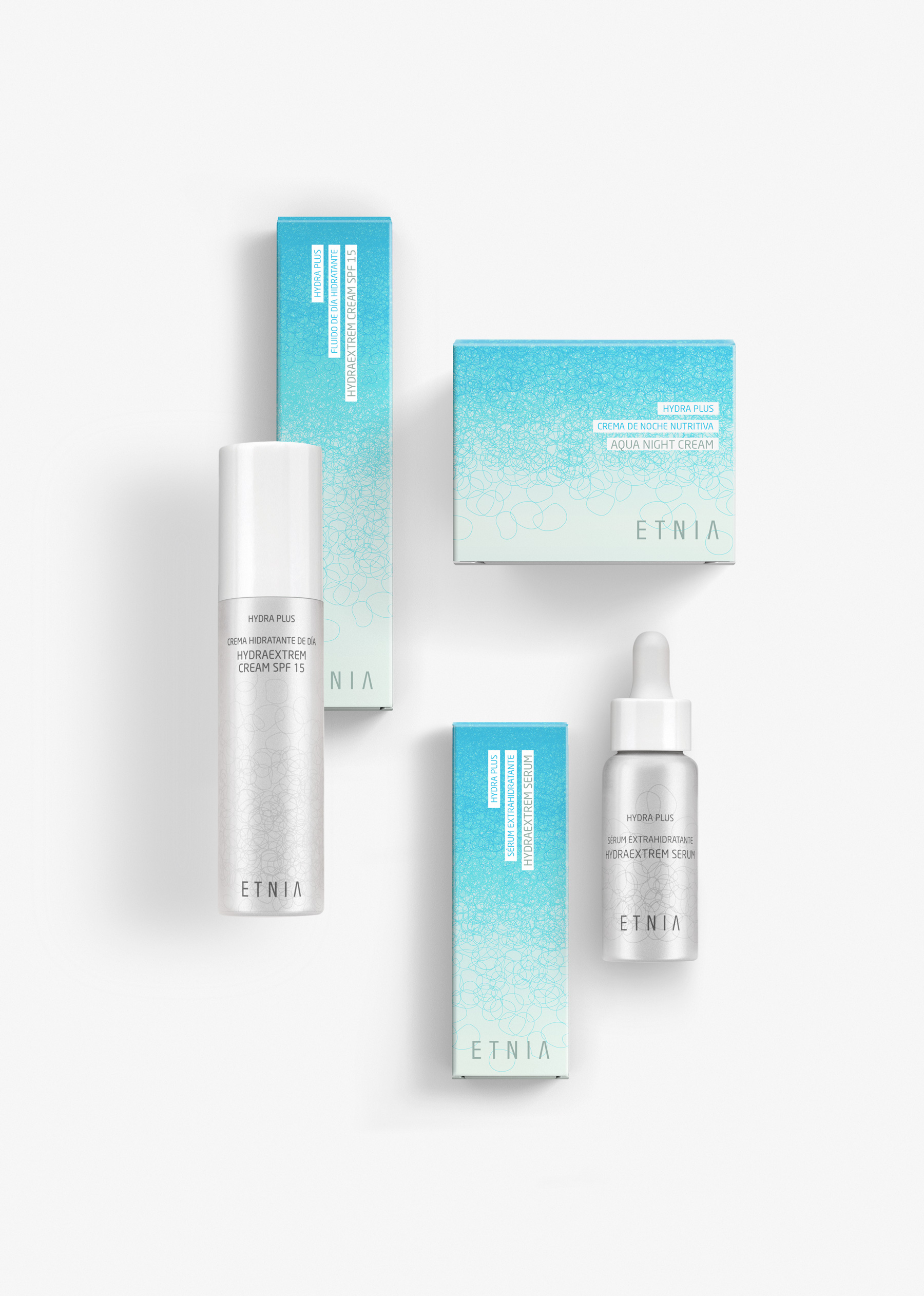
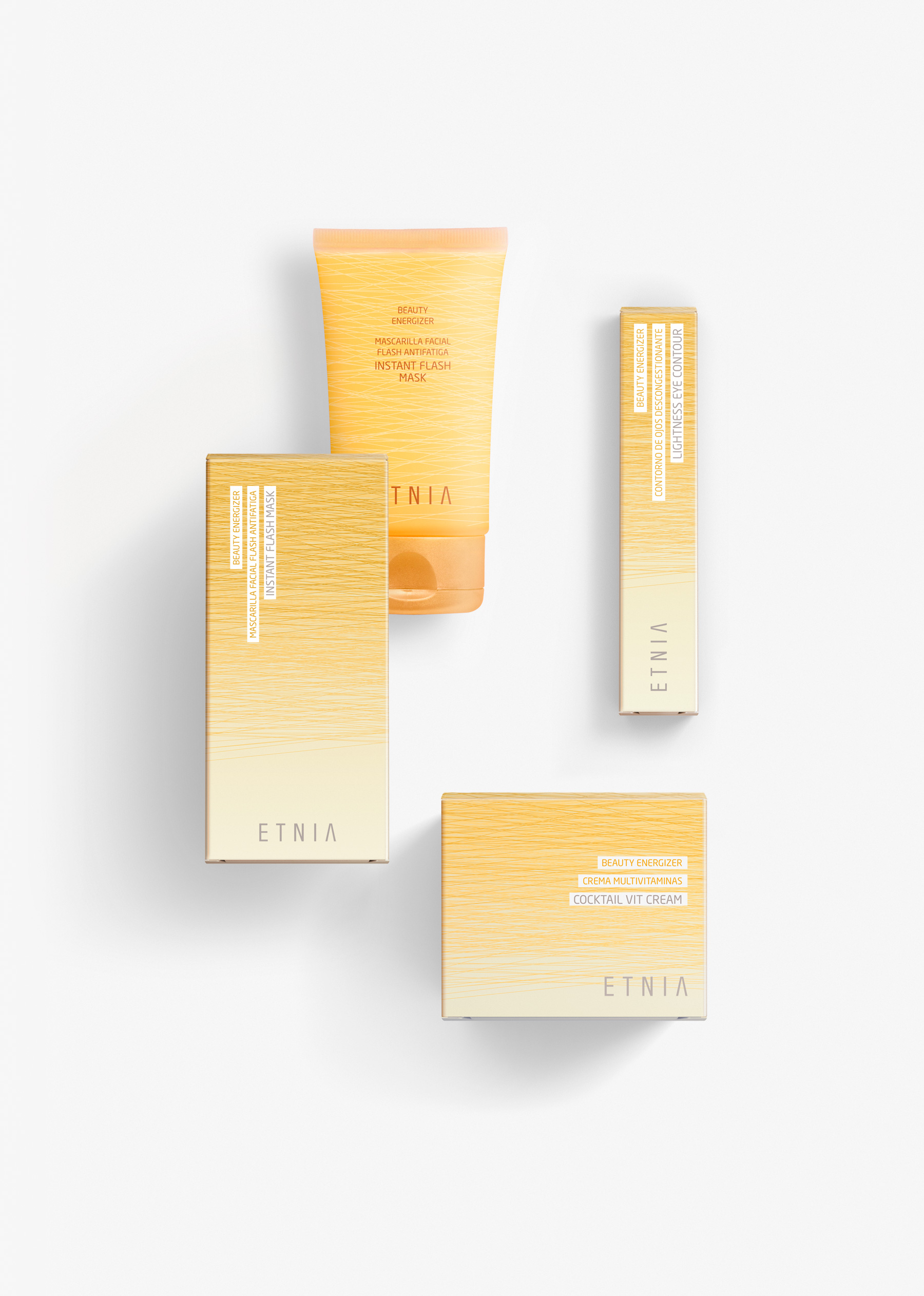
ETNIA Cosmetics brand has a clear objective: To open a network of stores in Spain and to repeat the same strategy at international level. It is a global design project: brand, packaging, POS, web and communication at point of sale. It was decisive to begin defining the brand positioning and attributes, and then to translate them into a visual language in such a way that the brand personality is always present. ETNIA make-up and treatment lines include more than 200 references. It was a project which required the consolidation of a bespoke design with standard bottles. A complex task resembling a jigsaw puzzle. Pieces from different suppliers have been selected, and materials, finishes and processes have been chosen, and applied, in such a way that the end result, composed of pieces from multiple suppliers with different resources, is feasible whilst keeping everything coherent and transmitting a consistent ETNIA personality. Make-up, which is a key product in ETNIA shops, is full of colour, lines and textures. The visual identity takes these characteristics as a starting point for its packaging design, which highlights the most representative attributes of each category, such as elegance and beauty. The result is a design which differentiates from the usual characteristics, visual cues and trends of other brands, resisting silver, gold, and design elements associated with the make-up and cosmetics world. Instead, varying textures give the design a fresh and dynamic touch, and at the same time they serve as a flexible solution for an innovative brand with diverse product lines, which is in constant flux. (fragrances, body care, facial cosmetics…).
