Freswich
Sandwiches
Client Gufresco
Year 2020
Logo
Packaging
Awards
PENTAWARDS 2021
Bronze. Food
All works
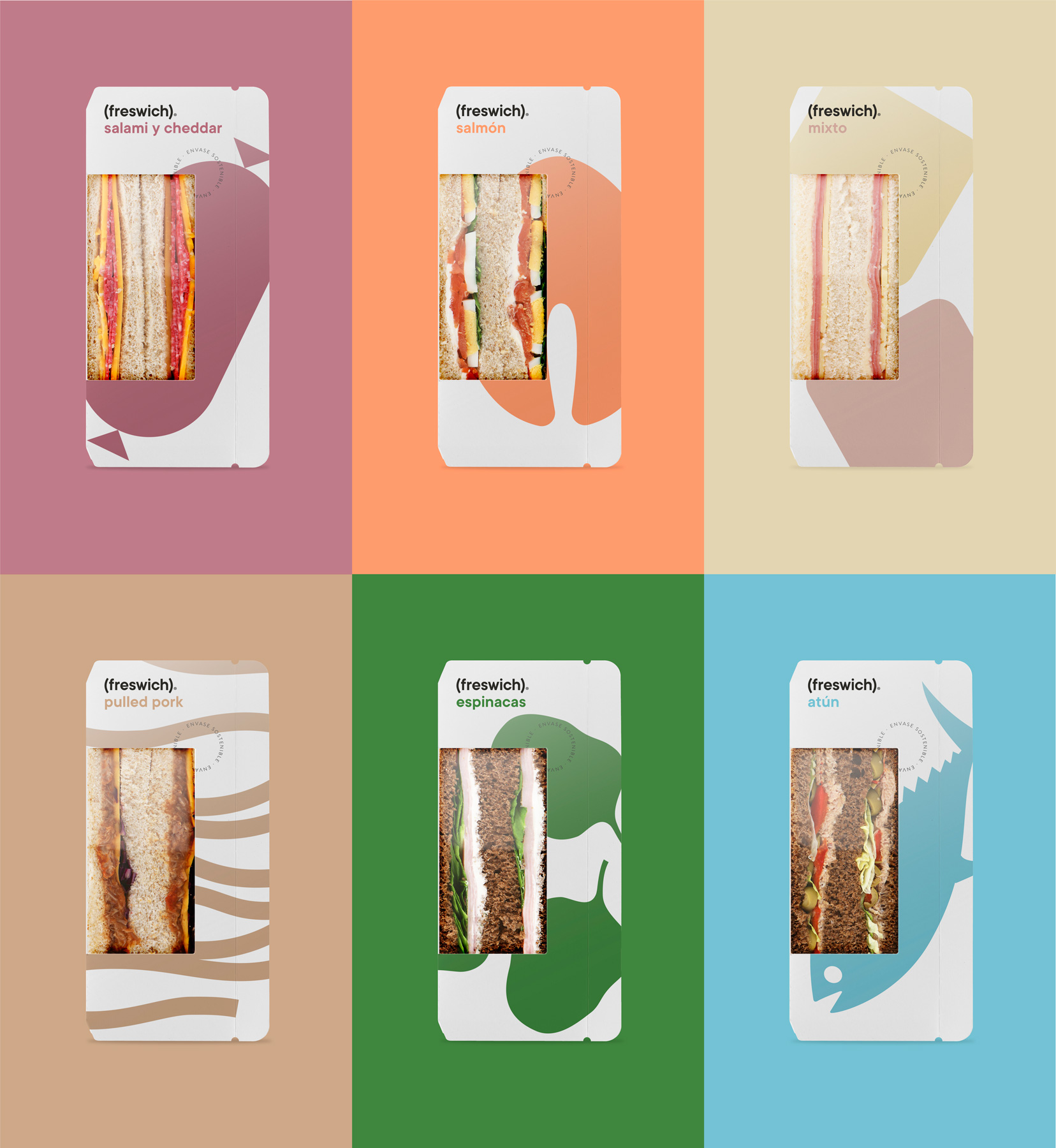
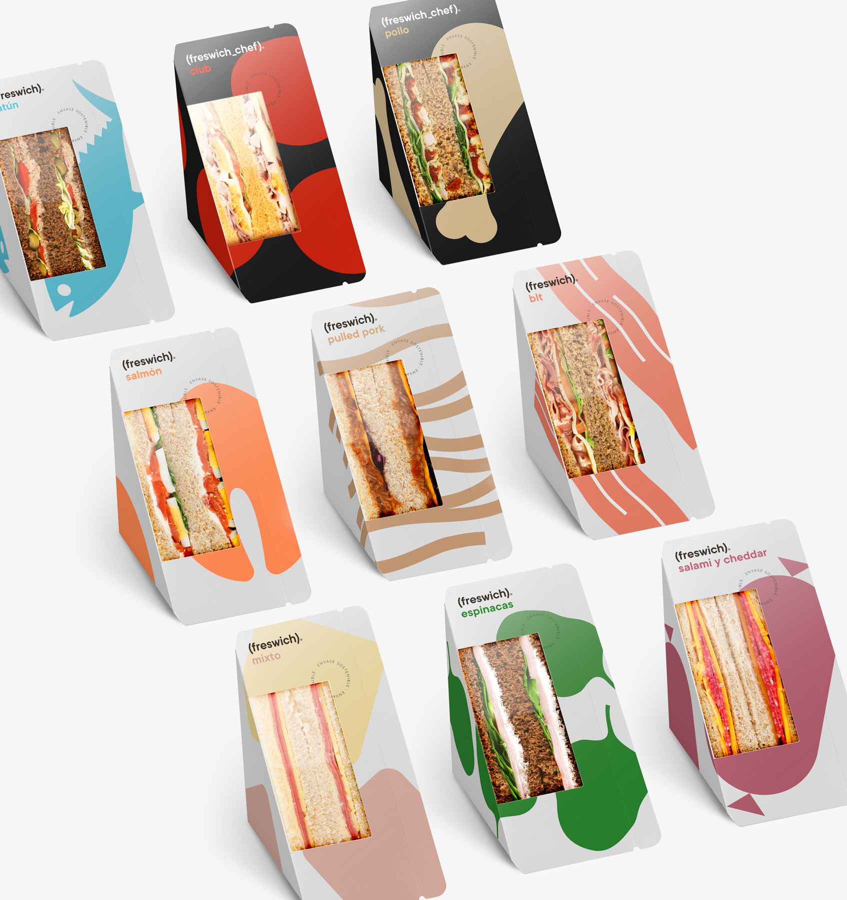
What should you call a sandwich brand that stands out for the freshness of its ingredients? Freswich. It may seem obvious, but it is often the most obvious ideas that work best—and when it comes to the demanding art of product naming, this is a golden rule.
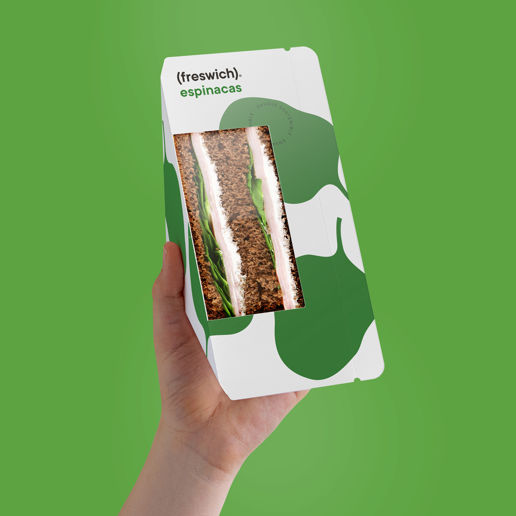
This desire for clarity and simplicity led us to create a logo in which the word freswich—written in lower case, true to the humble simplicity of a sandwich—appears within parentheses. These parentheses act as an immediate visual metaphor: they recall both the shape formed by the slices of bread that enclose a sandwich and the brief pause in time we take to stop what we are doing and enjoy a bite.
The symbolic image of the main ingredient is rendered in a single colour against the background—white for the basic range, beige for the vegan range, and black for the Chef range. This system helps to clearly identify each variety while keeping the front of the pack clean and uncluttered, emphasising the transparent window through which the sandwich reveals its contents.