Update cookies preferences

Global Omnium

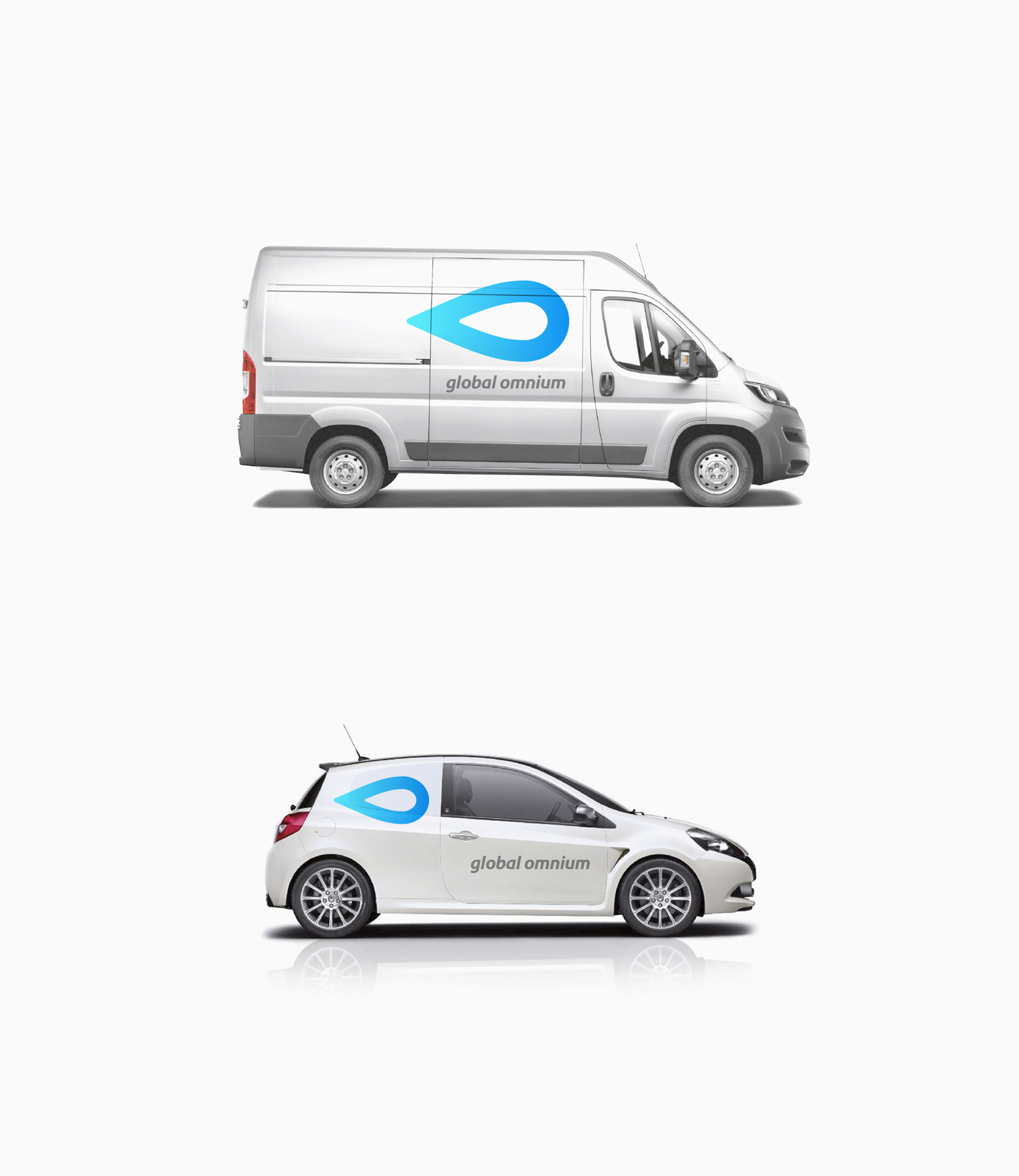
Corporate identity for water management business group. Global Omnium. 2015

Global Omnium has been dedicated, among other activities, to managing the entire water cycle – from catchment and purification to distribution – for more than 125 years.

We were commissioned by them to design a new visual identity in line with the company’s current positioning: a dynamic, modern group of companies with a high level of R&D, employing state-of-the-art technology, with a clear standpoint of social responsibility and respect for the environment, and the ambition to outsource its activity and compete in a globalised market.

The “drop” is the most universal and recognisable icon to represent the concept of “water”, and it acts as the “leitmotif” for the activity of the companies within the group. By placing it horizontally, it acquires a dynamic character, which is intensified by the colour gradient. This placement also gives it a distinctive feature: it is a drop that is “advancing”, which clearly highlights the main activity of the company – bringing water to wherever it is required.

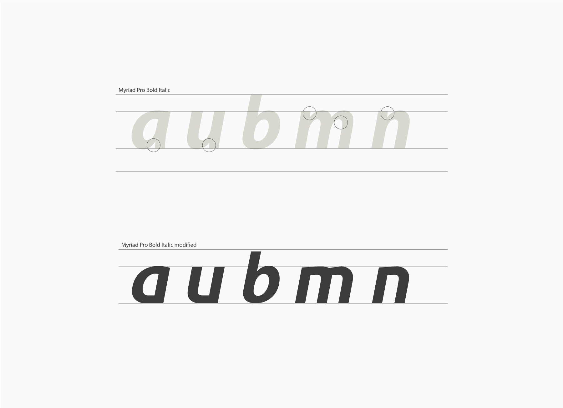
The simple, striking shape of the icon makes it more powerful, and its geometric outline denotes the element of technology and conveys the idea of a modern and dynamic company. The typeface has been specifically designed from Myriad, but simplifying some characters to make it more streamlined and modern and we have decided to use lowercase letters, which gives the logo a more personal, friendlier character.