Update cookies preferences

Krypton

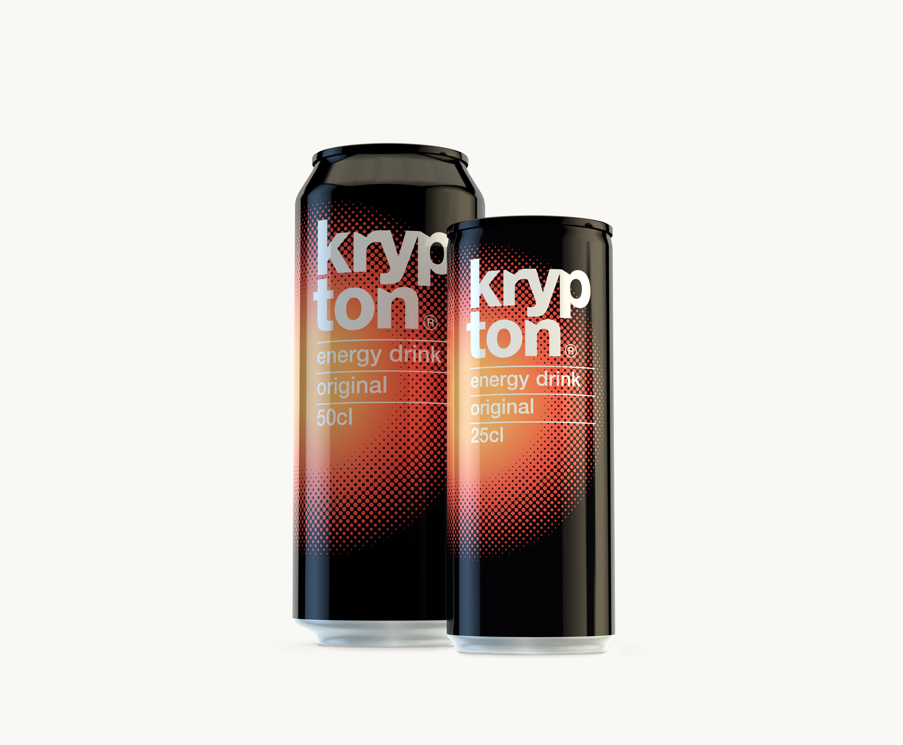
Energy drink packaging identity. Refrescos Iberia. 2014

All drinks categories have their distinct visual codes, which serve the consumer to quickly recognise the type of beverage they are looking for. That is, to communicate effectively. In the case of energy drinks, references for the concept of “energy” are overt and inevitable. With just a few components, from the naming to the graphic element, everything points towards transmitting a strong energetic image aimed at connecting with a young audience. The red circle that expands outwards from the center, like an explosion on a black background, transmitting strength and dynamism while, at the same time, it achieves a strong focal point on the shelf. The word krypton, with its obvious associations, has been further strengthened by giving it unique typographic features.