

All beverage categories have their own distinct visual codes, which help consumers quickly recognise the type of drink they are looking for—in other words, to communicate effectively. In the case of energy drinks, references to the concept of “energy” are overt and almost unavoidable. With just a few elements, from naming to graphic language, everything is directed towards conveying a powerful, energetic image aimed at connecting with a young audience.
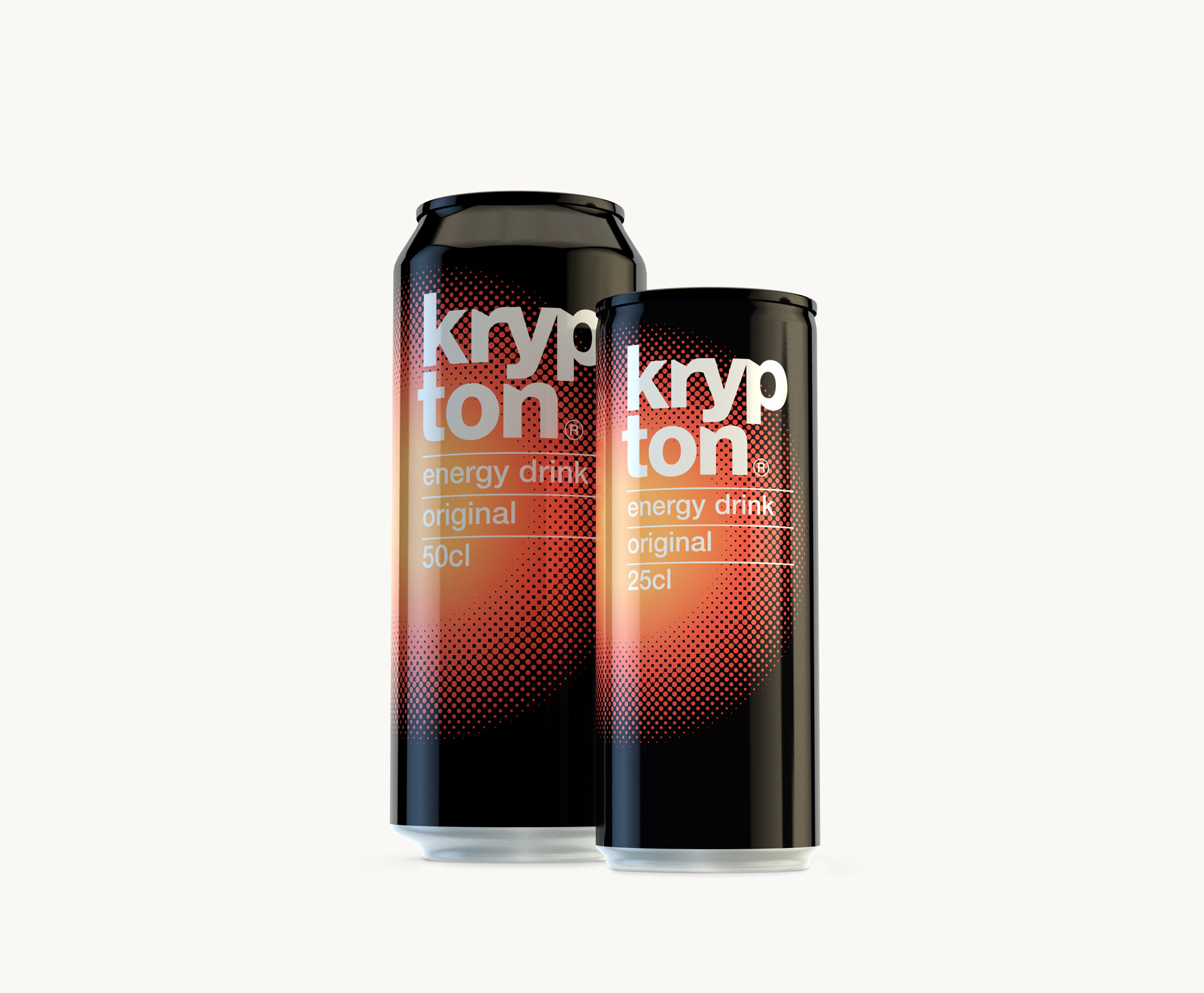
A red circle expands outwards from the centre, like an explosion against a black background, transmitting strength and dynamism while simultaneously creating a strong focal point on the shelf. The name krypton, with its obvious associations, is further reinforced through distinctive typographic features that give it a unique and memorable character.


