In 2018, Nivea entrusted Lavernia & Cienfuegos with an ambitious 3D design project with a dual objective:
1. Defining a coherent packaging design language
When Nivea approached us, the brand had identified the need to unify its packaging under a visual language that would faithfully reflect its DNA. We studied the company’s history, values, and positioning to develop a coherent formal language that would make its products recognisable even without logos or applied graphics. This involved an in-depth analysis of three-dimensional form, its expressive potential, and its ability to convey both product and brand identity.
2. Establishing visual codes and resources for different audiences
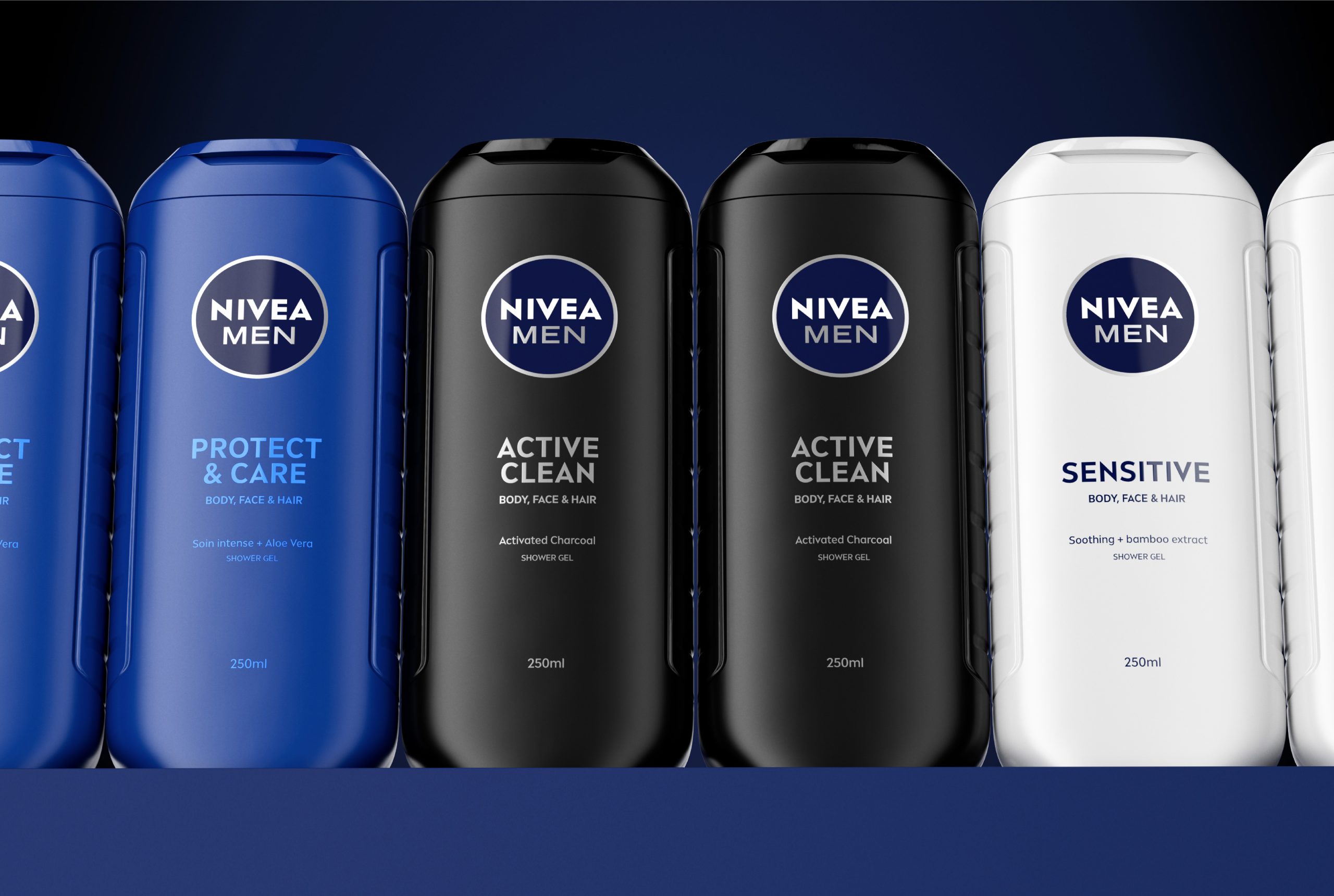
We developed specific visual codes and design tools to segment packaging for different audiences—unisex, family, male, and female—while maintaining consistency with the newly defined language.
With this foundation in place, we went on to design a wide range of packaging formats, including deodorants (stick, spray and roll-on), shower gel bottles, men’s products and the redesign of the brand’s iconic body lotion bottle.
In all these projects, the brand’s commitment to sustainability was a constant priority, reducing the amount of plastic used compared to previous packaging.
The project spanned nearly six years and involved close collaboration with Nivea’s marketing team and other key departments, including category managers (body, face, shower, etc.) and the internal packaging team.
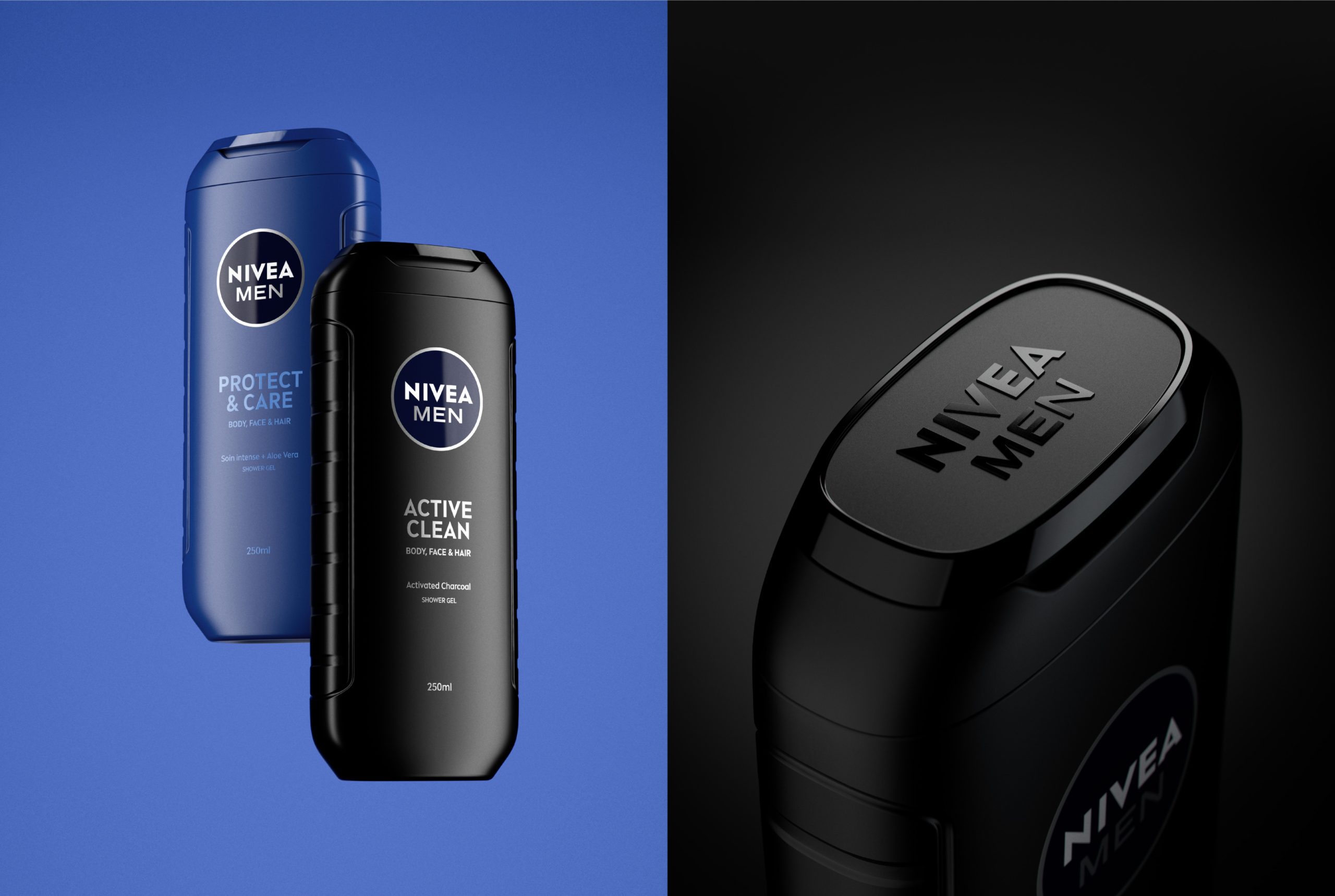
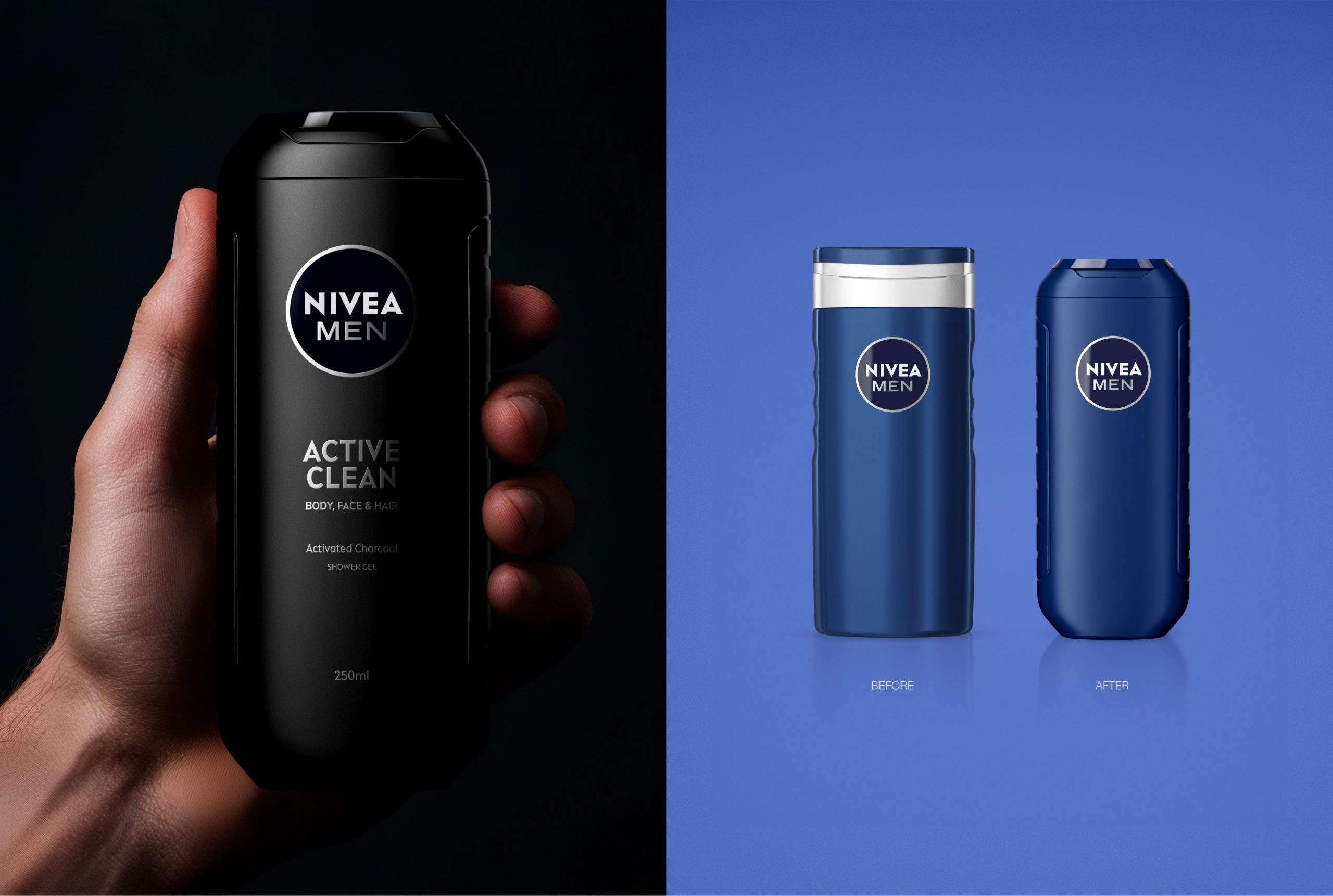
An early outcome of this collaboration was the new bottle for the Nivea Men shower gel range. The brief called for a design that would convey masculinity and efficiency while preserving the essence of the previous bottle. We opted for solid, straight, and bold shapes inspired by classic codes of masculinity, combined with a more modern, sporty feel. (The 250 ml format is widely used in gyms thanks to its easy-to-carry format.)
Special attention was given to the bottle’s ergonomics, incorporating side grips to improve handling. Details were also carefully considered: the contrast of textures on the cap—a combination of glossy and subtly rough surfaces—adds tactility and character to the overall design.
In this case, the cap was redesigned to significantly reduce the amount of plastic used compared to the previous model, without compromising the user experience.