Pancracio was a small, local chocolate company with a presence in very exclusive shops. In this new phase, the aim was to grow and reach broader markets without compromising its premium positioning and quality. All elements of the packaging and graphic system were analysed in depth in order to determine which should be retained and which should be updated.
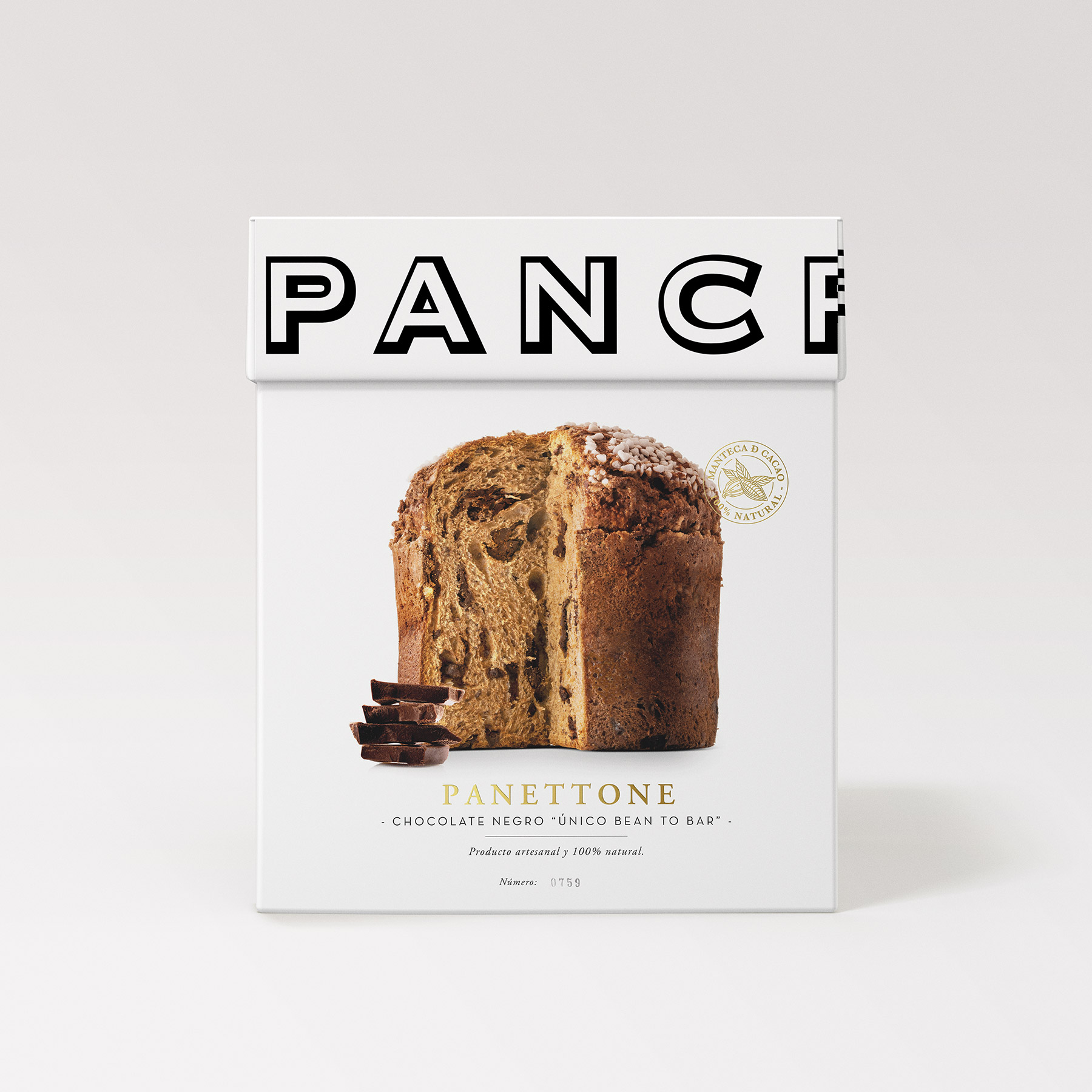
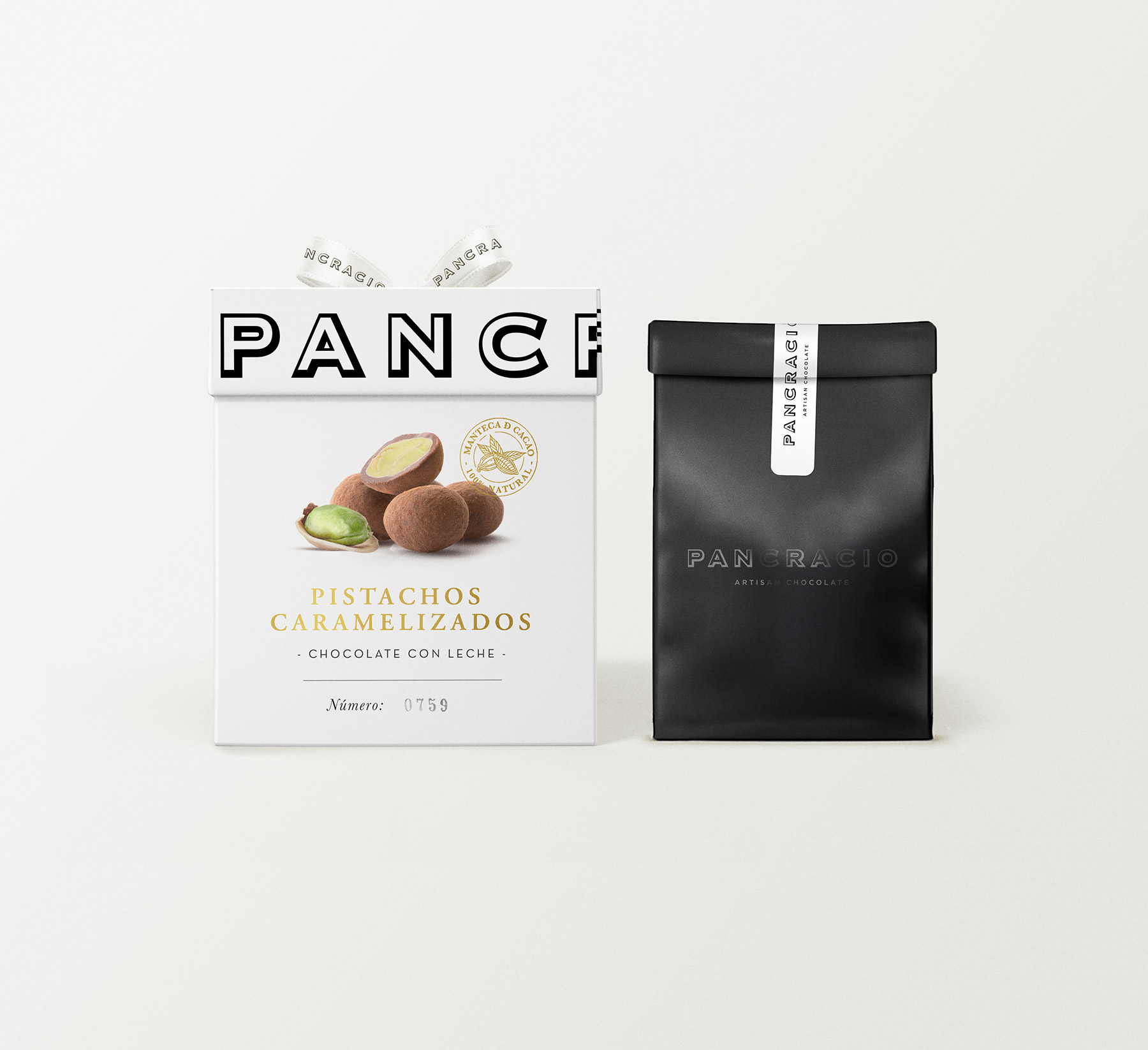
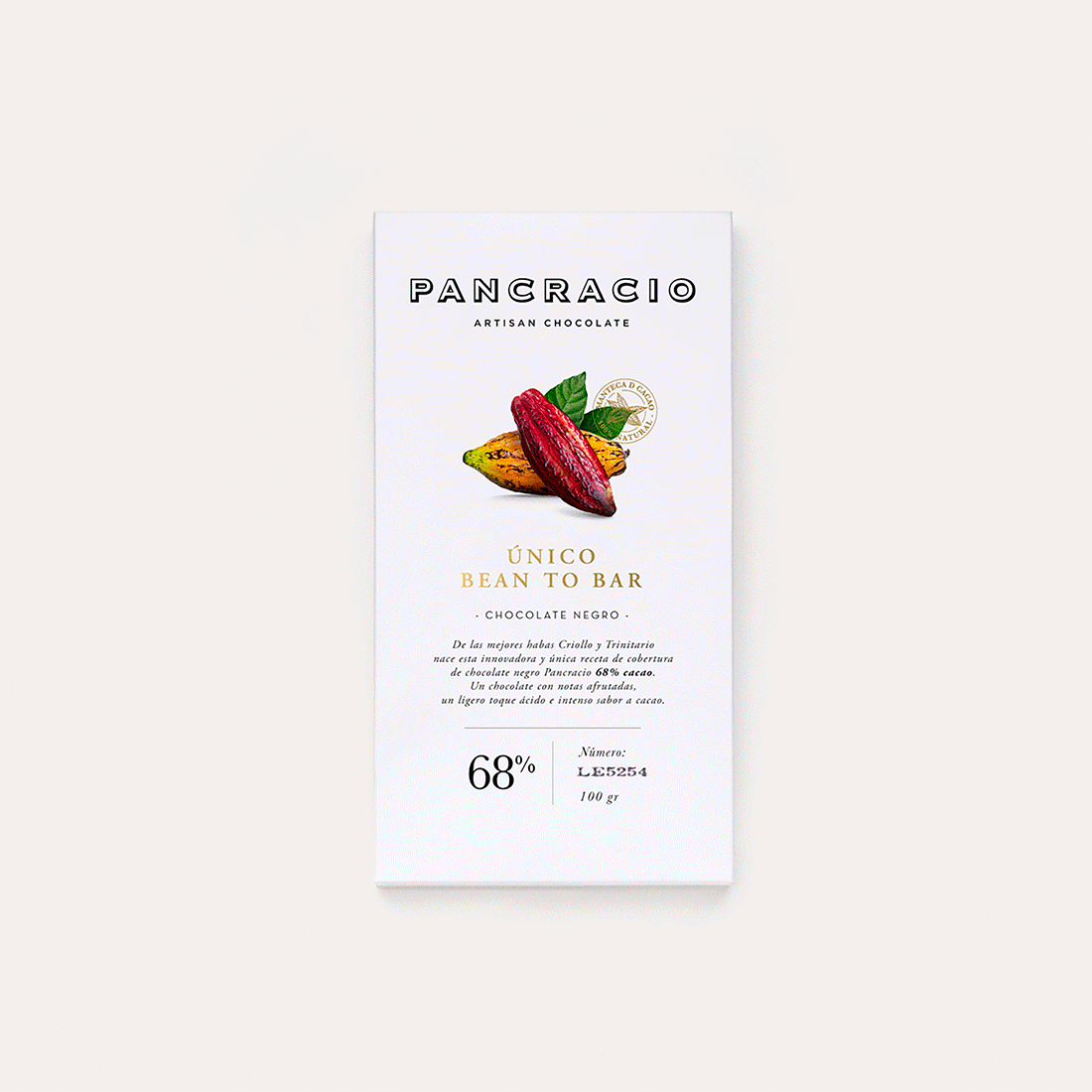
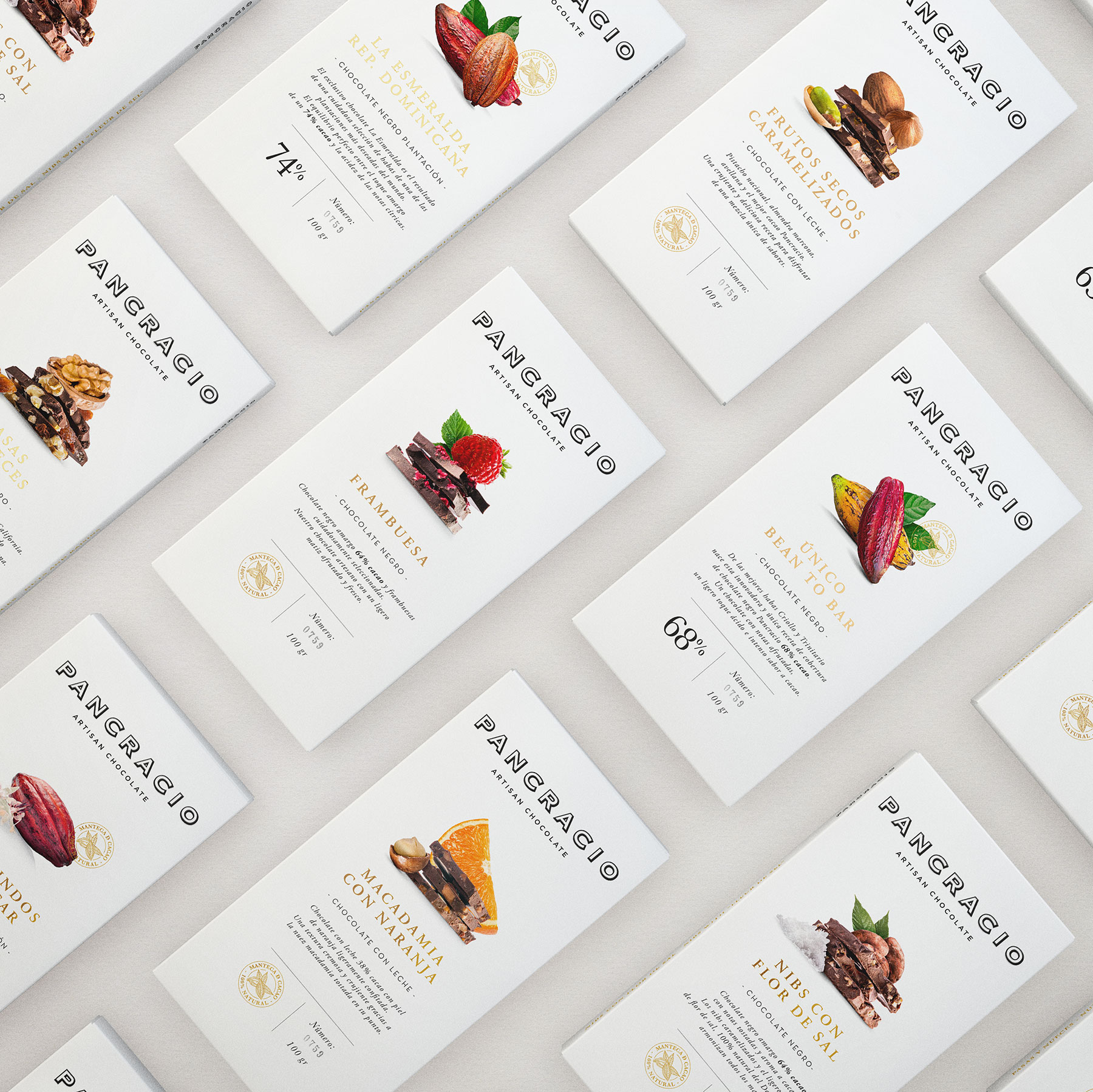
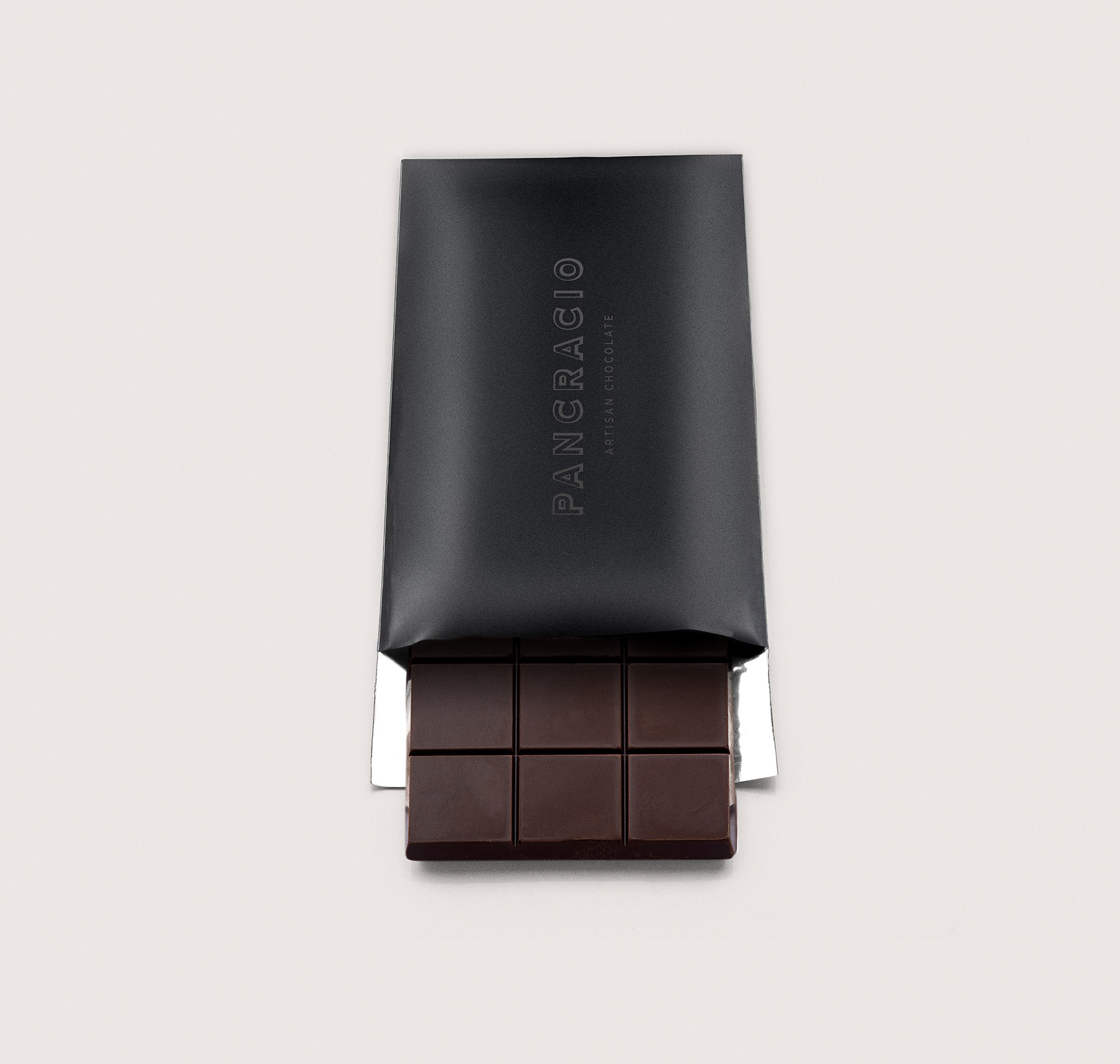
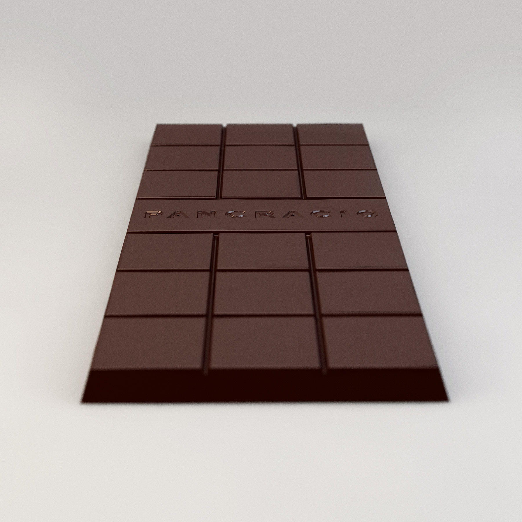
The decision was made to preserve the logo, valued for its strength and distinctive character. White backgrounds were introduced to allow images and text to breathe, alongside a centred composition in which information hierarchy and balance play a key role in conveying confidence. Carefully selected product photography completes the visual language.
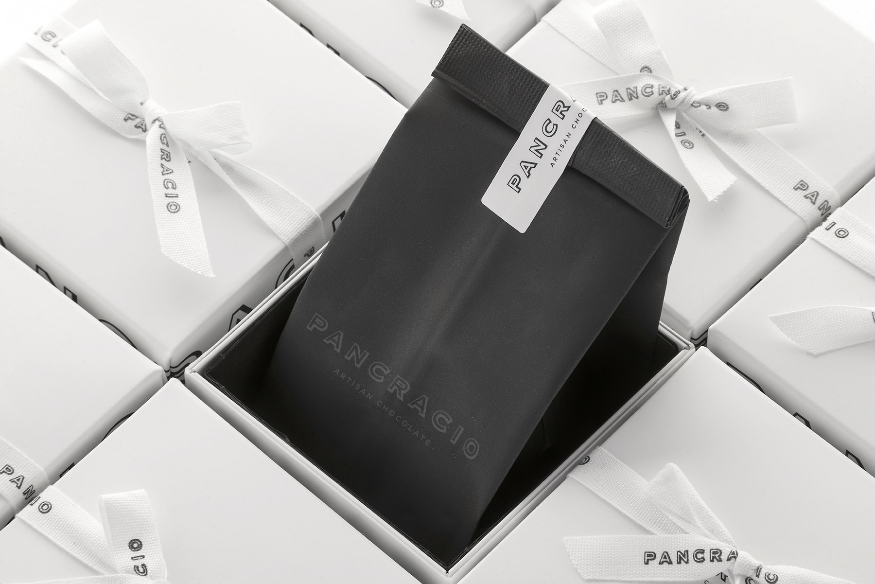
The result is packaging that is both elegant and approachable, with particular attention paid to the unboxing experience—making it especially suitable as a gift.