Paníacos
Bakeries/Cafés.
Client Arturo Ruiz
Year 2014
Logo
Brand Identity
Packaging
Naming
All works
Paníacos—a portmanteau combining pan (bread) and maniacs—emerges from a new bakery concept that also functions as a café. It offers innovative and distinctive products made according to traditional recipes. The business model brings together the heritage of the bakery with the contemporary service culture of the café, creating a space where customers can enjoy breakfast, lunch, or afternoon tea while chatting or browsing the internet.
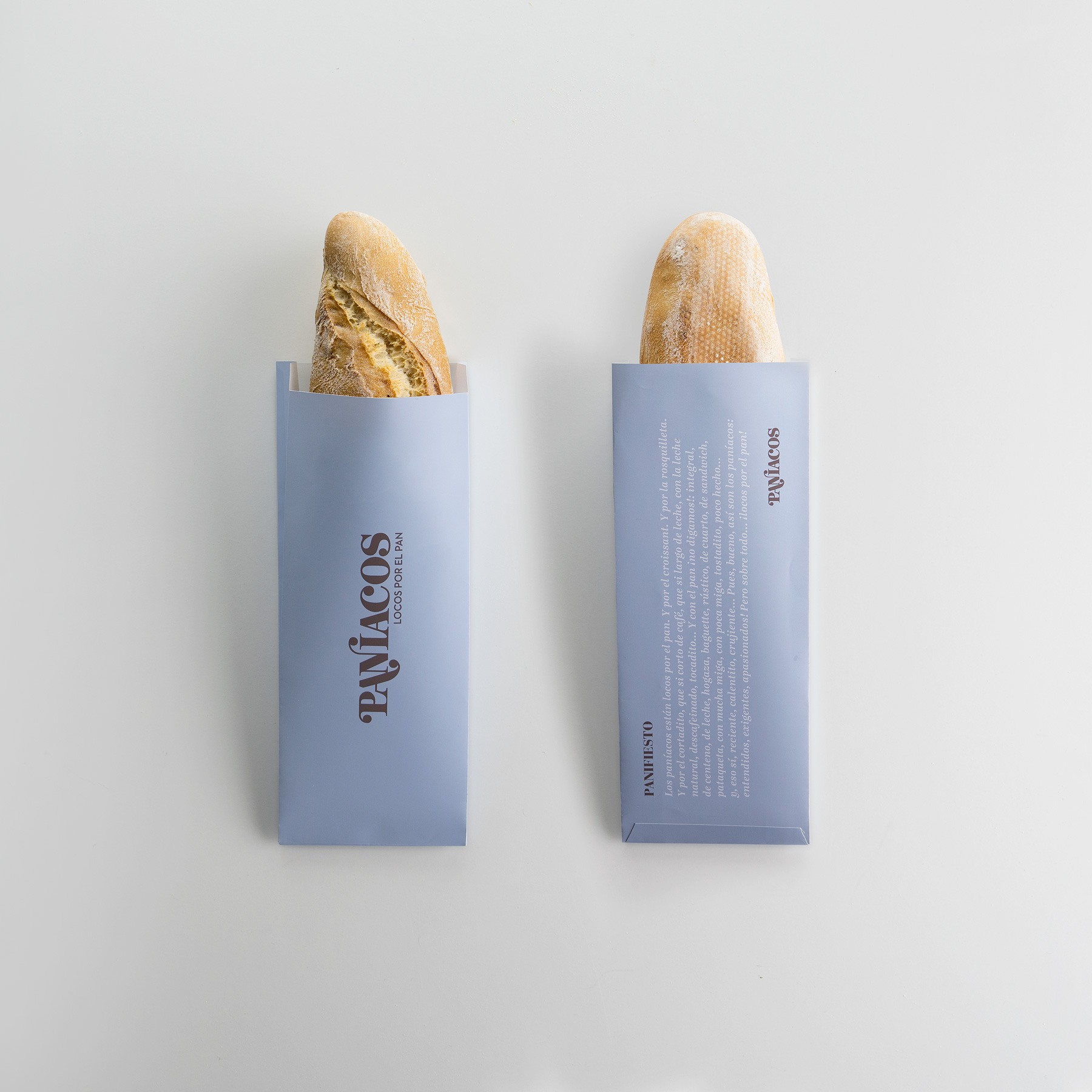
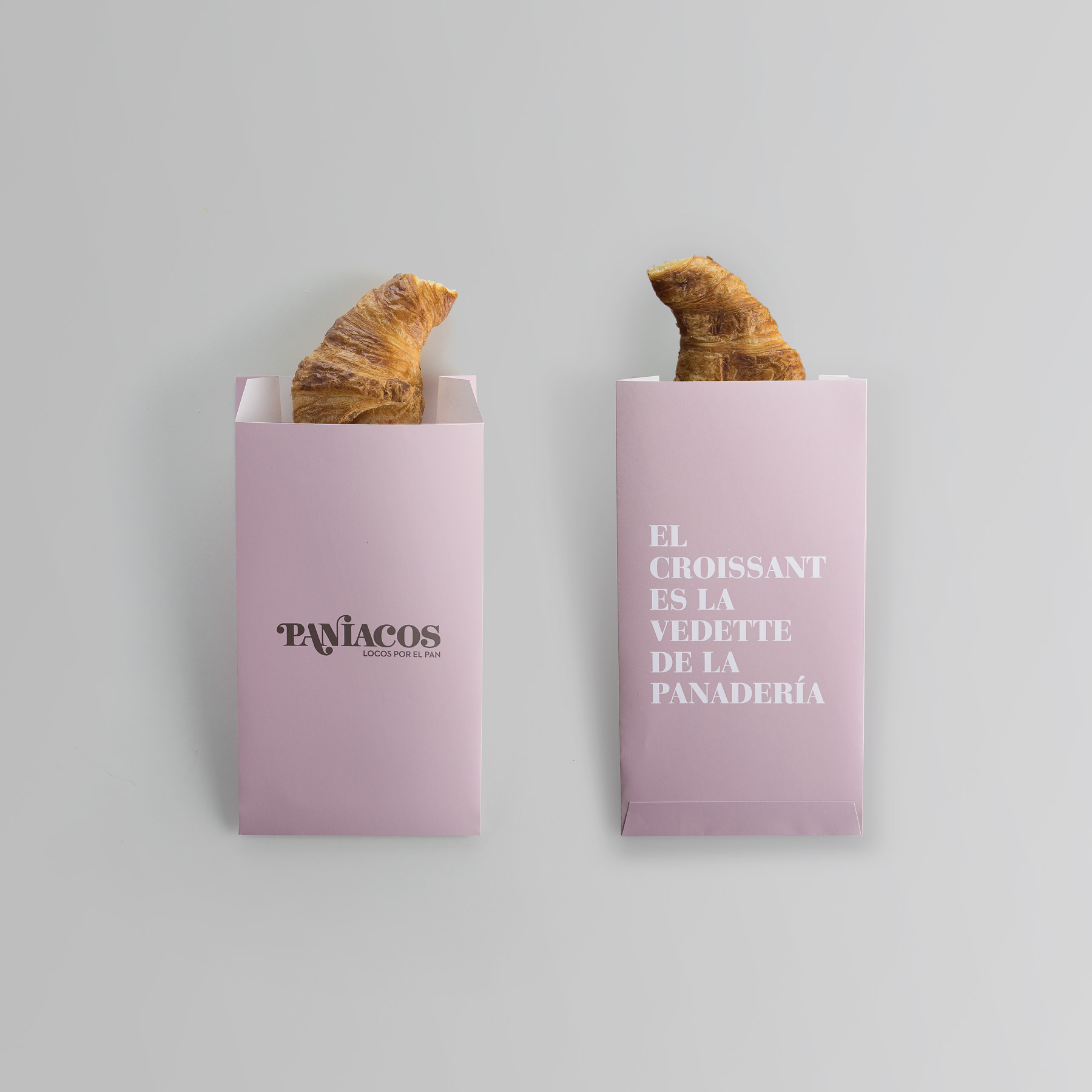
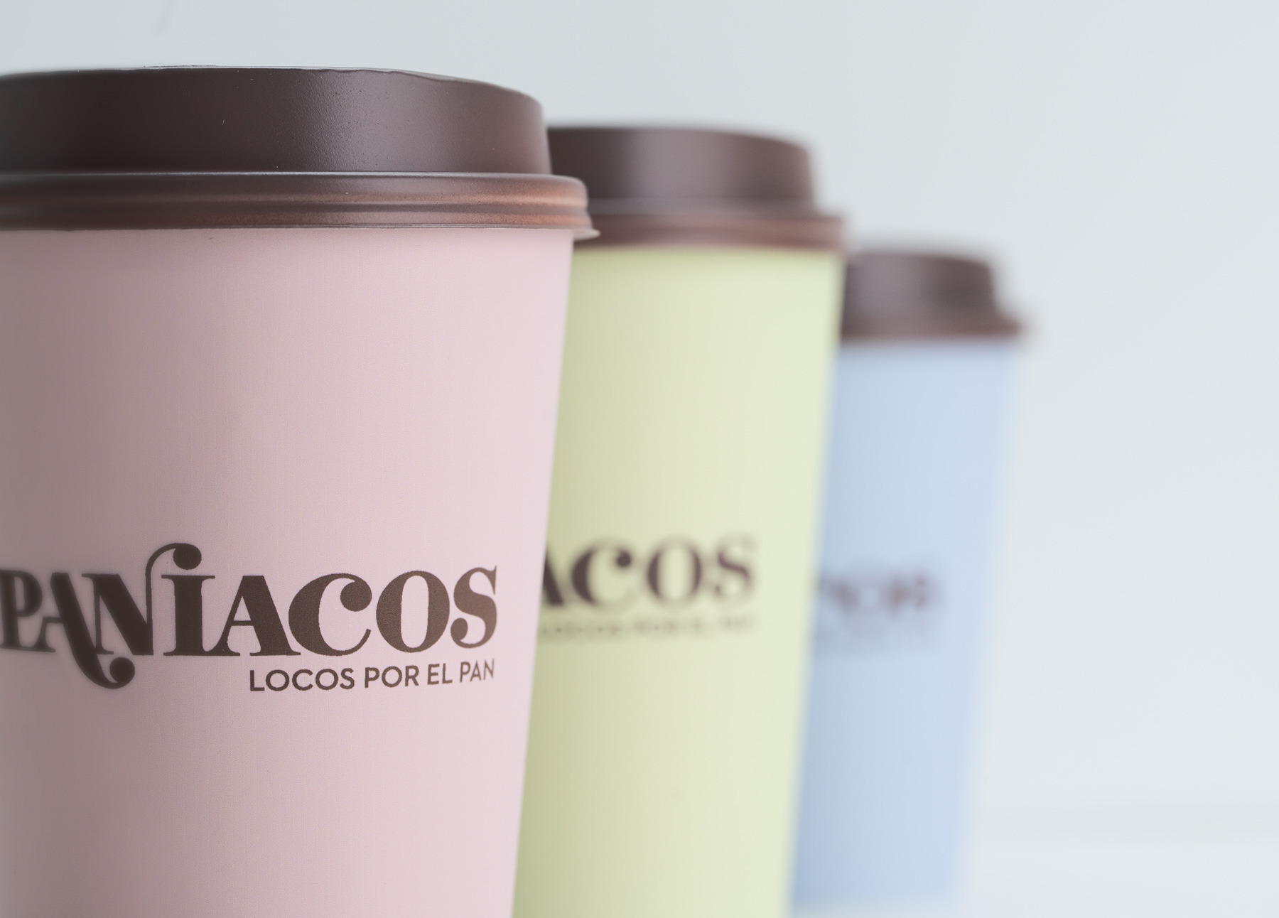
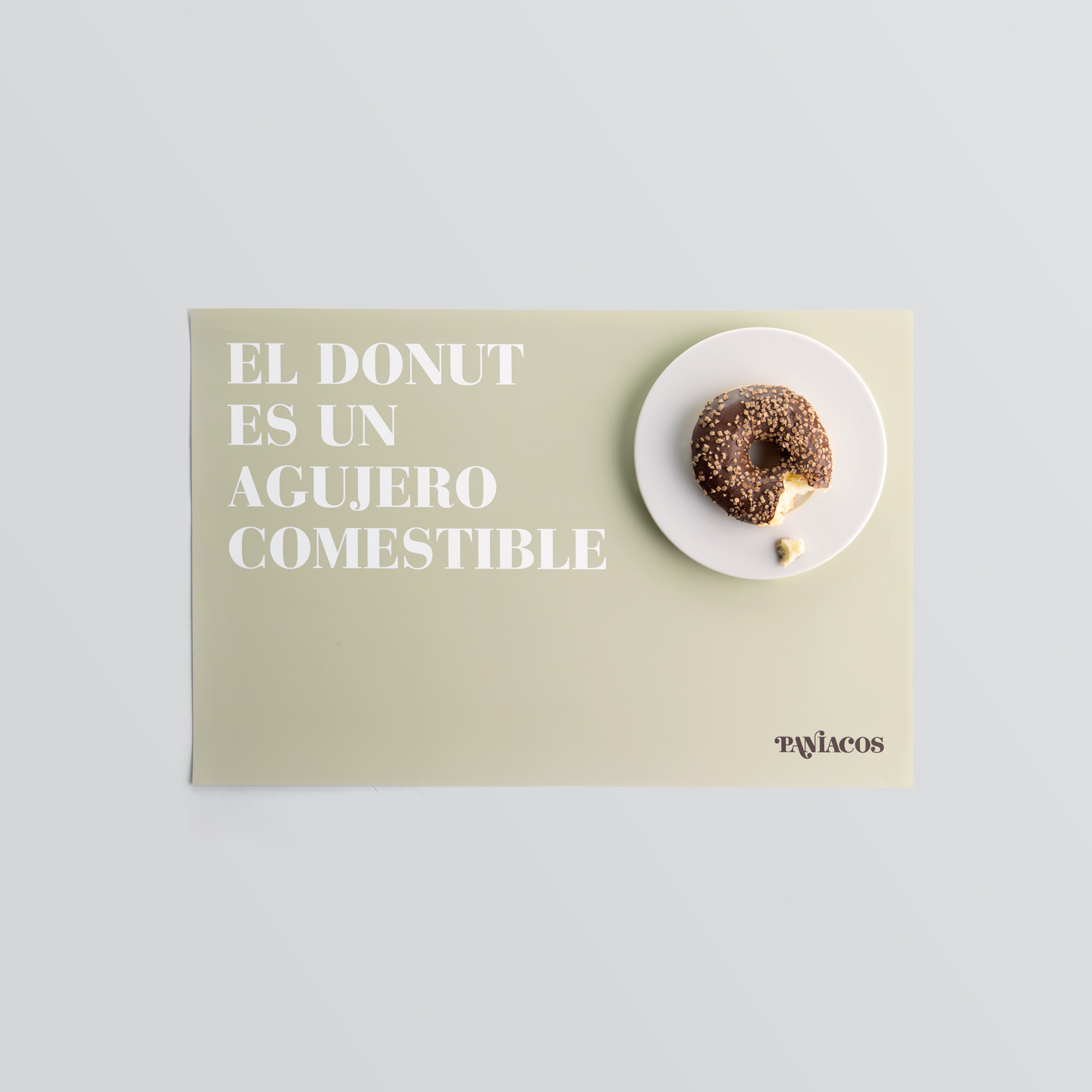
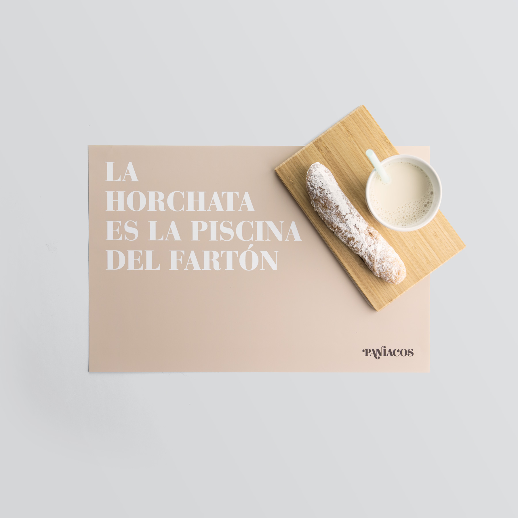
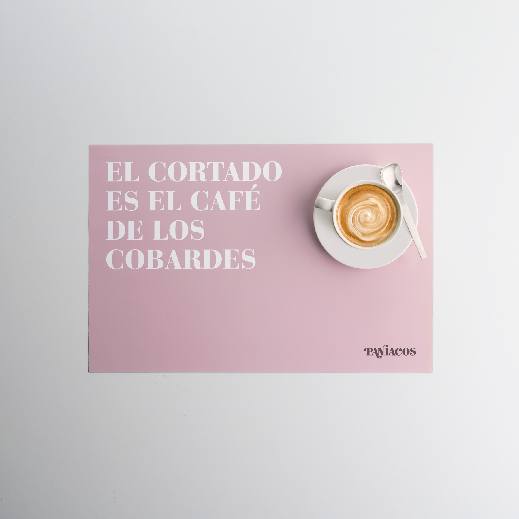
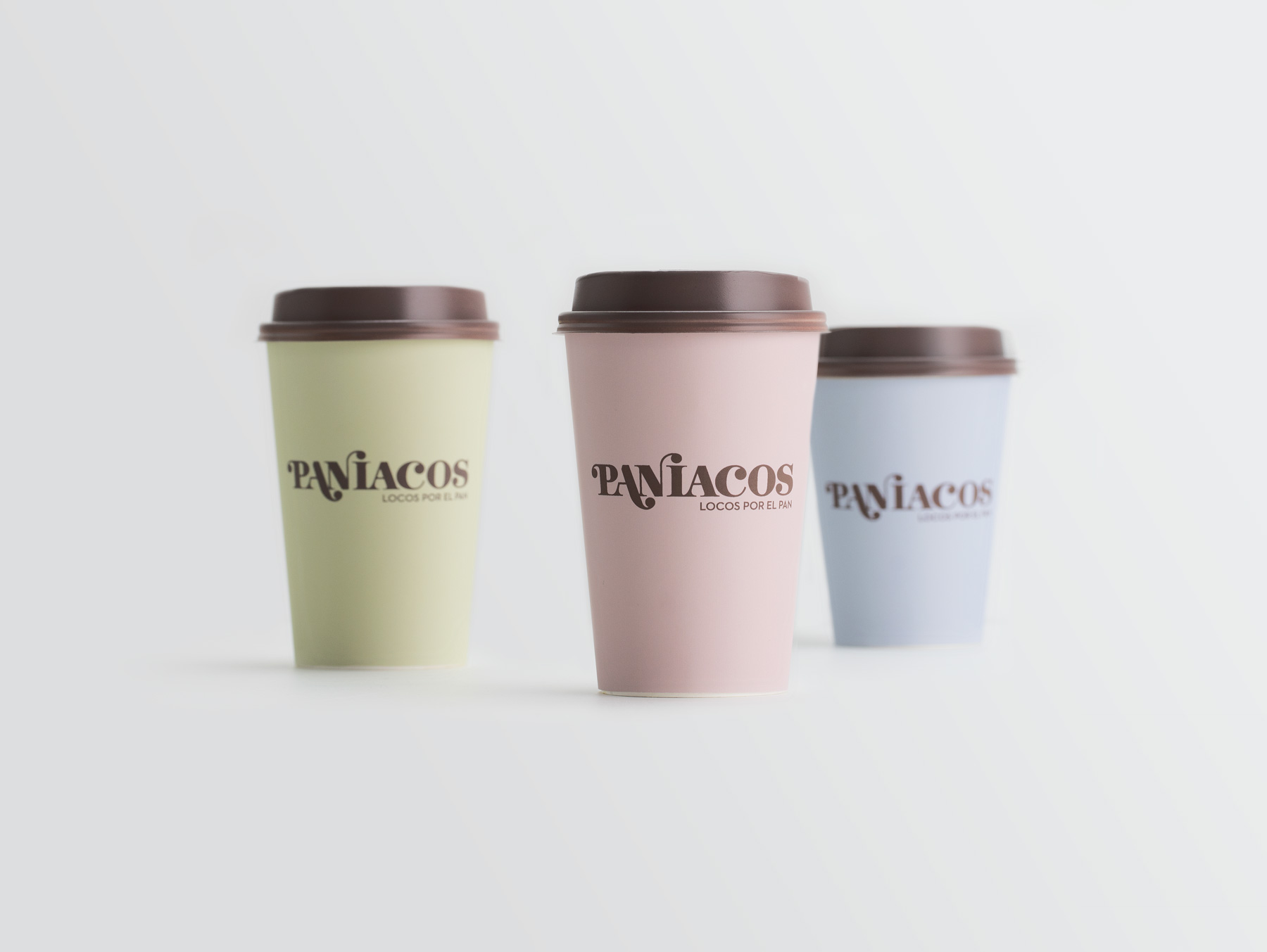
The logo seeks to balance tradition and modernity. It is based on a classic typeface, Bodoni, to which we added teardrop-shaped terminals—rounded end strokes that introduce dynamism and a subtle sense of irreverence. These details emphasise the word pan (bread) and culminate in the dot of the i. This hybrid, iconoclastic spirit defines the brand and extends to the tone of voice used in the copy across packaging and other applications—such as placemats, napkins, and bags—all set against pastel-coloured backgrounds.