Paniacos
Chain of bakeries/cafés, corporate identity, naming and packaging. A. Ruiz. 2014
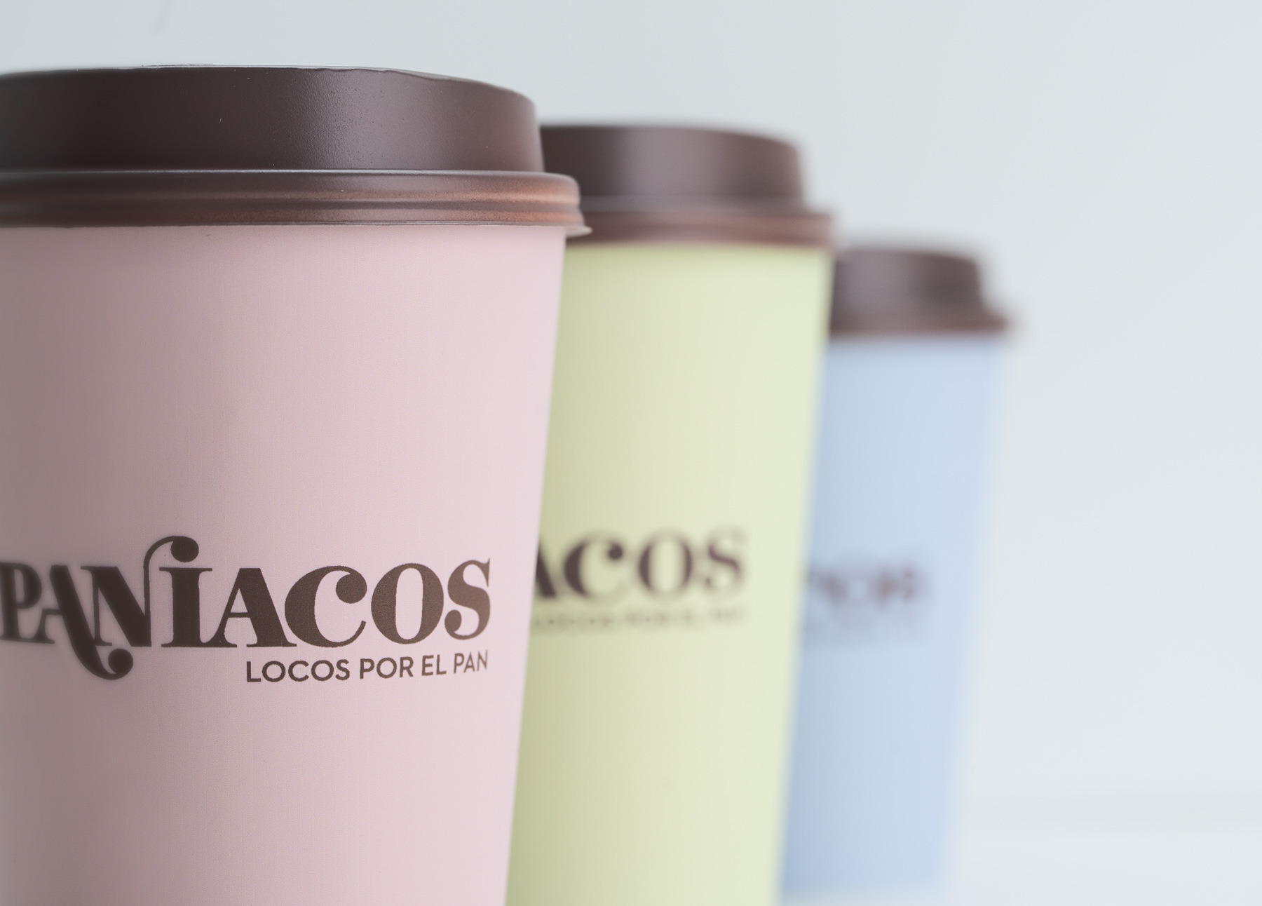
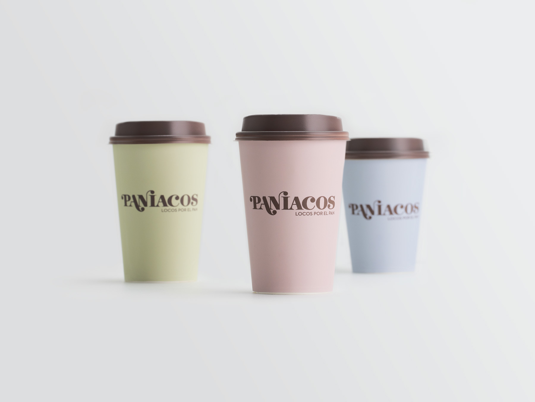
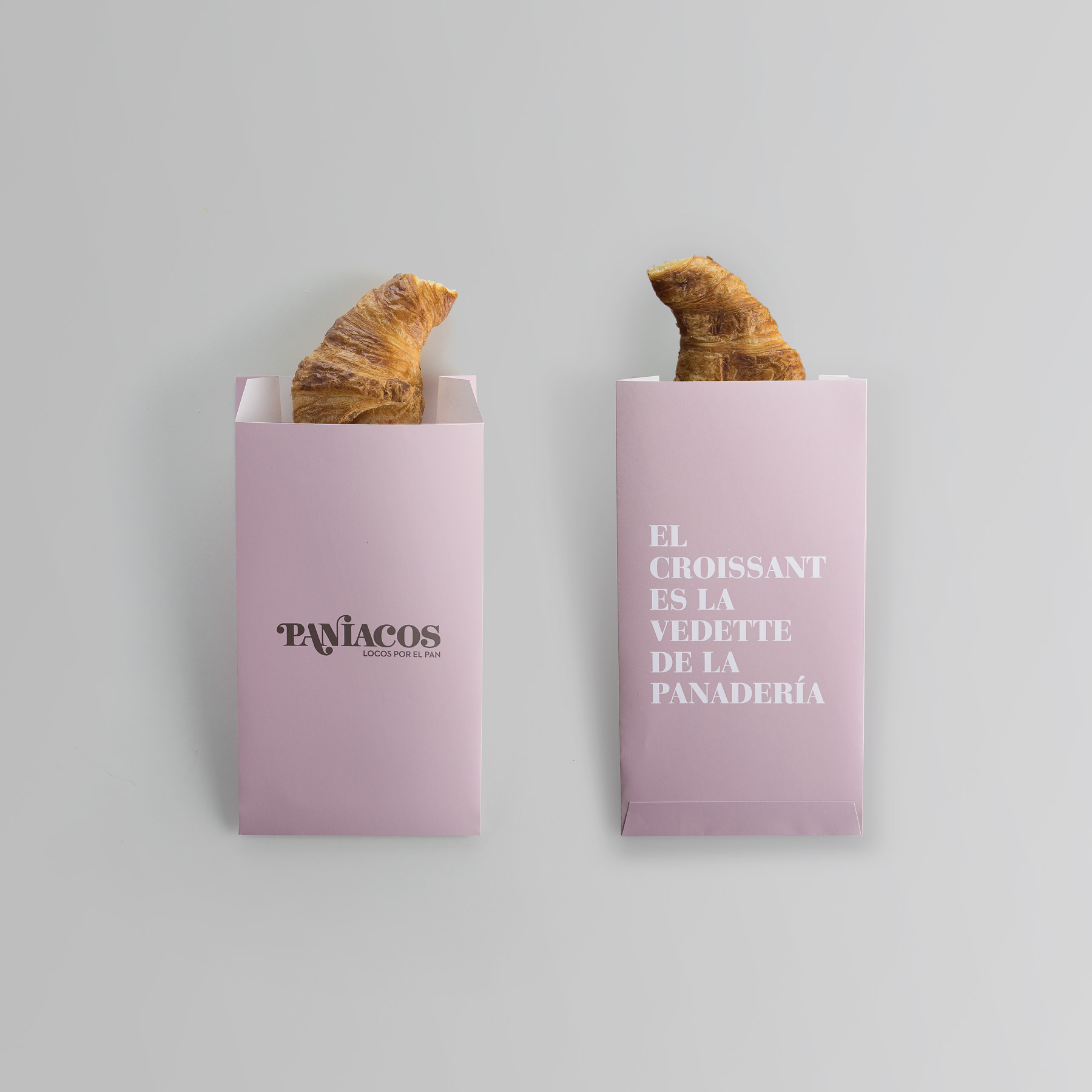
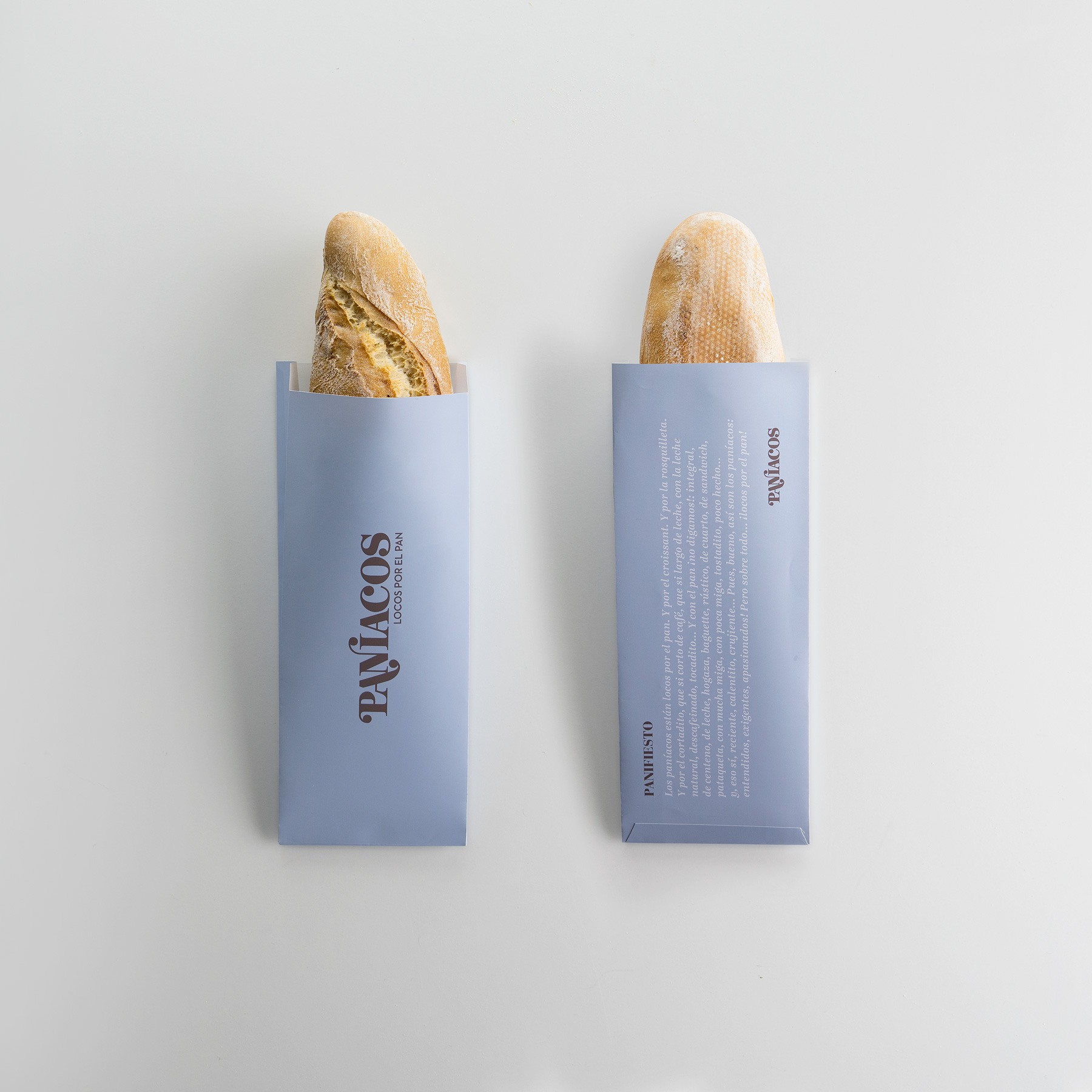
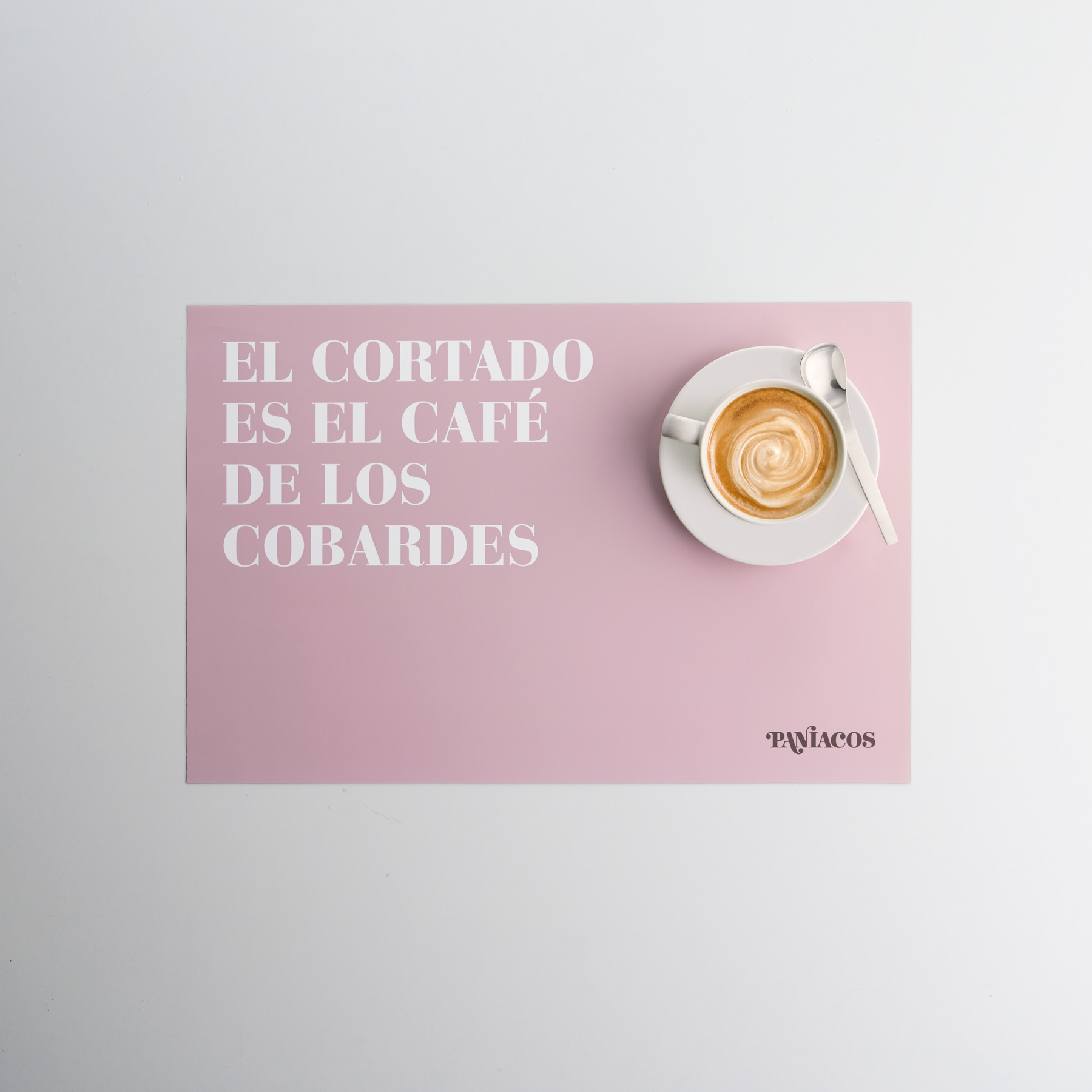
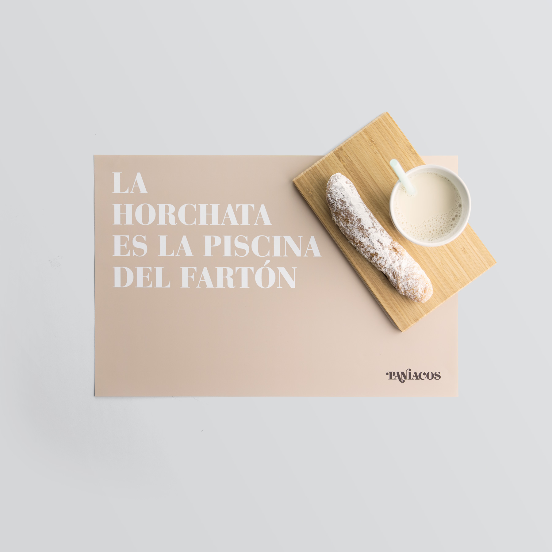
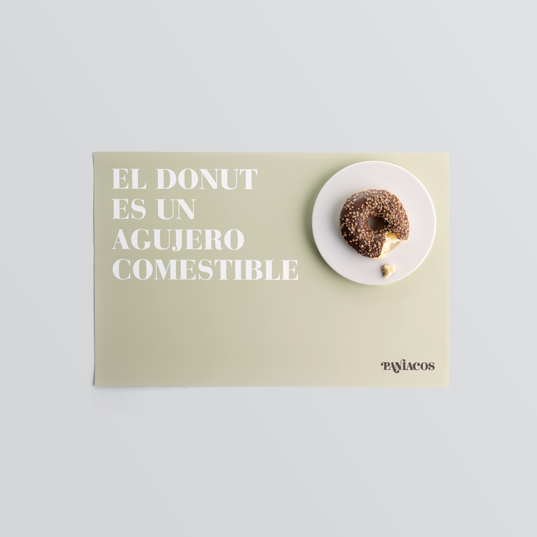
Paníacos (a portmanteau play-on-words of ‘bread’ and ‘maniacs’) springs from the new concept of bakeries that are also cafés. Featuring innovative and exclusive products made following traditional recipes. It is a business model that combines the tradition of the bakery with the modern service of the café, where you can have breakfast, lunch or afternoon tea while chatting or surfing the internet. The logo aims to combine tradition and modernity. It uses a classic typography, Bodoni, to which we have added a few teardrop terminals, the rounded end-strokes, which give it dynamism and a certain irreverence, setting the word ‘pan’ (bread) apart and coming to an end by depicting the dot of the ‘i’. This is the hybrid, iconoclastic ethos behind the brand, which also features in the ad copy that goes with the packaging and other elements—such as placemats, napkins, or bags—all on pastel-coloured backgrounds.