Piel·e Cosmetics

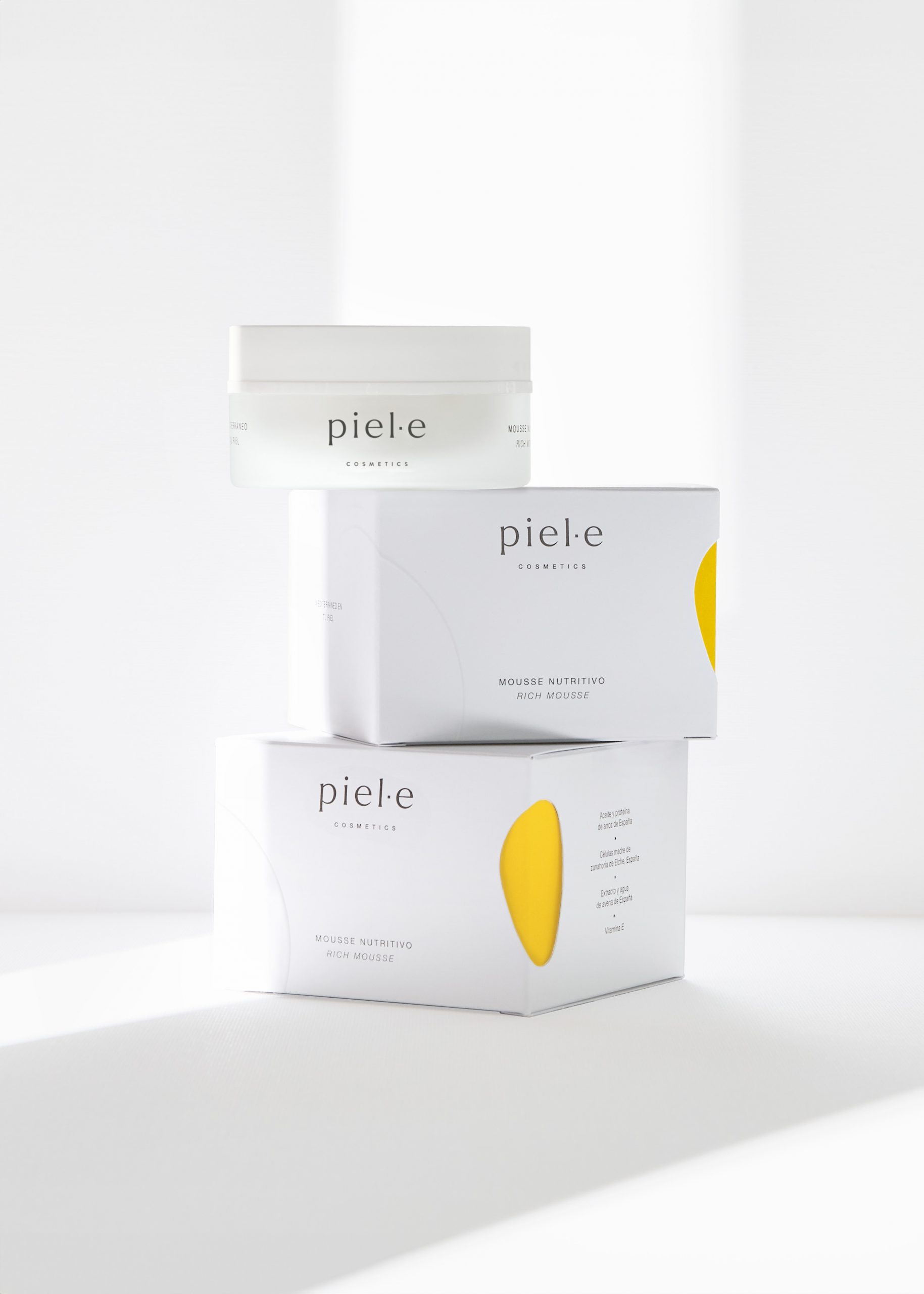
Packaging and logo for skin care products. Piel·e. 2022

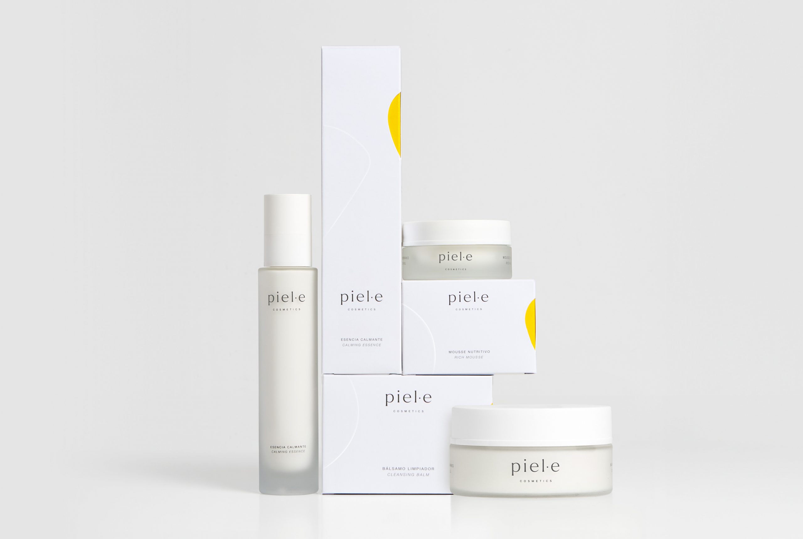
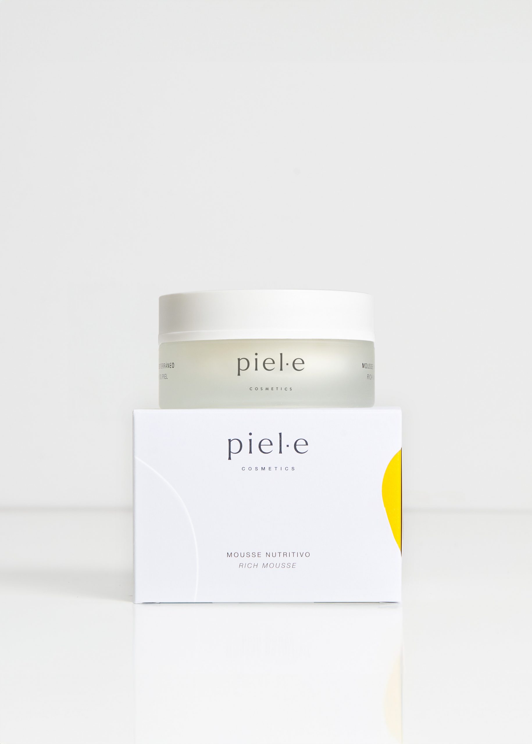
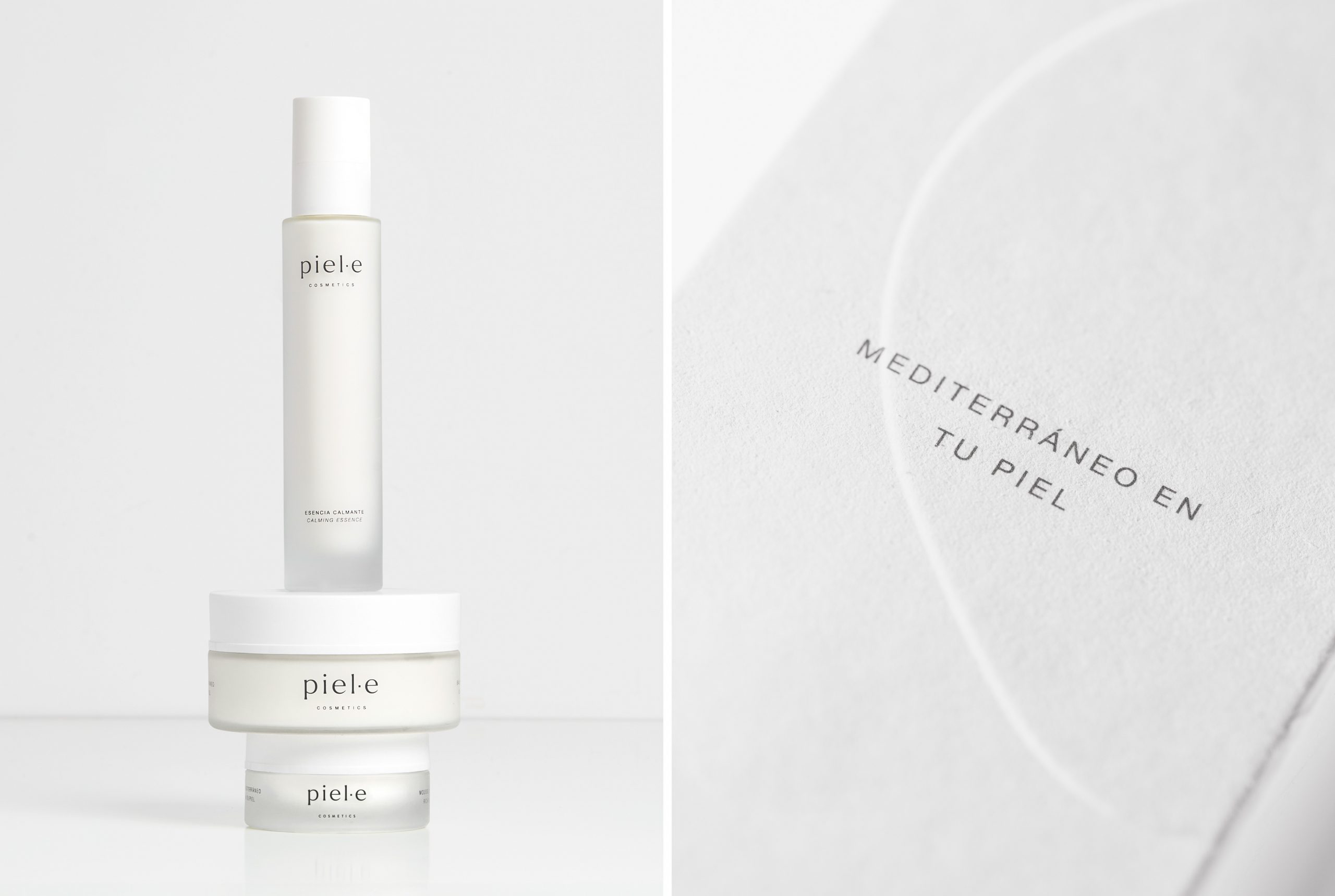
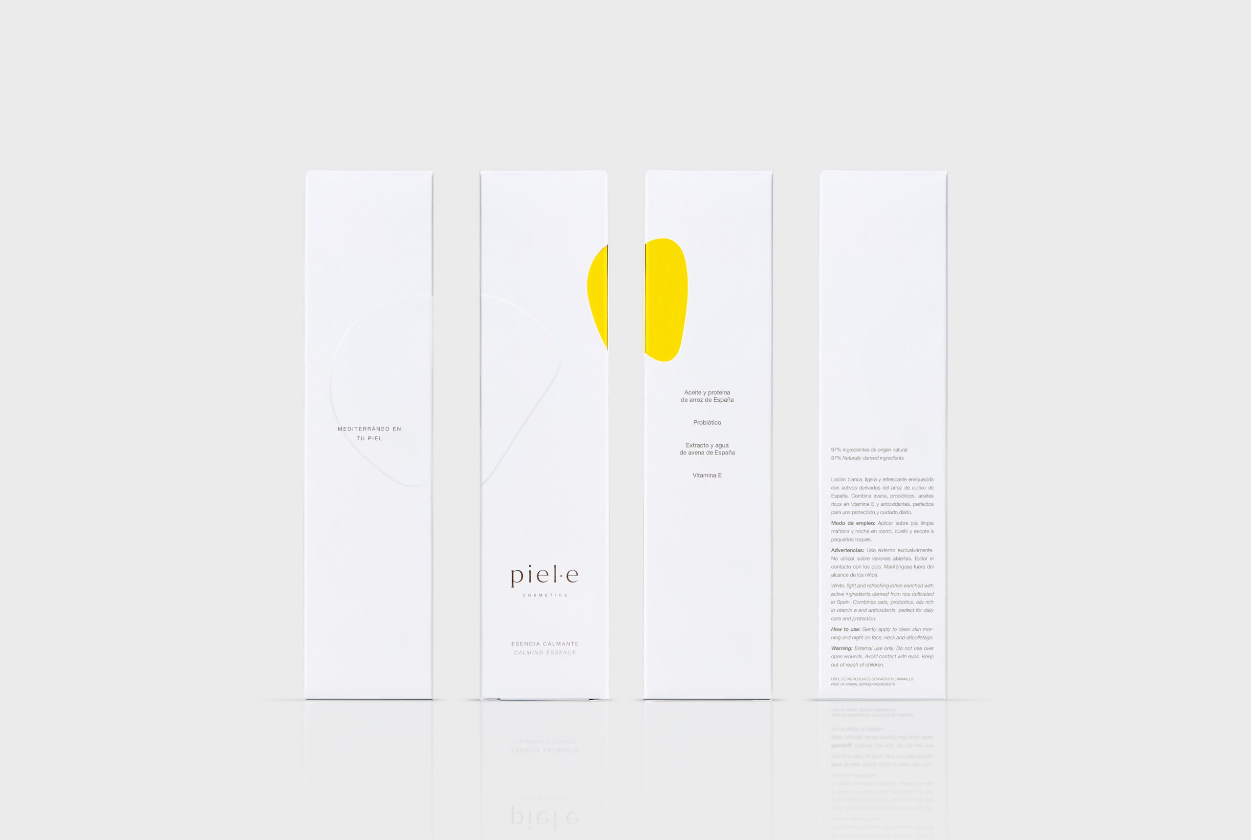
Piel·e is a brand of cosmetic products born with the intention of using ingredients from Spanish agriculture that represent Mediterranean culture. It is aimed at individuals who want to be part of the responsible and sustainable change in the cosmetics industry. We designed the logo with the Larken Thin typeface, which is stable, rich in nuances, expressive, and in lowercase (with appropriate kerning) conveys reliability and closeness. As for the packaging, we have tried to convey the main brand personality traits: elegance, with the predominance of the white background and text composition; sensoriality, through the presence of an die-cut organic shape that reveals the color inside the box, yellow for this first line, and a raised design that interacts with it. The primary translucent glass packaging also reinforces these sensations of softness and sensoriality, which are at the core of this premium brand.

www.piel-e.com