Sunsilk sells hundreds of millions of units worldwide each year. This therefore represents a project of major importance, involving significant investment—not only in the production of new bottles and jars, but also in the configuration of manufacturing plants and assembly and packaging lines across the main geographical areas where the brand has a strong presence.
The process was extremely thorough, ranging from an initial two-day briefing with a team of more than thirty people, to a creative development phase lasting almost two years, followed by consumer testing and compliance with the company’s sustainability programme.
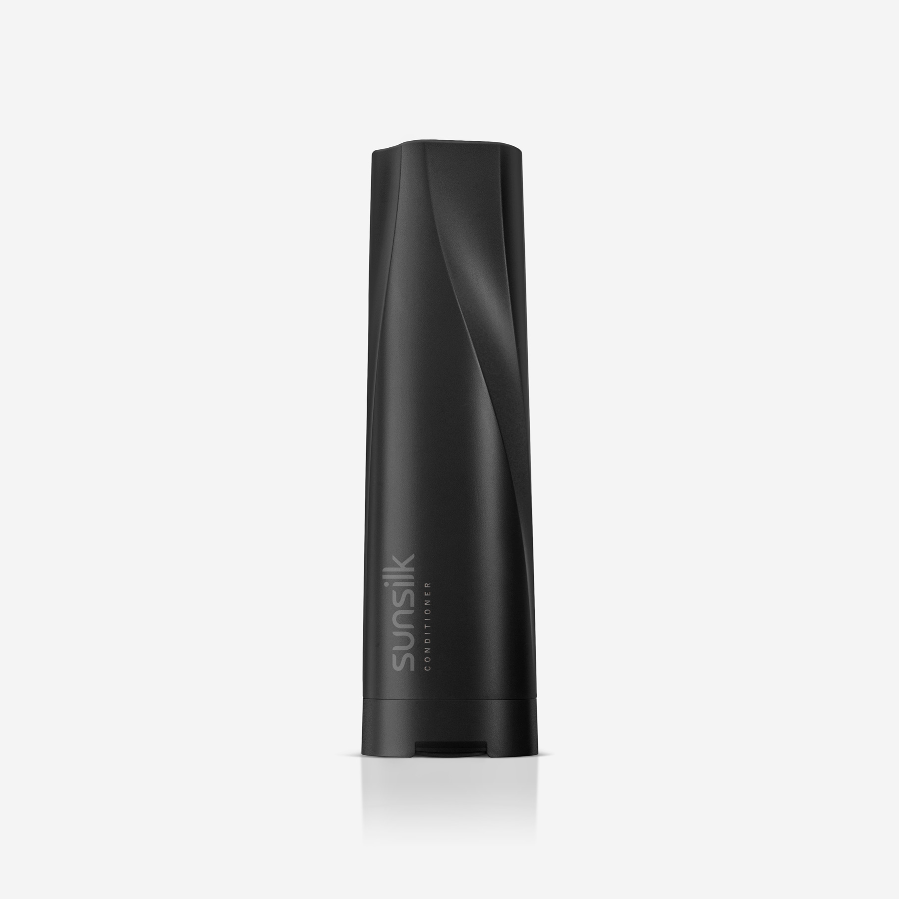
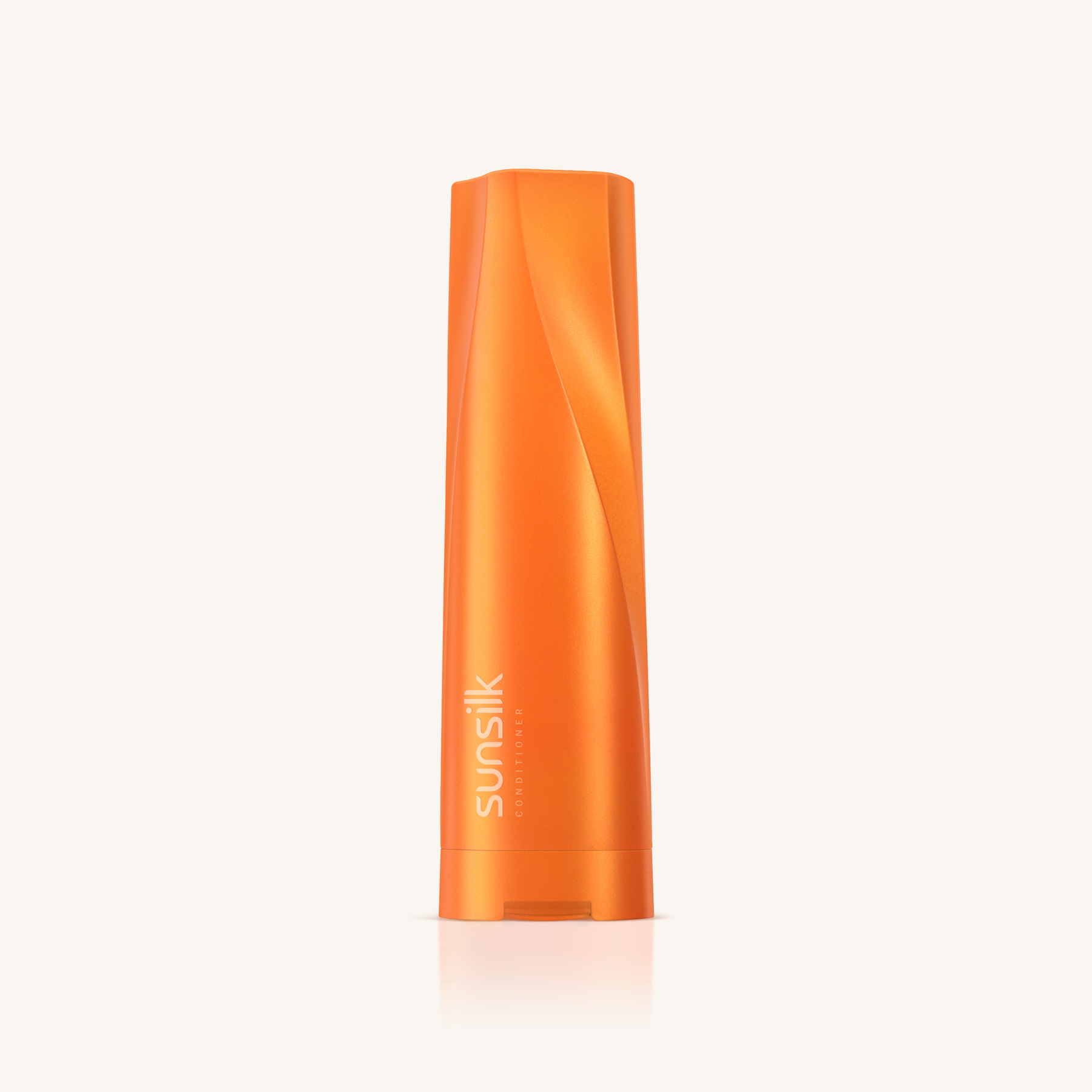
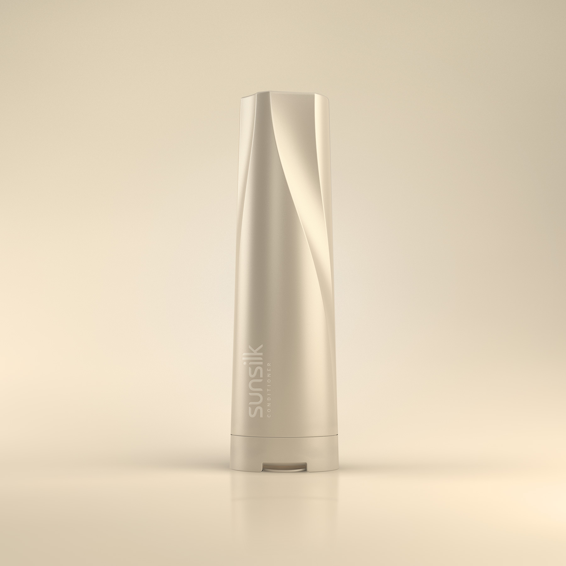
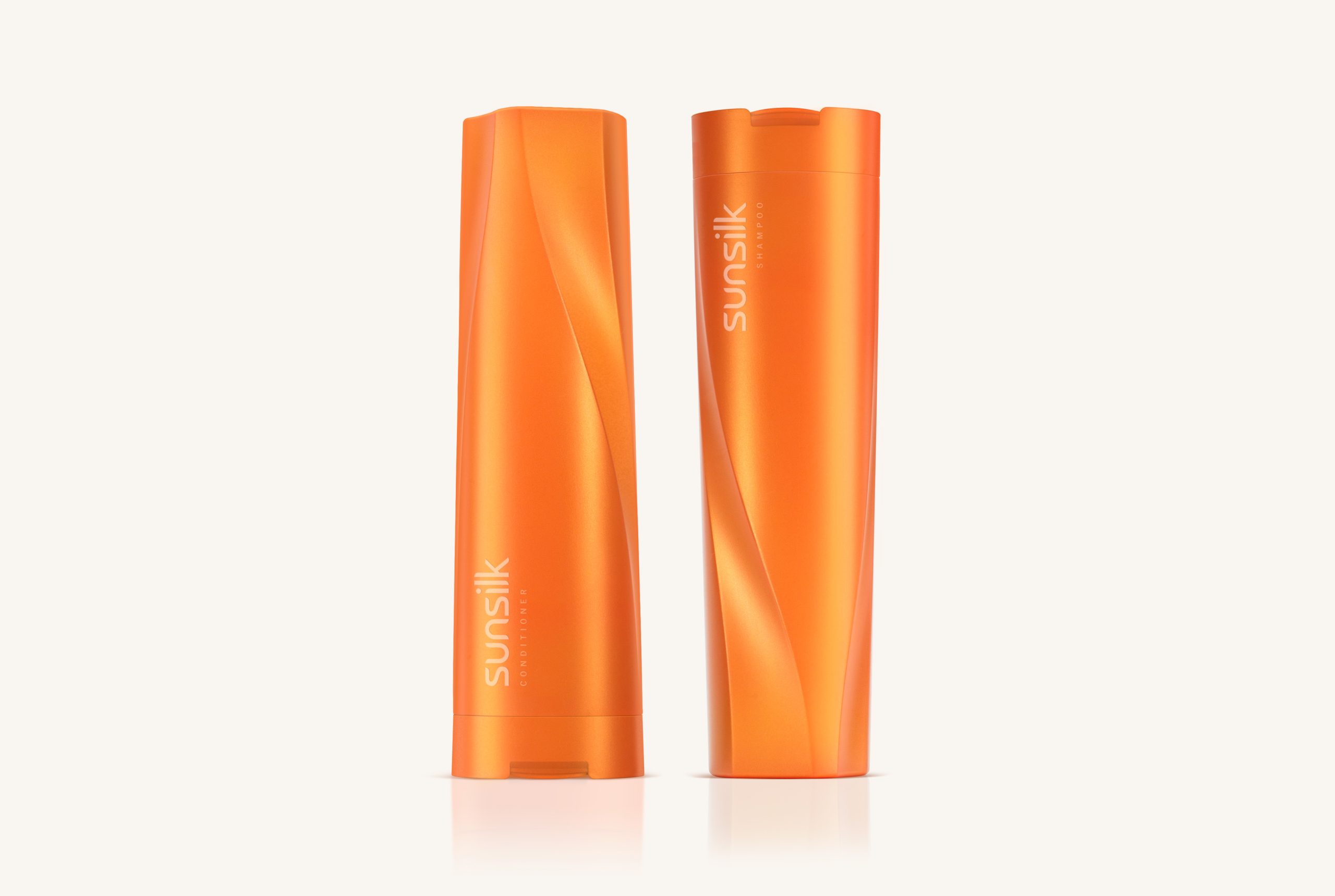
Sunsilk is a brand dedicated exclusively to haircare. It is aimed at young, open-minded, dynamic women who understand hairstyling as a key means of expressing their personality. Among the brand’s attributes, colour and expressiveness were identified as the core drivers of this project. In addition to a vibrant colour palette, the design is defined by an undulating surface that runs vertically along the containers—a feature that conveys dynamism and refers to the freedom of movement of healthy hair.
The design was adapted across the different formats in the range—bottles of various capacities and jars—so that all products share a strong, cohesive identity, easily recognisable both visually and through touch. This tactile quality was particularly important, given the conditions under which these products are used.
Colour, expressiveness, and efficacy. That is Sunsilk.