The Great Fusion
Skincare Range
Client The Great Fusion
Year 2021
Logo
Brand Identity
Packaging
Web
Naming
Art Direction
Awards
LAUS ADG-FAD 2023.
Bronze. Product Range. Packaging
WORLD BRAND DESIGN SOCIETY 2022.
Silver. Packaging Design Creation
Home
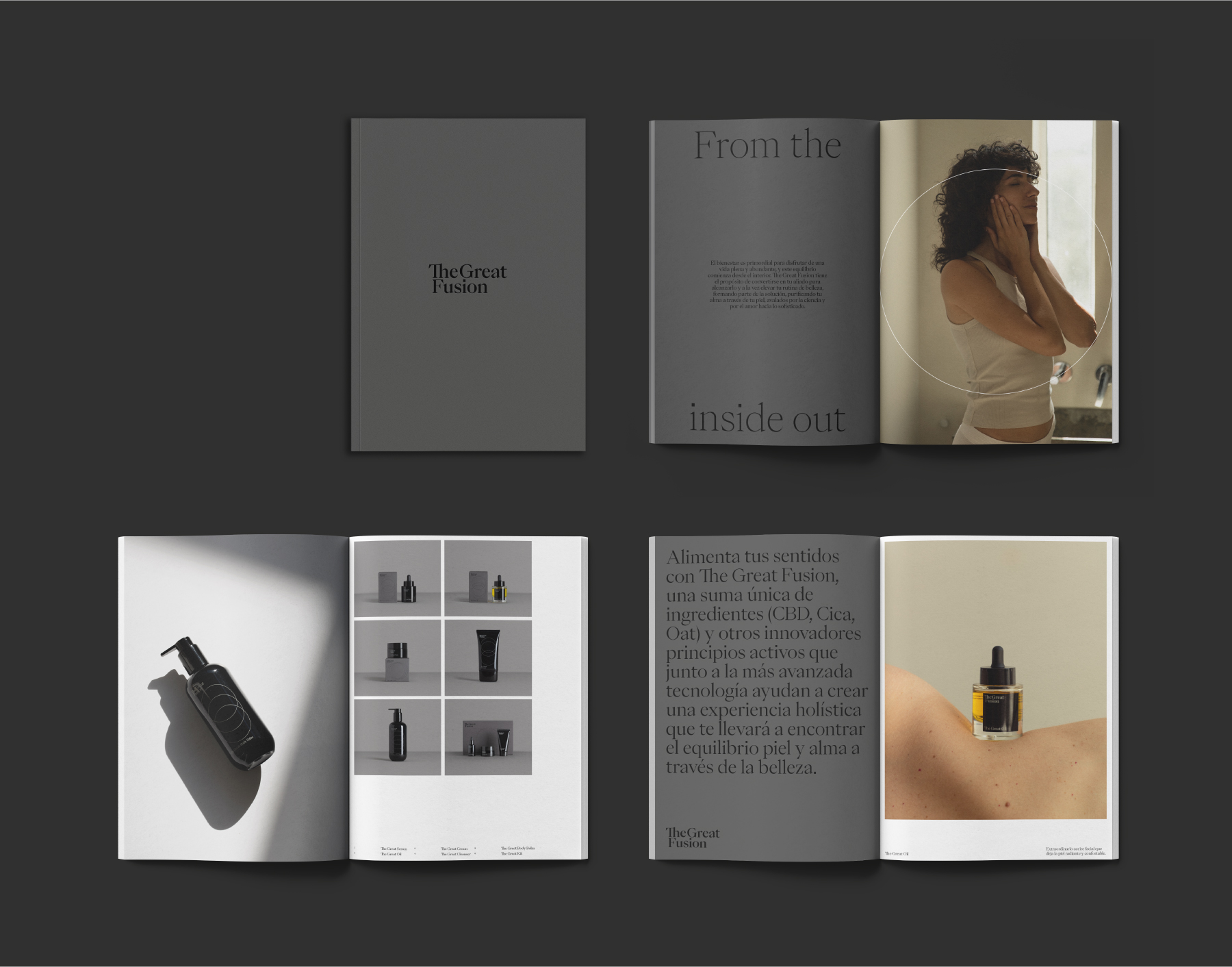
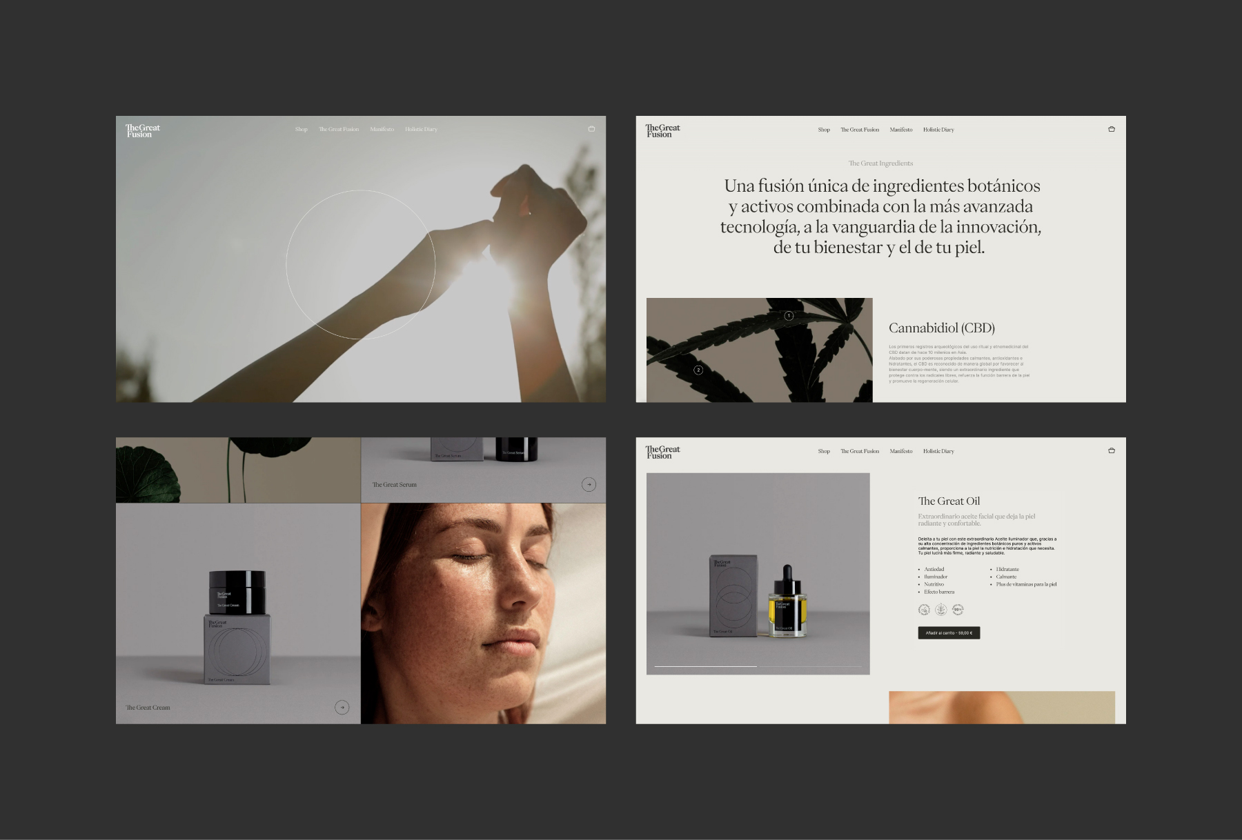
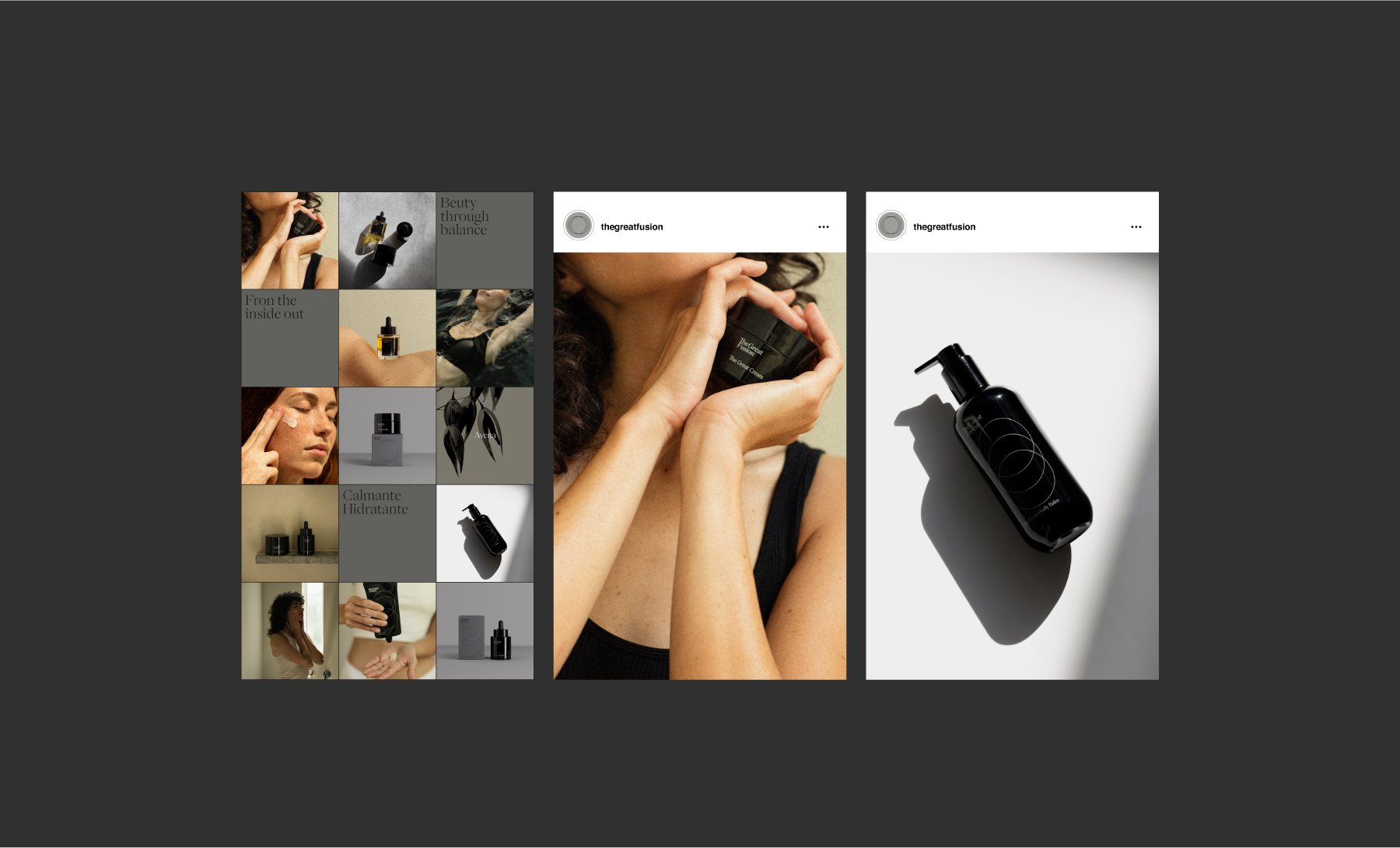
This was a global project in which all the brand’s communication elements were developed: naming, logo, visual identity, packaging, photography art direction, and website (web development by Nectar Studio).
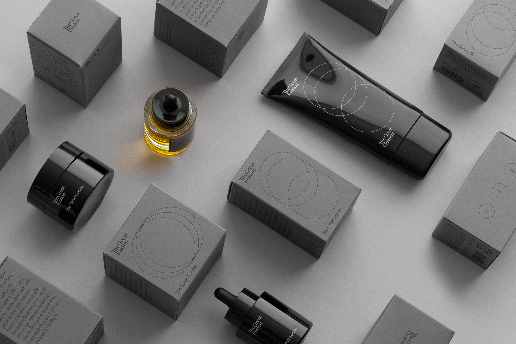
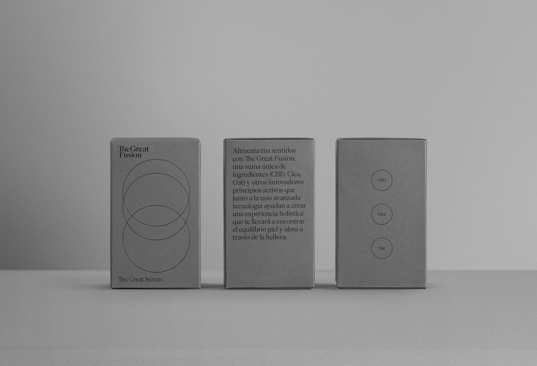
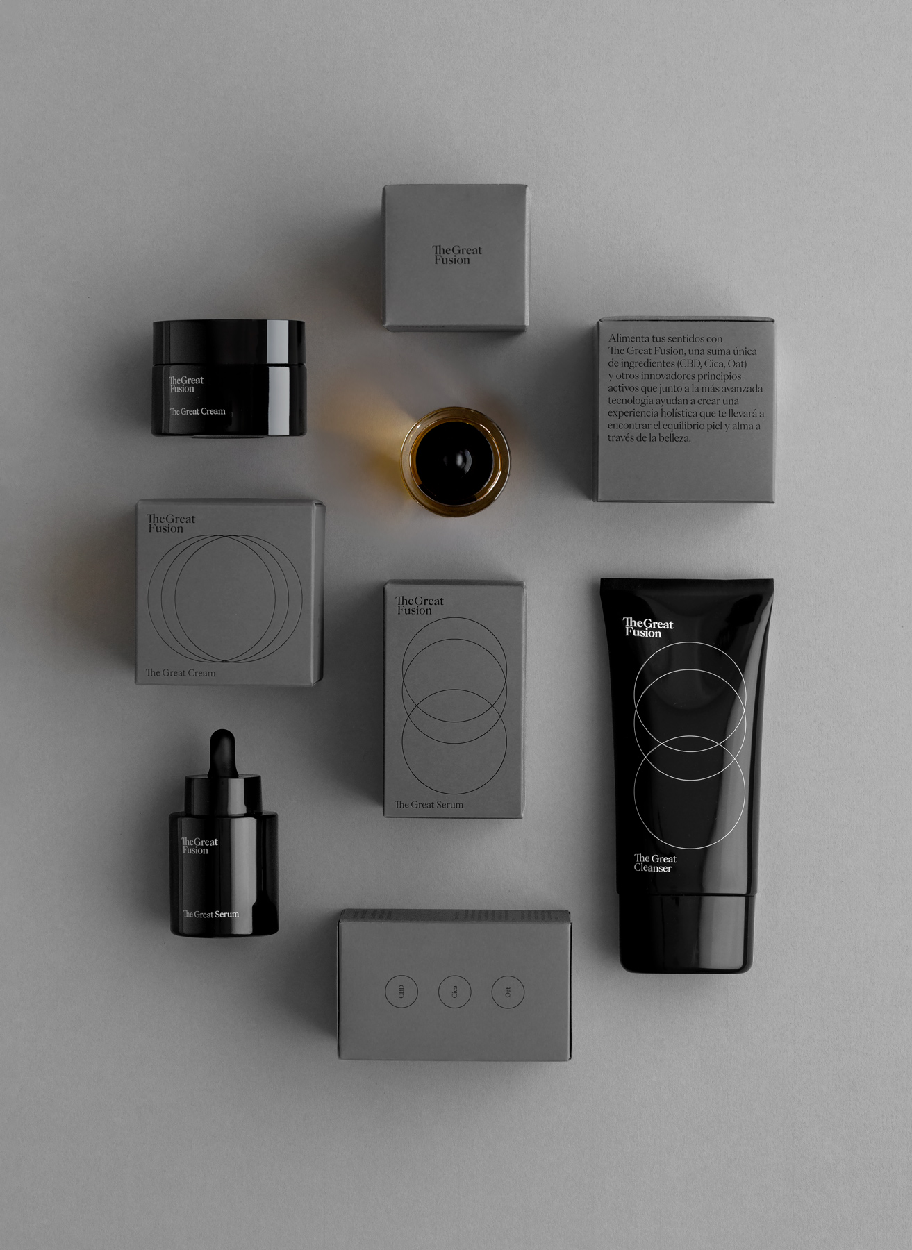
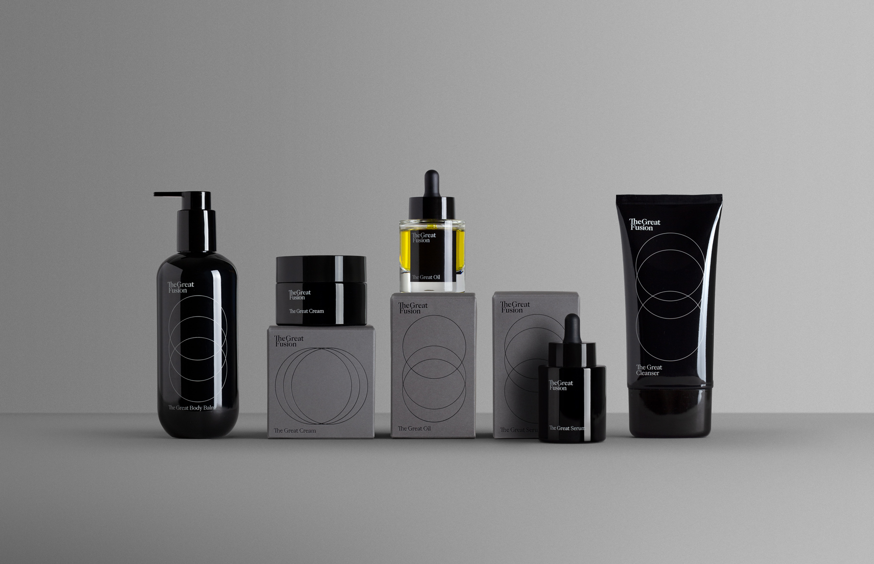
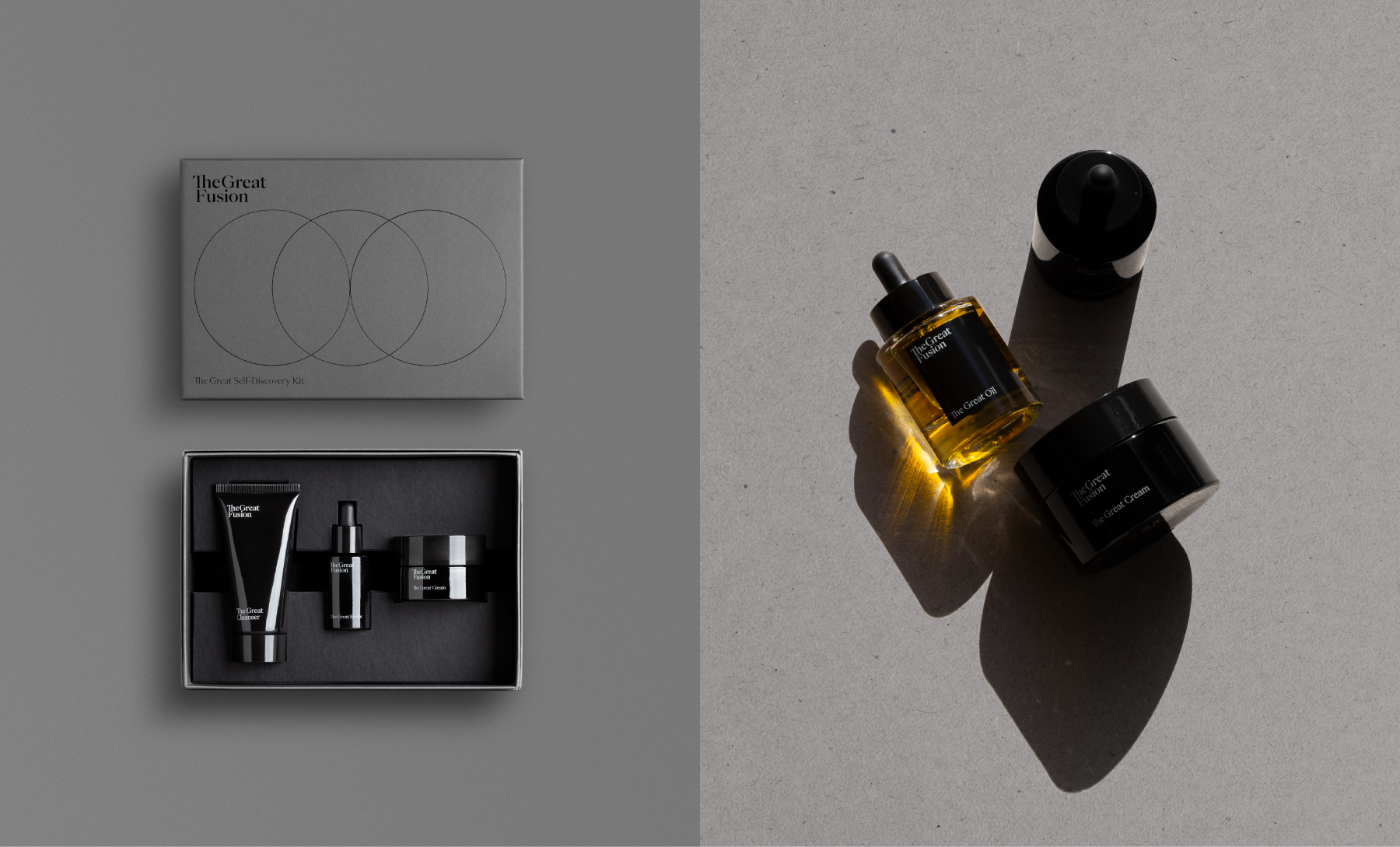
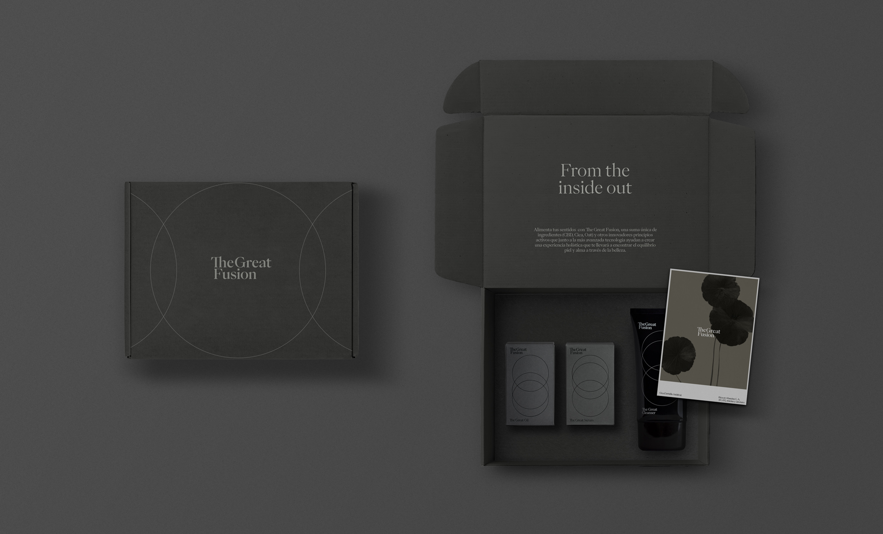
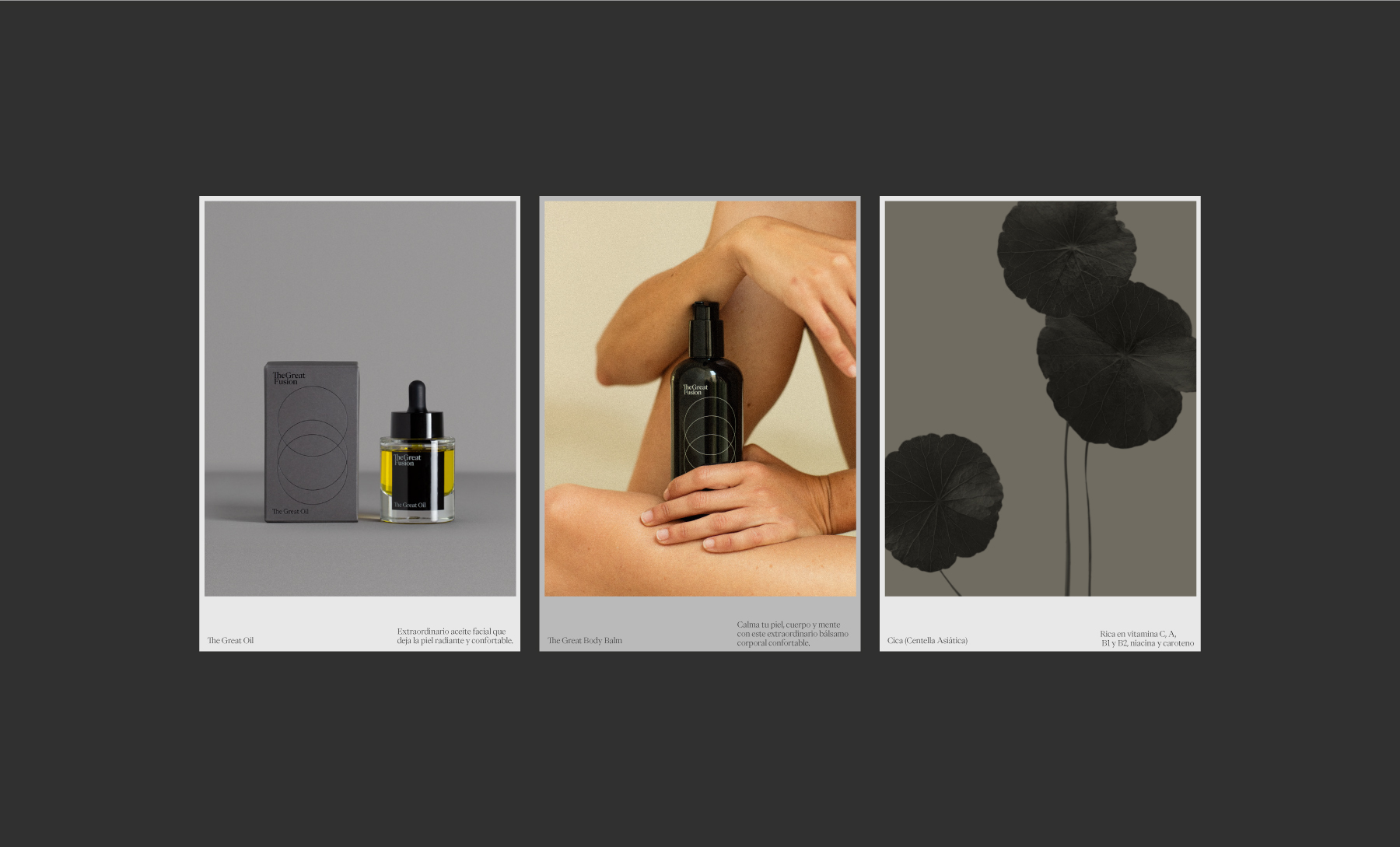
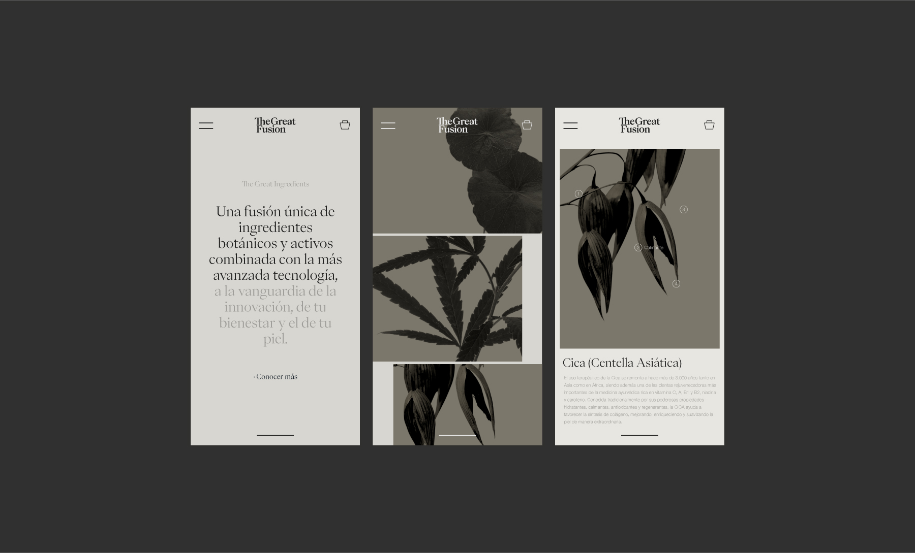
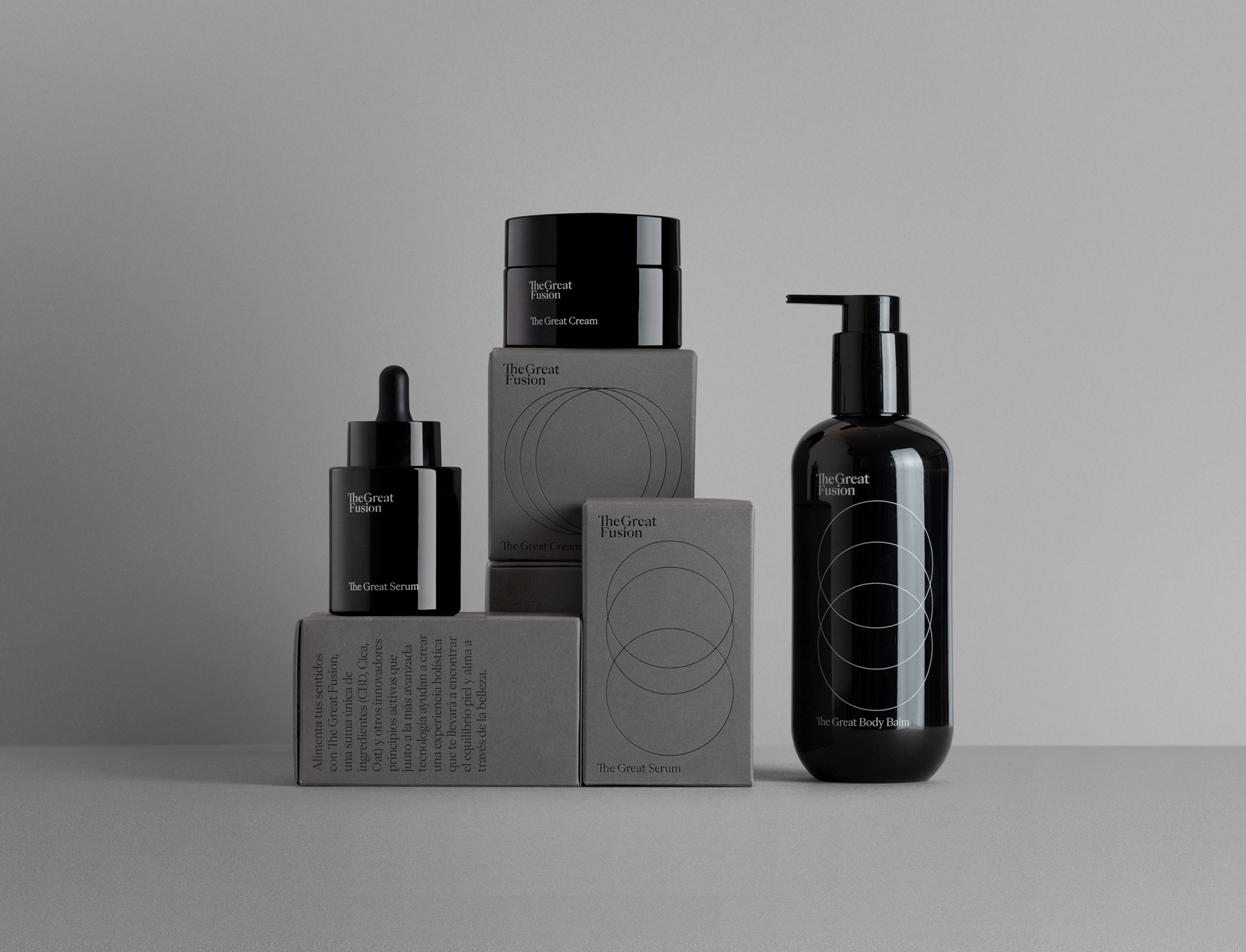
The Great Fusion is an indie beauty brand that views the individual as a whole, offering products designed to promote calm and inner peace by acting on the skin—so that external care also becomes a moment of personal balance and inner well-being. The brand is the result of combining traditional botanical knowledge with advanced technology, bringing together three key ingredients: hemp, cica, and oats.
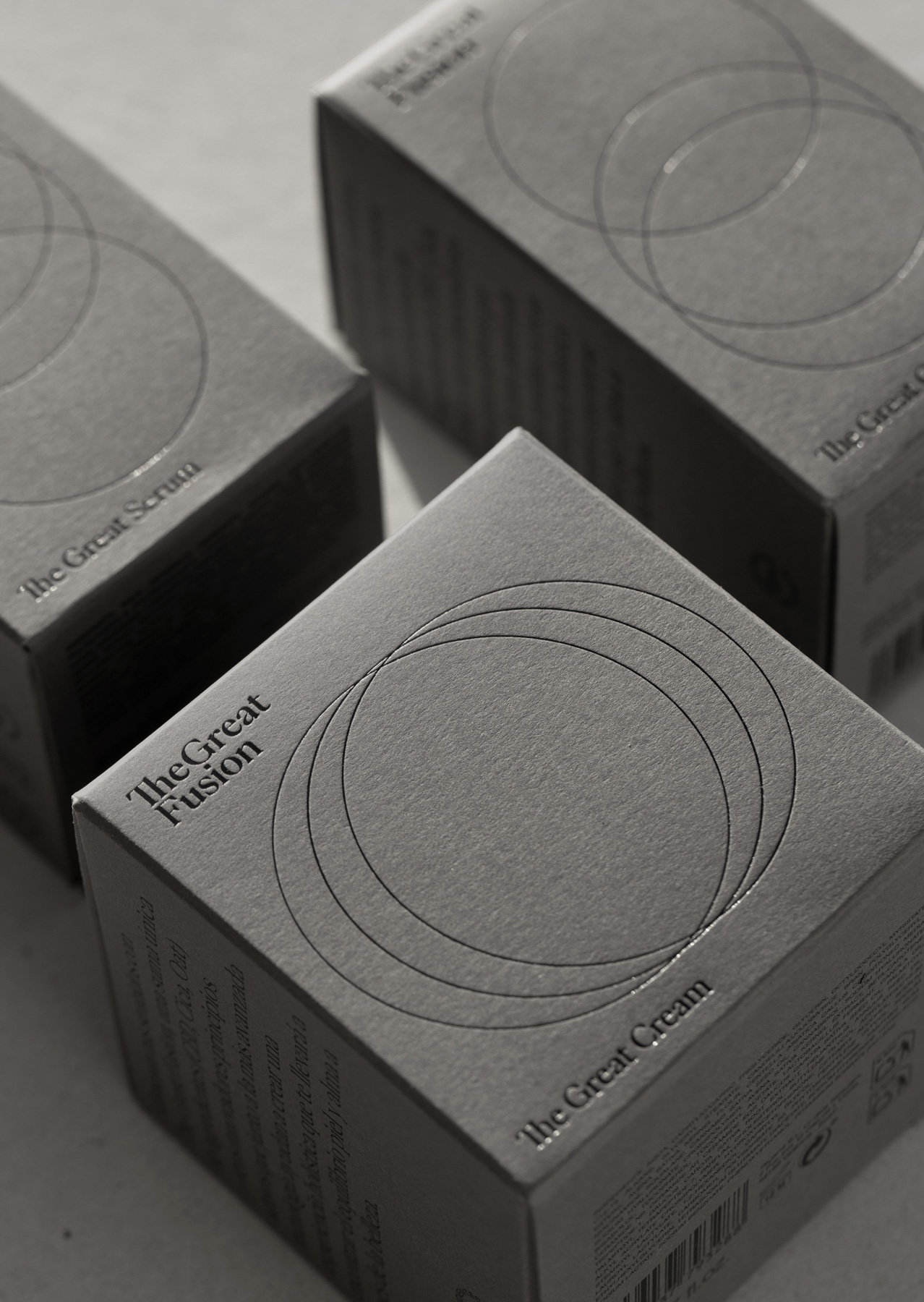
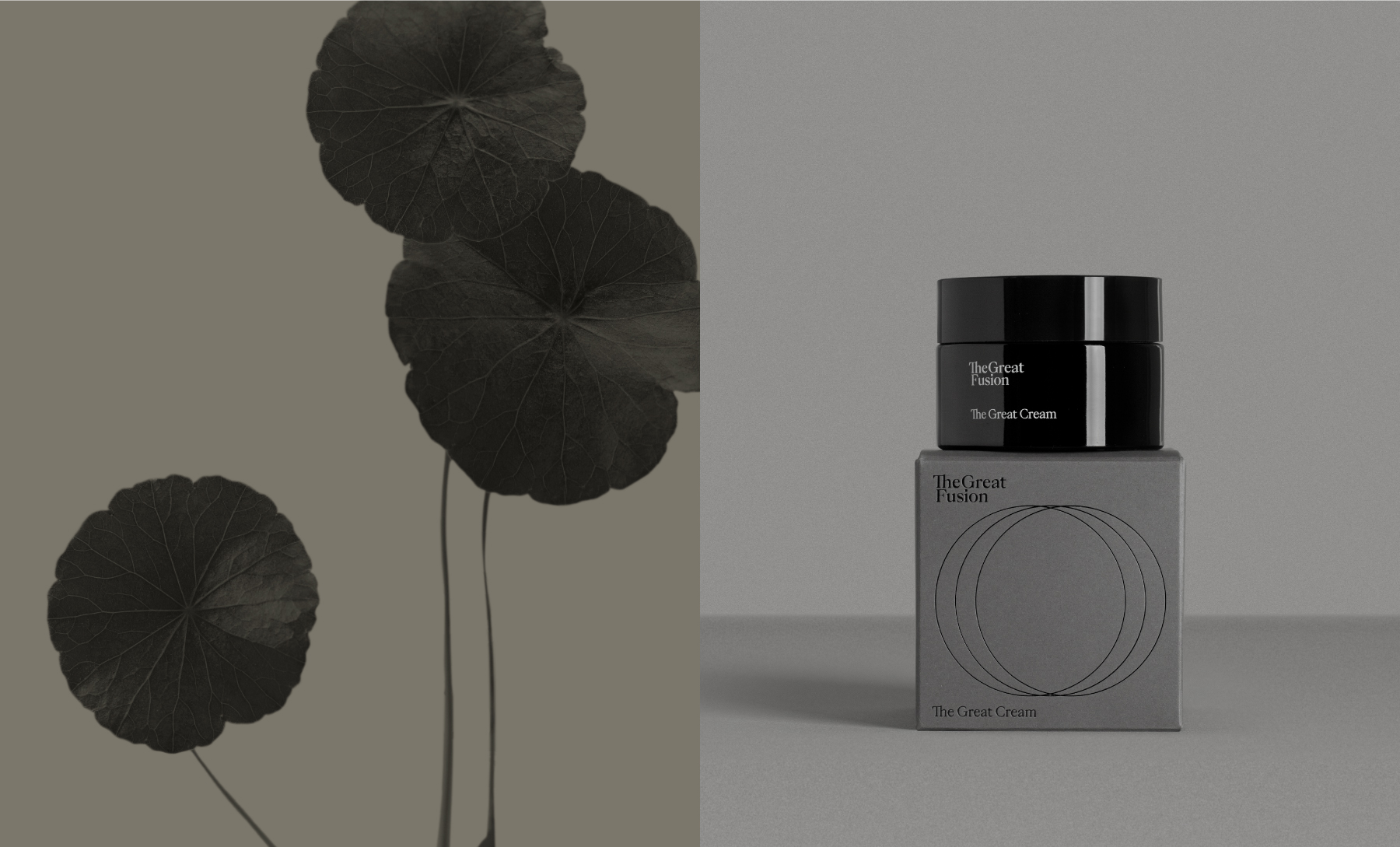
The main graphic element of the packaging design consists of three circles that merge, emphasising the union of these ingredients. These circles also function as a recurring graphic device across the brand’s printed materials, website, and social media. The circle represents perfection: it both highlights and isolates, and is often used as a visual counterpart to the brand’s discourse, drawing attention to what is essential and reinforcing key messages.
The logo is structured across two lines, separating the two core concepts—Great and Fusion—and is set in the PP Eiko typeface, which is also used consistently throughout the brand’s communications.