U/1ST
Makeup Range
Client U/1ST
Year 2022
Logo
Brand Identity
Packaging
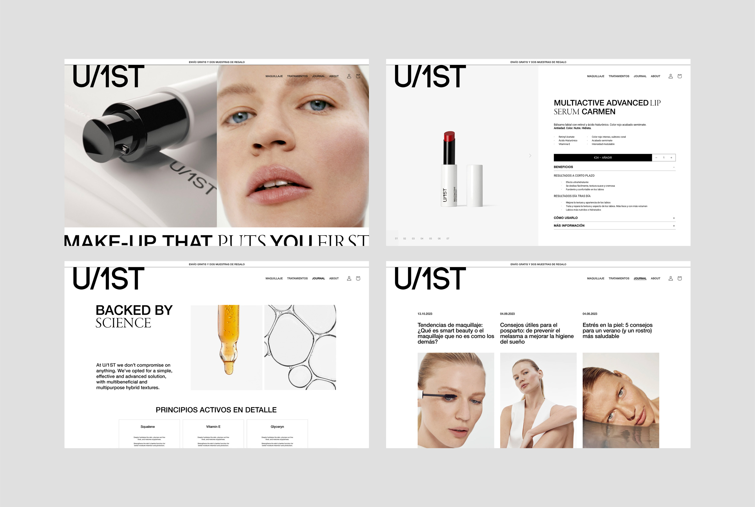
Web
Naming
Art Direction
Awards
WORLD BRAND DESIGN SOCIETY 2023.
Silver. Packaging Design: Product Creation
Home
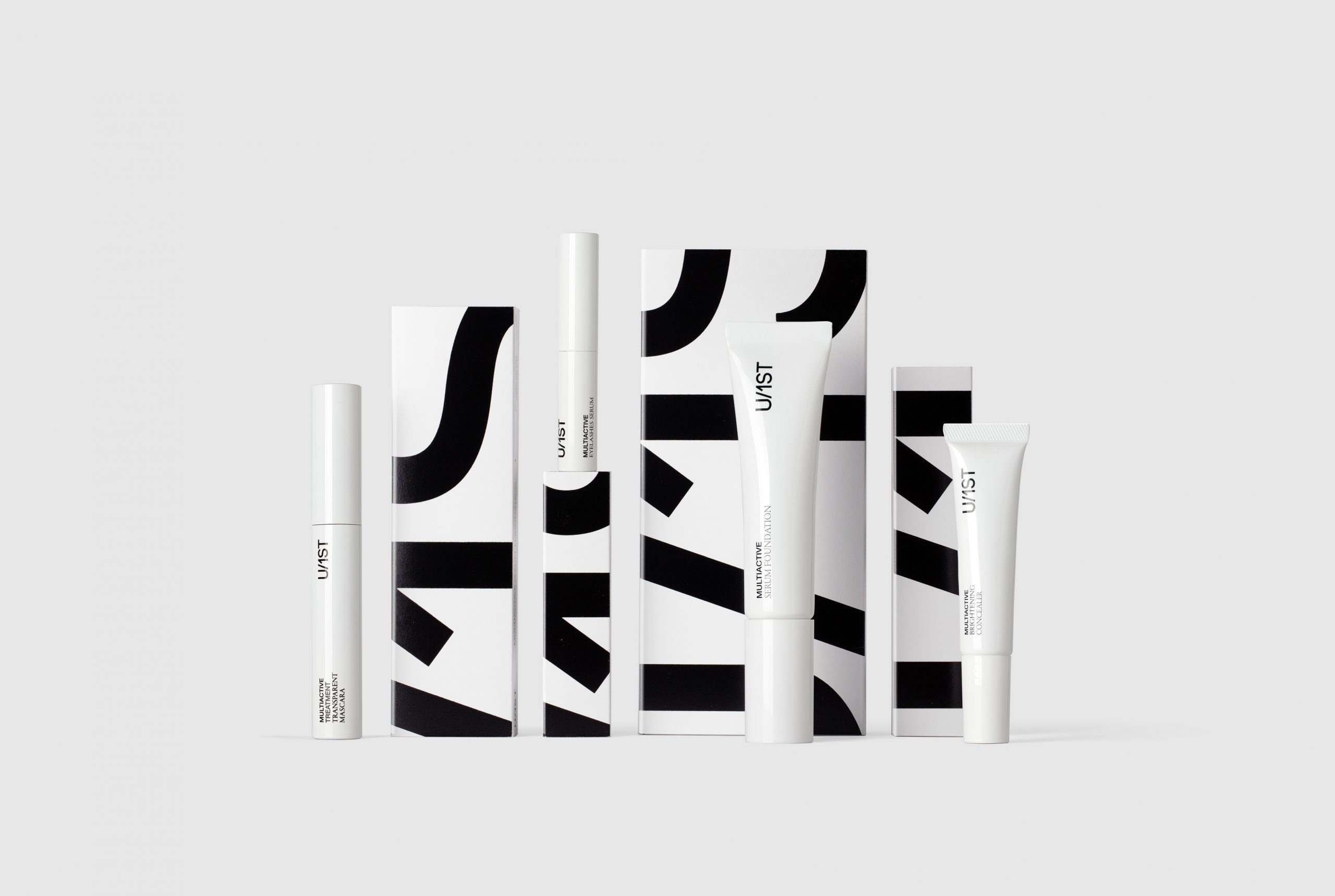
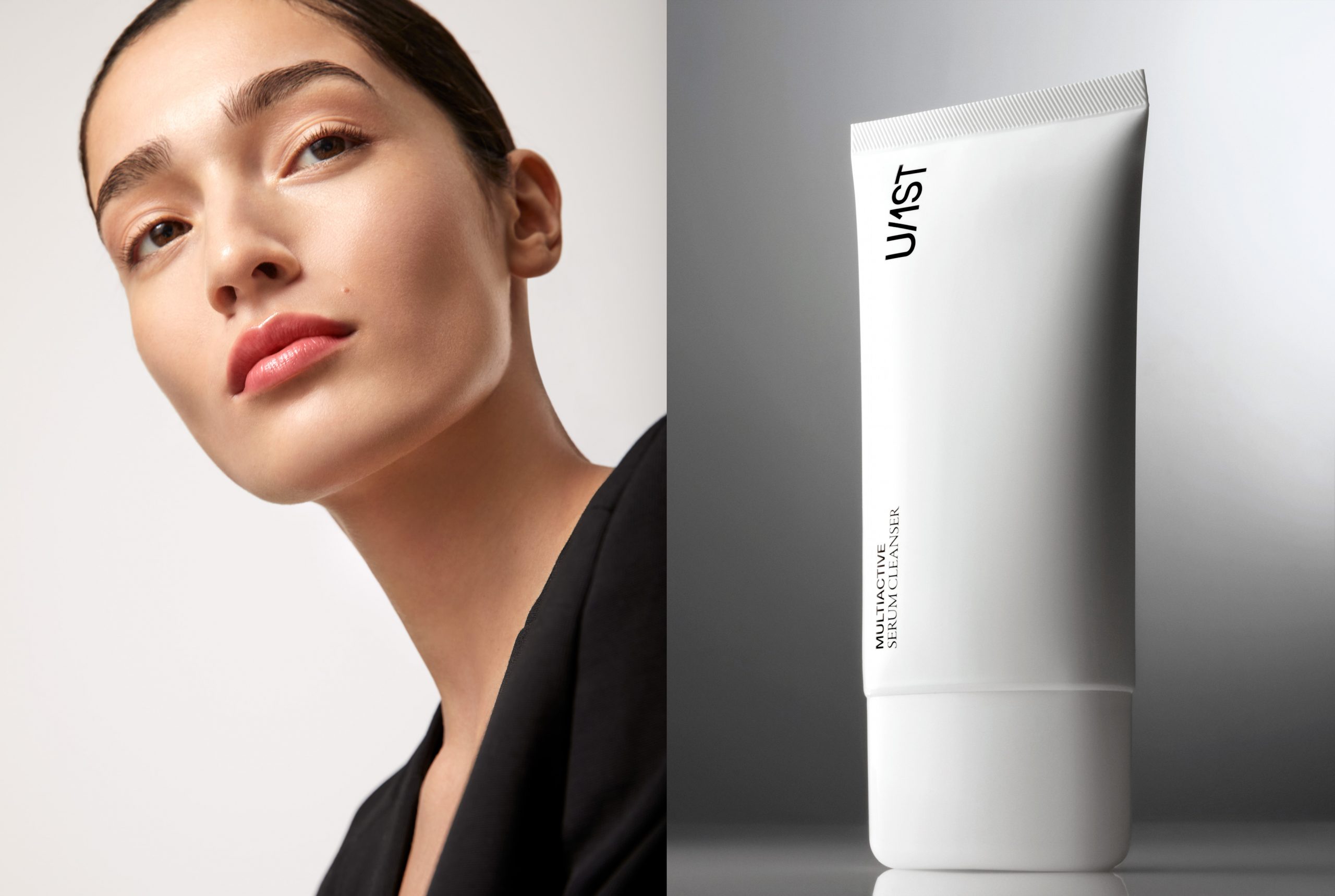
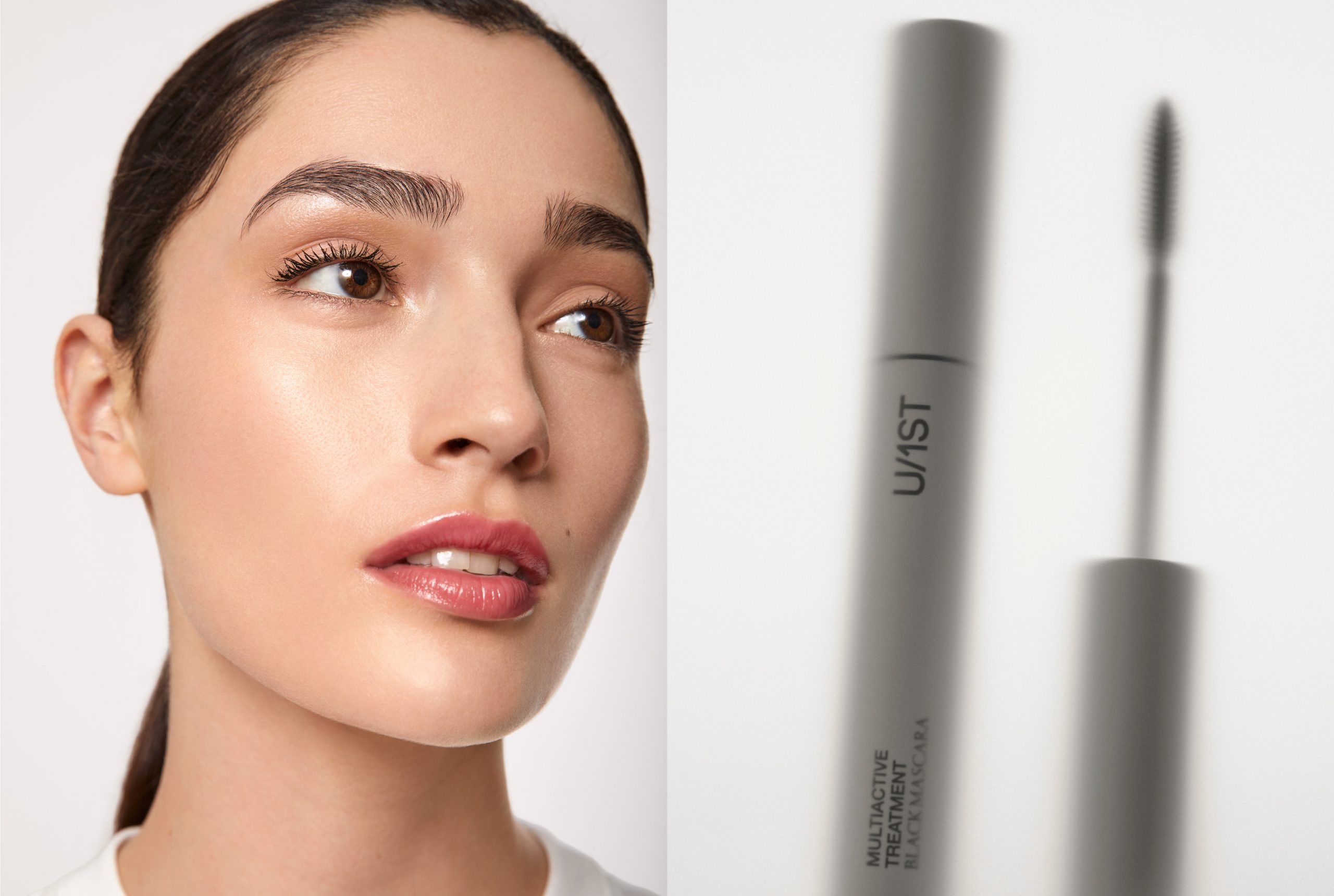
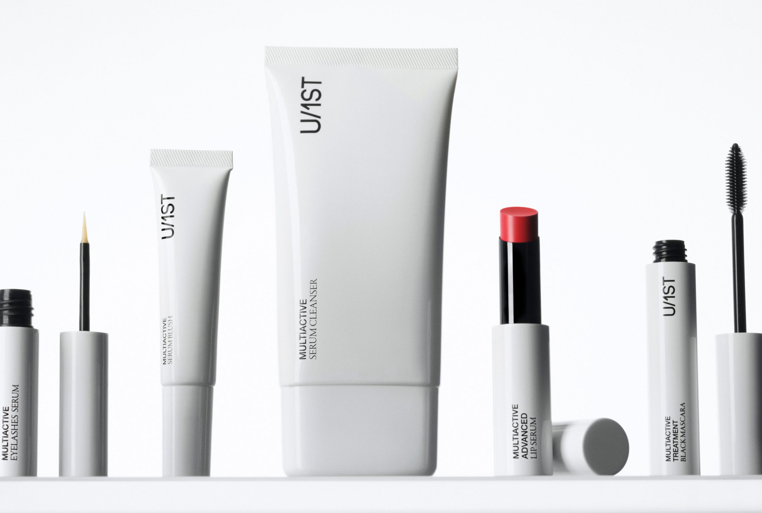
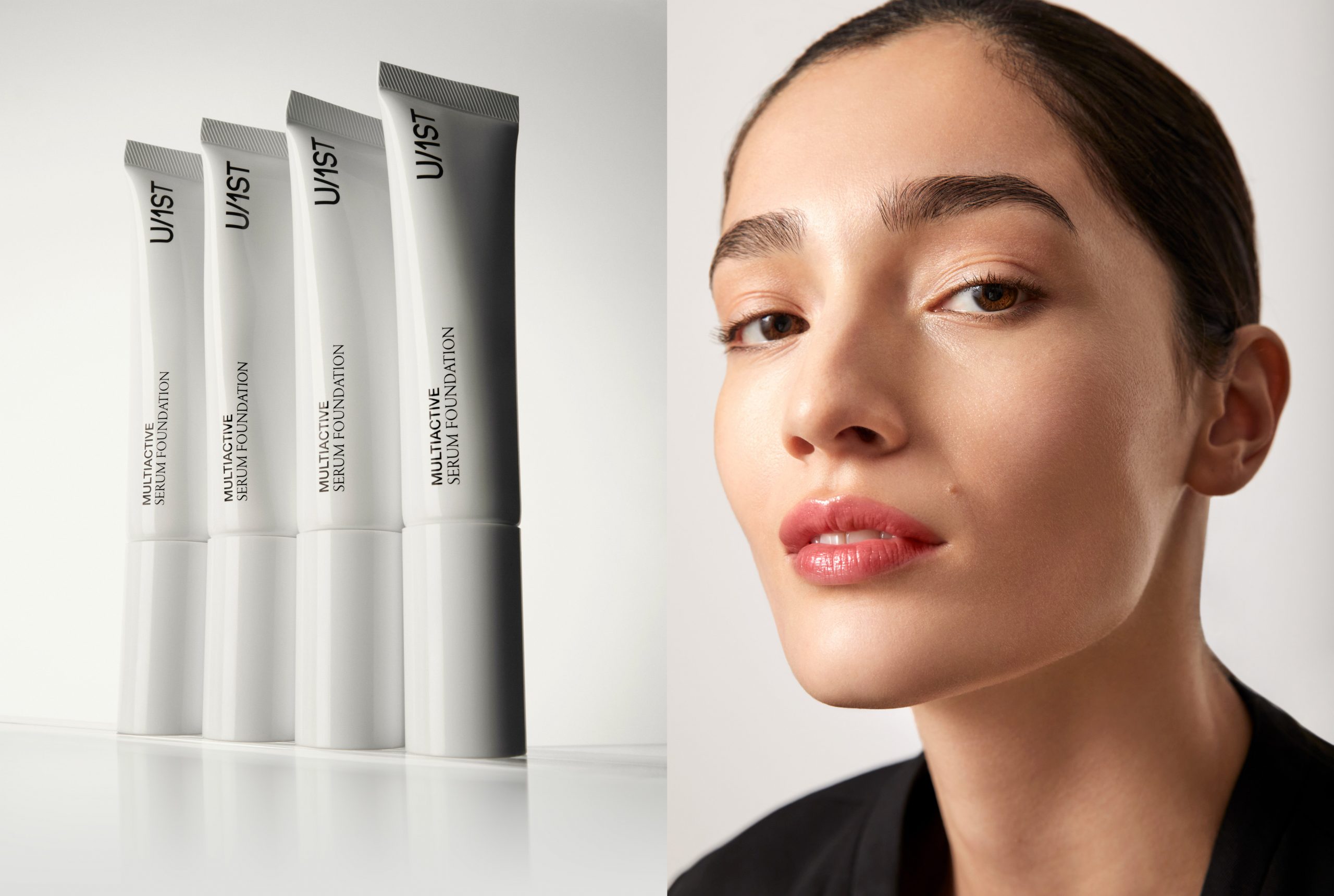
U/1ST was created with the purpose of developing a makeup line whose properties and ingredients care for the skin, going beyond a purely aesthetic approach.
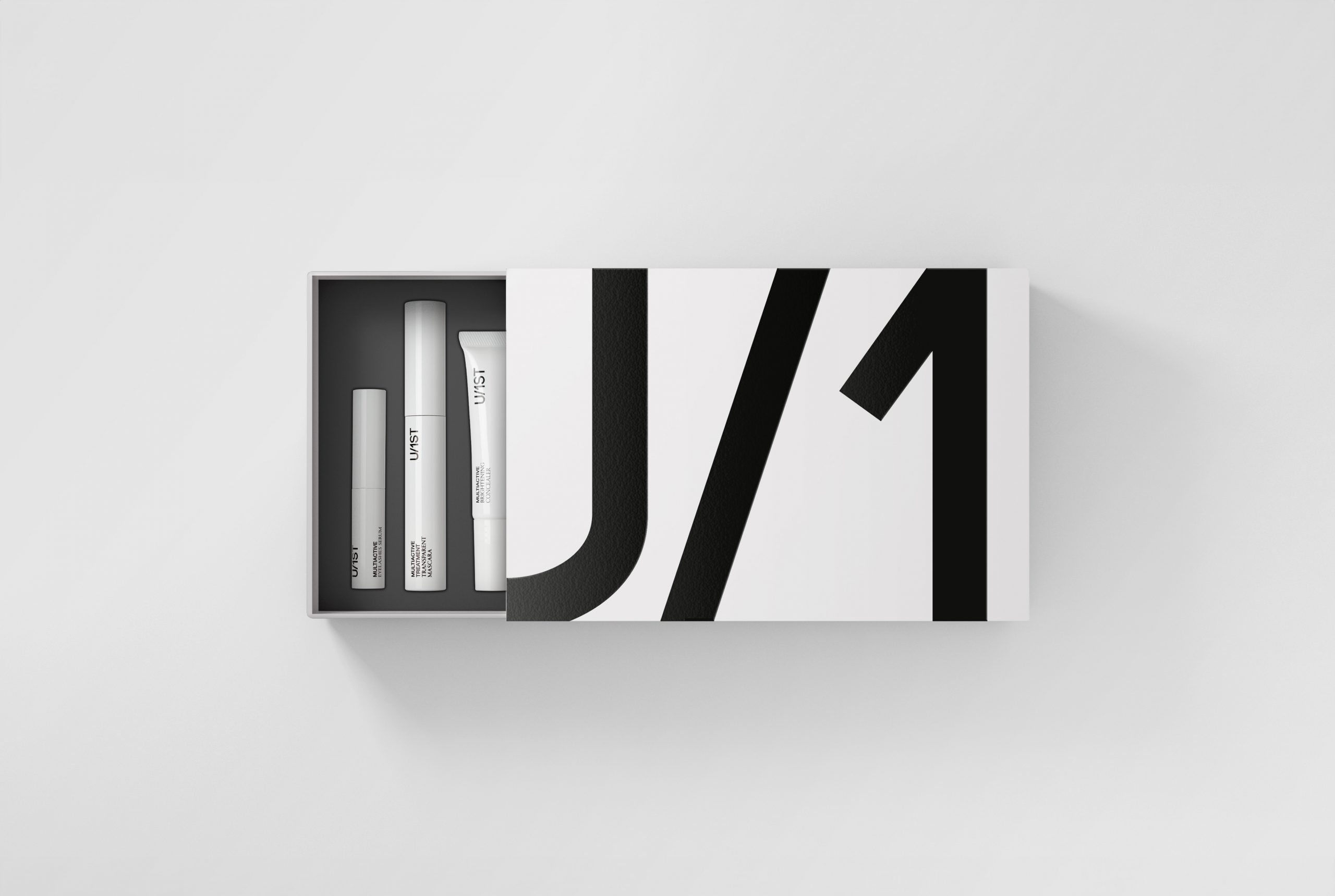
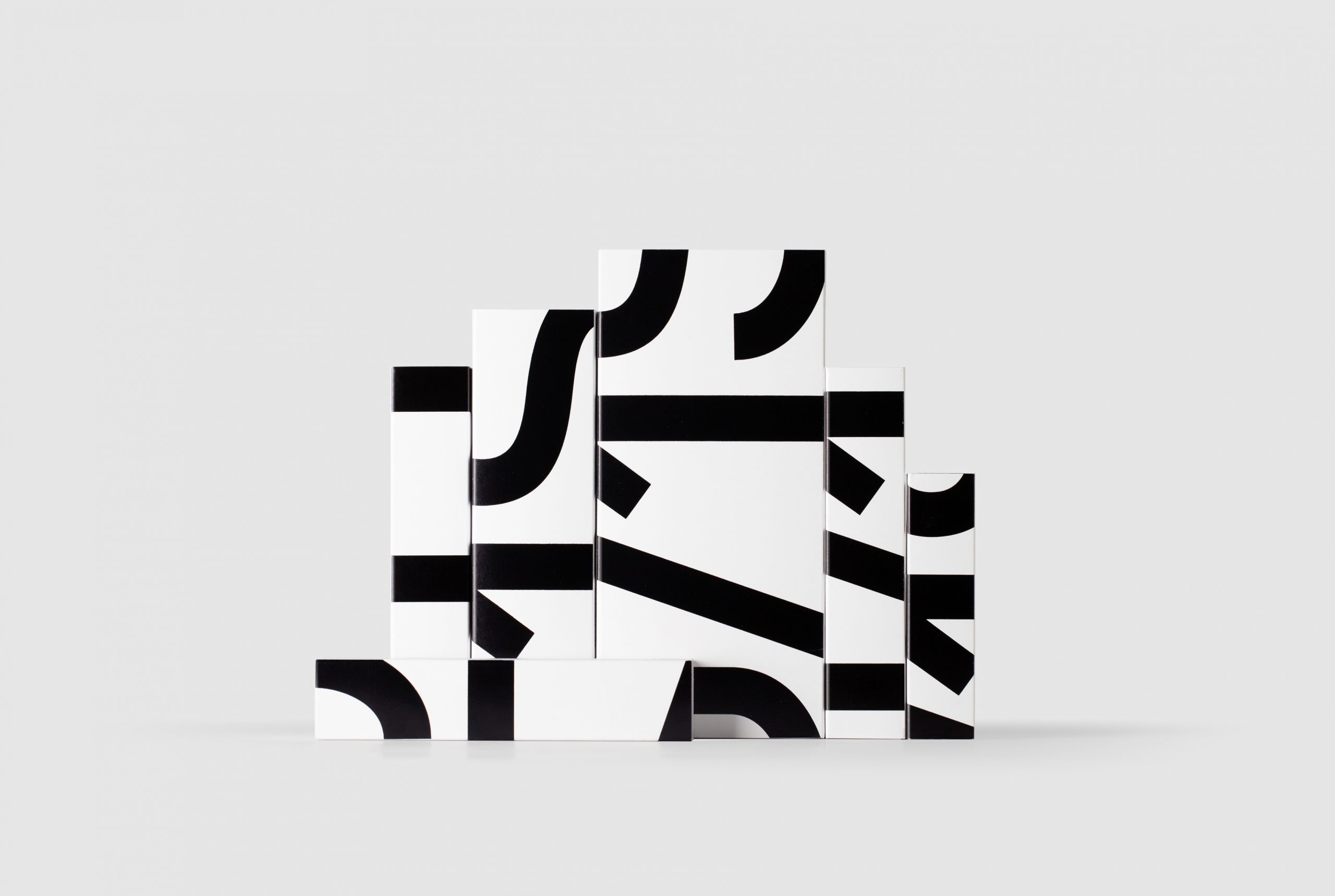
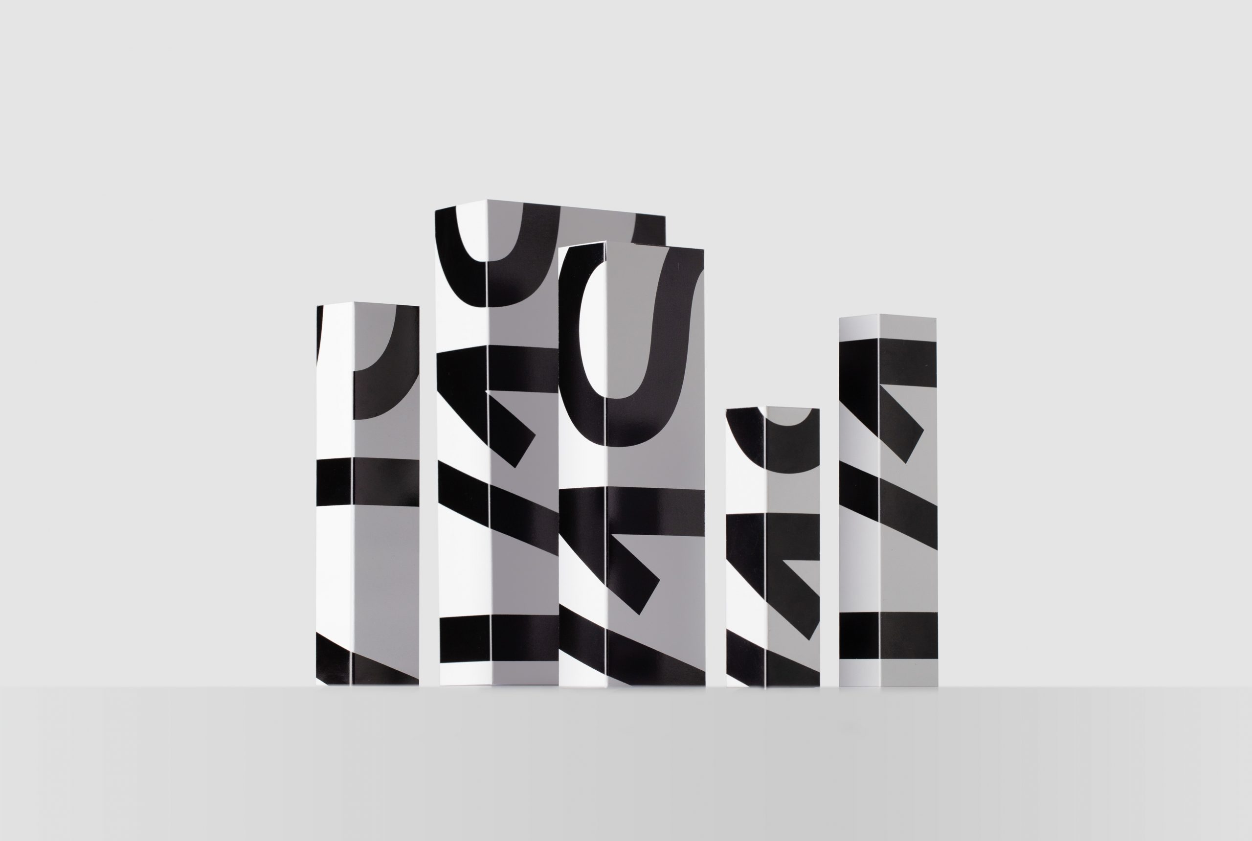
The products are designed for active, confident, and straightforward individuals who seek practical and realistic solutions. The logo, overflowing beyond the edges of the boxes, reflects this personality: powerful, even challenging. This attitude is evident not only in the packaging design but also in the brand’s presence across the web, social media, and all visual communication.
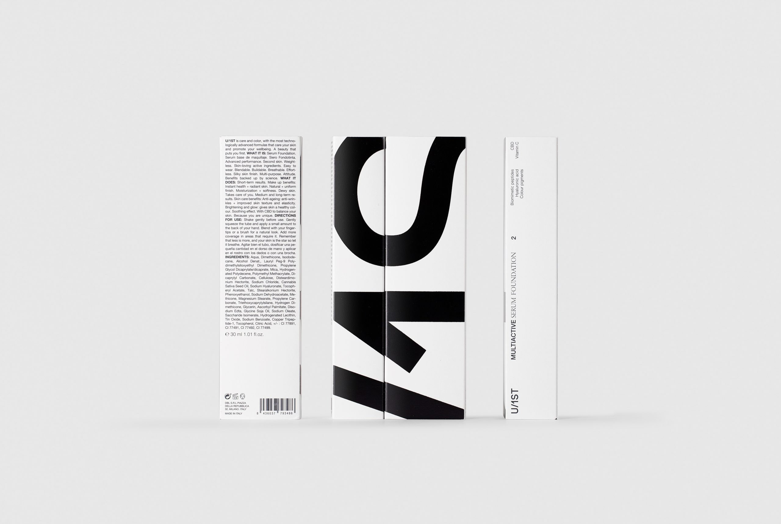
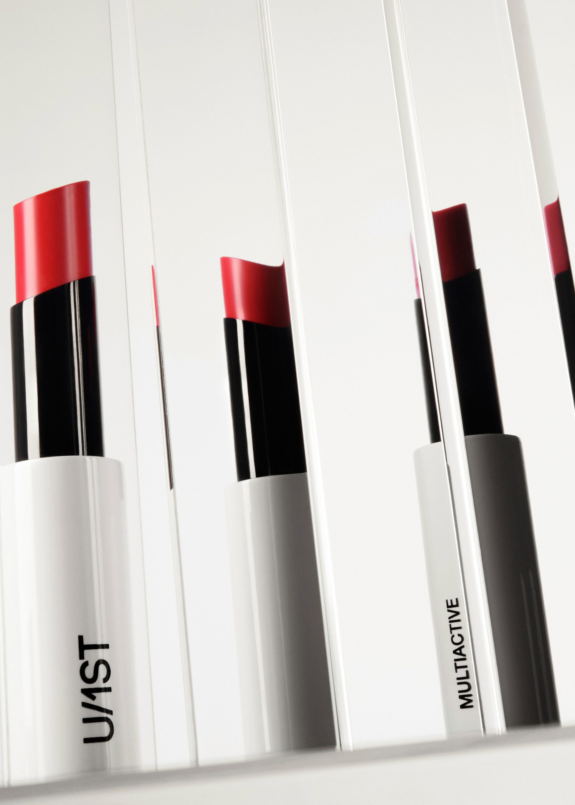
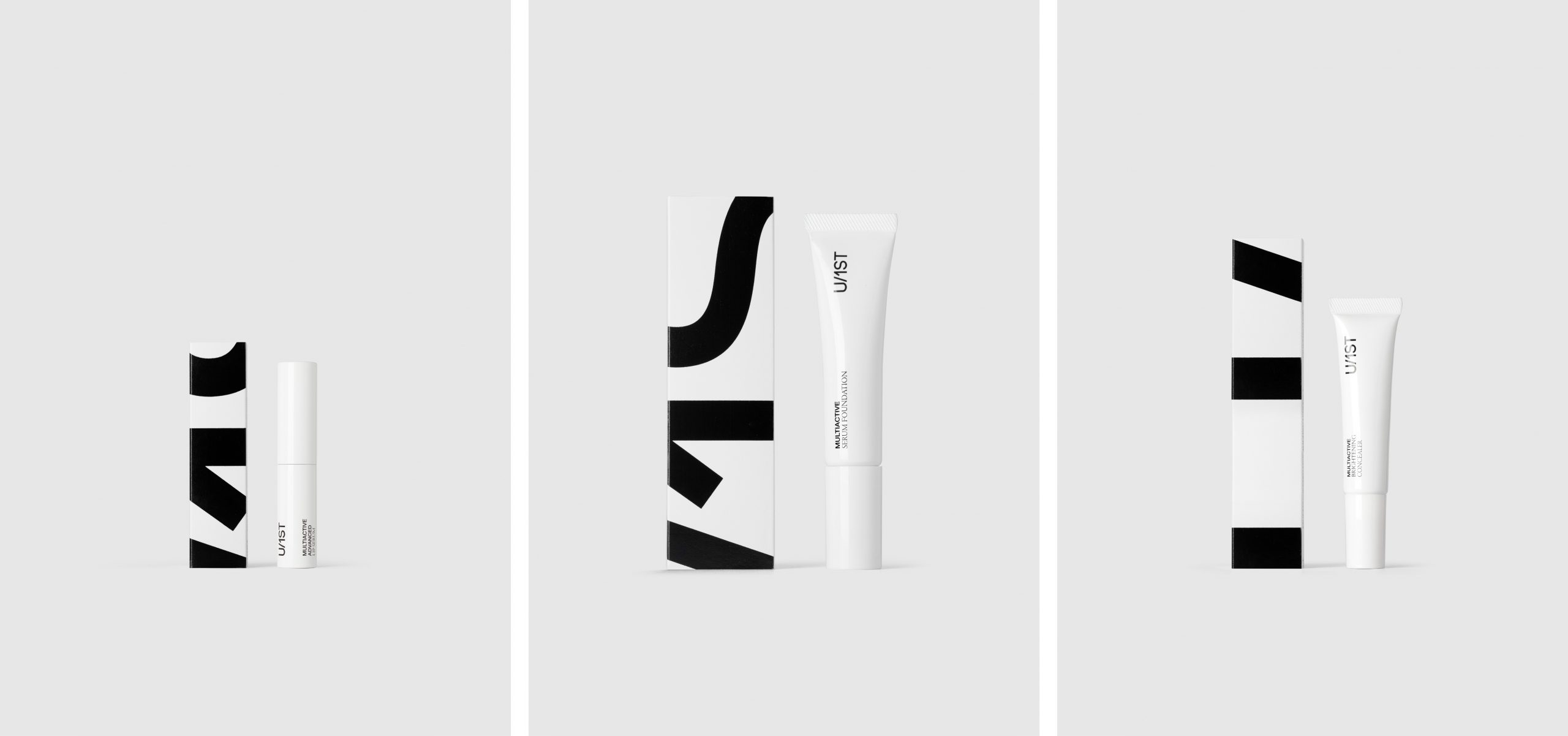
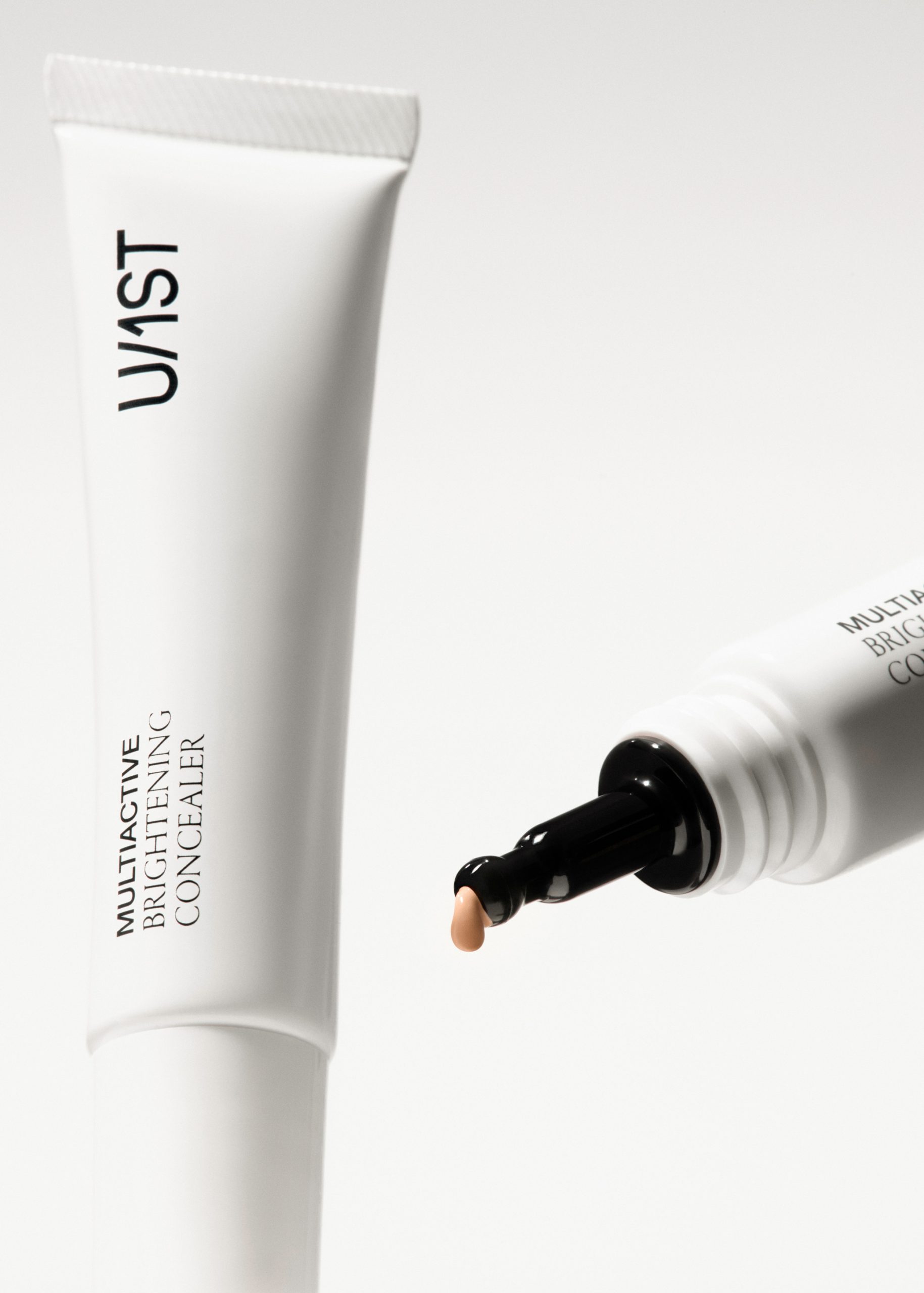
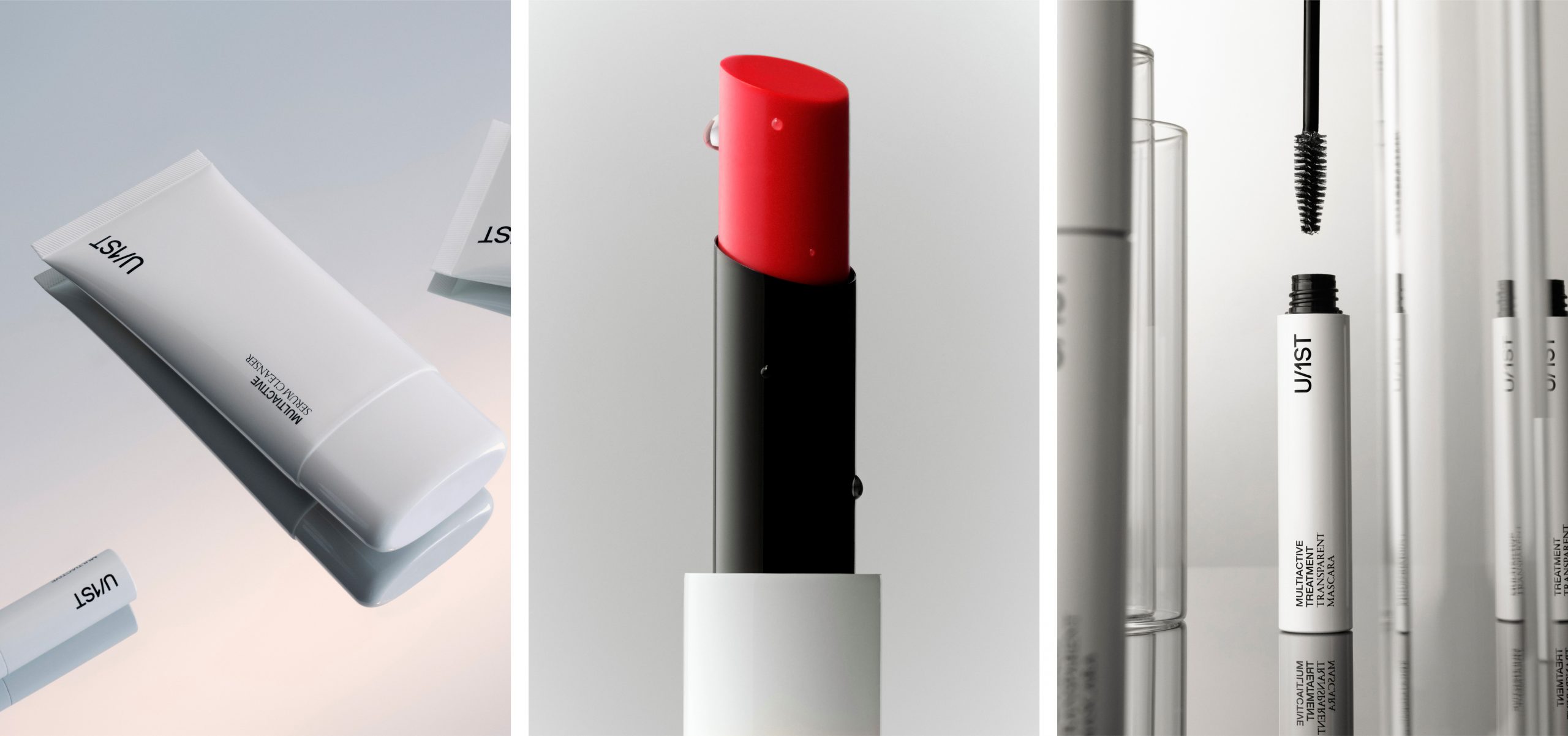
The logo is set in a sans-serif typeface that complements the advanced technology behind the products. It is presented in black on white, as the strong contrast enhances its visual impact and sets the brand apart from more conventional solutions, which often rely heavily on colour, particularly in competitors’ packaging.
A bespoke typographic system was also developed, combining a sans-serif typeface—suggestive of technology and modernity—with a serif typeface that feels closer to the world of beauty. This combination establishes hierarchy and guides the reading of the messages.
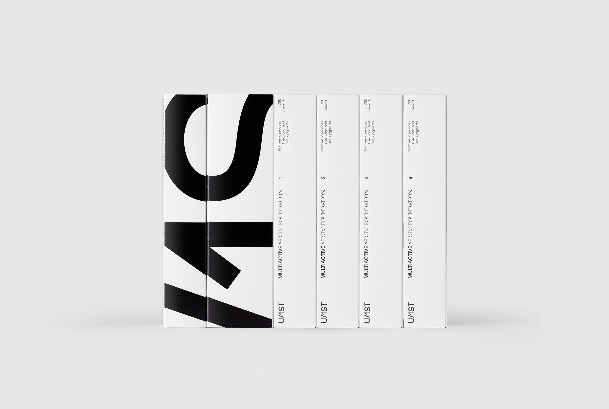
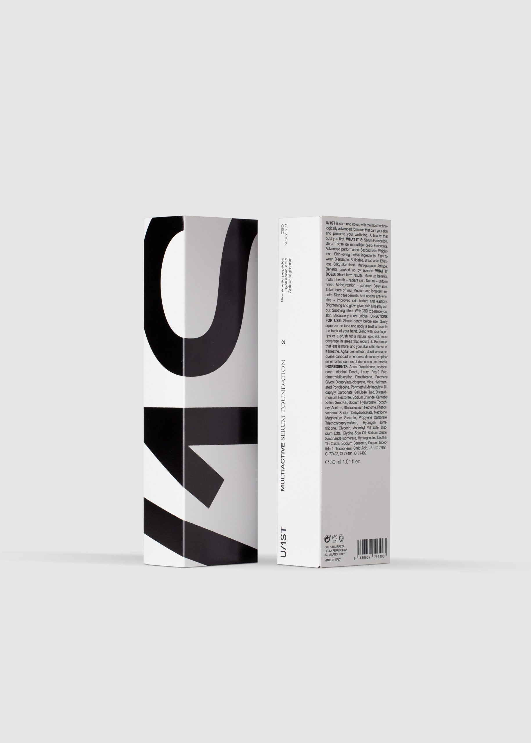
In the box design, two sides feature an oversized logo, while the other two carry the product descriptor and additional information. This structure allows the brand to choose which side faces the shelf: the most eye-catching and emotional, the more informative, or a balance of both.
Photography: L&C, Ernesto Sampons, Daniel Molina, Estudio Catorze