Utopick Chocolates
Chocolates
Client Utopick
Year 2016
Logo
Brand Identity
Packaging
Product Design
Awards
PENTAWARDS 2017.
Gold. Luxury. Gourmet foods
THE DIELINE AWARDS 2017.
3rd Place. Confectionary, snacks & desserts
LAUS ADG-FAD 2017.
Bronze. Product Range. Packaging
ADCV 2017. Silver.
Graphic Packaging
ART DIRECTORS CLUB OF EUROPE 2017.
Silver. Design&Craft. Packaging
Home
Paco Llopis is a Master Chocolatier—an ingenious craftsman constantly searching for new discoveries in flavour, texture, and filling techniques within the world of bean-to-bar production: an artisanal practice carried out entirely under the maker’s control. In this case, it involves using selected cocoa pods sourced directly from local producers in Colombia and other Latin American countries.
He came to us with the challenge of creating a new design and distinctive packaging capable of clearly communicating who he is and what he does—in other words, a design that embodies invention and creativity.
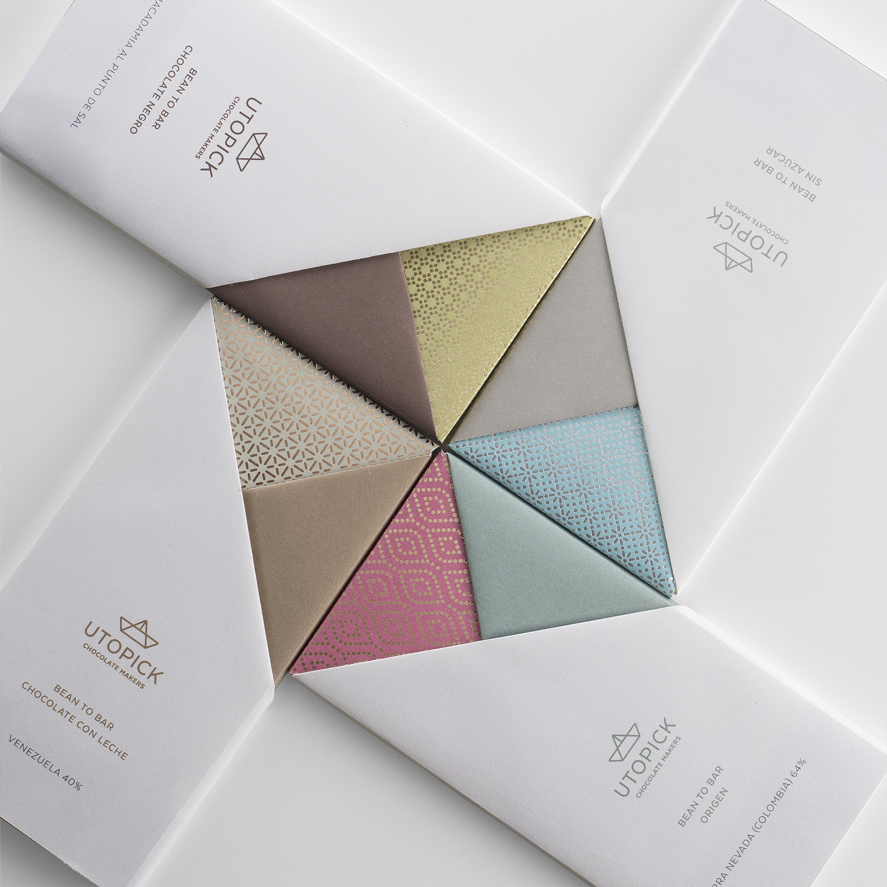
He already had a name for his product: Utopick—perhaps a reference to the creator’s pursuit of unattainable perfection, and at the same time a play on words: you to pick.
He also had a symbol: a ship, embodying the spirit of adventure and representing the long journey cocoa pods undertake to reach the chocolatier—the same route once taken by Spanish explorers when they first brought cocoa back in the sixteenth century.
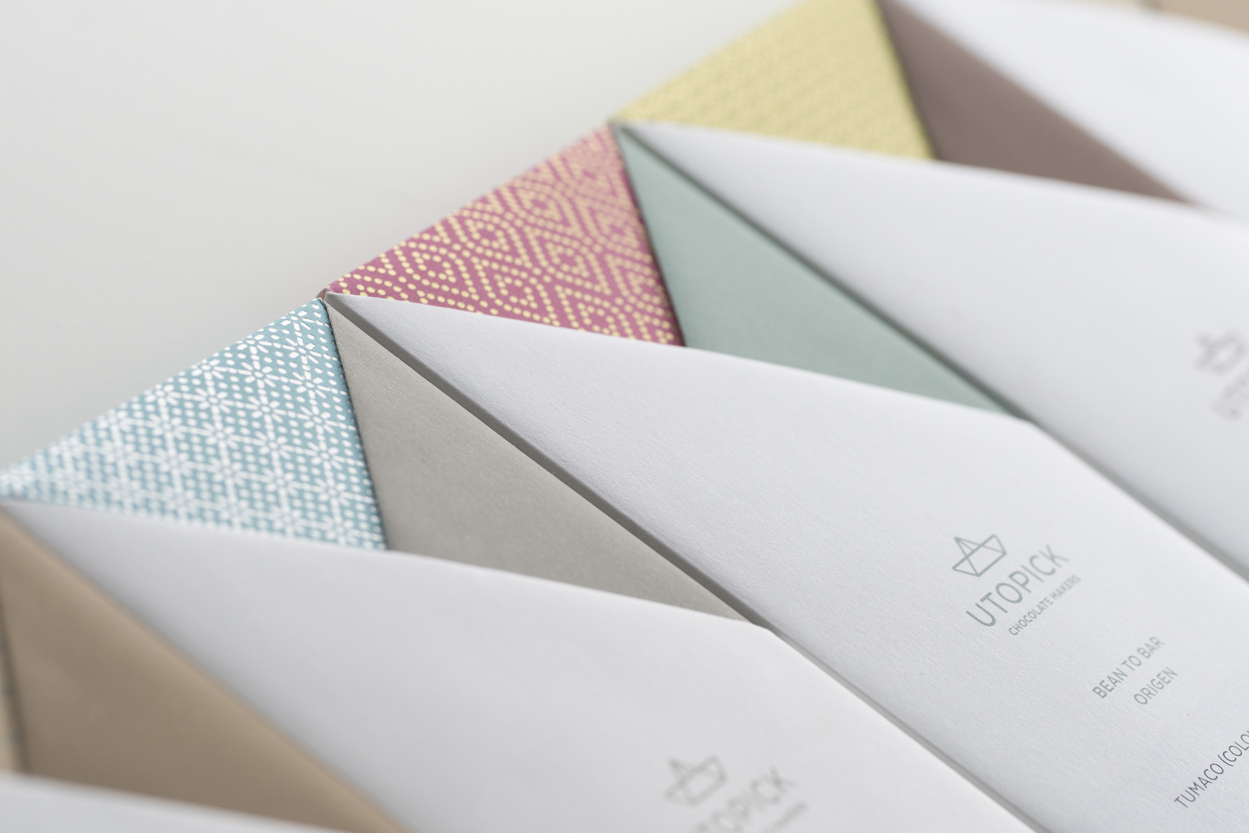
As we explored how to package the chocolate, we transformed this symbol into an origami boat, marking the moment our solution was born.
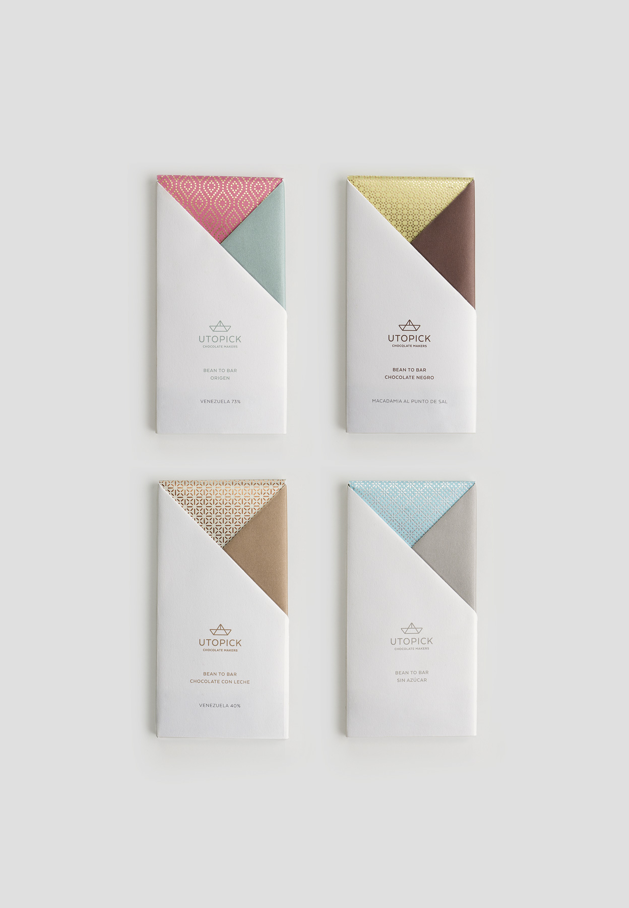
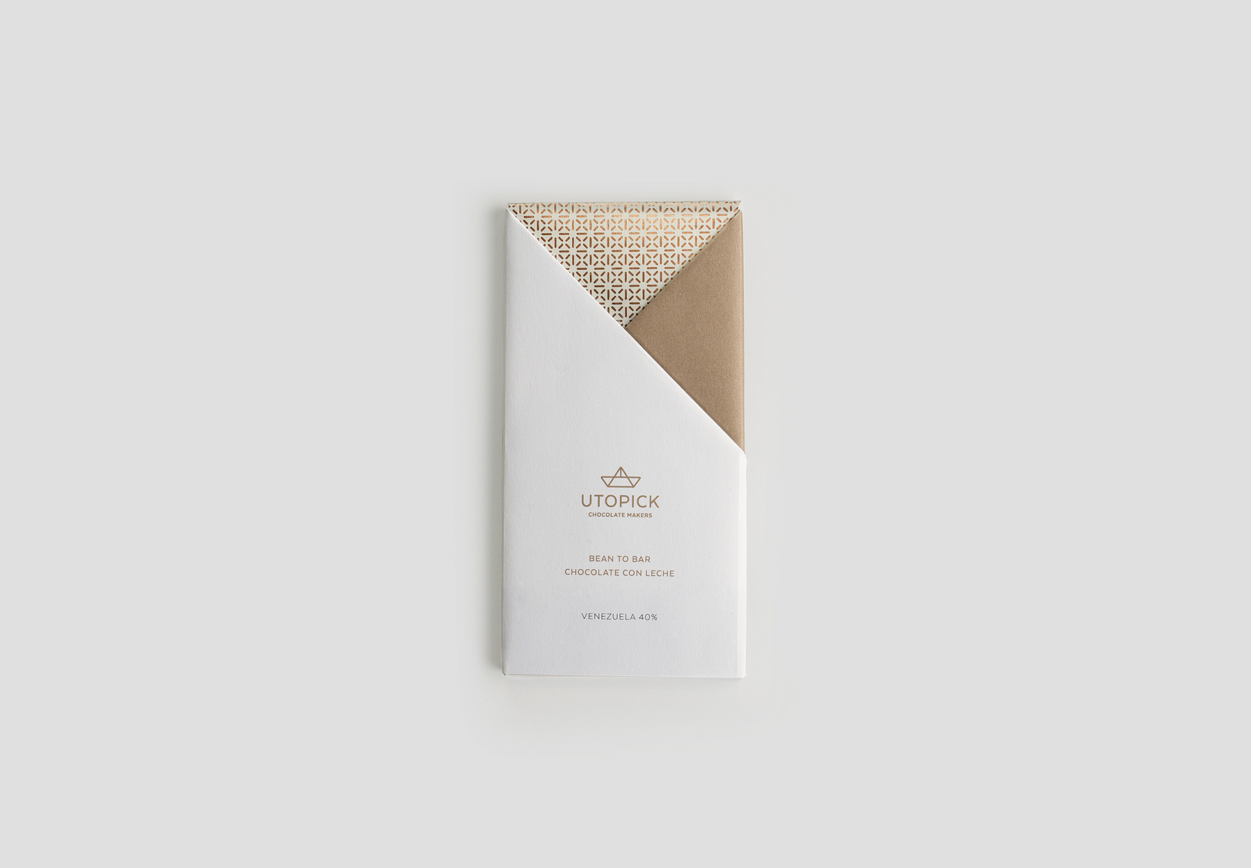
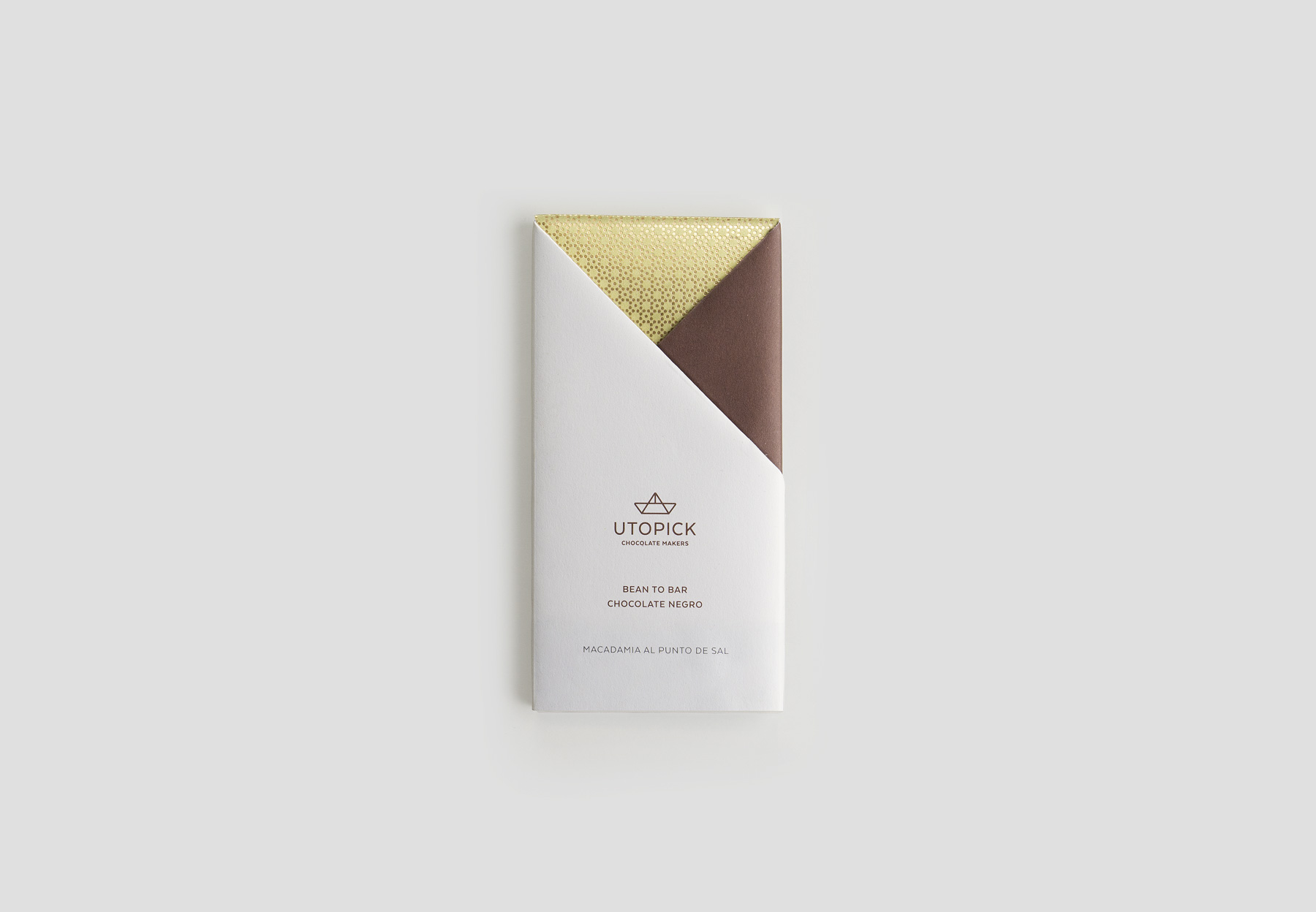
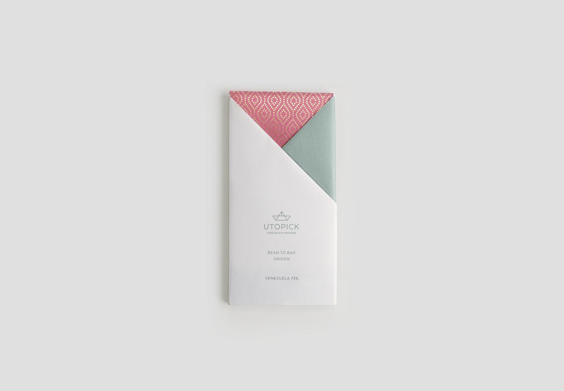
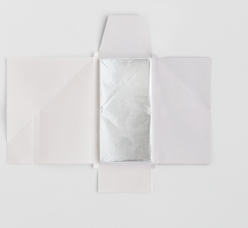
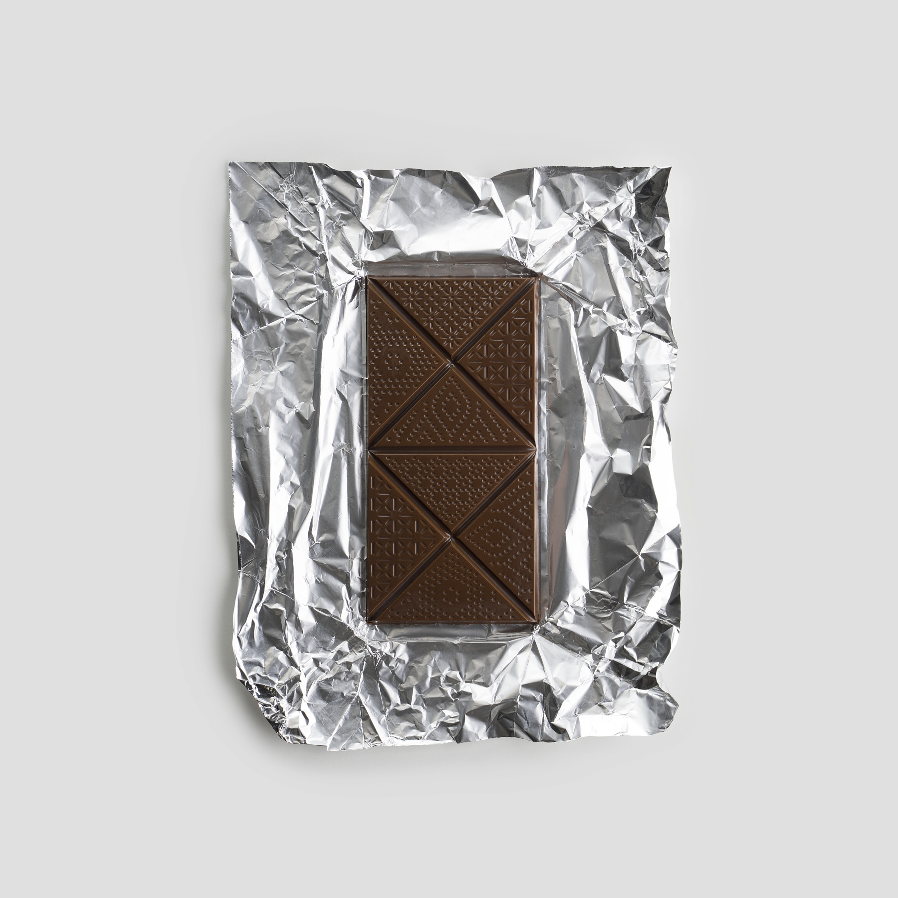
Utopick packages its batches by hand, so we developed a unique paper-folding system to wrap the bars. This hands-on process is pure and authentic, embracing the traditions of skilled craftsmanship free from the constraints of automation.
The paper folds create two triangles on the front of the design, each with its own colour and texture, giving every bar a distinctive character.
The packaging opens and closes in a way that makes it easy to rewrap the chocolate, allowing it to appear untouched (it is well known that some people like to keep their chocolate indulgence discreet).
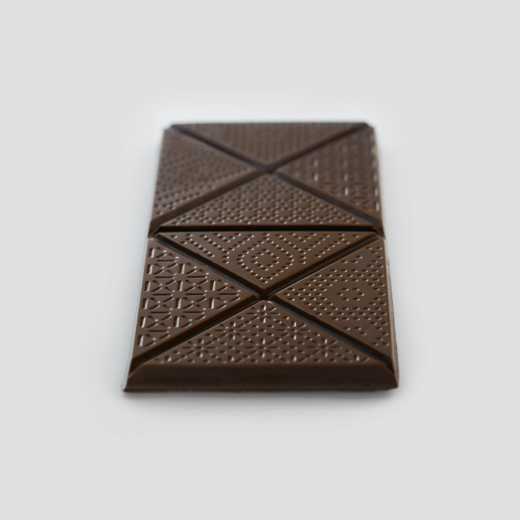
The same geometric forms are reproduced on the chocolate itself, which is pre-cut into large triangles—once again drawing on the ship’s geometry, the defining symbol of Utopick.
A paper ship that has travelled from afar.