Valencia Tourist Brand
Valencia Tourism Brand
Client Visit València
Year 2023
Logo
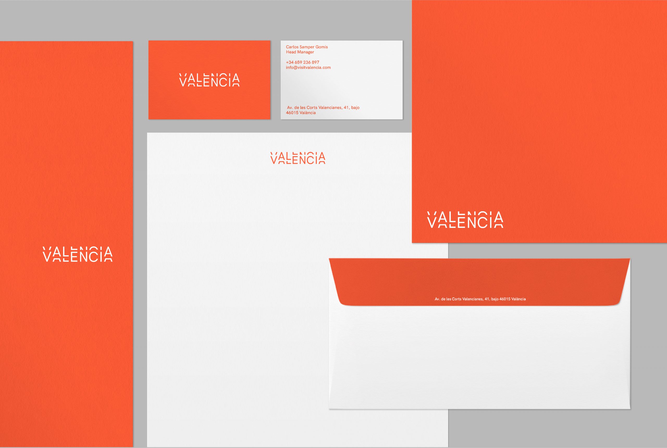
Brand Identity
All works
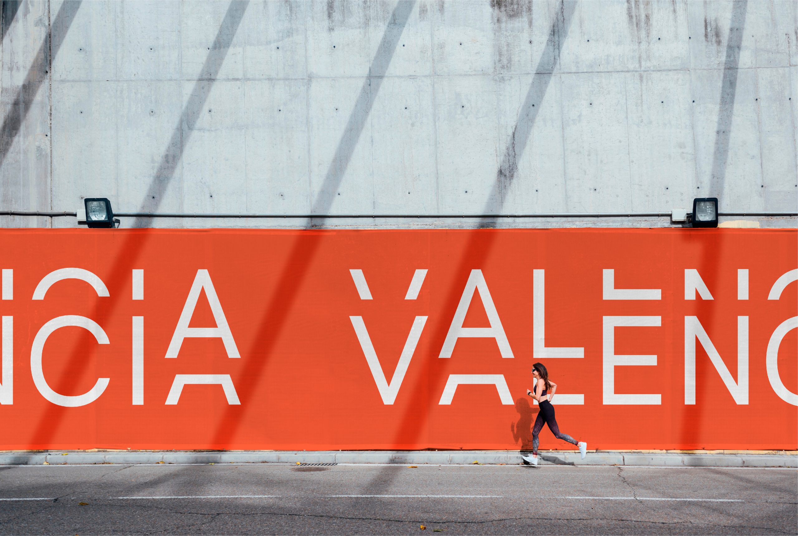
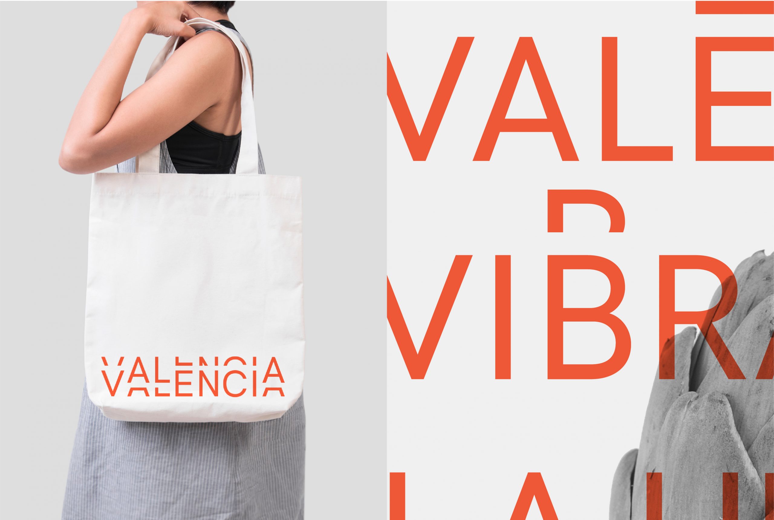
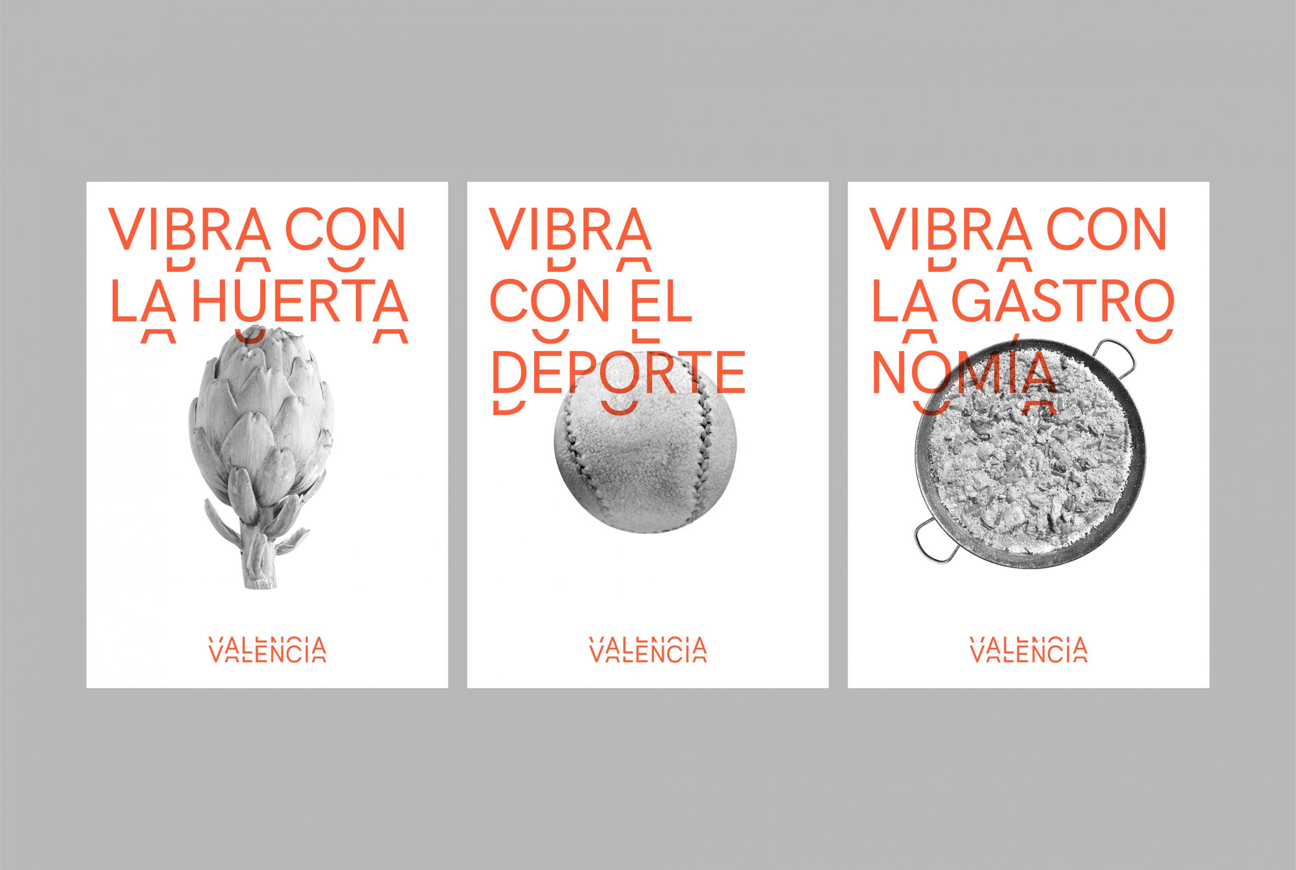
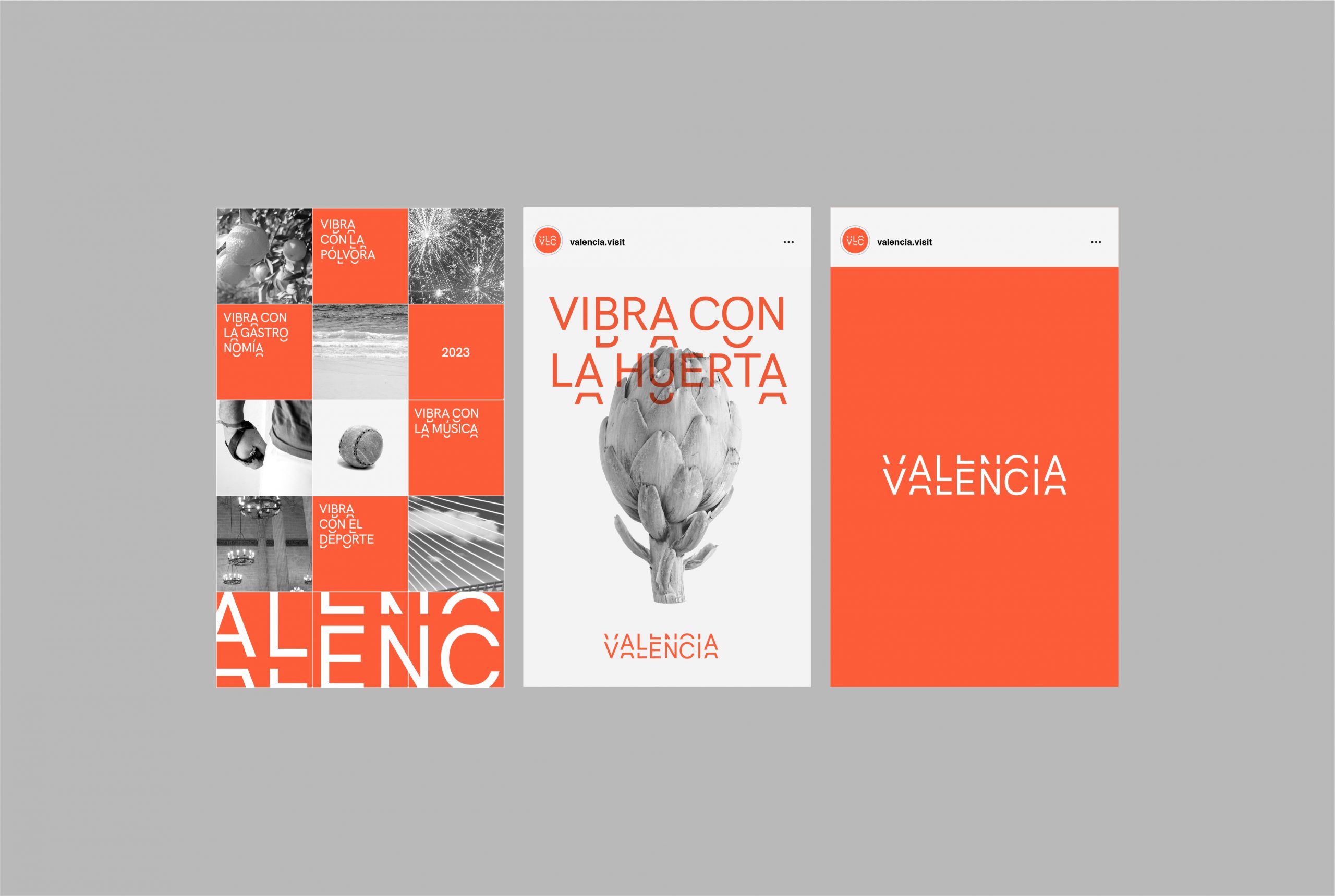
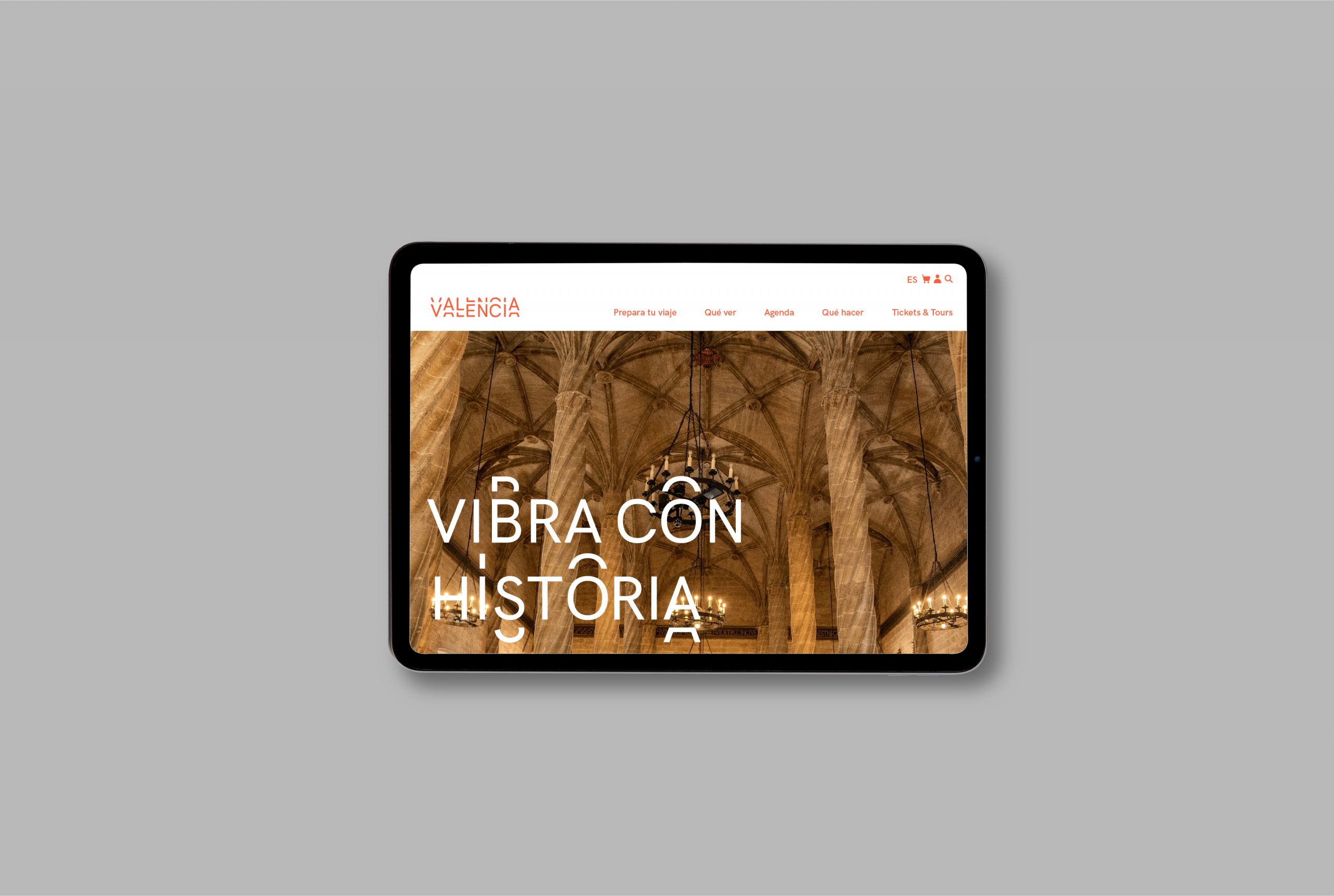
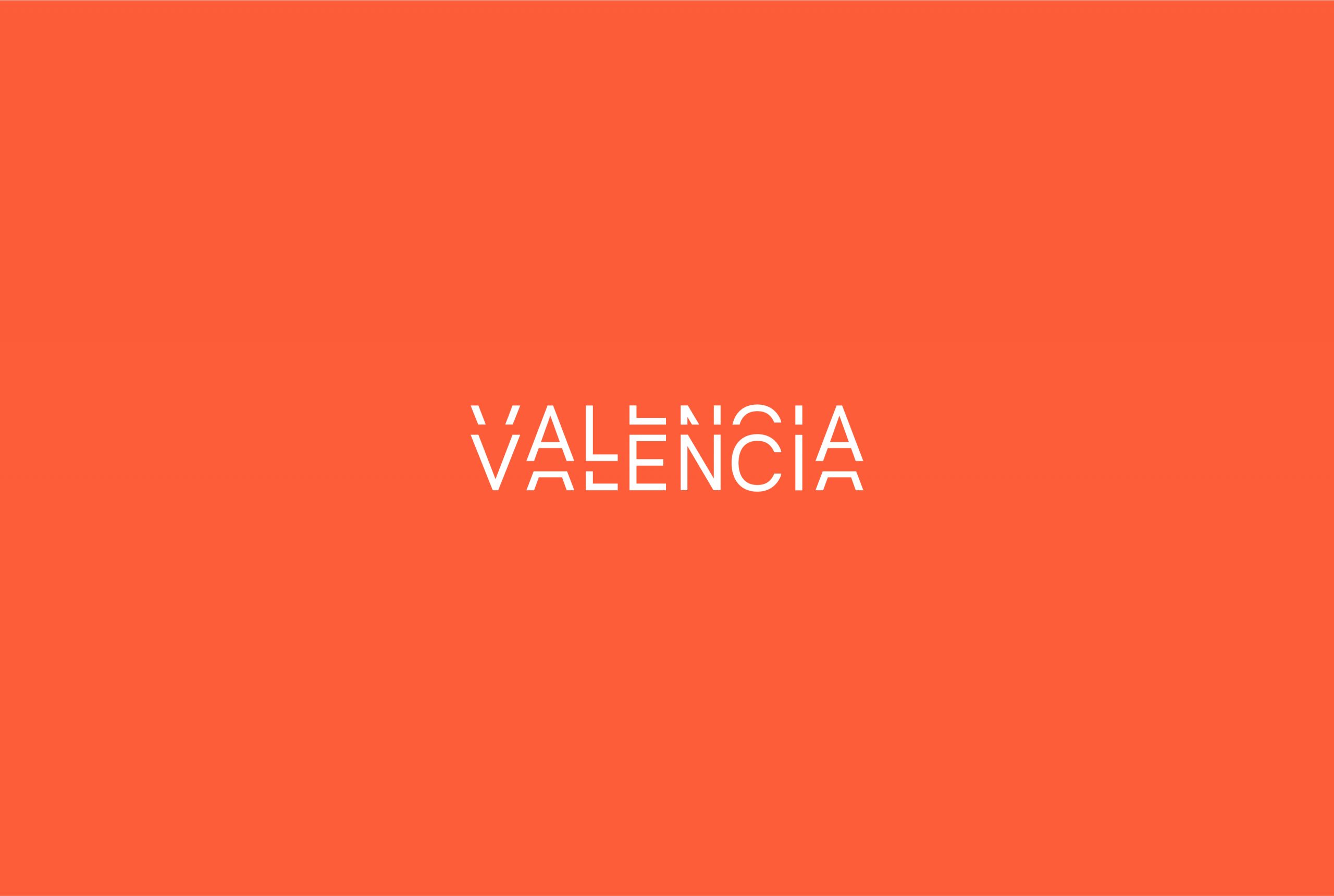
This logo communicates the idea of Valencia as a dynamic, open, and modern city—vibrant and alive with energy (brand concept developed by the Weaddyou agency). It does so through a graphic device drawn from the world of illustration and comic strips, where parallel lines follow the outline of a figure to create a sense of vibration. In this case, the device is applied to typography.
Although it is a tourism brand, preliminary studies and surveys revealed that it should not focus solely on conventional sun-and-beach tourism. Valencia is also a major city with strong economic, cultural, and infrastructural conditions for hosting conferences, as well as cultural, professional, and business events.
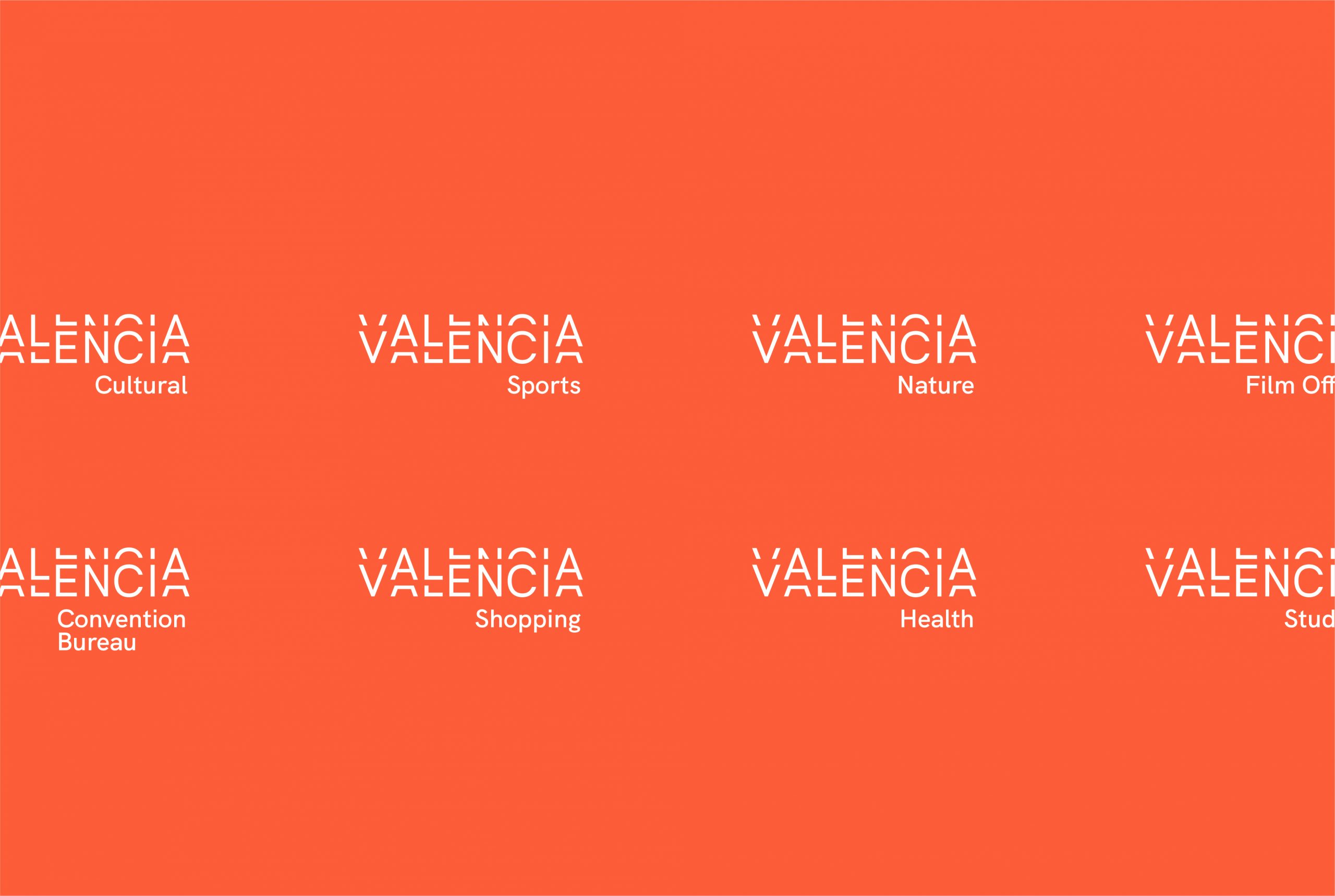
For this reason, we designed a logo in which movement and vibration are present in the letterforms, yet contained within a rectangular frame—a compact shape that conveys strength and solidity. At the same time, the result is sufficiently unique and distinctive within the field of city branding to be easily recognised and remembered.