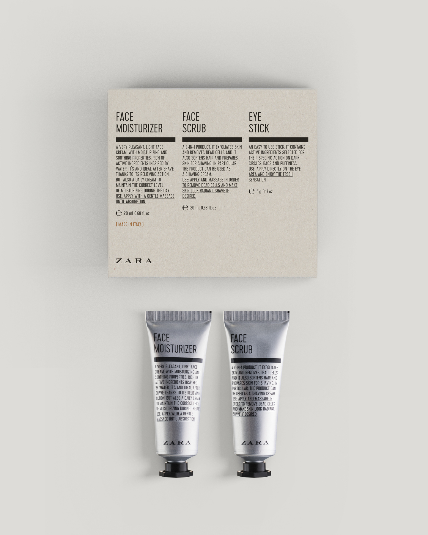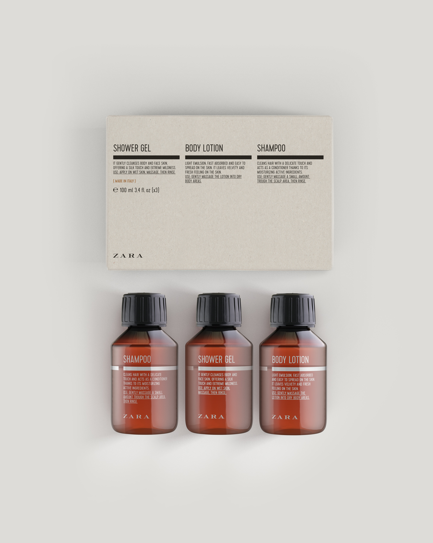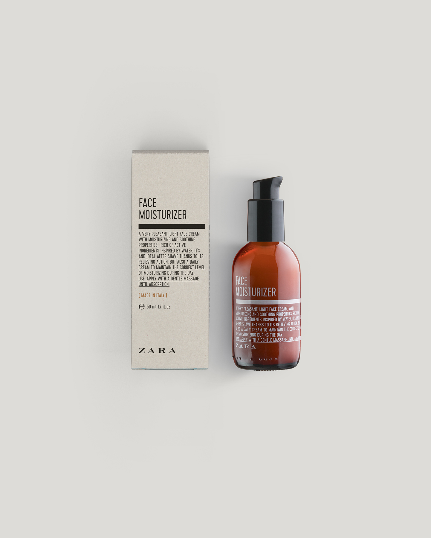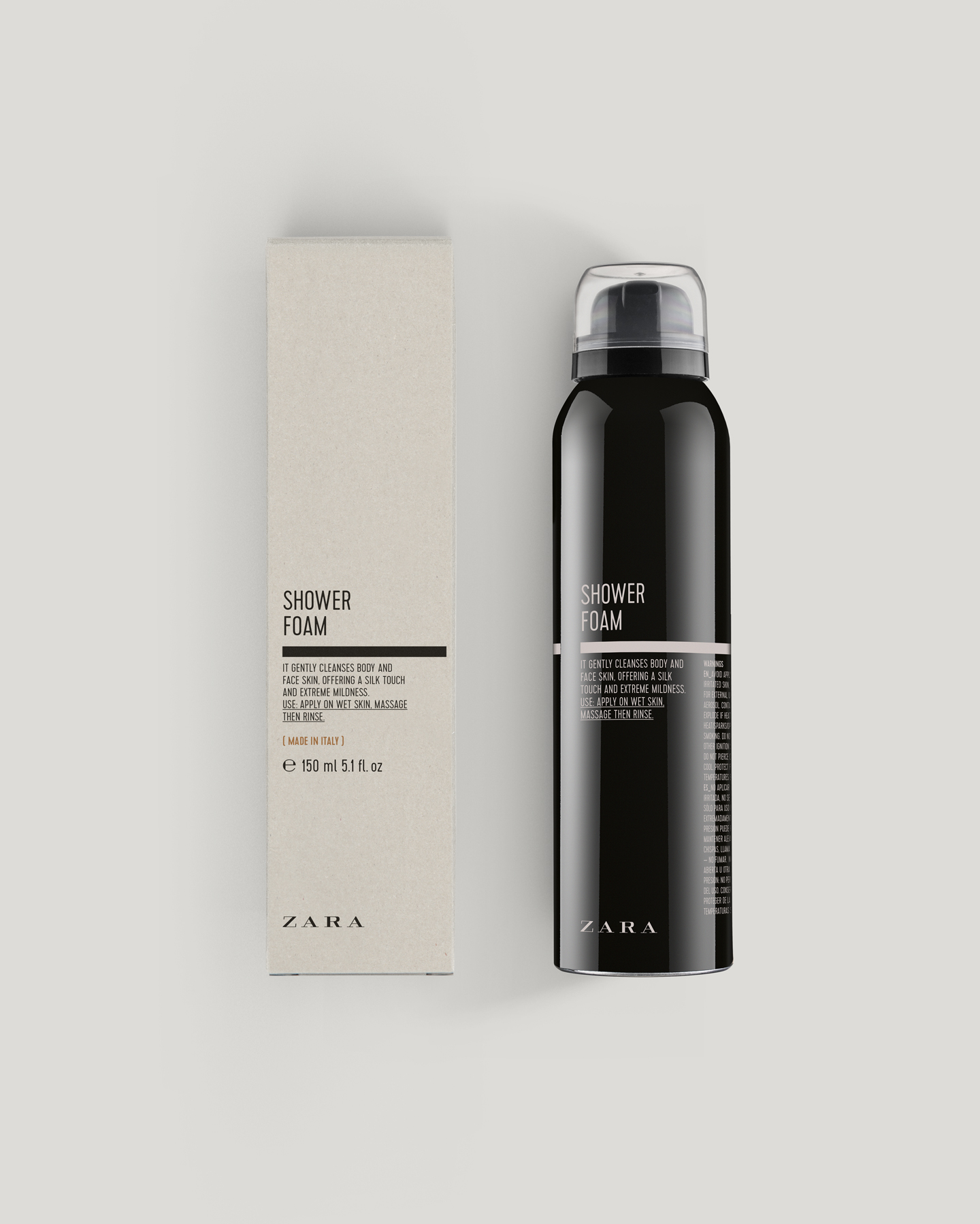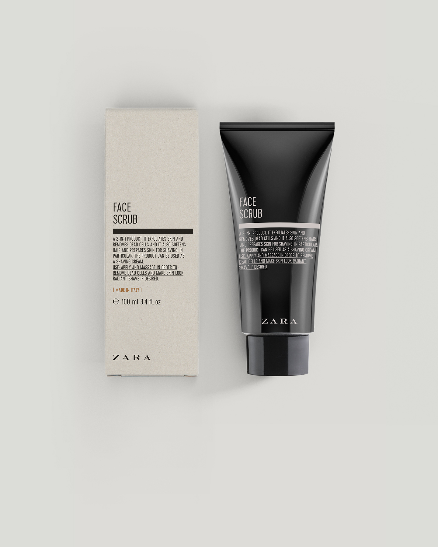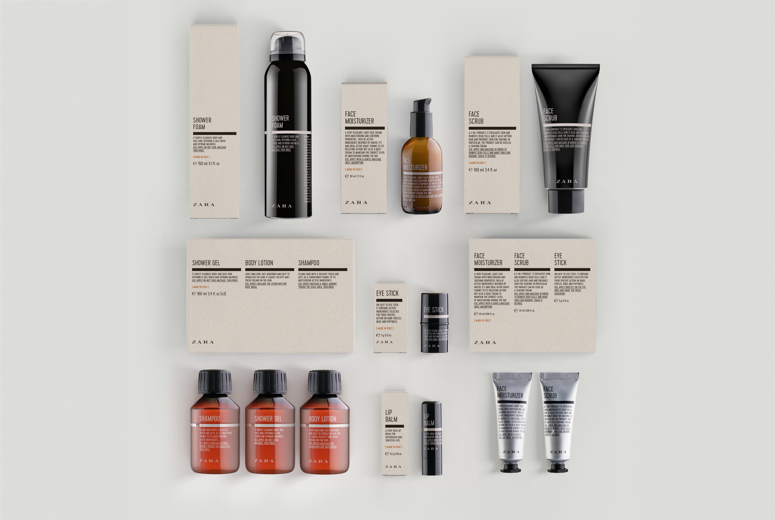
The aim was to develop a line of men’s cosmetics with an aesthetic closely inspired by the visual language of old pharmacies. Amber-toned bottles were chosen, along with a typographic approach in which ingredient lists become the main graphic element, while the phrase Made in Italy is given clear prominence on the front.
The proposed designs are based on typographic solutions that recall the labels of medicinal compounds traditionally found in pharmacies. The careful selection of typefaces, together with the composition and hierarchy of the texts, gives the range a distinctive personality and a visual language suited to the world of cosmetics. The colour palette reinforces the masculine character of the line.