Zara Men VHS
Men's Fragrances
Client Zara
Year 2016
Packaging
Awards
PENTAWARDS 2017.
Silver. Body. Distributors/Retailers own brands.
ADCV 2017.
Gold. Graphic Packaging
Home
The brief called for a new design for the boxes and graphic system of most Zara men’s fragrances. The design needed to be neutral and versatile enough to accommodate not only existing fragrances, but also future editions to be added to the brand’s portfolio.
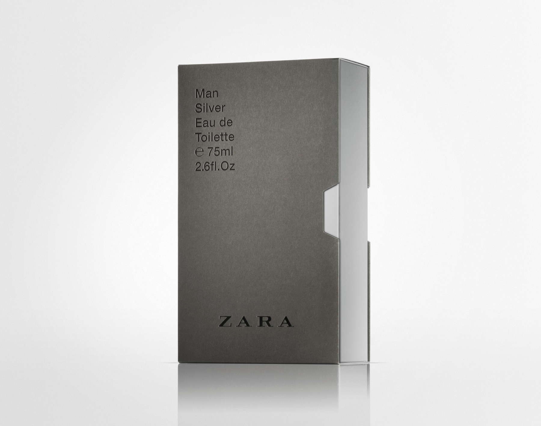
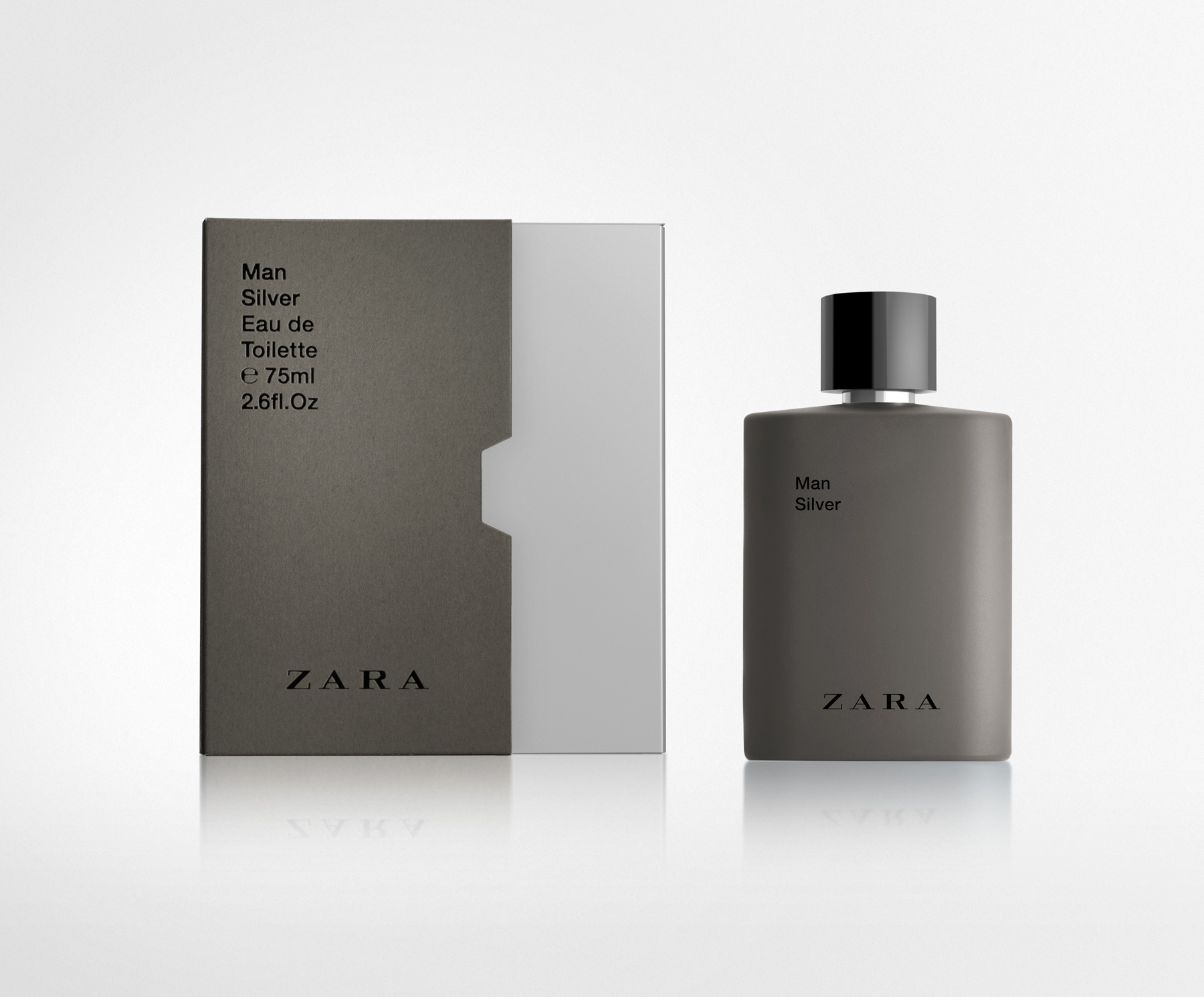
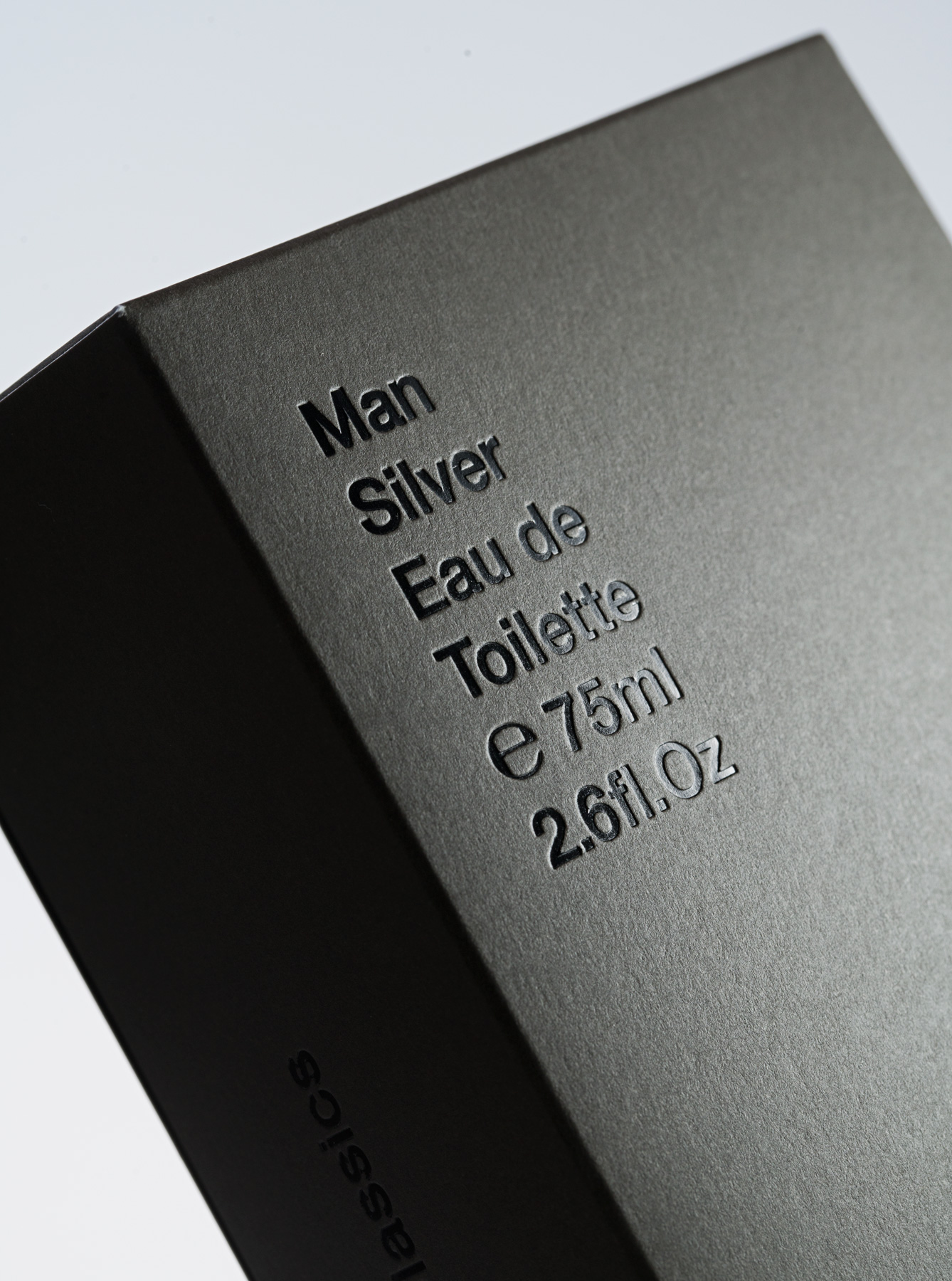
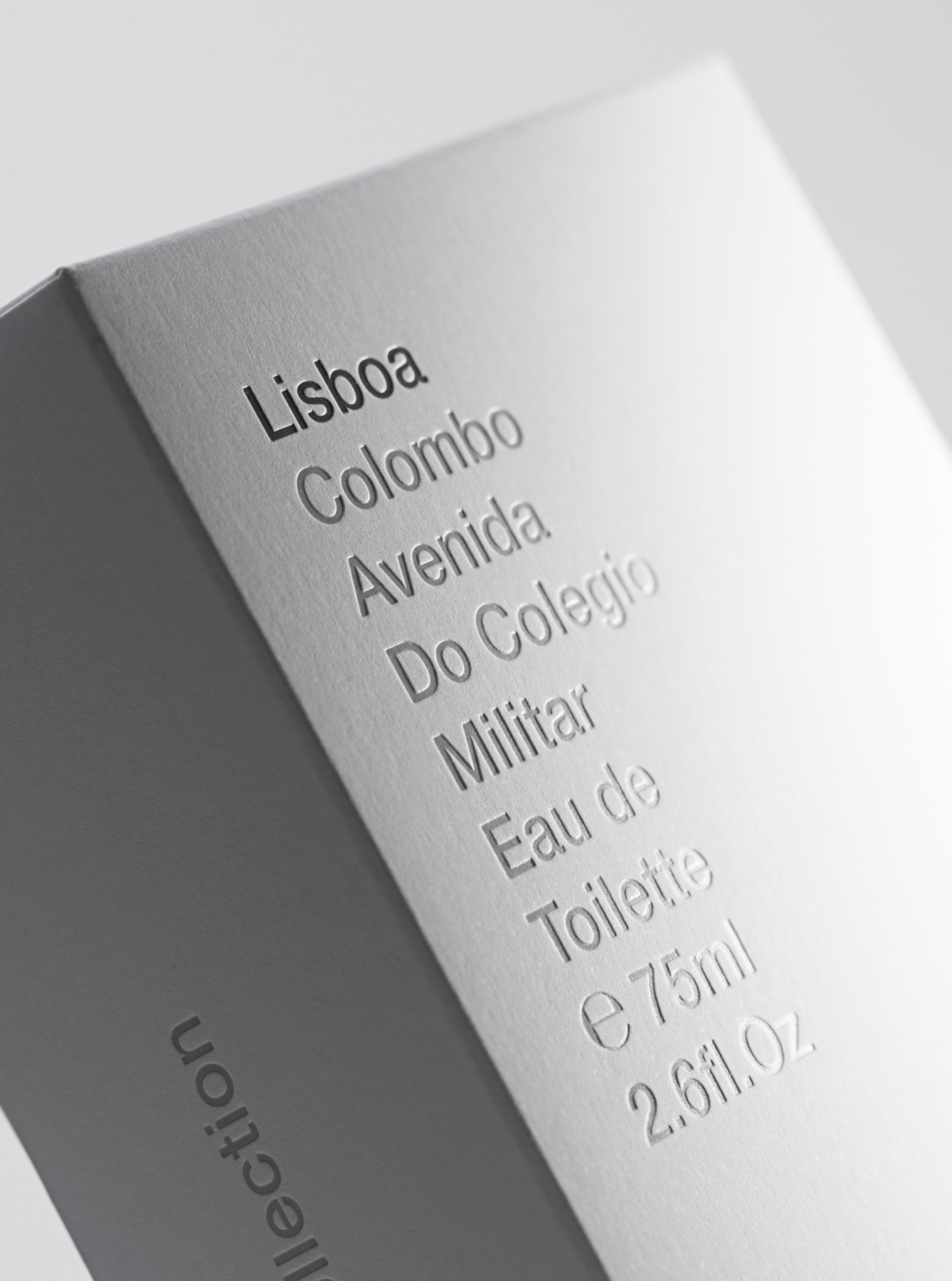
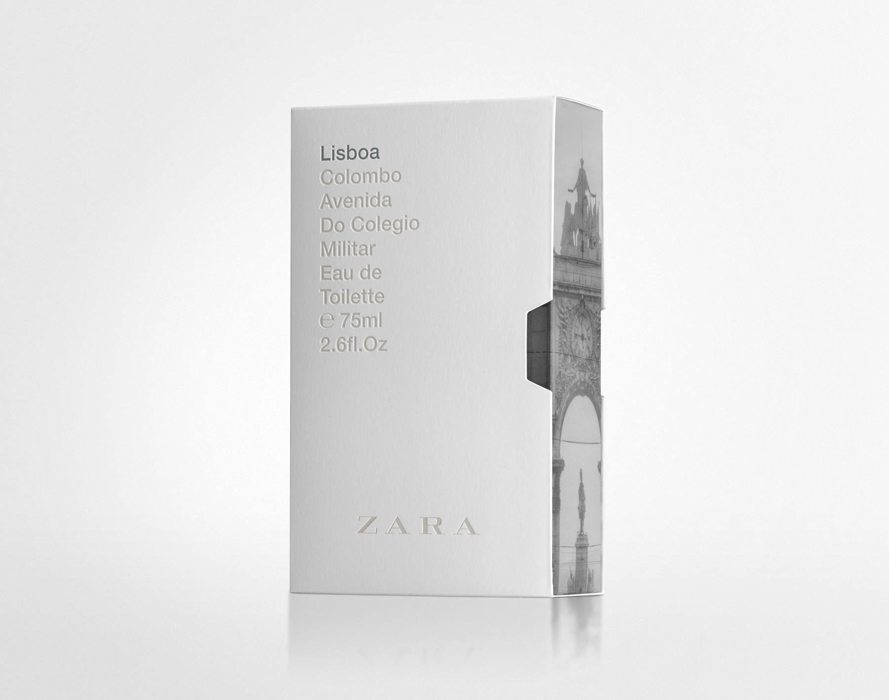
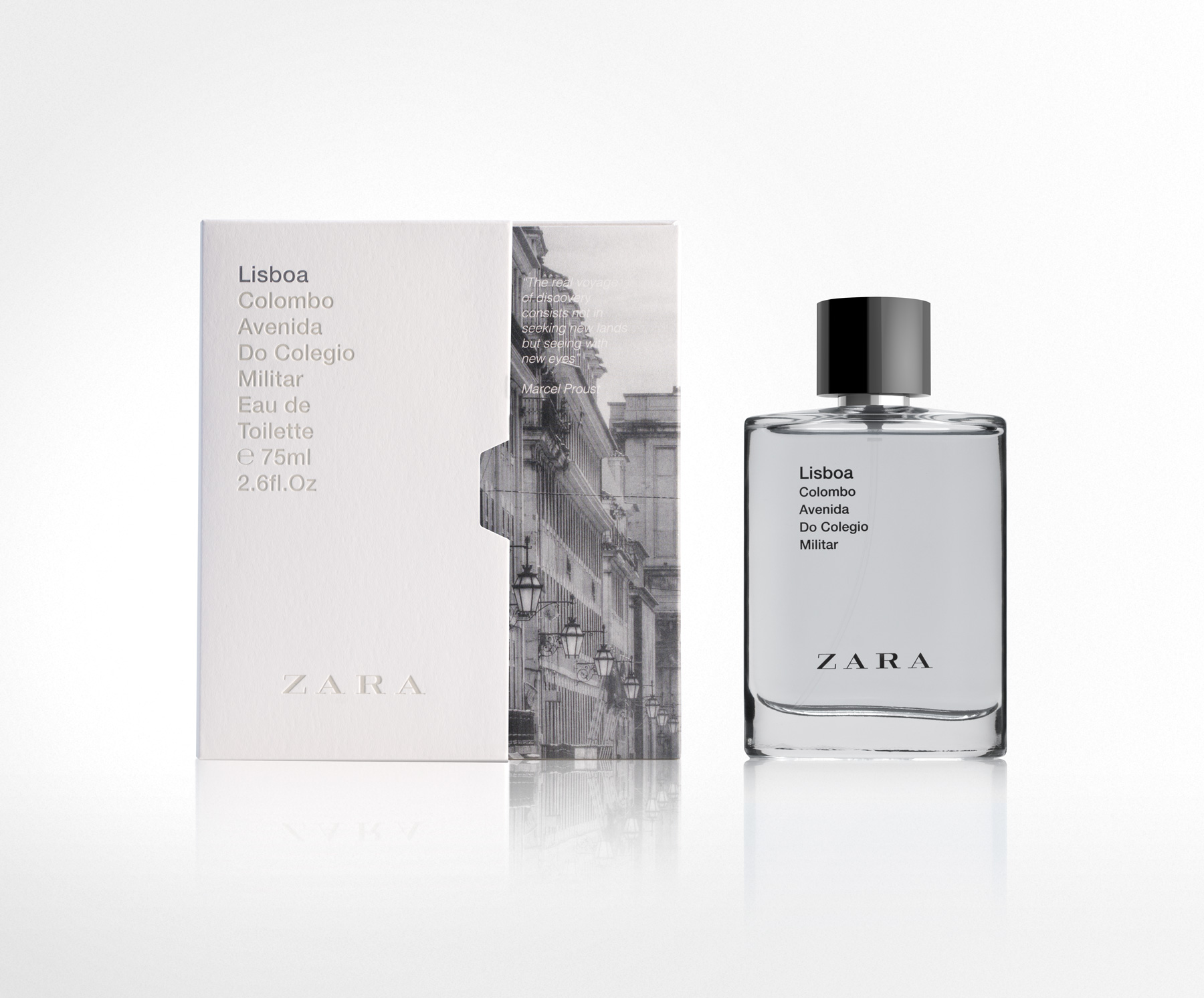
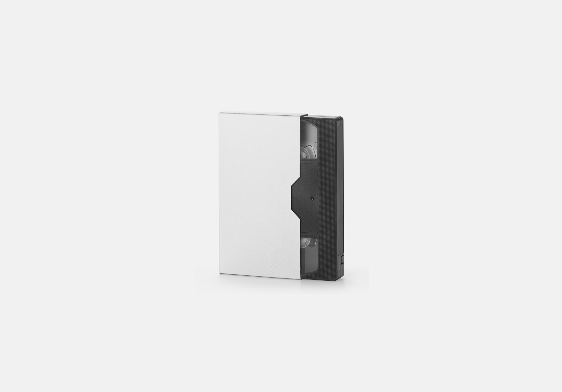
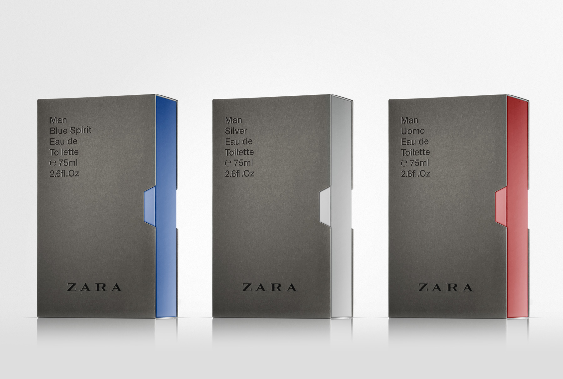
For the box structure, we chose a videotape case model adapted to the size of the bottle. This type of packaging allowed us to work with an outer sleeve and an inner box. From a graphic perspective, we opted for a classic typographic approach on the exterior, using Helvetica, a restrained composition, and sophisticated finishes: blind embossing, bas-relief, and gloss varnish applied to the lettering in contrast with the matte cardboard.
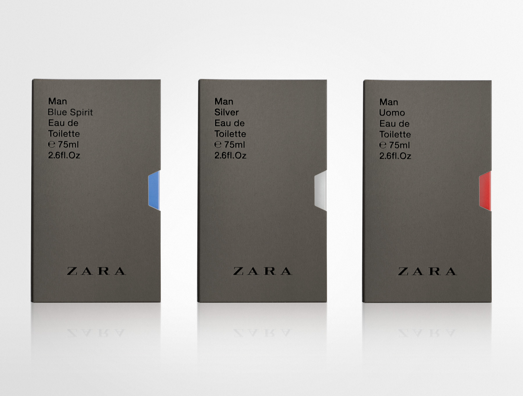
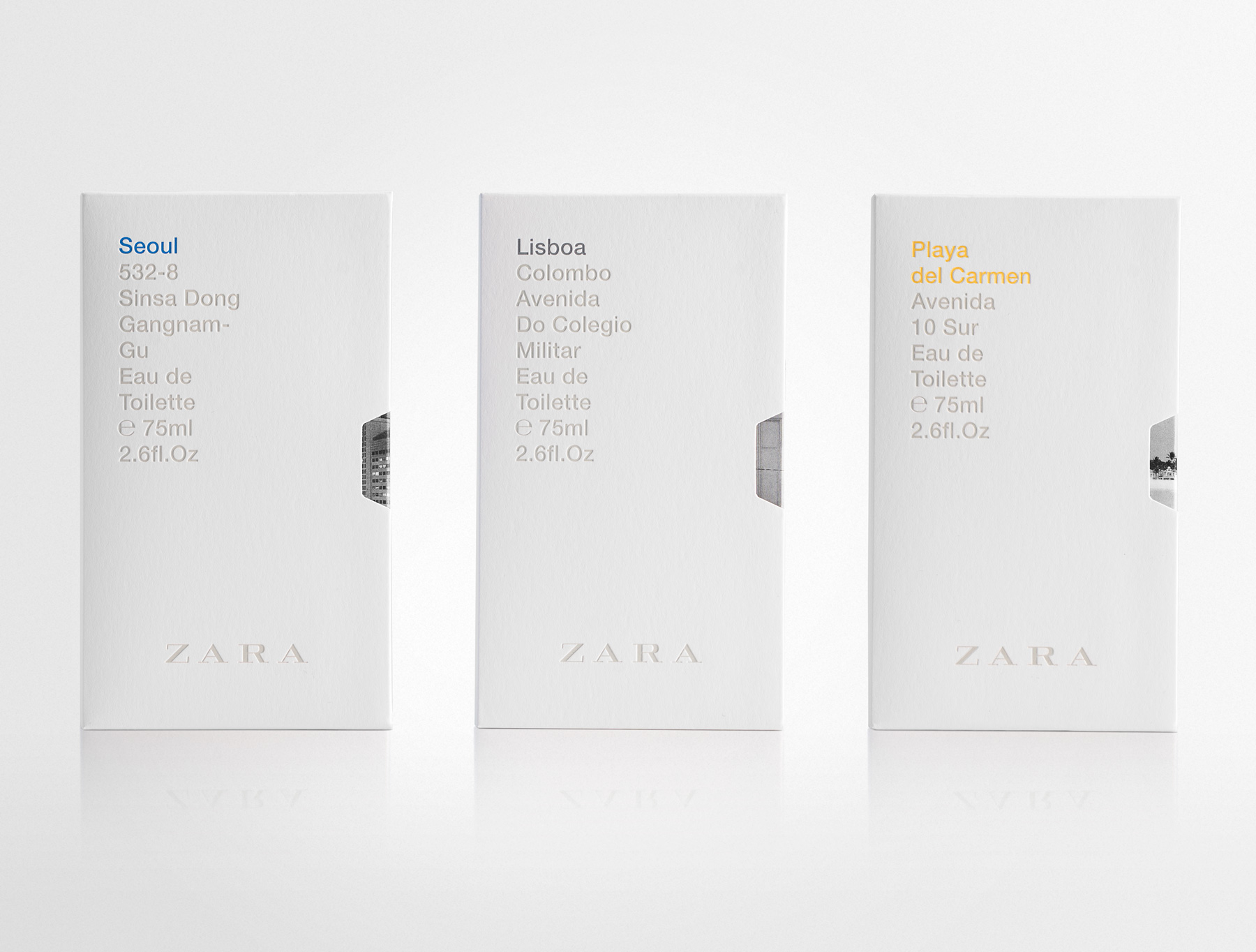
The first fragrances to feature the new design were the core classics: Silver, Uomo, and Blue Spirit. The exterior is finished in warm grey, while the inner box adopts the colour associated with each fragrance. This colour is revealed on the opening side—just like a videotape case—and through the thumb notch.
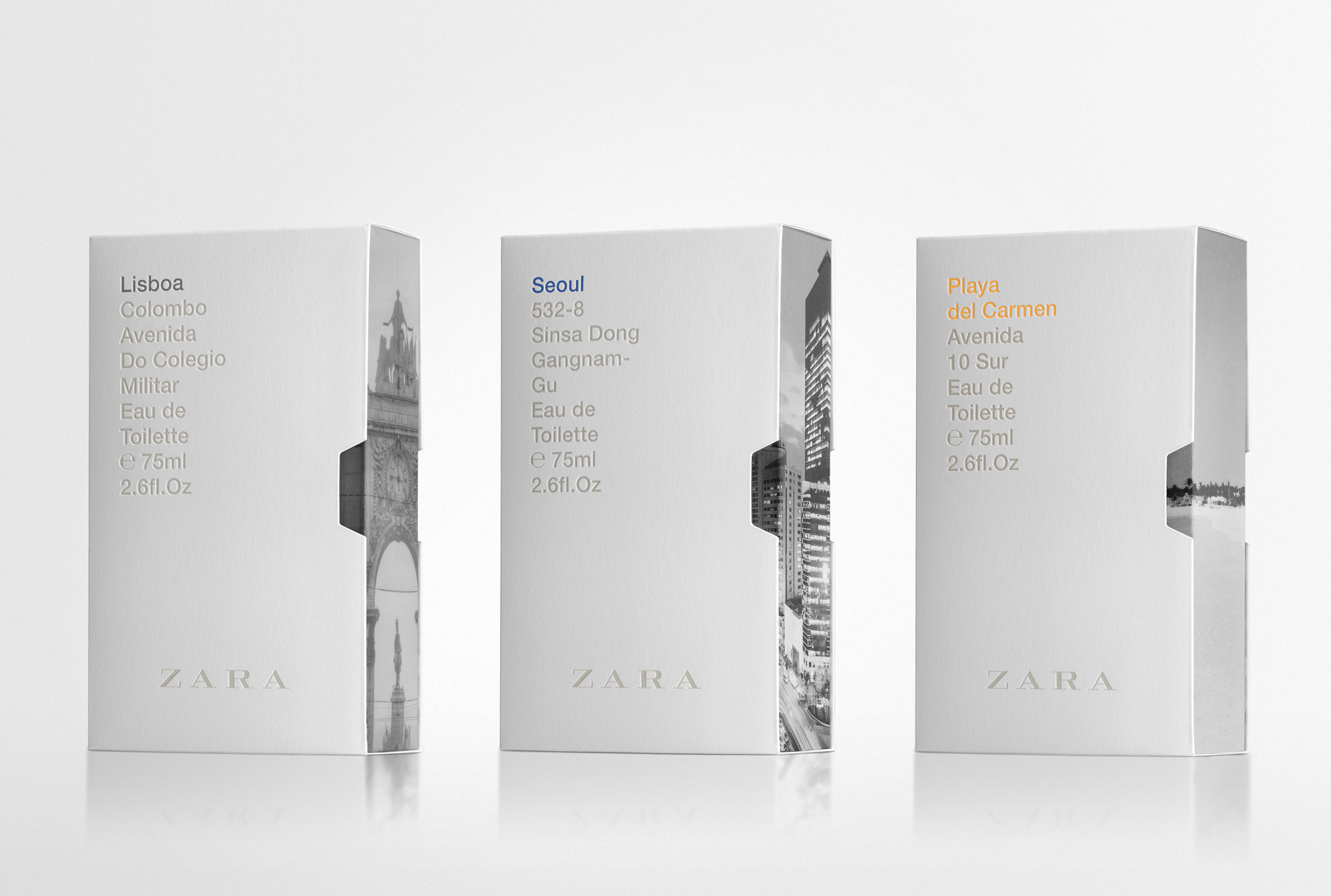
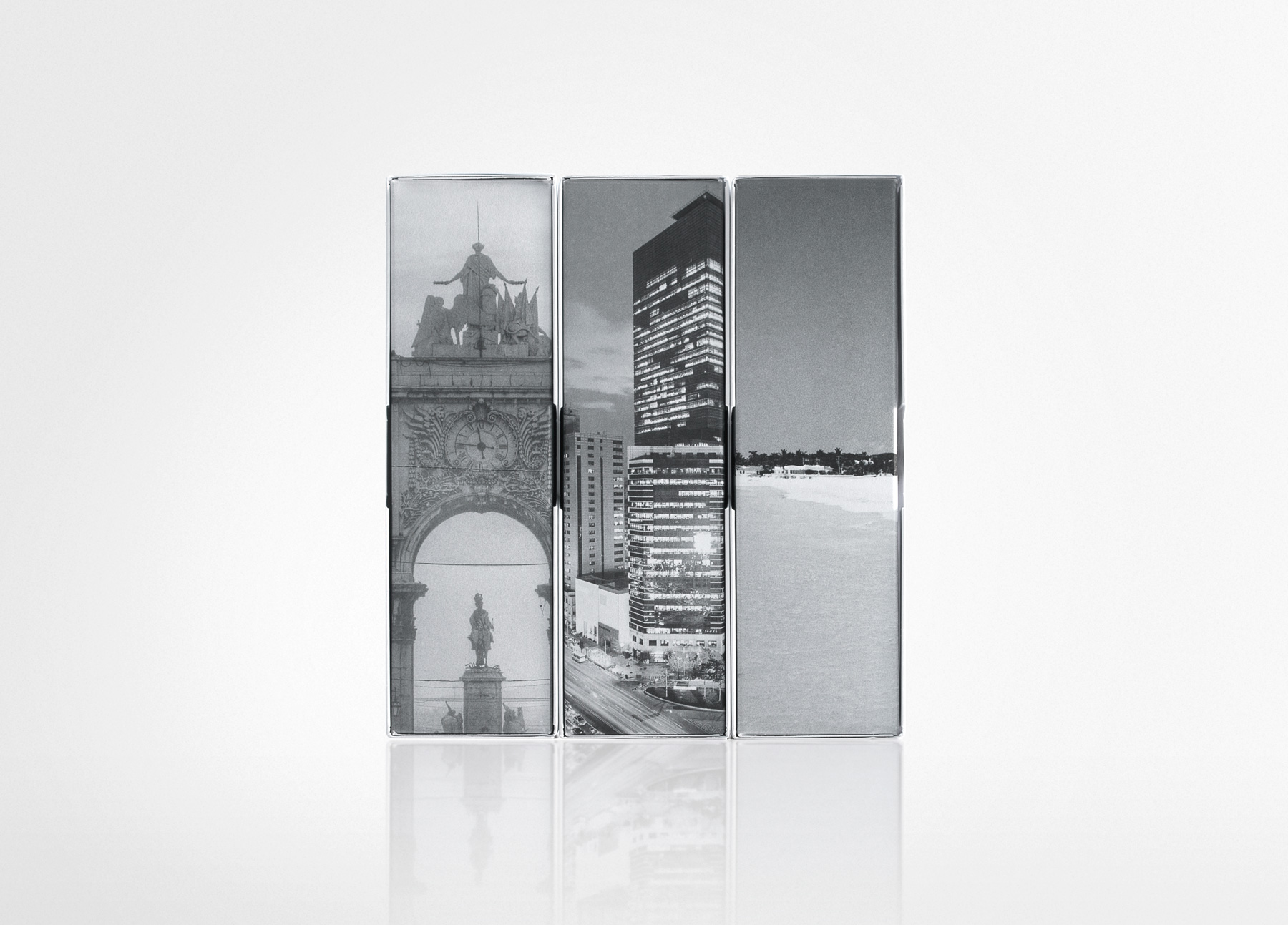
The system was later extended to the Cities line (cities where Zara is present), for which this packaging solution proved especially appropriate. In this case, the outer box is white, while the inner box is fully covered with an image of the city. As the inner box is gradually removed from the case, the image is progressively revealed, echoing the way travellers slowly discover a city as they explore it.