

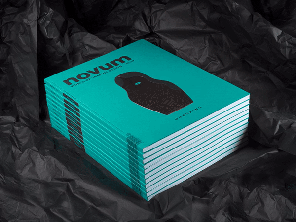
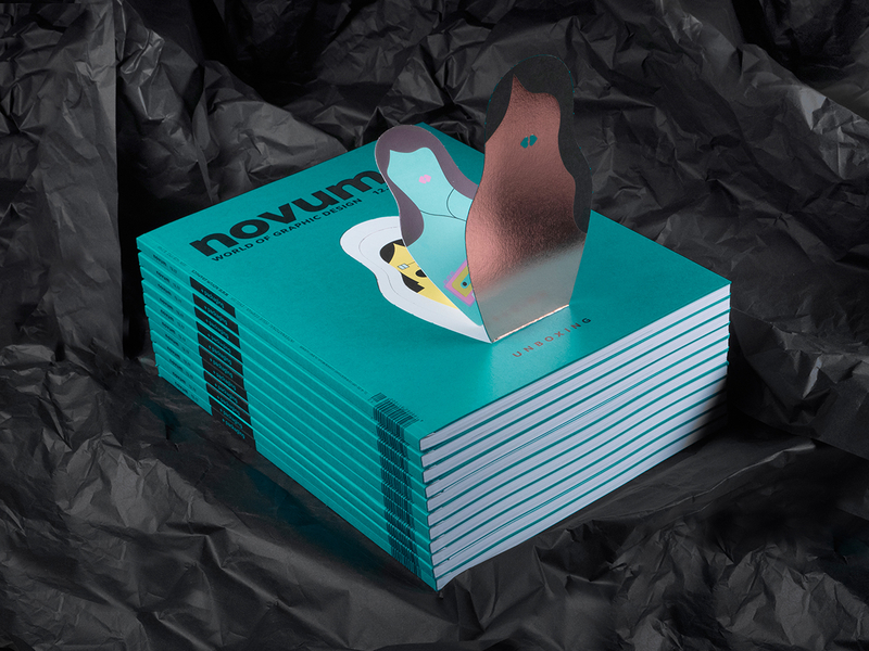
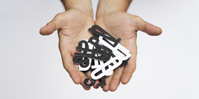
Unboxing!
In Lavernia & Cienfuegos’ portfolio there are many exciting packaging projects. Was that a particular intention of yours or did each project just lead on to the next one? And what is it that you like so much about this field of design?
We have always dedicated ourselves to graphic design and product design, so twenty years ago we saw that packaging offered us the possibility of carrying out integral projects where we found packaging solutions for both the 2D and 3D design (the bottle, the jar or the box). Little by little we started to work in this sector and one project led us on to another. For us, any project is an opportunity to do something really good. Sometimes we have to turn the brief around, that is, look for a different approach that allows us to make a more innovative and more ambitious design which is, therefore, better for the client. That’s why we do not select projects to work on, but whenever we can, we select the client. We are interested in collaborating with companies that we feel comfortable with, that understand and value what we do. A project can always be turned upside down, but a client cannot.
Let us turn to the extensive CD you did for Naranja de Valencia, a cooperative of orange growers and exporters. What was the particular challenge here?
Valencia has been an exporter of oranges since the mid-nineteenth century. It is the largest producer in Europe and oranges were one of the economic pillars of the region for much of the last century. The marketing of this fruit entailed undertaking extensive work on the design of brands, labels, bags, and general of pieces of merchandising that have accompanied the sale of oranges for more than a hundred years, mainly for export. There is a museum in Burriana (a city near Valencia) dedicated to the design of orange brands and wrappers because a very dynamic and powerful graphic industry developed in this sector. When a group of producers and exporters under the PGI (Protected Geographical Indication) commissioned us, the challenge was to make a new design, up-to-date, modern, but taking all that graphic tradition into account. The typography used, sans serif, has been altered with the purpose of recalling the style of the traditional typefaces used in the middle of the twentieth century in the designs of orange labels. The brand identity involves another essential element that accompanies the logo. This is an illustration that works as a motif pattern to be used on almost all the other media, such as wrapping paper, signs, bags, fruit boxes, the website, etc.
Quite a different look of course was produced for Suavina lip-care products. Here you pulled off a blend of contemporary and traditional. What was the design process like in this commission?
This project has elements in common with the oranges commission. There was also a preceding tradition in this case. Laboratorios Calduch has been making this lip balm for 135 years and its packaging maintained the graphic codes used by pharmacies from the first half of the twentieth century. The presentation container of the lip salve is a redesign, an update that they have been using for many years. The curvature of the planes and the rounding of the edges gives it the smoothness that this type of product requires and modernises it. The brand appears on the lid, redesigned based on the original, and appears next to the word “dermo” and the date of origin of the product: 1880. The purpose of the ensemble is to transmit both tradition and modernity, through the contrast between a classical typographic composition, a sans serif font and the engraving of the letters in bas-relief.
The corporate design for the chocolate-maker Utopick, which also included packaging, is very interesting: Here you continued the design on the chocolate itself. How did Utopick react to this solution and how closely was the client involved in the process?
Utopick has been an ideal client. They were looking for innovation, a radical change, a break with what they had at the time. In the preliminary meetings they insisted that they wanted something very special, so when we presented them with our proposals they were enthusiastic. They have always been willing to go as far as we take them. It was a challenge for them to change the traditional bar and adapt another system of packaging chocolate, but they did everything they could to produce what we had designed. Fortunately, the new packaging has been a success. It has taken the company to new markets and has given them the reputation that comes from design prizes and diffusion in social networks.
In the language of forms you used in this project you continued the manufacturer´s symbol – a ship – but in an abstract way. Is story-telling a part of packaging design nowadays would you say?
There are many brands in the market and connecting emotionally with the public is a way to be different, to create a link that generates loyalty to the product and the brand. In this process of emotional communication with the client, telling a story is very important. It does not have to be a specific, realistic story that talks about the origin or tells real or credible anecdotes. It is possible to suggest, through graphic resources such as non-figurative drawings, colour or typography, the idea of a world of its own, of a story. In the case of Utopick, the brand, the packaging, the drawing on the bar, even the name, all contribute to create the atmosphere of a story.
Even industry is now placing great importance on packaging – what´s the best way to stand out from all the other well design packaging in this area?
Today there are too many products competing in the same space. The battle to stand out from the crowd and catch the eye of any customer makes shop shelves chaotic. I think we have to design for the target of each product. Today it makes less sense than ever to address everyone. You have to choose a target and aim very well. There’s no need to be garish or flamboyant. Each individual has a gaze and that gaze looks for what interests them, reacts to the things that speak to them in an intelligent way about what they want to hear. The key is knowing how to connect with the chosen audience. Speak to them in their language and tell them something that is new to them or tell it to them in a different and attractive way. Humour, which features ever more frequently in packaging, is one example.
And, last but not least: Do you wish clients had more courage to allow something new to evolve?
Of course! I would love it if all our clients were more daring, more courageous. I think marketing, as it is practised in most companies, is a constraint. It’s too afraid of failure, without actually avoiding failures, and with that attitude the only thing you achieve is to prevent a great success. I do not think there is any really innovative and successful product, a star product, that is the result of surveys, tests and statistical analyses. A friend of mine says that a synthesis is worth more than a hundred analyses. Creativity cannot be found in data or surveys. Its ideal environment is risk.
Issue available in the following link:
https://novum.graphics/en/magazine/archive/detail/novum-1217/
10 Tips from Creatives on Finding an Audience for Your Work

What has your experience been like finding an audience for your work? What challenges and unexpected surprises have you experienced along the way?
What strategies have you employed to find an audience and share your work? What has worked well and what hasn’t?
We have always asked ourselves where big companies would look for designers, and above all, those companies which we would like to work with; keeping in mind that we have never had salespeople or marketers dedicated to searching for potential clients and making visits.
Before the internet existed, I imagine that companies looked for designers in specialised journals, but, unfortunately, very few had international distribution and, furthermore, the number of projects that they could showcase was very small. Back then it was very difficult to show your work.
But then the internet arrived! And about ten years ago, the first blogs specialising in packaging appeared and we started sending them images. We had been doing packaging projects for some time, mostly for cosmetics and foodstuffs, and we decided to publicise them through these blogs. To our surprise, it worked wonderfully and we started getting calls from multinational companies that wanted to meet us and work with us. So then we not only knew where they were looking, but we learned what they wanted: creativity.
We had outlined a customer profile that interested us. Basically, these were companies that met three requirements:
1 · The design formed part of their strategy. That is, they knew how and why to use our work and they valued it.
2 · They provided us with interesting projects, in which we could develop all our skills.
3 · They had an international presence. Our work has two types of benefit: one, obviously, is the economic benefit, and the other is the company image. The latter is why new customers call you. No matter how good your work is, if nobody knows you, you’re lost. So it is important that the things you design cross borders, that they are sold and used in other parts of the world. It is fundamental for a certain professional reputation.
Do you have a favourite way to share your work? Why?
Are there any specific platforms you use to reach your audience and would recommend others use too? Why? (examples might include but are not limited to: Social Media, Behance, Portfolios, Local Gallery Events, Making Your Work available through Stock)
We have paid a lot of attention to our own website, which we always try to keep up to date, and we are on Facebook and on the most important packaging blogs. We are now designing a strategic plan to see what other platforms we could benefit from being present in. We recently started with Behance and it seems to be working, although it is still too early to be sure.
What advice or tips would you share with other individuals in your discipline for getting their work noticed by other people?
The first piece of advice I would give is not to overlook small projects. Any project is an opportunity to make an innovative, striking piece of work. In fact, it is usually easier to develop groundbreaking solutions with small customers than with large companies, which are highly conditioned by mass sales and by production and price limitations. Quite a few of the jobs that have given us notoriety are projects that we made for small businesses.
The second is that you have to have the discipline to make good photographs of the work.
Presentation is immensely important: images, texts, animations or films. The form is as – or even more – important as the content. Like it or not, this is the sign of the times. Moreover, it is one of the pillars of our profession: to communicate, to seduce.
When you started your career, did you have a specific audience in mind? Has that idea of who your audience would be been accurate?
When you start working, you don’t know much about companies and the market. At first, we didn’t have a clear idea of what a company was like and who our audience could be. We didn’t even think about an audience, back then it was enough for someone, whoever it was, to take notice of us and commission us for something. Then, as we discussed earlier, we were able to trace the ideal client profile. But it is something that takes time to define.
Both my partner, Alberto Cienfuegos, and I studied Industrial Design, but the practice gradually led us towards Graphic Design as well. After a few years, we realised that dedicating ourselves to both disciplines was very good for making packaging. We then thought, and this is what happened, that we could provide a complete design service, because we could offer both the graphic and the structural design, and, by doing so, ensure much more consistency in the final result. Principally, because it allows us to deal with both aspects – graphics and 3D – at the same time, from the very beginning, not one after another. I think that it’s something that international companies value very highly. Fundamentally, they call us because we offer structural design. And we prefer to do it that way – to design everything. The packaging is communication, and "the 3D communicates as much as, or even more than, the graphic element." The volumes, the textures, the materials... have a huge expressive capacity, very intense, even though they are not as explicit as the communication through texts or images, but it is more profound, and both must complement each other and have the same objective.
Full article in the following link: www.theblog.adobe.com/getting-noticed-10-tips-from-creatives-on-finding-an-audience-for-your-work
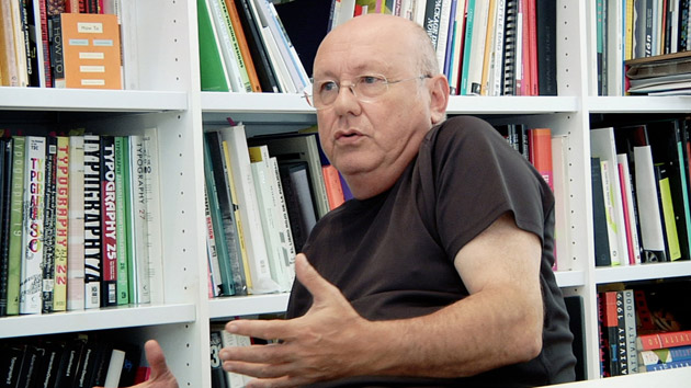
Nacho Lavernia (Lavernia & Cienfuegos Design) - 14 August 2017
Design Talk with Nacho Lavernia
Do you feel the future of design is completely digital?
Design is a creative method of problem solving that includes, and this is very important, the ability to communicate results visually. For some years, this method has used digital tools and, of course, it will continue to use them in the future. But digital technology is only a tool. The future of design lies, in addition to the traditional fields—such as product design or graphics (now extended to other types of digital media such as apps or video games)—in the development of social design, design thinking, or service design. And this is a result of the method, regardless of the tools used.
What do you feel the pros and cons are of digital techniques?
- Among the pros of digital techniques:
- The speed of implementation and seeing results.
- The speed of communication with the client.
- The speed of being able to see everything that has been done related to the subject we are working on.
- Greater expressive/communicative possibilities with very precise tools.
- Among its cons:
- Less time to do things. Computers have made project deadlines shorter.
- It eliminates some scope for reflection.
- It generates distance in the physical contact with what is being designed: with physical matter, with paper, with ink... the senses are less involved: touch, smell...
What do you feel the pros and cons are of analogue techniques?
Digital technology has broken down a barrier to accessing the profession. In the analogical era, learning to present a piece of work or make a final design required years of practice, during this time sensitivity developed as the profession was learned. Now the output from computers is technically perfect, it hardly requires any learning. But it is still necessary to learn (and teach) how to design, and it must undoubtedly be done in a different way.
As for the pros and cons, they are the opposite of the previous answer.
Which manual techniques do you still use? If yes, why?
Primarily drawing. The “tempo” is different. It forces you to reflect, because undoing mistakes on paper is much more difficult and expensive than with the computer, so you need to reflect and analyse what you are going to do before you do it. In the analogue world, there is a period of reflection and preparation to choose what you are going to do, and how. In the digital, you do and do, and then you choose. I do not think that either process is better than the other, but I think they are very different and, of course, give different results.
Nacho Lavernia (Lavernia & Cienfuegos)
Interview for Ilas Magazine
1) Let’s start from your work. Your projects are minimalist but at the same time express a sophisticated sense of attention to detail. What guides your work?
We have always strived to make our work expressive and visually powerful. We find that when you are able to express yourself with the least amount of elements that the design becomes more powerful, more potent. We try to strip away what we deem unnecessary and develop a single concept to its extreme. In any design we make there are many elements at play, some may just be details, but they all have the same importance. The meeting of two materials, or two different surfaces, their finishes, the empty space in a graphic, everything, no matter how insignificant it may seem, contributes towards expressing what you want to say and gives strength to the whole.
2) How much inspiration and how much research does it take to get such a consistent image in all your projects?
While our projects have all a consistent image, we are always looking for new solutions for each problem. We try to find a key idea, a concept that leads us along a different path. I believe that in every creative process, memory is fundamental. When I talk about memory, I mean everything that you keep in your head: images that come from observation, study, the world of art, design, cinema; and also ideas, experiences. Research is a guided source of knowledge, it’s very useful, it provides you with new resources, which you had not explored. It is one of the activities we carry out to fill the memory with new images and ideas that we can turn into solutions. Inspiration comes when you dig into your memory and suddenly you find the key idea that may give you the solution you were looking for. In other words, the two things go together.
3) What are you into at the moment and how is it feeding into your work?
Italo Calvino said that “creativity is like jam: it needs to be spread on a solid piece of bread”. And that slice of bread is made from craft, culture and research. I do not know any designer who is not a very curious person. That slice of bread Italo Calvino speaks of is largely made of visual culture, which is our raw material. So you must always be interested in art, cinema, advertising, cities or objects; but also in literature, music, and so on. And everything you are interested in undoubtedly influences what you design and how you do it.
4) Does it still make sense to talk about design research? What does doing research mean for you today?
Research is essential, but we can argue about how it should be done. Research is our workout: our way of building up our creative muscles and filling the memory with new ideas. We have colleagues who need to make a pseudo-artistic work, aside from their work as designers, to try out new ideas. We do not have this need because we try to research every project. If you research in the abstract, with a parallel work, what you’re doing is consolidating your own visual language. If you investigate a real project, a commission, you investigate the way you design, your approach to a specific problem and possible solutions to the situation. And this is the essence of design, isn’t it? We are not artists, we work on commissions, with requirements and objectives that are imposed on us.
5) Design means combining aesthetics and functionality, which seem to be two different ways of looking at the same thing, don’t they?
I completely agree. Aesthetics and functionality are not two opposing concepts. All modern design, like modern architecture, has developed in the shadow of Sullivan’s famous apophthegm: “form follows function”. The industrial aesthetic arose as a rupture with the craft aesthetic, which had prevailed until the Industrial Revolution, and is defined as the result of the perfect adaptation of an object to its function. That is, when the structure of an object optimises its functionality, the result is a beautiful object. The problem comes from two fronts, which may be cause and effect. The first arises when technological advances enable the optimisation of the function to be resolved with mechanisms that barely occupy any space, and which therefore do not condition the form. The second, is the gradually increasing relevance of the communicative aspects of the object. In the consumer society, the sign value of an object (furniture, household appliances, vehicles, packaging, etc.) is growing, and there is also an ever more significant variable, the desire our clients have for their products to be different, unique (not necessarily better). So today we could change Sullivan’s maxim to the following: “Form follows market”, where the physical function no longer conditions form.
6) To what extent and how have your culture, your country of origin influenced your work?
There must be some influence, but in this globalised world it is increasingly difficult to detect and pinpoint it. Nowadays, all the designers of the world look at the same magazines, buy the same books, browse the same websites, design with the same computers, use the same programs, receive the same influences and work for domestic and foreign clients that are increasingly alike; because they also have the same machines, buy and sell in the same markets and apply the same management and marketing strategies. Under these circumstances, can you talk about local design? I think that the features we attribute to design from a specific place (Italian or German or Nordic design) are more in line with the clichés used to characterise each country or its industry: Italian creativity, German precision, Scandinavian simplicity... but now you can find all these characteristics in designers all over the world, regardless of their origin or place of work.
And secondly, can we talk about local features in an activity like design that has its essence in the generic, in quantity, repetition, homogeneity, standardisation, in universalisation?
I know that this response makes perfect sense in the field of product design. In graphic design there is a much more direct intervention of cultural codes that are still closely linked to the region, to the local. However, the graphic language that we use in a specific project is one thing, and the style or personality of your work in general is another; it is something subtler and more permanent.
7) How did you conceive the idea for your projects? There is a method that you feel to share with students who are getting into this profession?
We really like to look for solutions by looking at sectors other than the one in which we are working. For example, by transferring solutions, ideas or resources from food packaging to perfumery or vice versa. Or using design languages specific to one sector in another. In fact, these are techniques for finding original solutions. I think that every designer has their method, usually involving black box thinking, which is what the experts call a process without a systematic methodology. In this sense we are concerned with stimulating the creativity of our team and not bureaucratising our work. Creativity is not a linear process that advances step by step. It is a seemingly chaotic process that is constantly jumping forwards and backwards. I find the criteria you use to evaluate what you are doing much more important than whichever method you use. You have to be rigorous to be able to judge, not to take it step by step.
8) What do you reckon the role of graphic designer will look like in the future?
I have always thought that the differences between graphic design, product design and architecture are in the technical aspects. In the materials, the production processes, the field of work (planes or volumes), in the scale (dal cucchiaio alla città); but everything is design, and there are three fundamental factors that taken together characterise the work of the designer. Firstly, creative thinking: designers do not focus on the problem, as technicians do, but on the solution. Secondly, knowledge of the techniques of representation (drawing and others) that allow us to communicate what we have designed in detail, in order for someone to produce it. And thirdly, everything we do is aimed at the user. The designer is responsible for the physical and emotional relationship the user has with the object or with the pack or with the brand or with a poster. These three elements (creativity, mastery of the tools and the user as the final objective of the project) are the basic pillars of our profession and that is what companies are looking for when they incorporate Design Thinking into their organisations. And that is what service designers do, or those who are dedicated to social design, or “social innovation” as Manzini calls it. We have a way of making it our own and we can apply it to any field where it is useful. That’s where I think the future of design lies. Far beyond the graphics, the product or the packaging.
9) How much has the online availability of graphic design resources influenced the work of designers?
The online world has become an incredibly powerful showcase for publicising your work and making it easy for potential clients on the other side of the world to become aware of you. It is extremely useful for instantly finding out what is being done and what has been done or to find graphic resources such as images, typographies, illustrations, and so on; and, of course, to communicate with your customers even thousands of kilometres away. It has compressed space and time. Computers have simplified many tasks and speed up the whole process, which has its good side and its bad side. In the end, the important thing is to think, and to be able to do this well takes time. I’m convinced that computers and the internet are changing ways of designing, but also the ways of living and even thinking. Everything is linked.
10) What’s the first thing you do when you face the challenge of a new project?
We have, like all design studies, a process that adapts to the complexity of each project. However, there is a starting point which we place great importance on. It’s the brief. We analyse it very thoroughly and complete it by asking all the questions that we consider necessary to really understand the objectives, and especially the requirements or limitations of the project. Then we spend a lot of time looking at what has been done, in studying what is known as “the state of the art”. From there we start to work by looking for an approach or a concept that opens up a new and interesting path.
11) Which projects are you currently working on?
We have several projects under way. From packaging to food and perfumery, to corporate identity... and we are designing a fence to protect four huge trees, ficus macrophylla, in a garden in the centre of Valencia, near where we have our studio. It’s a very nice challenge because we have never done anything like this, it forces you to leave your comfort zone and think differently. And also, because we will have to go past it every day, which will be horrible if it turns out badly! Challenges are always exciting and fun. Vila Matas says that "creativity is intelligence having fun".
Interview in Italian in the following link: www.ilasmagazine.com/contatti
Lavernia & Cienfuegos - 24 May 2017
“The making of” Experimenta66 [Spanish text]
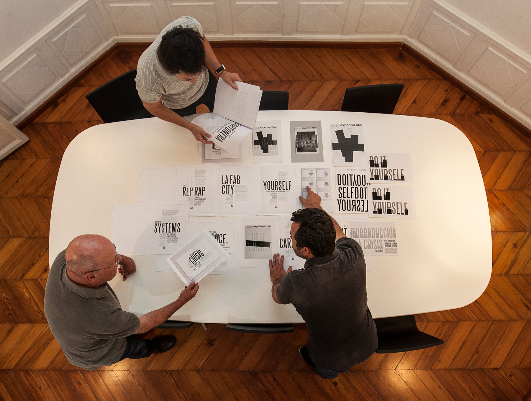
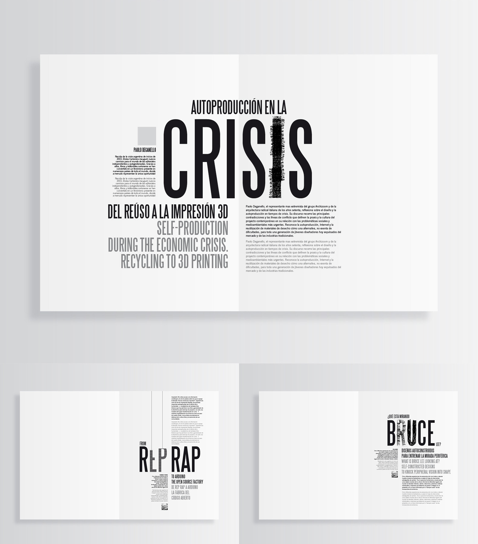
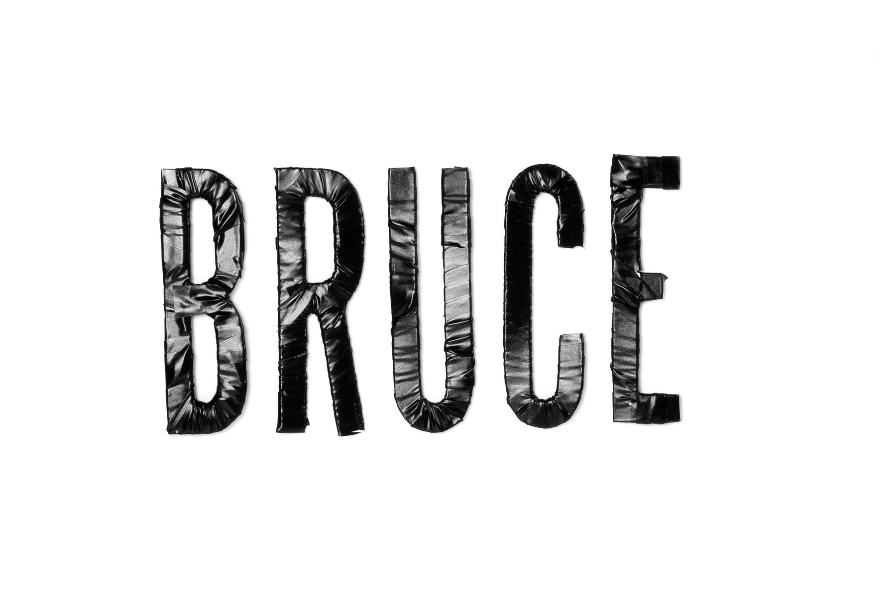
A los diseñadores nos gusta empezar a trabajar con todo el contenido, textos e imágenes definitivos encima de la mesa. Así nos aseguramos de que las decisiones que tomamos van a funcionar en todos los casos y además podemos tener presente la estructura definitiva de la obra. Y el tiempo. Sin sorpresas. Pero cuando se trata de una revista, eso es imposible. No hay manera. Los autores se retrasan, el editor se desespera, las imágenes no llegan, hay que cambiar un montón de cosas, traducir, corregir, retocar… No hay más remedio que armarse de paciencia y echar horas. La sorpresa es el caldo de cultivo en el que va creciendo el proyecto, con la presencia angustiosa del calendario. El tiempo pasa, tic, tac, tic, tac… Como se trataba de un número dedicado a la auto producción la primera idea fue utilizar letras troqueladas con la expresión “DO IT YOURSELF” para que cada uno pudiera componer su portada. Para explicar al lector qué cosas podría hacer con esas letras pensamos en usar los titulares de las portadillas como ejemplo. Se trataba de mostrar posibilidades. Una era la de manipular alguna de las letras: forrar, envolver, pegar con cinta adhesiva, cortar, doblar e incluso fingir cosidos, volumetrías o el proceso de elaboración de un impresora 3D construyendo las letras corpóreas. Es decir, usando los lenguajes propios de la autoproducción. Cutter, tijeras, hilo, cuerda, cinta adhesiva… y a probar. Cortamos algunas letras, las troqueladas de verdad ¡no estarían hasta el último día!, y nos pusimos a ello. Nos parecía interesante que cada manipulación tuviera relación con el contenido del artículo, lo cual se antojó una quimera, por muchas razones, a medida que nos iban llegando los textos.
Al avanzar en esta idea (tic, tac, tic, tac…) nos iba invadiendo el temor de que el resultado pudiera ser un batiburrillo de efectos, gratuito y además falso porque tendríamos que fingir los manipulados ya que no teníamos letras troqueladas. Renunciamos, pues, a los efectos y empezamos a componer con la Steelfish sin manipular (tic, tac, tic, tac…). Cuando estás en un proyecto como este el tiempo no transcurre de una manera lineal y constante. No. Se va acelerando progresivamente. Tic…tac, tic..tac, tic tac, tictac… Decides troquelar letras y haces un boceto que va a la imprenta para que estudien su viabilidad con el troquelador. Pasan unos días y no hay contestación. Bueno, hay tiempo. Un día llamas y preguntas. “¡Ah! El troquel” -te contestan- “¿No te había dicho nada? Hay que separar mucho más las letras entre sí.” “¡Vaya!” –dices_ “Y ¿cuánto?” “No sé. Lo pregunto y te lo digo”. Dos días más y al fin llega la respuesta, un poco ambigua e imprecisa, pero renuncias a concretar más y te pones manos a la obra para corregir la composición. Lo cual no es tan fácil como puede parecer. Al día siguiente lo envías para que lo aprueben y vuelves a llamar: “El del troquel está fuera estos días”. Mientras te empieza a entrar un sudor frío, porque miras el calendario y ves qué cerca está la fecha de entrega (tic, tac, tic, tac…), comienzas a replantearte las portadillas, a pedir que te envíen los textos de introducción de cada artículo, las biografías de los autores, sus fotos… y a componer de distintas maneras hasta encontrar la que te gusta (tic, tac, tic, tac…), con la esperanza de que lo que haces se adapte bien a cada caso y funcione. Al final todo encaja. Las letras troqueladas tardan en llegar, pero llegan. El problema de que al abrir la revista se caigan todas al suelo, se resuelve. Lo de la realidad aumentada funciona. Y lo mismo con otro montón de dificultades que acaban por solucionarse. La revista se imprime. Parece imposible, pero se imprime en forma y tiempo. Tienes la sensación de que las cosas salen porque detrás hay un equipo que se ha dejado la piel (editor, diseñadores, fotógrafo, impresores…). Y te preguntas, por enésima vez, si siempre ha de ser igual, si no se puede hacer de otra forma. Hasta que alguien vuelve a llamar y…
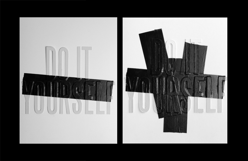
La idea para la cubierta fue proporcionar a los lectores un juego de letras troqueladas para que ellos mismos se pudieran diseñar su propia portada (Do it yourself). Para explicar a los lectores qué podían hacer, se materializaron unas cuantas ideas utilizando las letras troqueladas. La intención era mostrar en el interior de la revista algún ejemplo de “rediseño” de portada. Sobre estas líneas se muestra uno de los bocetos creados, en este caso con la ayuda de “cinta americana”.
See final project
Nacho Lavernia interview for Design Genius
Recently Nacho Lavernia was interviewed for Design Genius, a book on the ways and workings of creative thinkers by Gavin Ambrose and Paul Harris.
Design Genius celebrates the creative thought processes of 69 leading artists, designers, creative agencies, animators, illustrators and typographers. While highlighting key design techniques and theories, the visual curiosities presented in this book aim to engage, provoke and inspire.
Here is the interview
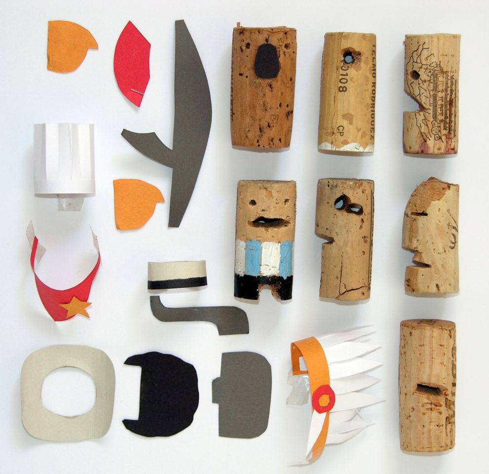
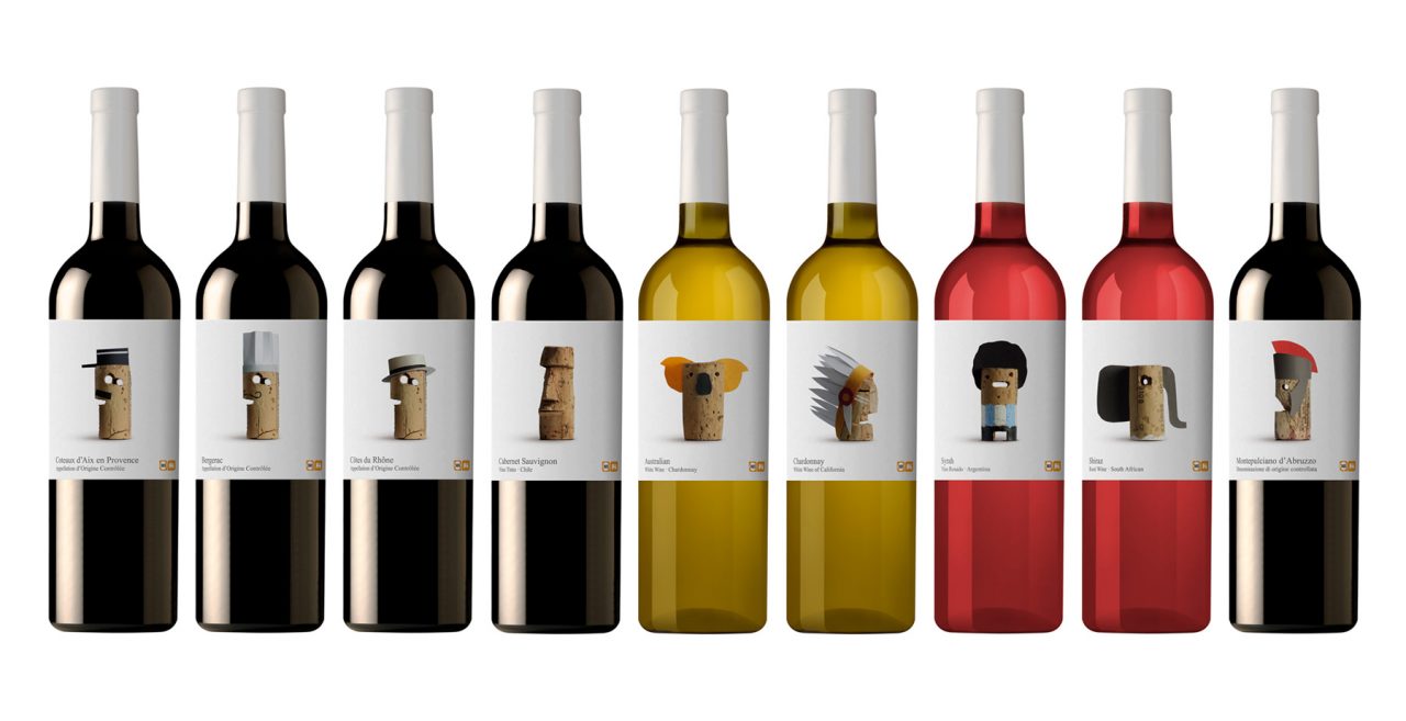
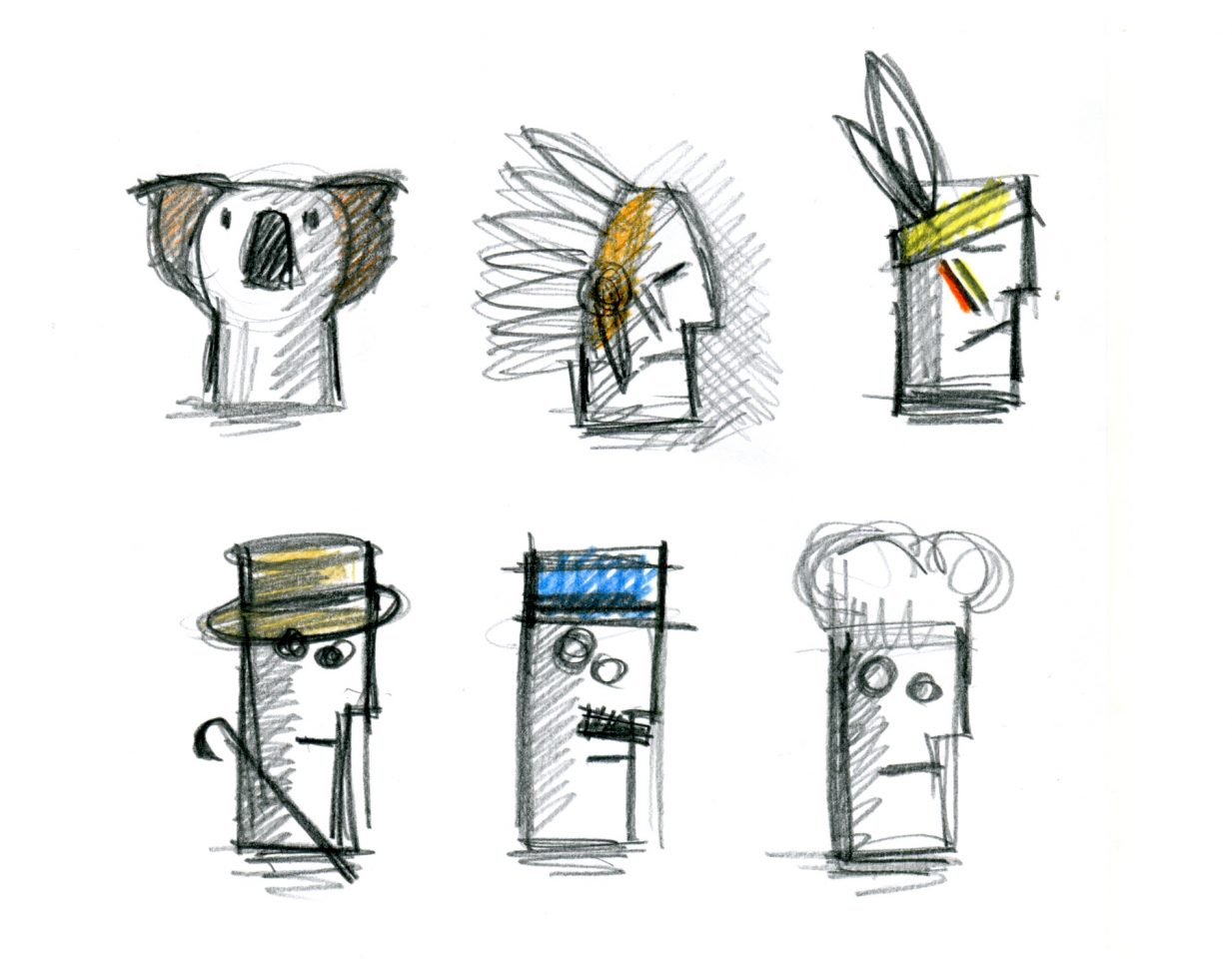
Lavernia & Cienfuegos’ design for Delhaize Vinos establishes a human connection through amateurism and the personification of corks extracted from bottles of wine. The various grape-growing regions are depicted by well-known signifiers, such as hats, that relate to specific regions. For example, a Roman centurion’s helmet for Italy and a policeman’s cap for France. There is also the explicit use of characterization, such as the depiction of footballer Diego Maradona for Argentina. in full.
Gavin Ambrose: I want to ask about the process of creating something new. Many markets are now saturated, so design has to play a more important role in brand development in the creation of new or existing products. The Delhaize Vinos project (shown opposite and on the following spread) is a good example of this, in a very crowded, saturated market you have found a new angle with a fresh approach.
Nacho Lavernia: We always try to find an original focus and then resolve it in a singular form. Sometimes, we do this successfully and at other times less so. Differentiation is now the value that is most demanded of design. Design provides other values of course but the need to differentiate brands and products has been a growing trend in recent years given that the market has become saturated, as you say. It is continually more difficult because today one competes with the whole world and therefore, you have to differentiate yourself from the greatest number of brands and products.
It is a dynamic that is starting to generate something like vertigo.
GA: How do you put a value on design? Value is a word often used in relation to design but to define exactly what this is can be tricky. Is it simply monetary value design can offer? Or does it a offer a more holistic set of improvements to how we live, to the way the world looks and acts?
NL: Any object has three values: use (its utility), exchange (its price) and significance. What is the value of its significance? Its capacity to influence ourselves and our environment. There are objects that reinforce our self-esteem or that help others see us as we want them to. The objects we posses are a reflection of our economic and cultural status. We think about cars or clothes where the value of the significance is very high. But design can add value in any of these aspects– functional improvements, cost improvements and emotional improvements produced between the object and its owner.
GA: A lot of your work makes very human connections, be it through narrative – as with the wine project – or through other senses such as touch and shape. Is the human interaction part of design something you consciously try to foster?
NL: Isn’t this the job of a designer? I think one of the things that differentiates the designer is to always work on the relationship between the object and the user. The artists or engineers that are at the two extremes of design act in another way. The first focuses on themselves, in their expressive capacity. The second on the object, on its functionality. It is the designer that has the user as their prime objective.
GA: Does your environment affect how you work?
NL: I think the work environment, that is the place, the ambience, the team, is decisive, but I also think it is a consequence of the way that each person works. That is, there is a reciprocal influence between oneself and the environment. The environment is created, or at least, you can transform it. Alberto Cienfuegos, my partner, and I have always thought this and we have tried to surround ourselves in a work environment that is at the level of our needs and also of our desires.
Design Genius