Naranja de Valencia
Branding and packaging for a group of orange producers and exporters. PGI “Valencian Citruses”. 2016
ADCV 2017
Gold. Coporate identity
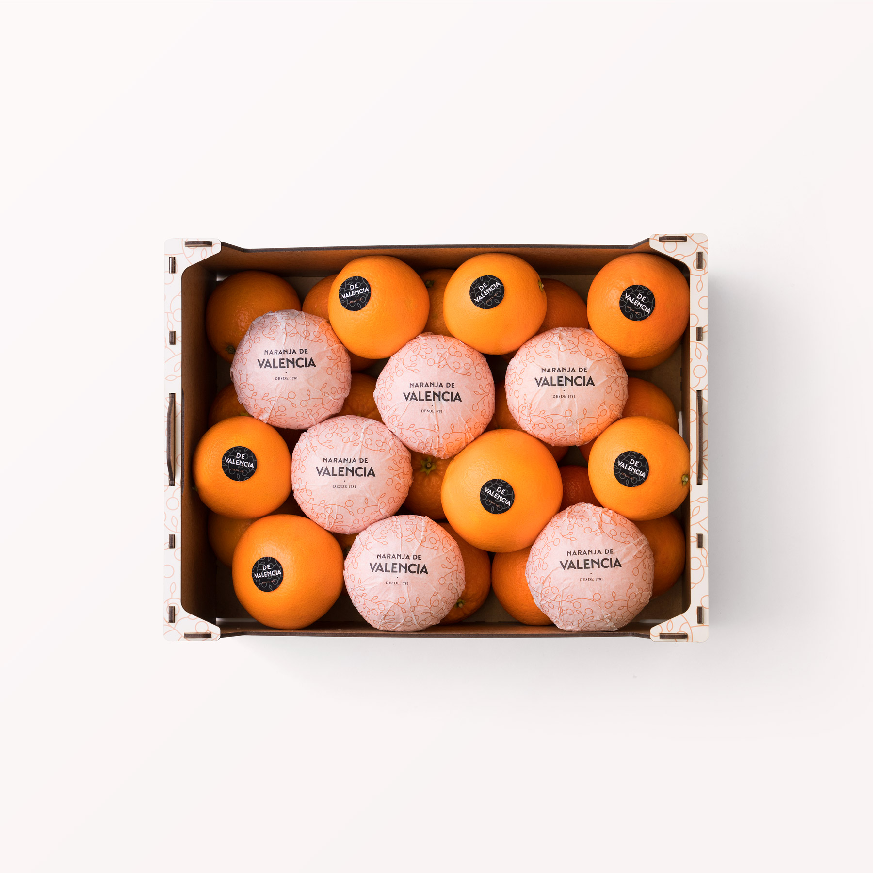
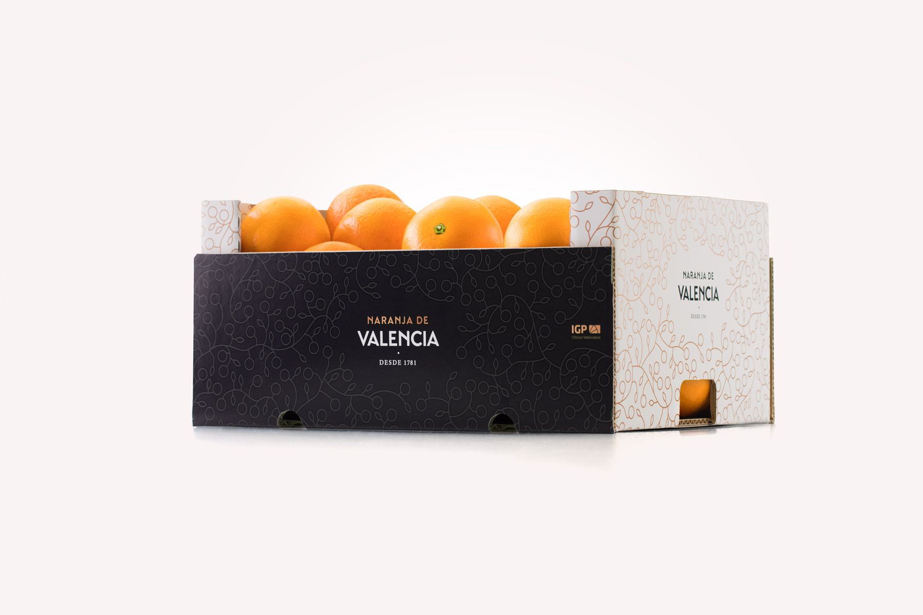
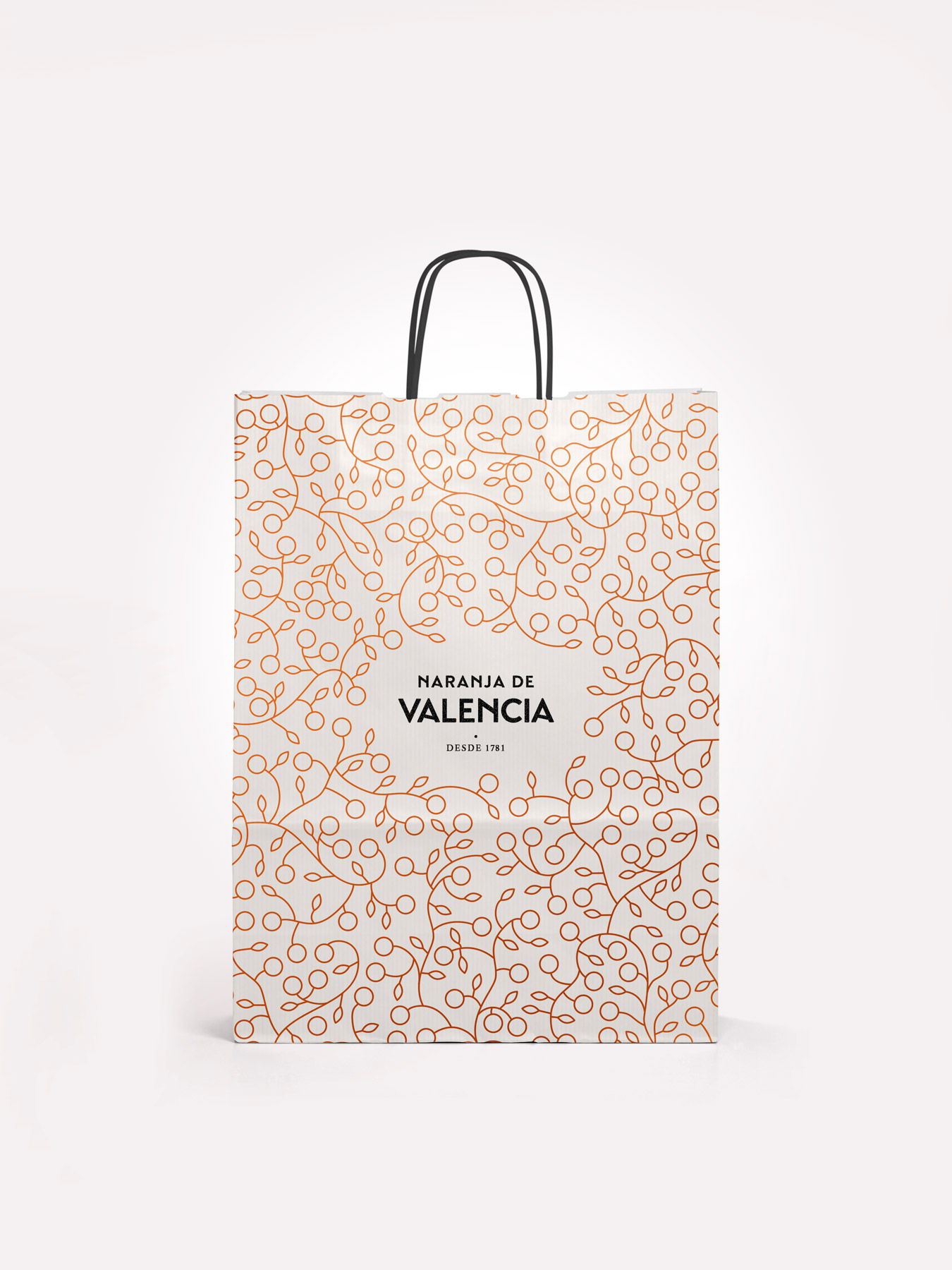
A group of producers and exporters made use of the PGI, Protected Geographical Indication, which guarantees that the oranges they distribute around the world are grown in Valencia, therefore benefiting from their renown quality. The name of this brand is very clear and very direct: Naranjas de Valencia—or Valencia Orange, in the English version. All the brand applications revolve around the point of sale: boxes, mesh bags, signs, bags, t-shirts for fruit shop vendors and a website. In the logo, the word Valencia stands out most of all, as the presence of the oranges, displayed in their boxes or mesh bags, makes it almost unnecessary to say what the product is. The choosen typography, san serif, has been modified to evoke the traditional types used in the middle of XX century in orange design labels – activity that had a great development in the first half of that century. The brand identity has another essential element that complement the logo. We accompany the logo with an illustration that works as a motif pattern to be used in other media, such as wrapping paper, signs, bags, website, etc.
ADCV 2017
Gold. Coporate identity