

Proud to meet Proud
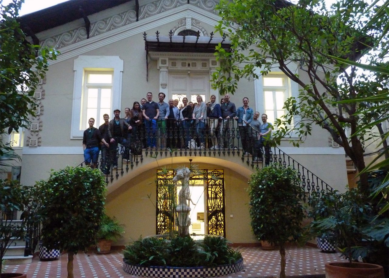
In November 2013 we had the honour of receiving Dutch studio, Proud Design, here at Lavernia & Cienfuegos. We met Steven De Cleen and his team while they enjoyed their 10th anniversary, choosing Valencia as their destination. We had the opportunity to share our works, debate the complex industry of packaging design and comment on the many similarities of both studios, namely our predilection for injecting emotion and humour into consumer packaging. Check out the wonderful world of Proud at: www.prouddesign.nl/about
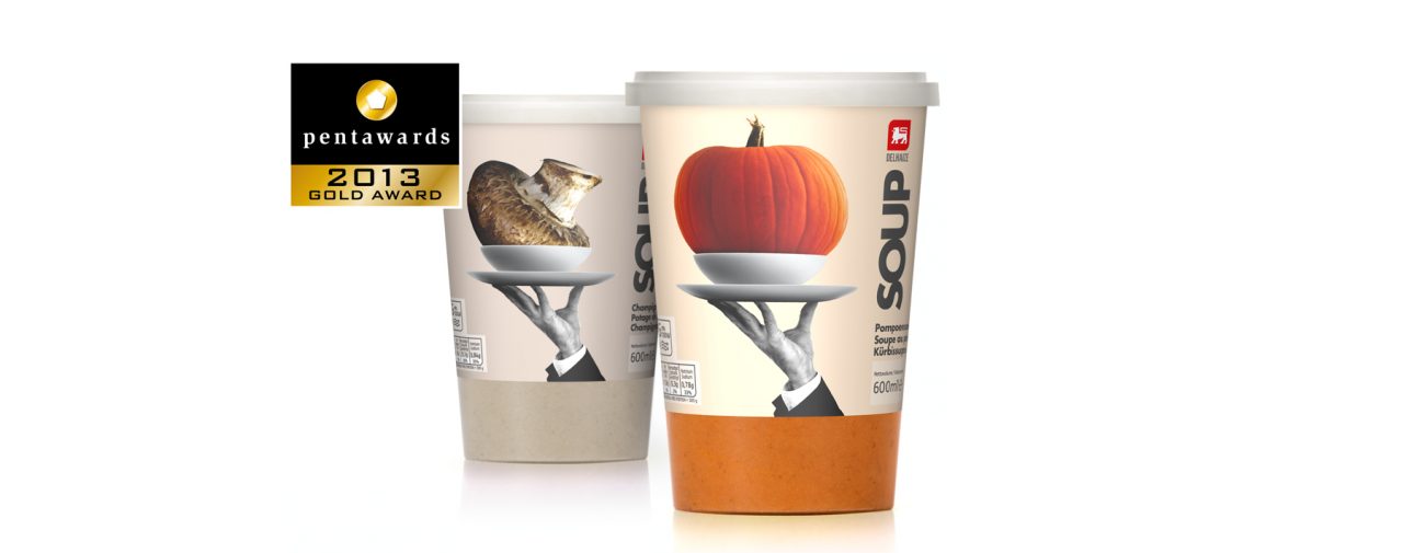
Another Pentaward Gold for 2013, this time for ‘Delhaize Soups’
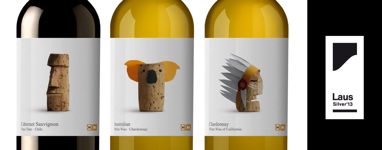
“Wines of the World” adds LAUS to its awards!
The cork is a sign of humility, an object of little value, often used as craft material, as a simple and easily manipulated element with which to play and create. The use of cork gives it the air of something simple, typical of an everyday product. The cap is the element that unifies and personalizes the whole range. The motif designed for each label refers to the country of origin.
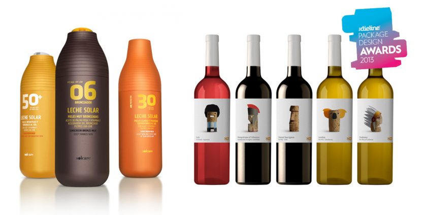
The Dieline Awards: new double award
TheDieline.com is the worlds most visited packaging website, which has turned into the into the leading voice for the packaging industry. The Dieline Awards formally recognize the world's best consumer packaging design. The industry expert panel for the 2013 Awards presented 42 awards over 13 categories from a selection of over 1100 projects entered.
More information about the awards: [1] [2] [3] [4]
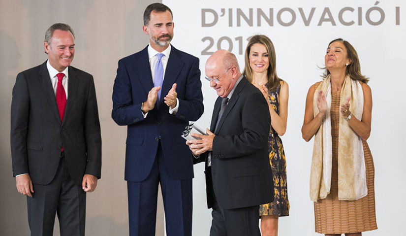
The “2012 National Award for Design” goes to Nacho Lavernia!
With collaborators and suppliers, who have always been there.
With all that, at one time or another, have worked with me as partners, colleagues or as interns.
Also with friends.
And last but not least, with the whole team at Lavernia-Cienfuegos.
Thank you!
Nacho Lavernia C.
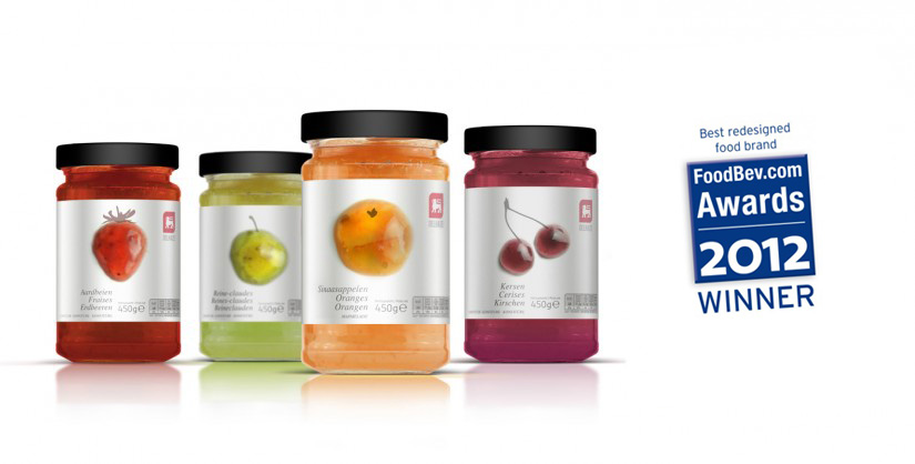
Packaging design awards in FoodBev Awards 2012
From FoodBev.com:
Best redesigned food brand – Winner: Delhaize Jams by Lavernia & Cienfuegos Design.
"Own label gets sexier and sexier, so that it’s hard to distinguish from 'brands'. Delhaize Belgium Jam works and stands out because it has the confidence to be simple in a category crowded with heavy imagery."
"The redesign of Delhaize Belgium Jams is to the point, focused, clear, clean, attracting the consumer’s eye by celebrating the core of the product (taste/fruit), making a lot out of a very simple thing. It's become more than just jam. Well done."