

Zúmex
We designed the identity for Zumex, a global leader in the design and manufacture of automatic juicers for the hotel, catering and retail equipment sectors, as well as for industrial applications.
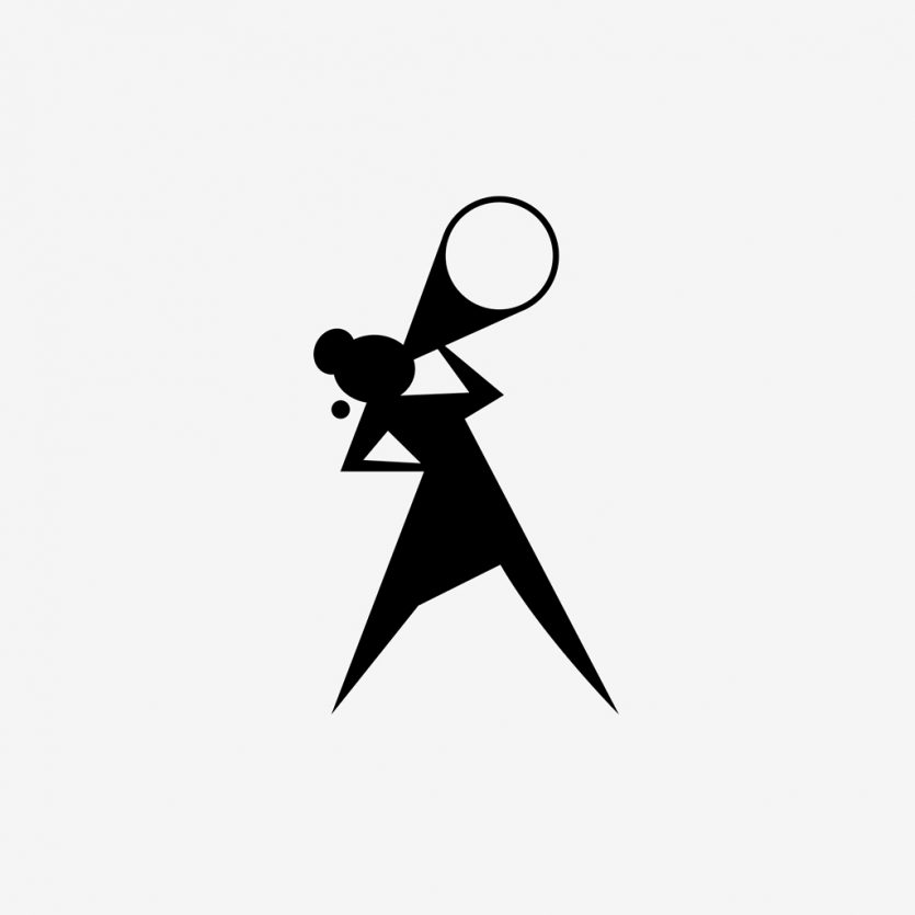
Dolores Pictures
Logo and identity for film producers, Dolores Pictures. The design is inspired on the figure of a woman that represents a film director in “action”.
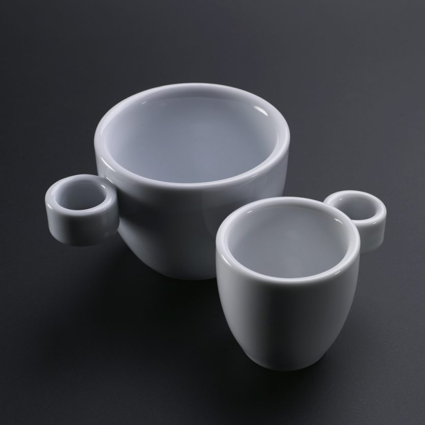
Cafes Valiente
We were asked to design a cup that could be clearly differentiated from the rest. A unique cup that Cafés Valiente could use as a brand symbol at coffee shops where their coffee is served. Since the cups are to be used at restaurants, and not at home, the requirements of the design were very specific: resistance, durability and possibility to be piled up. These conditions reduced the design options available. The only element we could work with was the handle, and that is what we did. We decided to invert the position of the handle, to put it upside down. We designed the handle horizontally achieving an aesthetically interesting solution. Both circles, the cup and the handle, were viewed at the same level. In addition, the new handle positioning often works better than a traditional handle making it easier to lift when a cup is full.
RNB
Identity design for one of Spain’s largest cosmetics manufacturers, specialising in fragrances as well as body and facial treatments.
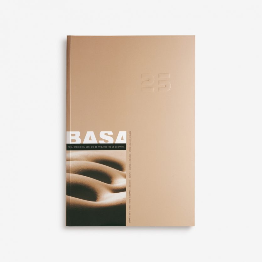
Basa
For two years we produced the design for BASA magazine, the official magazine of the Canary Islands Official College of Architects.
www.coactfe.org
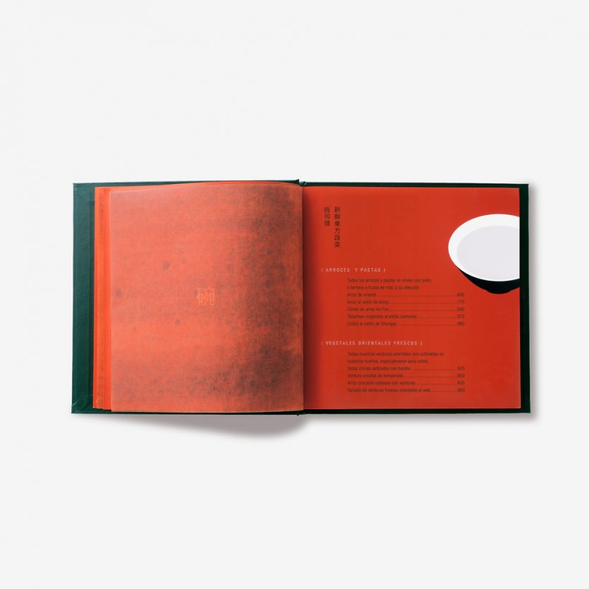
La cocina de china
The design is example in which obvious elements of identity turn into the brand. Both the image and the naming make use of obvious and immediate elements of the visual Chinese culture. The most obvious element is often the most surprising and efficient, as demonstrated in the design and use of the restaurant identity