

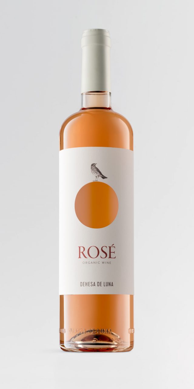
Dehesa de Luna
Dehesa de Luna Biodiversity Reserve Estate is located in Campo de Montiel and encompasses a protected area of almost 3,000 hectares of outstanding ornithological interest. From its hills, it is possible to observe a wide variety of bird species, including imperial and golden eagles, short-toed snake eagles, goshawks, kites, peregrine falcons, bustards, red-legged partridges, and many others.
The visual identity we designed brings together two key elements: the moon and birds. The wine labels were initially conceived as pencil drawings in which different birds—one for each wine—are superimposed over the moon. This graphic resource also allows for the development of a coherent visual language across future products planned for the estate, such as cheese, olive oil, honey, and others.
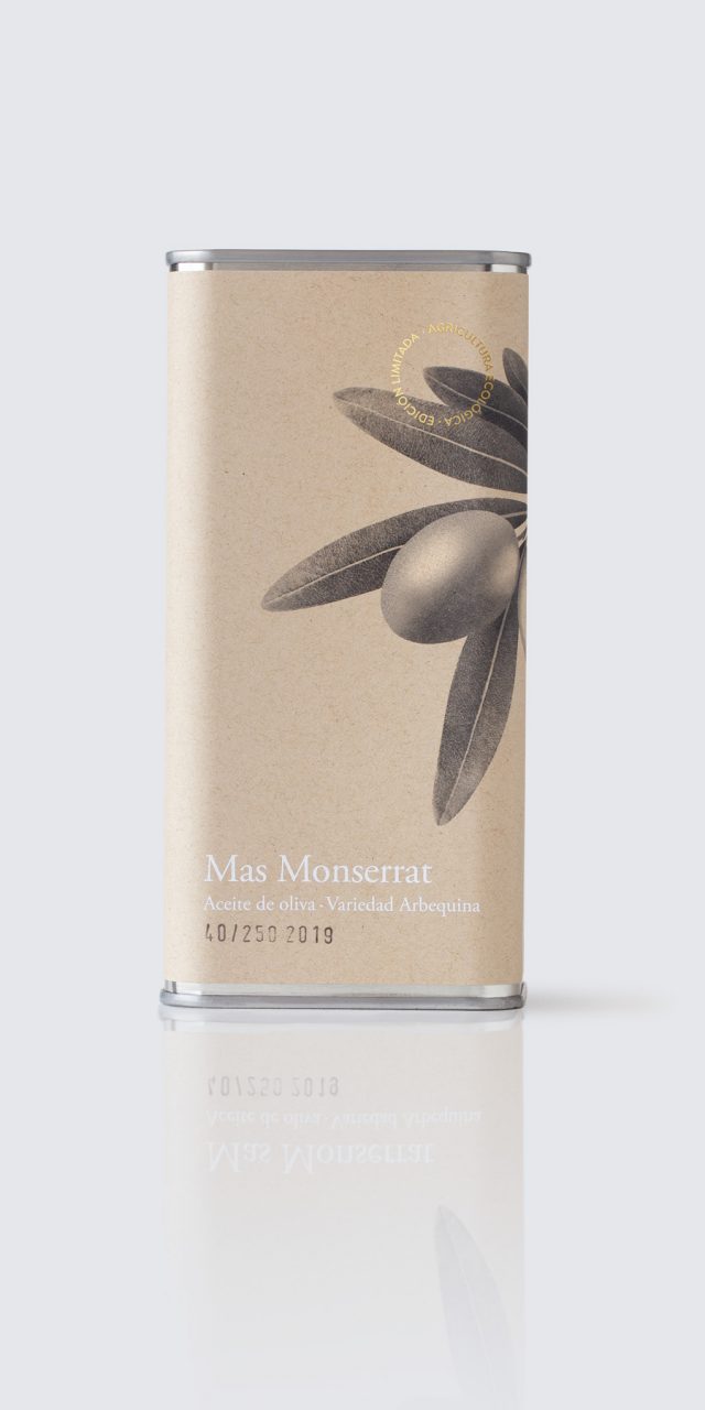
Mas Monserrat
This is a premium olive oil produced artisanally in an olive grove in Moixent, Spain. The production is limited to just a few numbered bottles.
The graphic approach is deliberately restrained, resolved in two colours, where the emphasis lies on composition and on the spatial, scale, and colour relationships between text and image. The result is a discreet and elegant visual language, applied to a recycled paper label that reinforces the product’s artisanal and premium character.
Lola Cruz
Lola Cruz is a footwear brand designed by María Jesús Gozalvo, who inherited her knowledge and passion for shoemaking from her father. The brand creates shoes with strong personality, conceived for young, independent, and cosmopolitan women.
The logo seeks to reflect the spirit of the brand while conveying strength and style. In developing it, we chose to respect two fundamental principles commonly found in designer fashion brands. Firstly, black was selected as the corporate colour. In fashion, colour palettes are inherent to each collection and change constantly; black provides neutrality and ensures harmonious coexistence across seasons. Secondly, we sought an abbreviated form of the name that could be applied to shoes, buckles, belts, bags—either as a fastening element or as a decorative detail.
For this purpose, we selected the letters L and Z: the first and last letters of the name, representing the beginning and the end, and the two most distinctive characters within the logo.
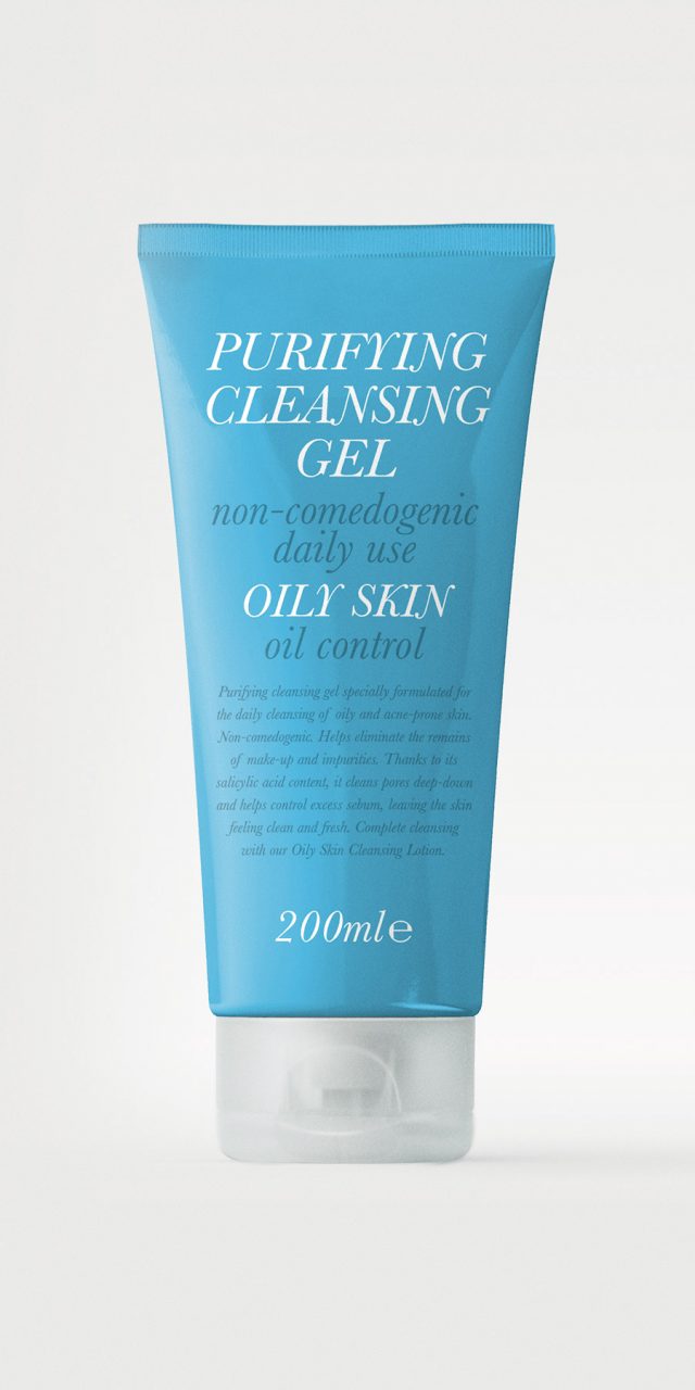
Oily Skin
This is a skincare line aimed at young people, for which we developed a typographic-led solution. The brief allowed for a high degree of creative freedom, and we chose to convey a restrained, functional aesthetic in which information takes priority within the graphic design. Young people with skin concerns seek clarity and effectiveness above all else.
Our inspiration came from the visual language of late nineteenth-century medicinal compounds found in pharmacies, characterised by typographic compositions that combine typefaces of different sizes and weights. We selected a transitional Roman typeface—Baskerville Italic—for the main text. The variation in scale and weight establishes a clear hierarchy of information. Typography is rendered in black or white against a blue background, the colour that identifies the range.
Global Omnium
Global Omnium has been dedicated, among other activities, to managing the entire water cycle—from catchment and purification to distribution—for more than 125 years.
We were commissioned to design a new visual identity aligned with the company’s current positioning: a dynamic, modern group with a strong focus on R&D, the use of state-of-the-art technology, a clear commitment to social responsibility and environmental respect, and the ambition to expand its activity and compete in a globalised market.
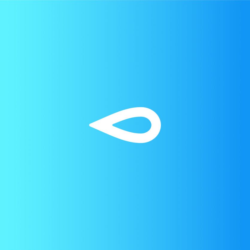
The drop is the most universal and recognisable icon for representing the concept of water, and it acts as the leitmotif for the activities of the companies within the group. When placed horizontally, it acquires a dynamic character, further reinforced by the use of a colour gradient. This orientation also gives it a distinctive quality: it becomes a drop that appears to be moving forward, clearly emphasising the company’s core activity—bringing water wherever it is needed.
The icon’s simple yet striking form enhances its visual strength, while its geometric outline conveys a sense of technology and reinforces the idea of a modern, forward-looking company. The typeface was custom-developed from Myriad, simplifying certain characters to achieve a more streamlined and contemporary appearance. The use of lowercase lettering lends the logo a more approachable and human character.
Experimenta 66
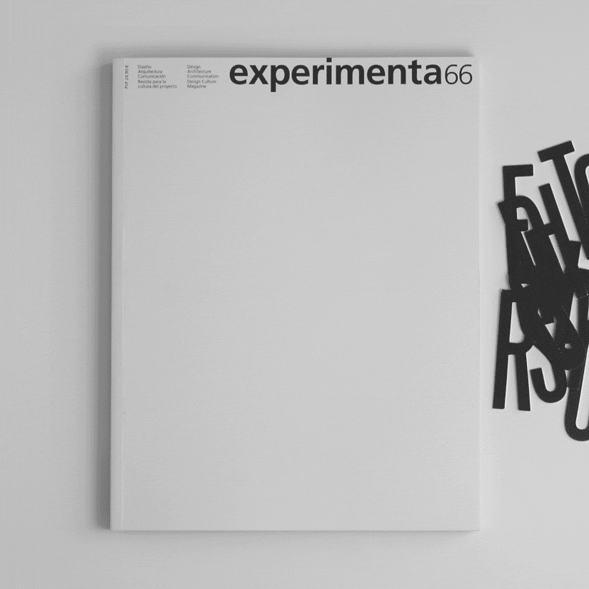
Experimenta’s editor and publisher, Pier Luigi Cattermole, asked us to design the first issue of the magazine’s new phase—a challenge we could hardly refuse. After three years as a digital-only publication, Experimenta returns to print. The magazine had paused at issue number 65, and from now on each edition will be dedicated to a specific theme, with the design commissioned from a different studio or designer.
The most remarkable aspect of this rebirth is that Experimenta remains unmistakably Experimenta, picking up exactly where it left off with issue number 66. For this reason, we approached the project with great respect for the magazine’s legacy, preserving two of its most recognisable features: the format and the masthead.
For the interior spreads, we worked in close collaboration with Experimenta’s long-standing designer, Antonio Rodríguez. Lavernia & Cienfuegos focused its contribution on the cover and the article openers. As this issue revolves around a do it yourself theme, we proposed that readers create their own covers: a blank canvas on which to compose the title DO IT YOURSELF using die-cut letters provided with the magazine, white on one side and black on the reverse.
We chose Steelfish as the typeface for its strong, bold character. The same typeface is used in the article openers, where the key word of each title is highlighted and serves as the starting point for the composition of the remaining page elements.
We are proud to have taken part, from the front line, in the rebirth of an editorial project that speaks, reflects, and breathes design—one that was never meant to disappear. Experimenta is dead. Long live Experimenta!