

Sunsilk
Sunsilk sells hundreds of millions of units worldwide each year. This therefore represents a project of major importance, involving significant investment—not only in the production of new bottles and jars, but also in the configuration of manufacturing plants and assembly and packaging lines across the main geographical areas where the brand has a strong presence.
The process was extremely thorough, ranging from an initial two-day briefing with a team of more than thirty people, to a creative development phase lasting almost two years, followed by consumer testing and compliance with the company’s sustainability programme.
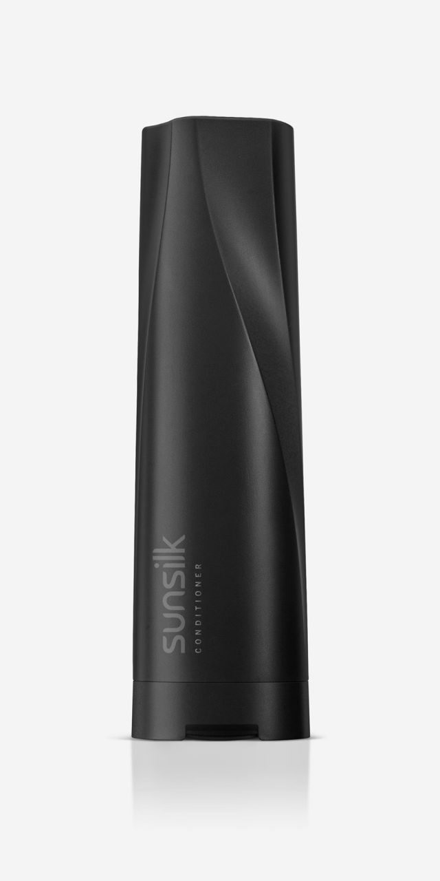
Sunsilk is a brand dedicated exclusively to haircare. It is aimed at young, open-minded, dynamic women who understand hairstyling as a key means of expressing their personality. Among the brand’s attributes, colour and expressiveness were identified as the core drivers of this project. In addition to a vibrant colour palette, the design is defined by an undulating surface that runs vertically along the containers—a feature that conveys dynamism and refers to the freedom of movement of healthy hair.
The design was adapted across the different formats in the range—bottles of various capacities and jars—so that all products share a strong, cohesive identity, easily recognisable both visually and through touch. This tactile quality was particularly important, given the conditions under which these products are used.
Colour, expressiveness, and efficacy. That is Sunsilk.
Fuego Lento
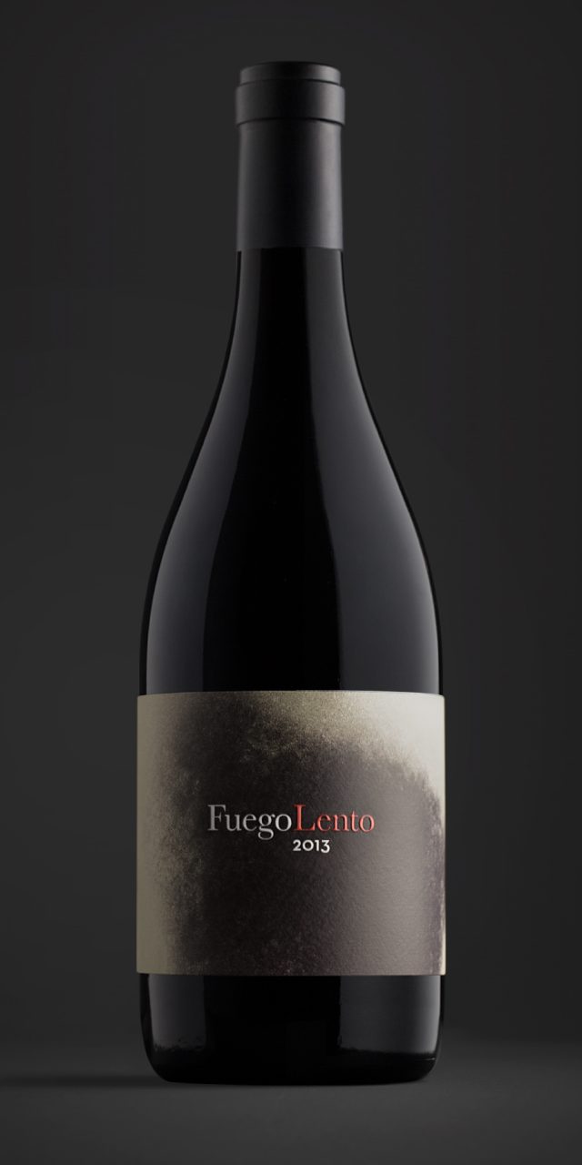
Slow Fire—more commonly known as slow cooked—is an expression that takes us back to the kitchens of a bygone era. It refers to a technique that uses a low flame to slowly draw out intense flavours, evoking images of smoky coal fires, glowing embers, and brick walls blackened by soot. This gradual build-up of soot is the result of time itself: the patient nurturing of something until it reaches perfection. For this reason, soot became the central element of the project.
These fine black particles were transformed into the main graphic resource and applied across labels, boxes, and other supporting media. Slow Fire is not only a culinary technique, but also a way of understanding the essence of both food and life: never rushed, never stressed. Pleasure and haste simply do not go together.
Paníacos
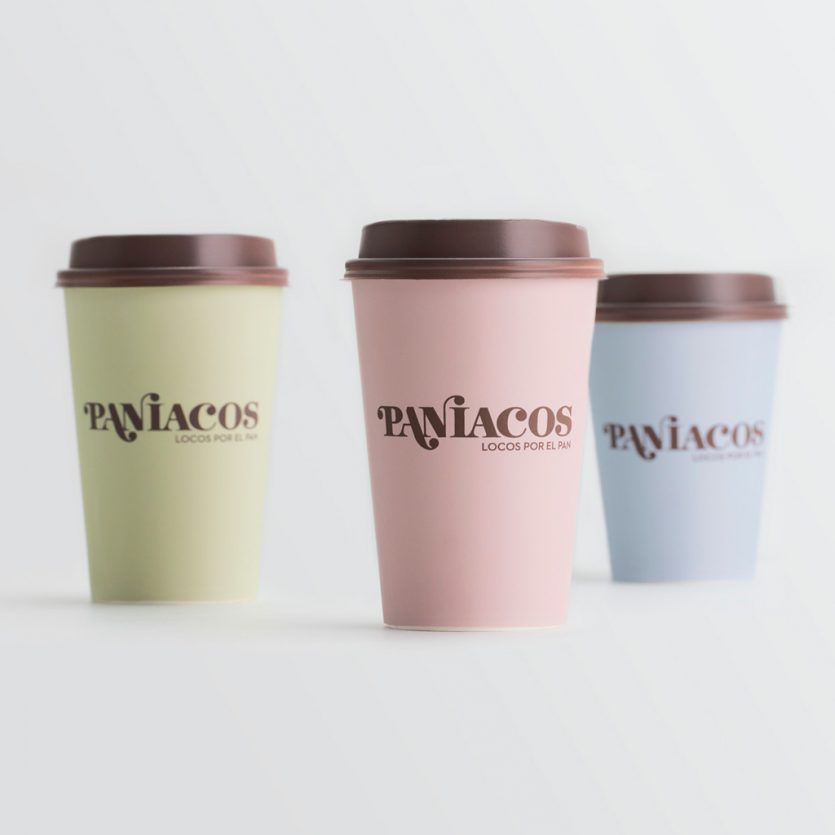
Paníacos—a portmanteau combining pan (bread) and maniacs—emerges from a new bakery concept that also functions as a café. It offers innovative and distinctive products made according to traditional recipes. The business model brings together the heritage of the bakery with the contemporary service culture of the café, creating a space where customers can enjoy breakfast, lunch, or afternoon tea while chatting or browsing the internet.
The logo seeks to balance tradition and modernity. It is based on a classic typeface, Bodoni, to which we added teardrop-shaped terminals—rounded end strokes that introduce dynamism and a subtle sense of irreverence. These details emphasise the word pan (bread) and culminate in the dot of the i. This hybrid, iconoclastic spirit defines the brand and extends to the tone of voice used in the copy across packaging and other applications—such as placemats, napkins, and bags—all set against pastel-coloured backgrounds.
Zara Men
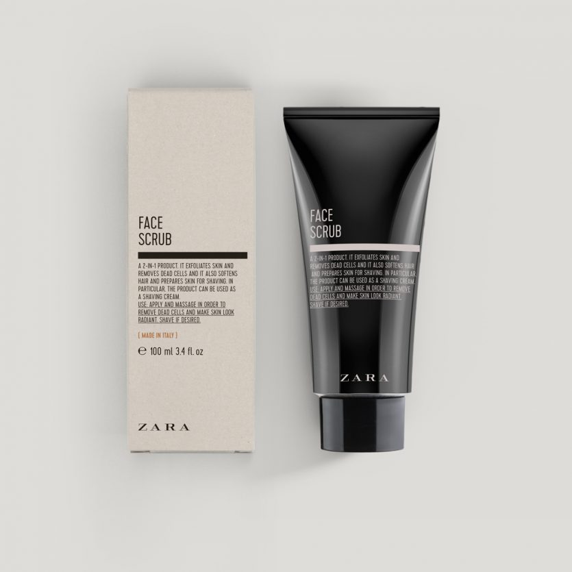
The aim was to develop a line of men’s cosmetics with an aesthetic closely inspired by the visual language of old pharmacies. Amber-toned bottles were chosen, along with a typographic approach in which ingredient lists become the main graphic element, while the phrase Made in Italy is given clear prominence on the front.
The proposed designs are based on typographic solutions that recall the labels of medicinal compounds traditionally found in pharmacies. The careful selection of typefaces, together with the composition and hierarchy of the texts, gives the range a distinctive personality and a visual language suited to the world of cosmetics. The colour palette reinforces the masculine character of the line.
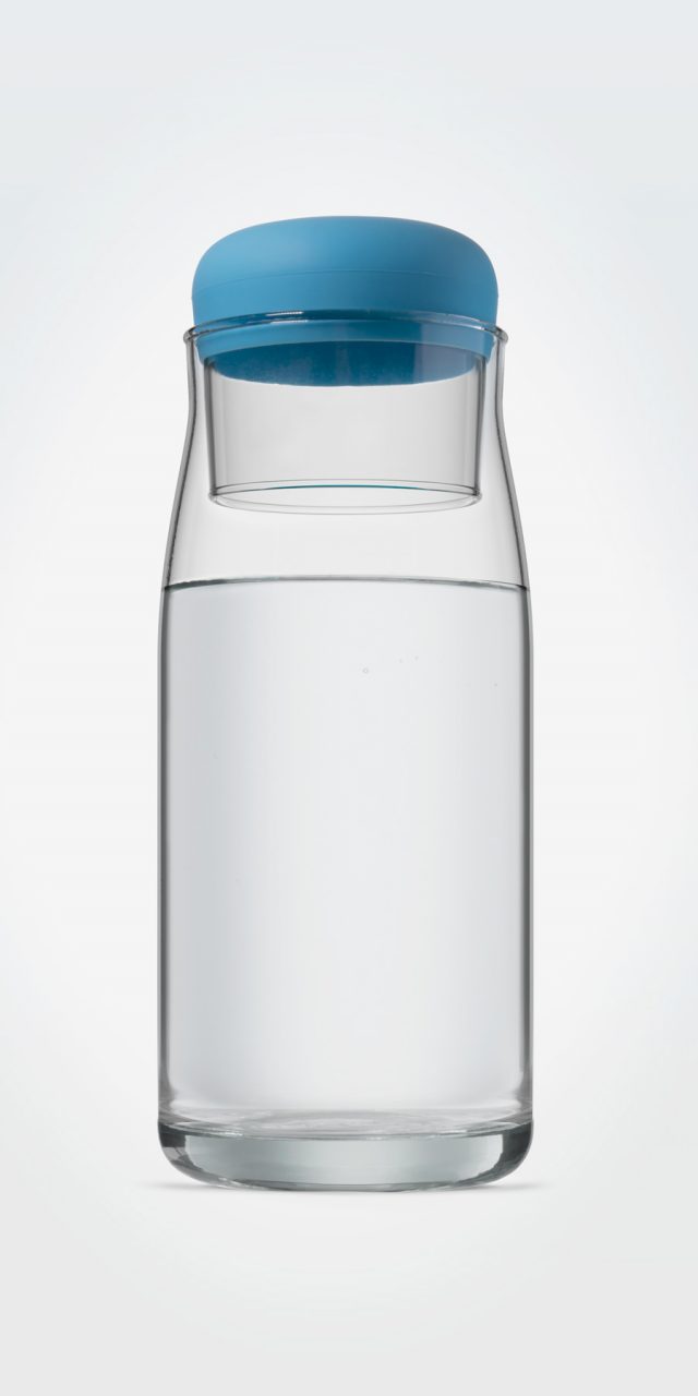
Global Omnium Carafe and Glass
Global Omnium is dedicated, among other activities, to managing the entire water cycle—from catchment and purification to distribution. The company commissioned us to design a carafe and glass set for internal use that could also function as a gift. The objective was to encourage the consumption of tap water, or at least for a company so deeply committed to delivering high-quality drinking water to homes, to lead by example.
Our inspiration came from the small jugs and glasses traditionally placed on bedside tables, within arm’s reach, where the glass itself often served as a lid. Both the glass and the carafe are made from eco-friendly glass. The base of the glass incorporates a silicone sleeve that allows it to act as a stopper without direct glass-to-glass contact, providing a more secure seal and protecting the contents of the carafe when it is not in use.
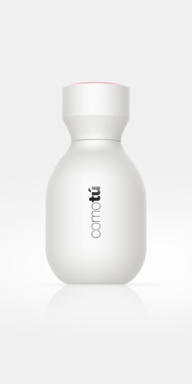
Comotú
The collection of mass-market fragrances Comotú, designed for Mercadona, was conceived as a simple product, aligned with its price positioning, yet with a surprisingly premium appearance. In order to build a strong brand image while minimising production costs, a single bottle design was used for all eight fragrances: four in black for men and four in white for women. The different scents within the range are distinguished by coloured caps.
The bottle features soft, rounded forms, while the secondary packaging makes use of gloss finishes or metallic inks. The overall design conveys qualities of modernity and high perceived value at a highly competitive price point. The success of its launch clearly demonstrates that a mass-market product can benefit greatly from thoughtful and well-executed design.