

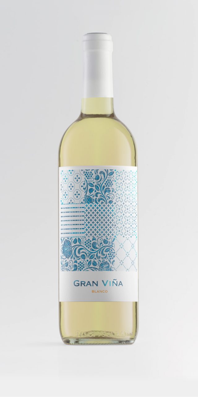
Gran Viña
This is a family of humble, honest wines, made from grapes grown in the vineyards that lie behind the old farmhouse—the landscape the grandmother looked out onto from her kitchen every day. They are a tribute to that woman who prepared delicious jams and exquisite almond and caramel sweets, and who shared her afternoons with her grandchildren—the same grandchildren who now tend the vines and make this wine as a way of honouring her memory.
The label evokes the tiled walls of that kitchen, recalling those moments through a quiet visual language, much like a Proustian madeleine.
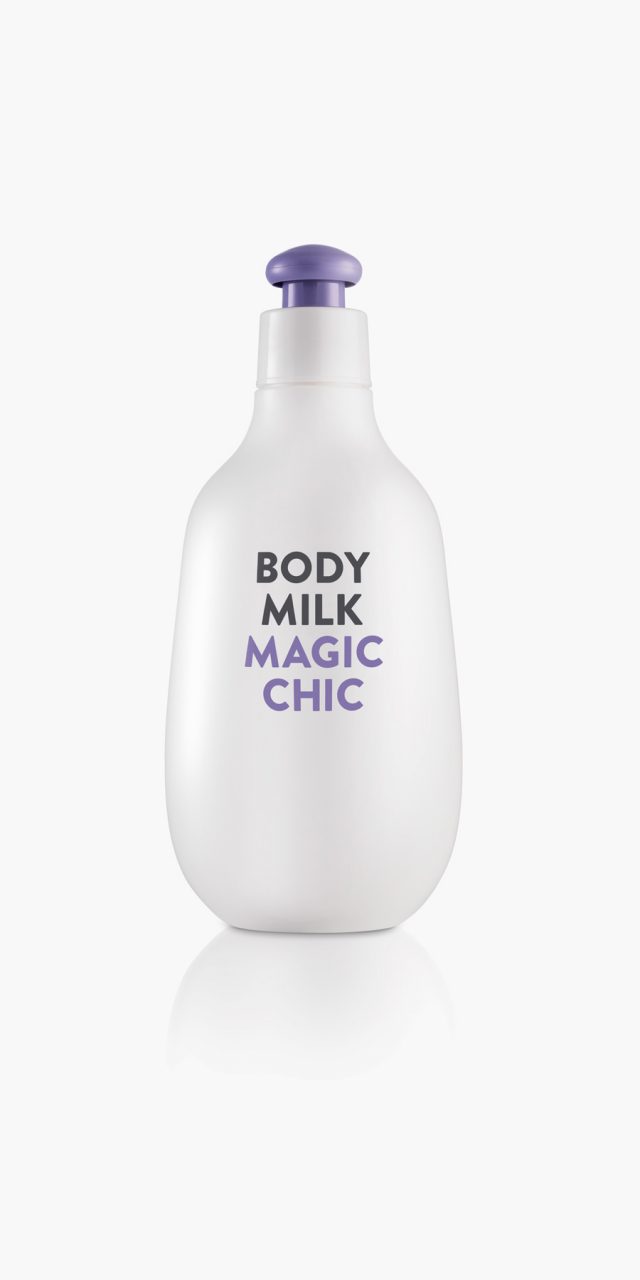
Magic Chic
Magic Chic is a family of three products—bath gel, body milk, and cologne—aimed at a young audience. The brief called for something different from what was already on the market: less conventional, more playful; something that was not romantic and did not speak about ingredients or product benefits. It needed to be direct and immediately engaging.
This intention is expressed through a simple, emphatic two-dimensional graphic design, set in contrast with the bottle we designed: soft, friendly, and with an unusual shape, complemented by a highly functional cap—an uncommon feature in this type of product.
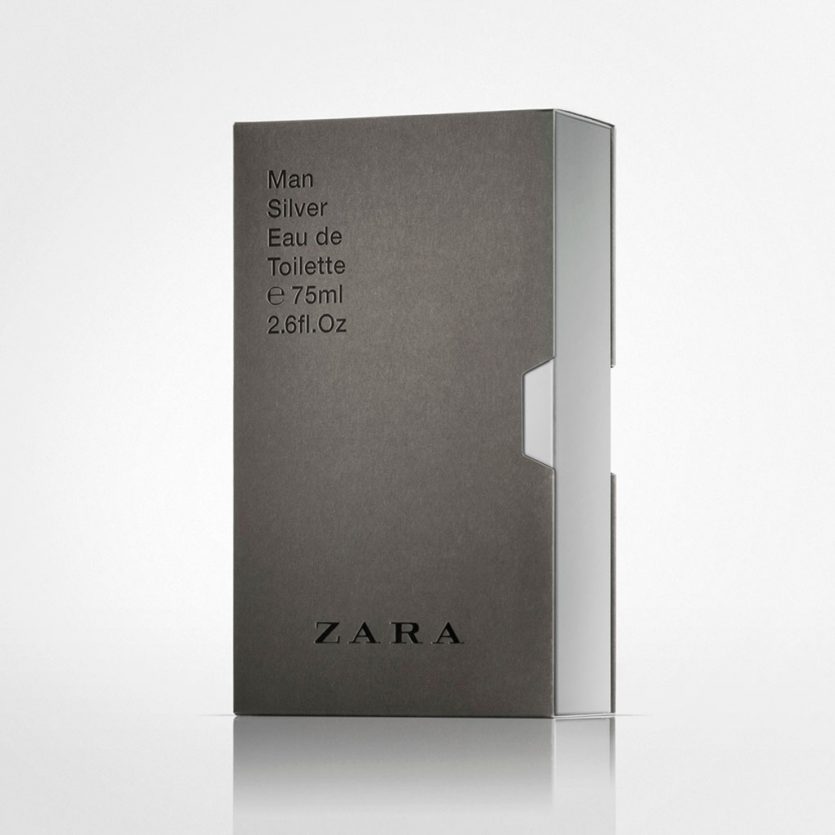
Zara Men VHS
The brief called for a new design for the boxes and graphic system of most Zara men’s fragrances. The design needed to be neutral and versatile enough to accommodate not only existing fragrances, but also future editions to be added to the brand’s portfolio.
For the box structure, we chose a videotape case model adapted to the size of the bottle. This type of packaging allowed us to work with an outer sleeve and an inner box. From a graphic perspective, we opted for a classic typographic approach on the exterior, using Helvetica, a restrained composition, and sophisticated finishes: blind embossing, bas-relief, and gloss varnish applied to the lettering in contrast with the matte cardboard.
The first fragrances to feature the new design were the core classics: Silver, Uomo, and Blue Spirit. The exterior is finished in warm grey, while the inner box adopts the colour associated with each fragrance. This colour is revealed on the opening side—just like a videotape case—and through the thumb notch.
The system was later extended to the Cities line (cities where Zara is present), for which this packaging solution proved especially appropriate. In this case, the outer box is white, while the inner box is fully covered with an image of the city. As the inner box is gradually removed from the case, the image is progressively revealed, echoing the way travellers slowly discover a city as they explore it.
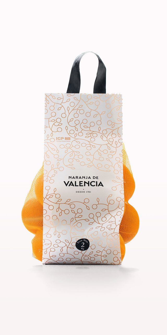
Naranja de Valencia
A group of producers and exporters made use of the PGI (Protected Geographical Indication), which guarantees that the oranges they distribute worldwide are grown in Valencia and therefore benefit from its well-established reputation for quality. The name of the brand is clear and direct: Naranjas de Valencia—or Valencia Orange in its English version.
All brand applications are centred around the point of sale: boxes, mesh bags, signage, carrier bags, T-shirts for greengrocers, and a website. In the logo, the word Valencia takes visual precedence, as the presence of the oranges themselves—displayed in boxes or mesh bags—makes it almost unnecessary to specify the product.
The chosen sans-serif typeface has been subtly modified to evoke the traditional lettering used on orange labels in the mid-twentieth century, a period in which this graphic tradition flourished, particularly during the first half of the century. The visual identity also incorporates a second key element that complements the logo: an illustration used as a recurring motif pattern, applied across different media such as wrapping paper, signage, bags, and the website.
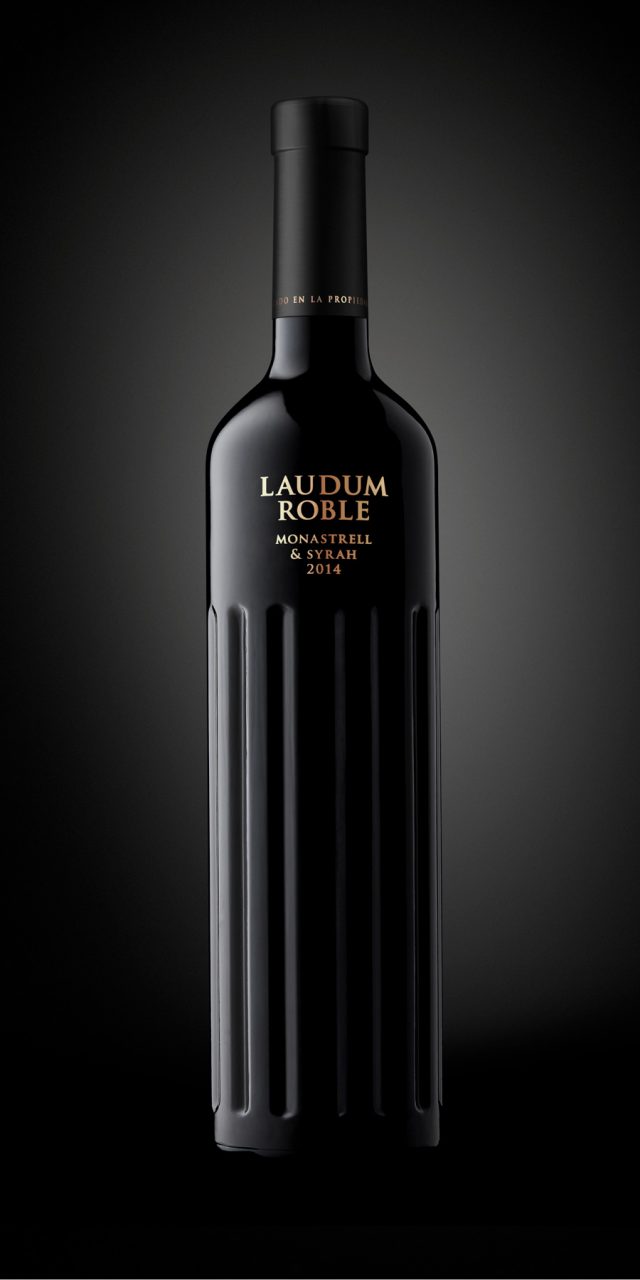
Laudum
Laudum is the genitive plural of laus, the Latin word meaning praise, glory, or fame. For a name of such classical origin, with strong Roman connotations, we designed a bottle that draws inspiration from Ionic and Corinthian columns, incorporating elements of ancient Roman temple architecture.
The relationship between viticulture and the temple is age-old. The column, as part of the temple, rises towards the sky; it embodies history and art—just as wine does.
Photography: Guillem López
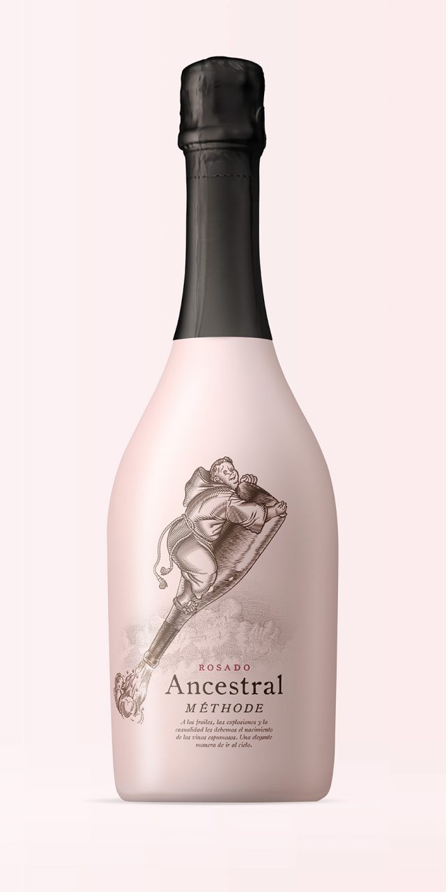
Ancestral
In very cold regions, the arrival of winter once halted the fermentation of grape must before it could be bottled. When spring arrived, fermentation would resume inside the bottle, producing gas, and the bottles—still not made of the glass-and-cork combination we know today—would often explode. Nevertheless, some remained intact, and thanks to this accident a new kind of wine was discovered: sparkling, extraordinary, and entirely the result of chance.
The ancestral method was the first to be conceived and forms the basis of the traditional method used today to produce exceptional Champagne and cava. Unlike the latter, in the ancestral method the wine is bottled before the first fermentation has finished, allowing fermentation to be completed in the bottle and resulting in natural carbonation.
The outcome is a fresh, playful, surprising sparkling wine. Undoubtedly, it was born of chance—like all great inventions—combined with the ingenuity of shrewd monks, always ready to edge a little closer to heaven for a good cause.